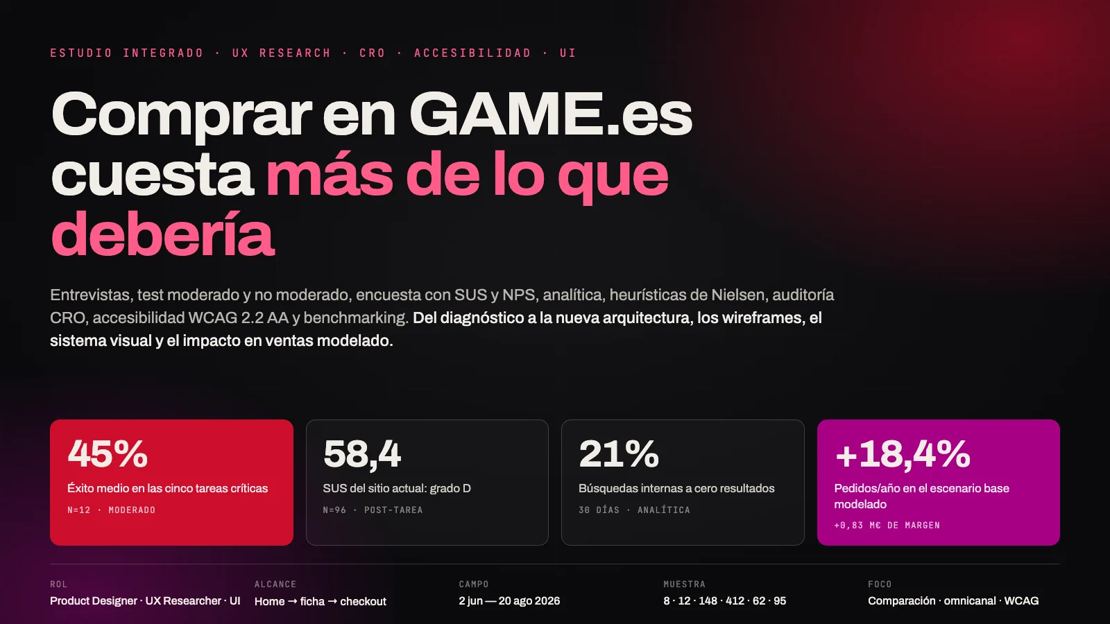
The real moment
A production company opens between 5 and 15 portfolios in tabs and discards most of them in under 30 seconds. The site is not competing against nothing: it is competing against fourteen other tabs open at the same time.
convention
Work / Product UX/UI / Kacho Cano · Audit and UX/UI design
Project 03 of 28 in the archive 03 of 09 in Product design UX/UI See the whole discipline ↗
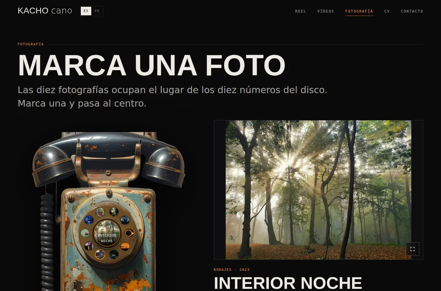
The project, in two parts
Part 01
(00) — The thesis
Competitors with a static home page, no moving image
Professionals of movement, presented standing stillRun on a template, and two of them use exactly the same one
Diego and Brendan share Adobe Portfolio and cancel outCompetitors who ask for shooting dates in their form
The cheapest process advantage in the projectCompetitors with the site in two languages
The closest rival is Spanish and his site is English onlyA production company opens between 5 and 15 portfolios in tabs and discards most of them in under 30 seconds. That is where the site’s only two jobs come from: survive the cull and make the email easy. Everything else is ornament. The design question was not “how do I show the work?” but “what makes them close the other nine tabs?”.
It is a hiring tool. Kacho does not sell images: he sells availability and judgement, and he competes against ten other professionals in the inbox of the same production company.
Reframing the brief changed the rest of the project. If the site is a gallery, success means it looks good. If it is a hiring tool, success means an email arrives with dates in it.
A production company opens between 5 and 15 portfolios in tabs and discards most of them in under 30 seconds. The site is not competing against nothing: it is competing against fourteen other tabs open at the same time.
Survive the cull and make the email easy. Anything that serves neither is ornament, and ornament in a hiring portfolio costs seconds that are not there.
Not “how do I show the work?” but “what makes them close the other nine tabs?”. It is the question that orders every decision that follows.
A report that mixes measurements with opinions cannot be argued with. Every claim in this audit is labelled with where it came from, and the ones that could not be checked appear as what they are.
Taken from a real measurement on the material: file weights, contrasts, luminances, dial geometry.
A settled, checkable pattern of the trade: the reel goes first, the CV downloads as a PDF.
Design judgement still to be validated with real users. Declared as such, not dressed up as a finding.
Four interviews and a hallway test are still pending. The five competitors are audited on structure, content and technology, but not timed on a throttled connection: that needs a browser and a person in front of it.
Five cinematographers competing for the same job, each picked because they do one different thing well: the CV, the build, the restraint, the SEO and the business model.
Madrid. The best CV of the set: agency, AEC, credits with production company and platform. English only and on a template.
New Zealand. Custom development. Lists his owned kit and 14 awards with context. Three navigation items.
A single film takes the whole home page, with Sundance and Cannes. It works because of the backing; it cannot be copied without it.
Sydney. “Showreel” is a navigation item of its own and his description declares two markets. Same template as Diego.
Underwater niche. Prints, workshops and a podcast: he does not depend on the day rate. Nine navigation items.
| Criterion | Diego | Tim | Mia | Brendan | Brett | Kacho v4 |
|---|---|---|---|---|---|---|
| Moving image on the home page | No | No | No | No | No | Yes |
| Role visible without a click | Yes | No | Yes | No | — | Yes |
| Running time before opening | No | No | No | No | No | Yes |
| Owned kit listed | No | Yes | No | No | No | Yes |
| Asks for shooting dates | No | No | No | No | No | Yes |
| Two languages | No | No | No | No | No | Yes |
| Custom development | No | Yes | No | No | No | Yes |
| Memorable interaction | No | No | No | No | No | Yes |
This is the finding that orders the whole redesign: professionals of movement introducing themselves with still images. Portfolio templates are built for photographers and video is heavy, so nobody does it. Distinctiveness is cheap here and nobody is occupying it.
These are not opinions about taste: each one comes from comparing the five sites on the same criterion and writing down who does it and who does not.
Templates are built for photographers and video is heavy. Kacho’s home page is the reel, full bleed, with year, title and role over it.
Diego states “Diego Cabezas AEC (2)”: he shot 2 of 6 episodes. That honesty builds more trust than overstating. Tim and Brendan credit nobody in the index.
Only Tim lists it. A production company hiring someone with their own camera and lenses saves the rental. It turns “what do you charge” into “what does the package cost”.
“Best Cinematography” on its own does not say whether the festival had three attendees or three thousand. Tim lists 14 with year, festival, category and title.
Diego and Brendan use exactly the same one (Adobe Portfolio) and cancel each other out. Distinctiveness is cheap: nobody occupies it.
Zero date fields across five competitors. The cheapest and biggest process advantage in the project.
The closest rival picked one language, and it is not the one of his main market. Kacho detects the browser: Madrid reads Spanish, London reads English.
His description says what he is and where he is. Tim’s is literally the word “Cinematographer.” and nothing else.
Prints, workshops, mentoring, podcast. A growth route, not an immediate action: it costs him nine navigation items and no clear path.
Not to be copied yet. The applicable version is the hierarchy: let the best piece actually lead, instead of 27 works weighing the same.
Self-criticism with the benchmark in front, not self-promotion. The same table that points at what the rivals do badly points at what this portfolio is missing.
| Pain point | Who does it better | Severity |
|---|---|---|
| Only 6 works. Brendan shows 27, Diego 21 | Diego, Brendan | High |
| No granularity on shared credit | Diego | High |
| No representation or agency | Diego | High |
| No press section | Diego | Medium |
| “Showreel” is not in the navigation | Brendan | Medium |
| No association membership (AEC) | Diego | Medium |
They depend on Kacho, not on the design. They are blocking before launch: a grid of six pieces reads as little experience, and a credit without granularity leaves the doubt of whether he shot it or only operated.
The previous version had a good idea and an execution that did not get there. These six points had to be resolved before any design discussion was possible.
The PNG was placed with left:3vw; height:95vh and the dial with left:10.2vw; top:30.2vh: two coordinate systems anchored to the viewport, not to each other.
The dial turned without saying which item was selected: the movement existed but it was not information.
A 13.7 MB photograph (7067 × 4714 px) to be shown at under 1000 px. A portfolio that does not load is not seen.
overflow:hidden with height:100vh on the body: it existed, but there was no way to get to it.
format('ttf') is not valid, it is truetype. And Impact cannot be embedded for licensing reasons — which is why the system uses Anton.
<html lang="en"> with Spanish content, no alternative texts and no visible focus.
The idea of the circular control, the orange-on-black palette and the ambition of having a gesture of its own. It deserved to work: the problem was not the concept, it was that none of the three was resolved.
The figures below come from measuring the result, not from estimating it. And the design includes its own refutation: if the gesture is not used, it has to be rethought.
Asset weight
147 MB → 8.7 MBDial deviation across the seven widths
It used to fit in none of themContrast of the main text
The minimum is 4.5:1Touch target where the fingers are
WCAG 2.5.8 asks for 24 px| Indicator | Benchmark |
|---|---|
| Qualified enquiries per month | The only one that really matters |
| Reel depth | ≥ 2 pieces per session |
| Video completion | ≥ 40 % |
| Dial usage | ≥ 60 % |
| Date field filled in | ≥ 70 % of submissions |
| Form abandonment | ≤ 40 % |
| Split by language | Decides whether prerendering is worth it |
If fewer than 60 % of visits to the photography section use the dial, the gesture is pretty but it does not work, and it has to be rethought. It is measured with the photo_select event, which also records the method: so we will know whether people tap, drag, scroll or use the keyboard.
Missing are the WebVTT captions (criterion 1.2.2), a run-through with a real screen reader and the real alternative texts for the ten photographs: the current ones are approximations marked as provisional. It is declared on the site itself, not hidden.
Part 02
(00) — The interface
Widths drawn for every screen, not adapted on the fly
Desktop 1440 · Tablet 768 · Mobile 390Complete languages, with the same set of screens
Screens · ES and Screens · EN, sibling pages in the fileColour tokens, named by function and not by hue
Surface · line · ink · accentLuminance spread used to fix the centre of the dial
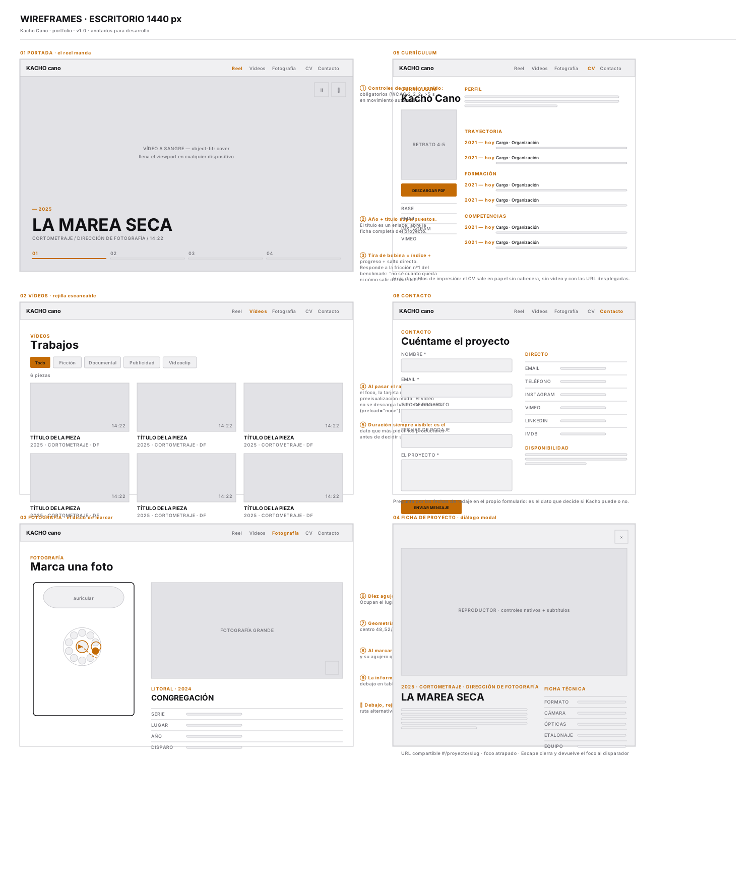
Out of 255 · by circle fitting, not by eyeThe ten boards go in the order they were made: first the skeleton and the flows, then the Foundations that fix the system, then the components, and last the screens assembled in both languages and across the three devices. All of them are captures of the Figma file and the deliverables exactly as they stand today.
The seven pages in grey, with the full-bleed reel on the home page and the project sheet resolved as a table of camera data. Drawing this first forces you to decide what information exists before deciding how it looks.
The decision you can see here and cannot see in the competitors: the running time of each piece goes on the card, before opening. Nobody opens a video blind.
Deliverable · WireframesDesktop 1440
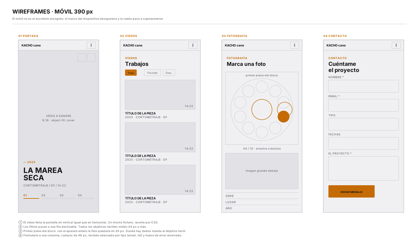
Mobile is not desktop shrunk. The information about the selected photograph moves below the dial instead of beside it, and the dial goes to a close-up, cropping the rest of the apparatus.
The two breakpoints are deliberately different: the two-column layout comes in at 1024 and the whole apparatus only from 1280.
Deliverable · WireframesMobile 390
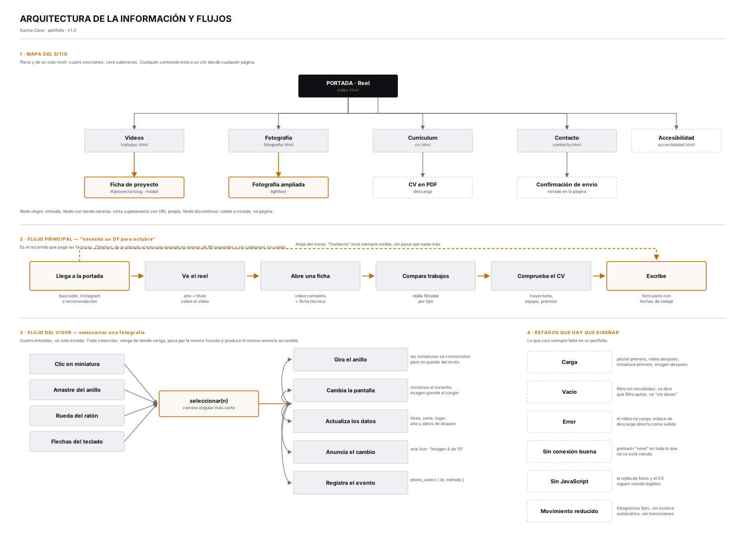
The site map and, above all, what happens when you dial a photograph: the dial turns by the shortest angular path, the photo travels to the centre using the FLIP technique, the hole it came from is left empty —which is what makes the movement legible— and the information appears.
And a fifth thing you cannot see: the change is announced through aria-live in the active language and the photo_select event is recorded with the method used.
Deliverable · FlowsInformation architecture
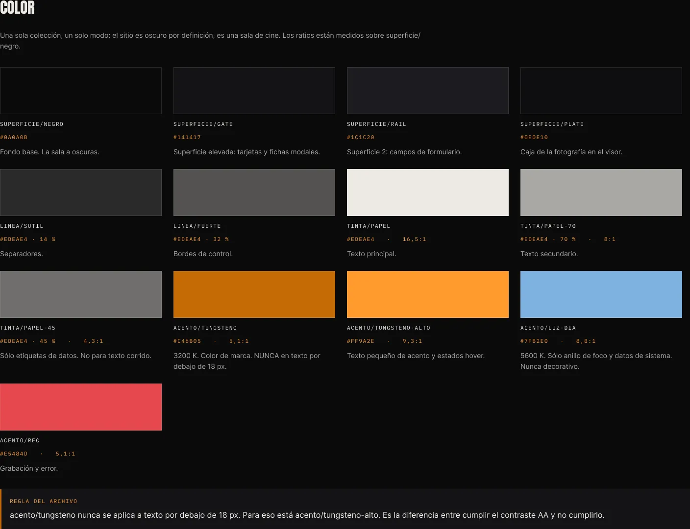
It reproduces the two colour temperatures a cinematographer works with every day: tungsten 3200 K #C46B05 as the brand colour, and daylight 5600 K #7FB2E0 reserved for the focus ring and system data.
They do not compete because they do not share a function: the blue never decorates. And it can be explained in one sentence to anyone in the trade, which is the proof that the rule is a good one.
The thirteen tokens are named by function —surface, line, ink, accent— and each carries its checked contrast: the main ink gives 16.5:1 on black.
Figma · 01 · FoundationsColour
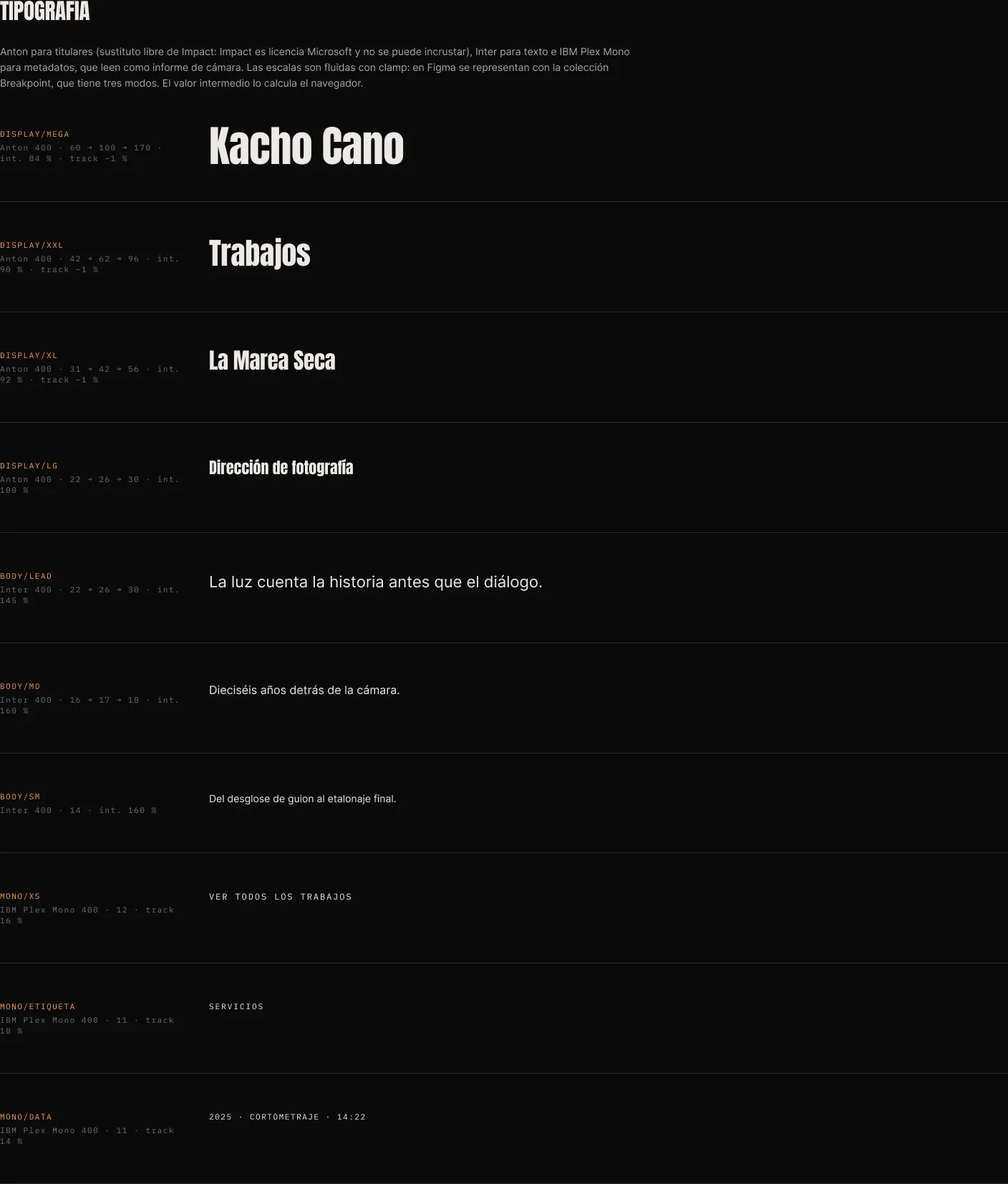
Anton for the headlines —the free stand-in for Impact, which cannot be embedded for licensing reasons—, Inter for the body and IBM Plex Mono for metadata, timecode and labels: the monospace reads like a camera report.
Eleven styles, from display/mega to mono/data, each with its definition next to its specimen.
Figma · 01 · FoundationsTypography
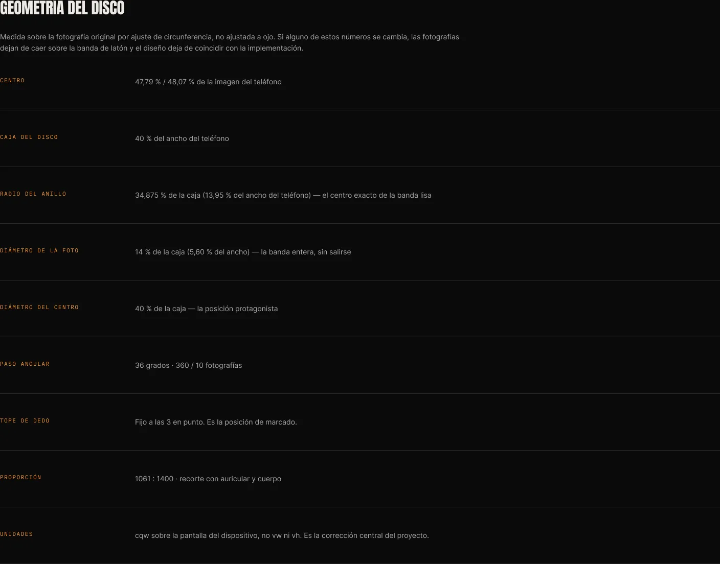
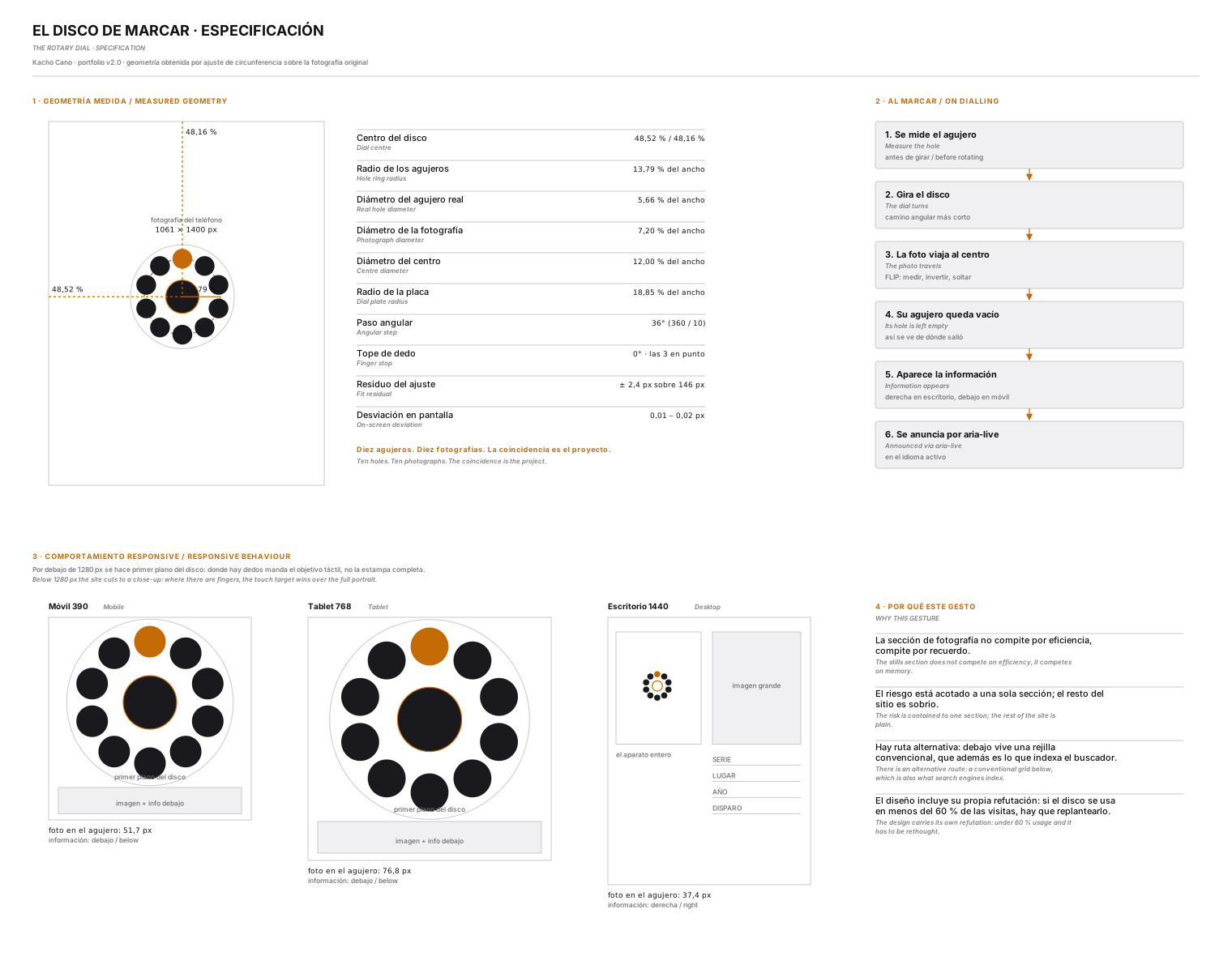
The apparatus on the home page is not a mobile phone: it is a wall telephone with a rotary dial, and in this version it arrives with a blank dial — a brass plate with no holes and no numbers. That improves the concept: the photographs no longer imitate holes that were already there, they create them.
The position was not adjusted by eye. The edge of the drum was detected with circular voting over the image gradient, and the centre was fixed by choosing the one that leaves the ten positions with the least luminance spread: ±2.73 out of 255. On-screen deviation lands between 0.01 and 0.03 px, verified across seven widths.
Figma · 01 · FoundationsDial geometry
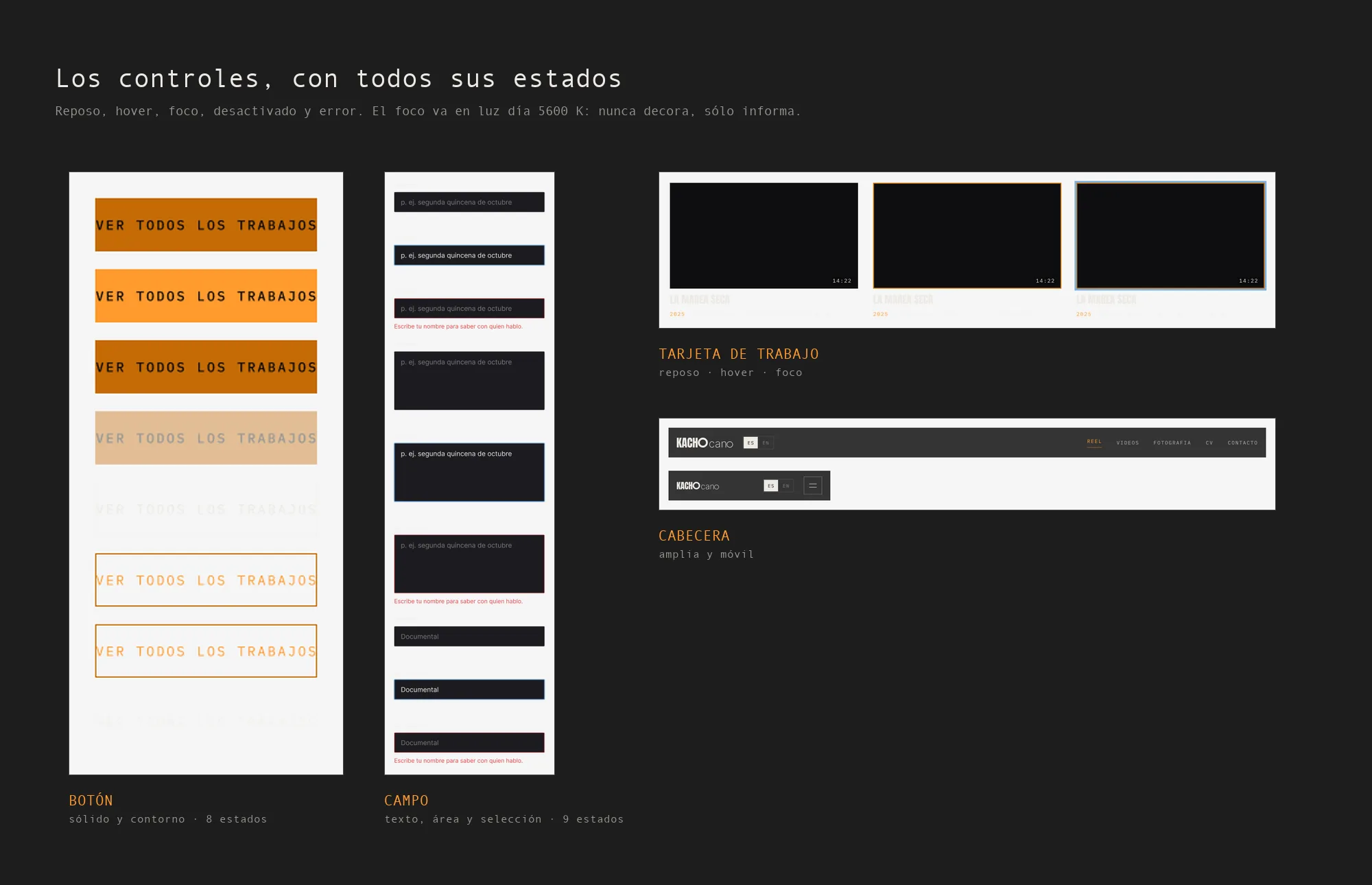
The components page of the file: solid and outline button with their eight states, text, area and select fields with nine, work card at rest, hover and focus, and the header in wide and mobile versions.
The states are not decoration: focus is always daylight 5600 K, which is the only place the blue appears. If an element is blue, the keyboard is on it.
Figma · 02 · ComponentsVariants and properties
One variant per selected photograph. On dialling, the dial turns until that photograph reaches the finger stop by the shortest angular path, and the hole it came from is left empty: that is what makes the movement legible.
The threshold that separates “I tapped” from “I am turning” differs between finger and mouse — 10 px with a finger and 4 px with a mouse— because on touch the finger drifts a few pixels, and otherwise every tap would read as a micro-drag.
Figma · 02 · ComponentsDial · photo selected 1–10

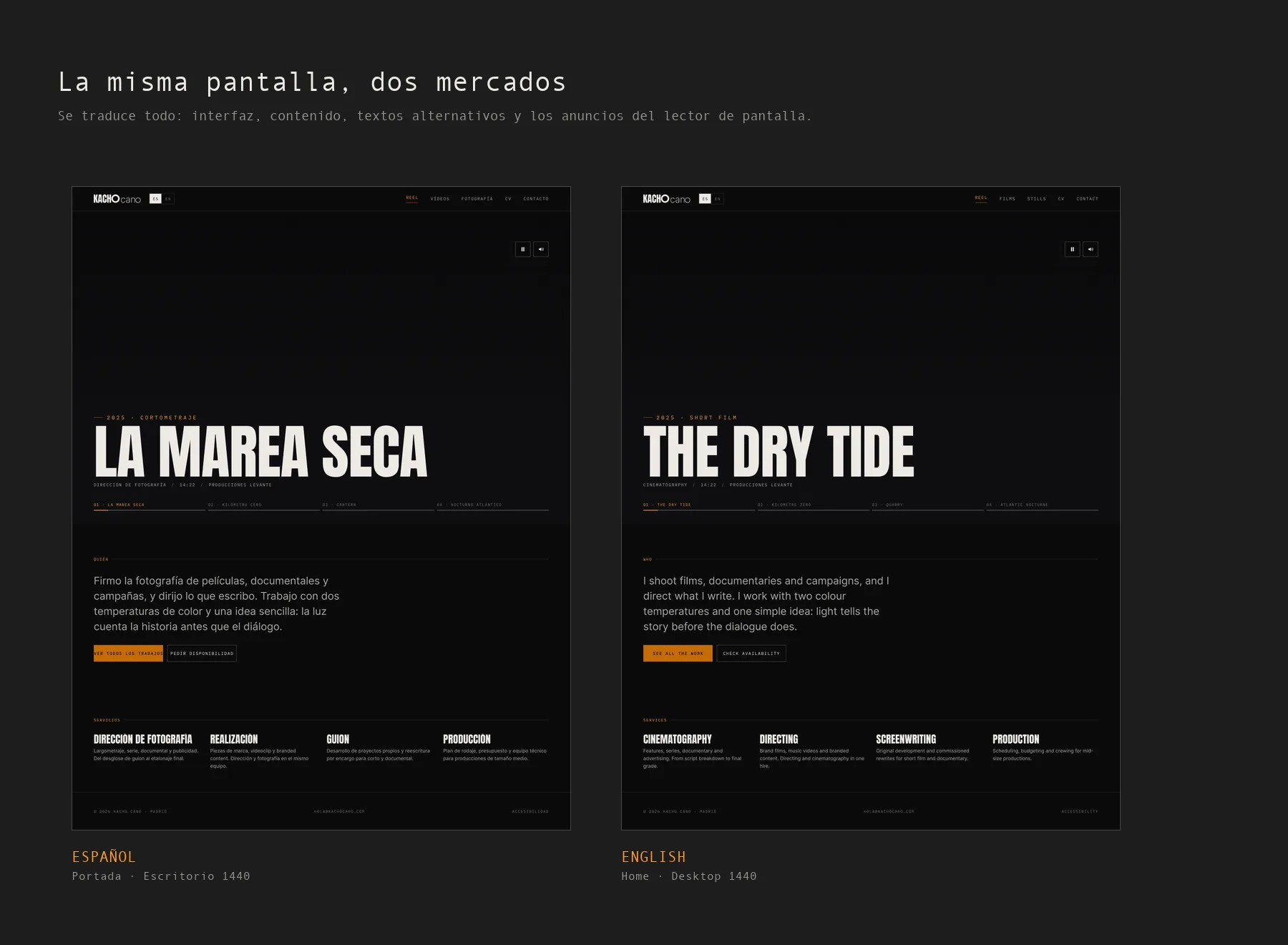
It is not one page with the text swapped: they are two complete sets of screens, 03 · Screens · ES and 04 · Screens · EN, so that differences in text length show up in the layout instead of appearing at build time.
Language is resolved in a cascade: ?lang= in the URL, then the saved choice, then the browser language and finally Spanish. Verified: es-ES and es-AR give Spanish; en-GB, fr-FR and de-DE give English.
The trade-off, said openly: it uses ?lang=en rather than /en/ routes. In favour, a single source of content and no way for the versions to diverge. Against, English SEO is weaker; if international work becomes the priority, it has to move to prerendered routes.
Figma · 03 and 04 · ScreensES and EN
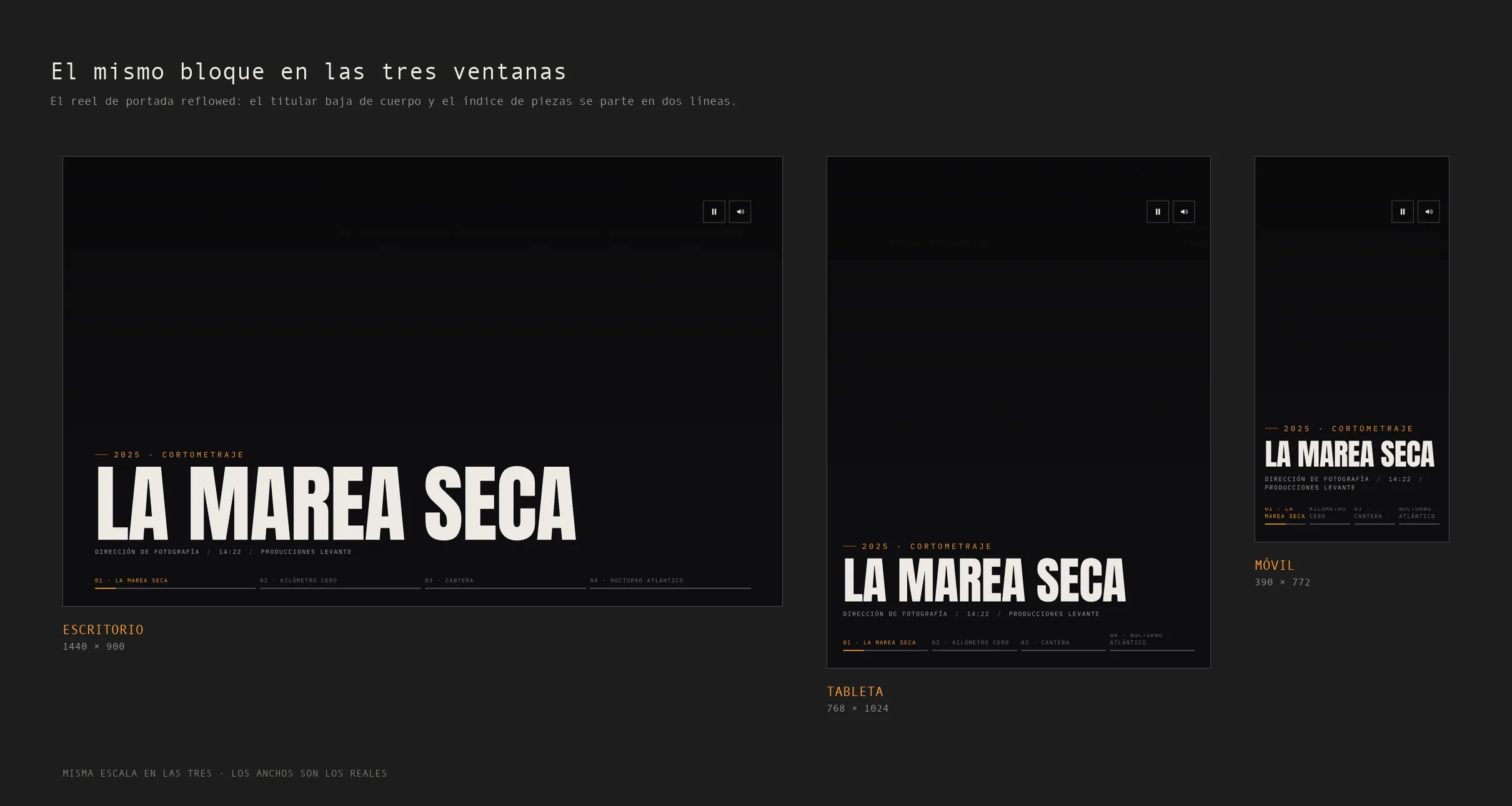
Every screen exists in the file at 1440, 768 and 390. Below, the same reel block in all three: the headline drops in size and the piece index breaks into two lines as soon as it does not fit.
The responsive decision is not aesthetic. With the whole apparatus at 1024 px the dial photograph came out at 29.8 px, which is exactly where the fingers are; that is why below 1280 the site goes to a close-up of the dial and crops the rest of the telephone. The touch target rises to 58 px —WCAG 2.5.8 asks for 24— without changing the drawing.
Figma · Screens1440 · 768 · 390
All of the above is built and running. The site can be opened and used in full —the reel, the dial, the CV and the form— on the front-end development page, and the mark that signs it is on the identity page.
Next in Product design UX/UI