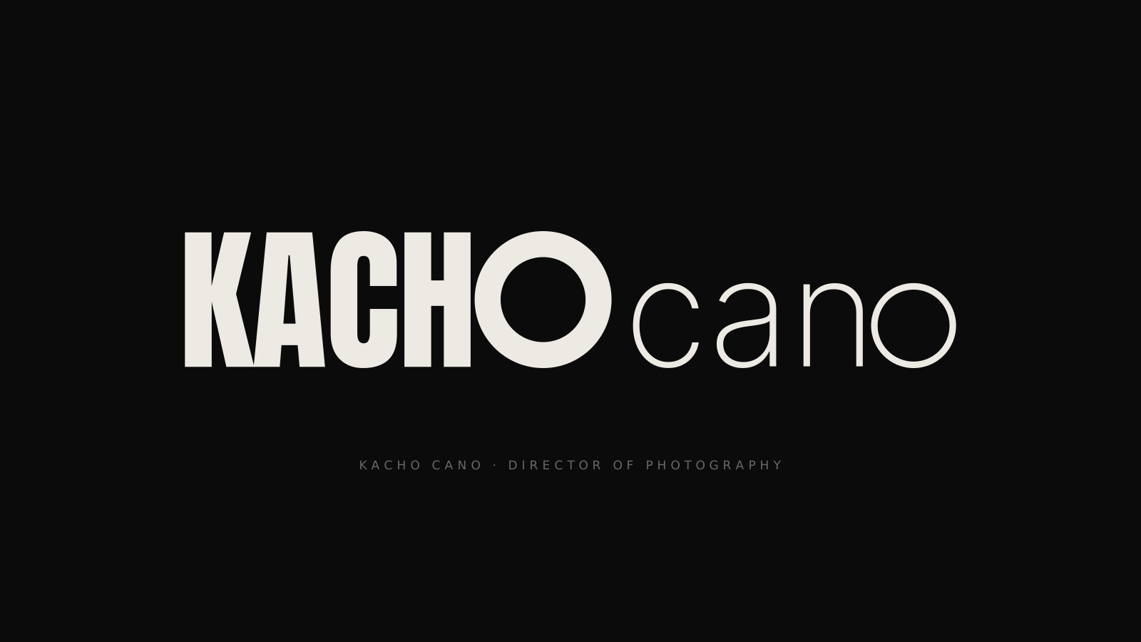
Work / Graphic / Kacho Cano · Identity
A brand with two lenses
Project 19 of 28 in the archive 02 of 11 in Graphic design See the full discipline ↗
The brief
Kacho Cano is a director of photography and his portfolio opens with a full-screen video. The mark had to hold up on top of that —small, in a corner, over moving image— and hold up just as well as a 24-pixel stamp in an avatar.
Two uses pulling in opposite directions. A logotype with live strokes breaks at the second one; a mark designed only to be a stamp cannot carry a first impression.
How it is built
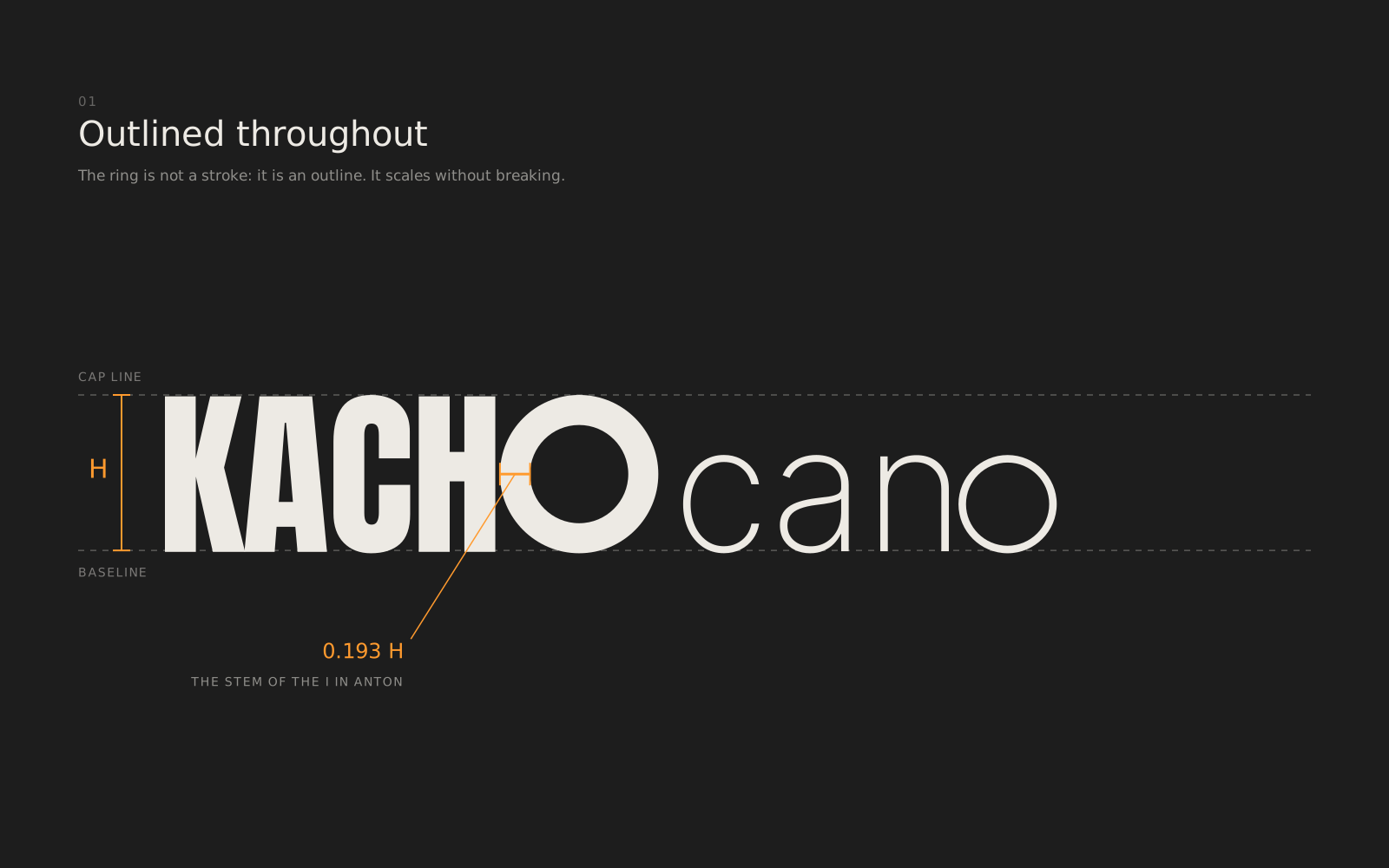
Everything is outlined. There is not one live stroke in the file: the ring of the O is a closed outline, so the mark scales to any size without the weight drifting. That single decision answers both directions at once.
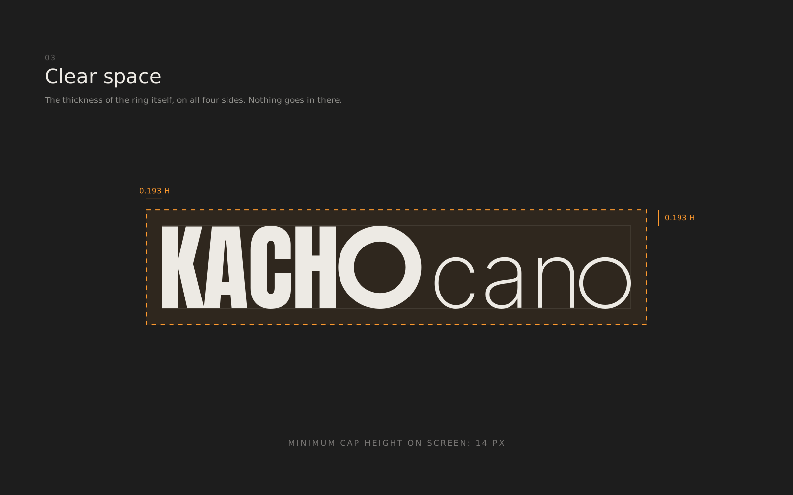
From there, one measurement rules: the cap height (H). The ring of the O is 0.193 H thick, and that is not a number picked by eye — it is exactly the stem of the I in Anton, the typeface of KACHO. The ring weighs the same as the letters around it.
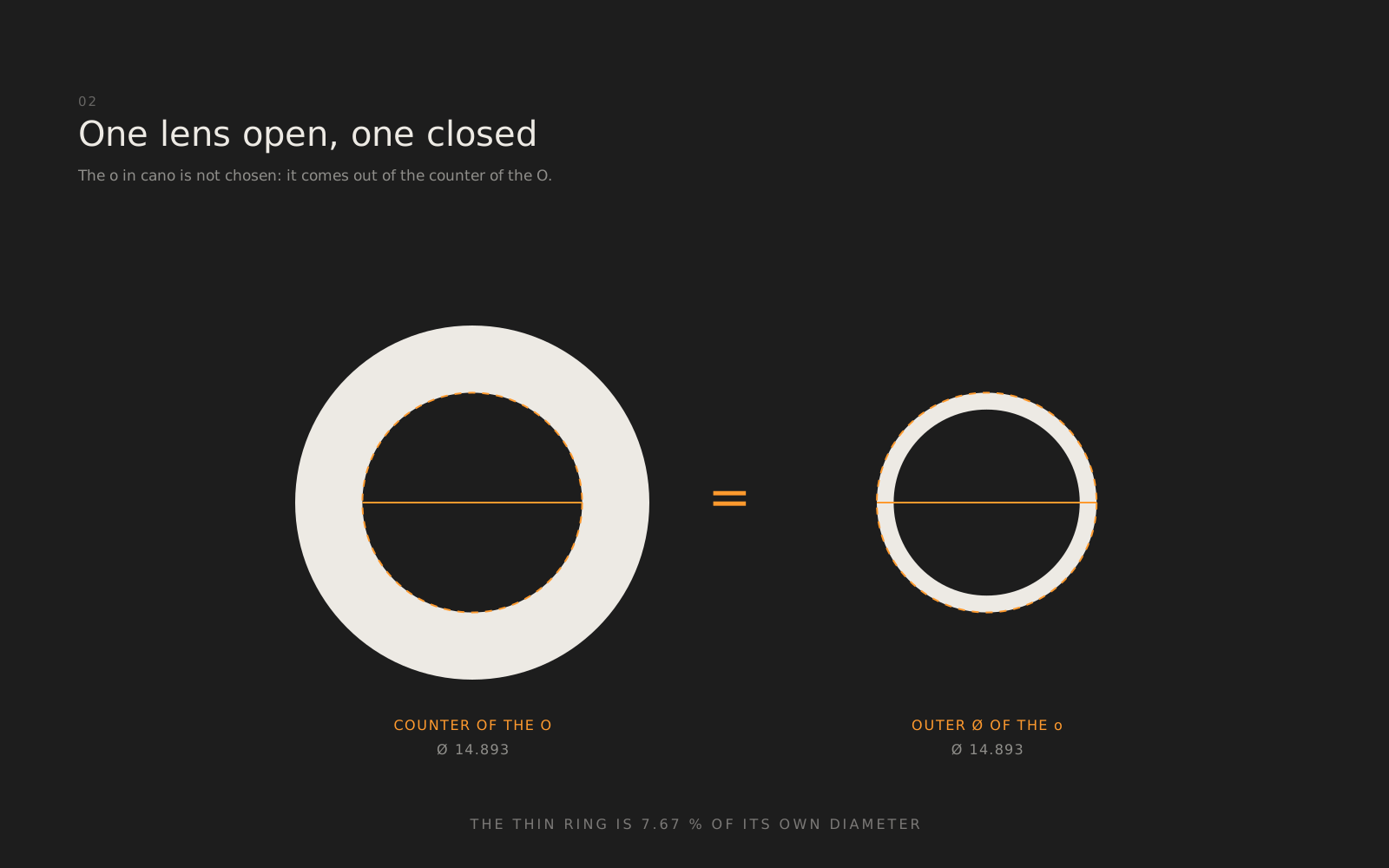
The second o is not chosen either. The counter of the O gives the outer diameter of the o in cano, and that thin ring is 7.67 % of its own diameter. One lens open, one closed: the aperture in two positions, inside the same word.
Clear space is the ring thickness itself on all four sides, and below 14 px of cap height the logotype is not used at all.
The stamp
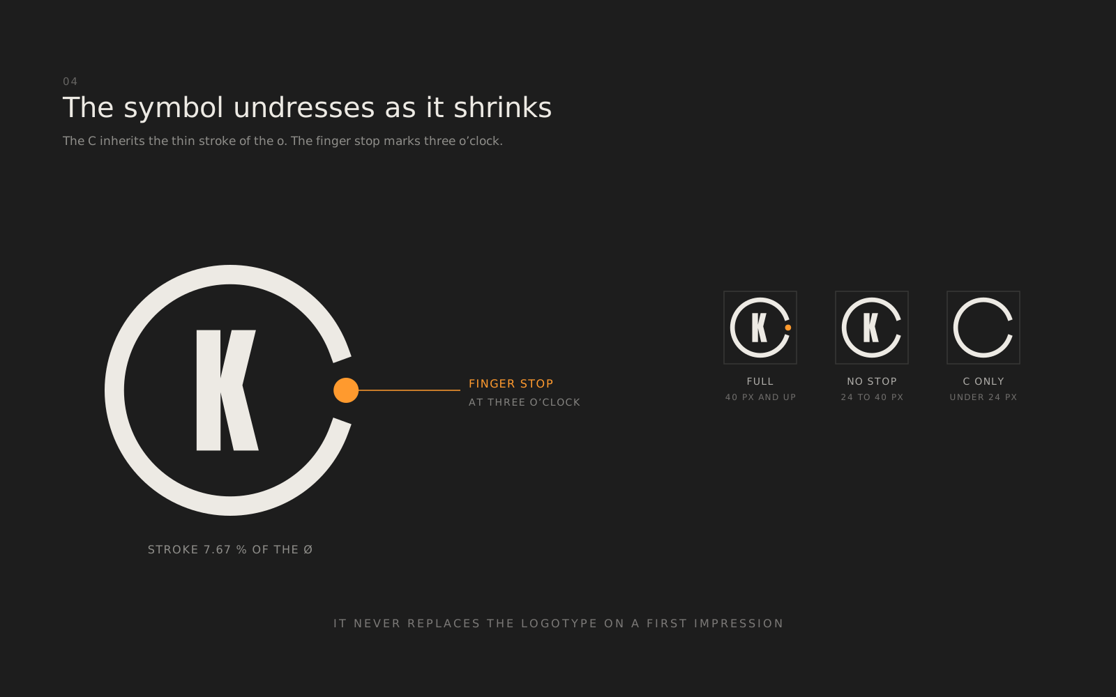
The symbol repeats the move in a square: a thin-stroke C —the same 7.67 % inherited from the o in cano— with the Anton K inside and a finger stop at three o'clock, the orange nub you find on the focus rings of a lens.
It undresses as it shrinks: below 40 px the stop comes off, and below 24 px only the C is left. It works as an avatar, a favicon, a watermark and a stamp, but it never replaces the logotype on a first impression.
Next in Graphic design
GMF Reformas · Brand identity