Business goal
Increase conversion in the online channel and capture more click-and-collect orders, while raising the share of pre-owned — the highest-margin product in the catalogue.
Work / Product UX/UI / GAME · Website and app redesign proposal
Project 04 of 28 in the archive 04 of 09 in Product design UX/UI See the whole discipline ↗
(00) — The thesis
Three hundred physical stores, pre-owned stock with a warranty and a living membership scheme. The site, however, is built as a promotional shop window rather than a decision-making tool: it organises the catalogue instead of organising the purchase.
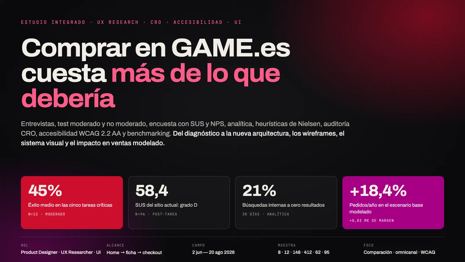
Average success rate across the five critical tasks of the moderated test
n=12 · think-aloudSUS score for the current site: grade D, 25th percentile of the industry
n=96 · post-taskInternal searches returning zero results, with a 62% bounce rate
30 days · analyticsOverall session-to-order conversion. On mobile, 1.12%
~1M sessionsDirect success across the six missions of the unmoderated test
n=148 · MazeAverage benchmarking score, against a market average of 2.6
13 dimensions · 5 sitesWCAG 2.2 AA criteria failed, six of them blocking level A issues
Manual audit + axeSessions that apply any filter, against 18-24% in the sector
GA4Every block declares where its data comes from. The chapters marked as expert evaluation —heuristics, CRO audit, accessibility and benchmarking— come from direct observation of the live site and are verifiable by anyone who opens game.es.
The chapters marked as simulated —interviews, usability tests, survey, analytics, card sorting and experiments— reproduce the full method with plausible synthetic data. They are here to show how each technique is designed, run and read, not to assert facts about GAME. That distinction is what separates an honest case study from a pretty presentation, and it is kept on every page of the study.
| # | Finding | Converging evidence | Severity |
|---|---|---|---|
| 01 | Pre-owned doesn't compete with itself. GAME's most differentiating offer lives in a separate category: comparing new and pre-owned versions of the same title means opening two product pages. | 8/8 interviews · 33% success on T2 · 67% of the survey say they compare prices before buying | Critical |
| 02 | The physical store is invisible online. There is no store-level stock on listings or product pages, and no persistent store selector. The biggest differentiator is resolved over the phone. | 25% success on T4 · 6/8 interviews call or visit a store to check · store NPS +31 against −12 for the site | Critical |
| 03 | Search is a dead end. No autocomplete, no typo tolerance; the zero-results page offers no alternatives whatsoever. | 21% of searches return zero · 62% bounce in those sessions · heuristics 5 and 9 | Critical |
| 04 | “Reserve” and “Pre-purchase” mean nothing to users. Nobody knows when they are charged, when it arrives, or what happens if the price drops. | 42% success on T3 · 7/8 interviews cannot tell the two terms apart · heuristic 2 | Critical |
| 05 | The architecture mixes axes. Platform, product type, condition and campaign all sit at the same menu level; card sorting proves users do not think that way. | 41% success in tree testing of the current tree · 0.31 agreement on the pre-owned cards | Critical |
Stop organising the site around the catalogue and organise it around the decision: which platform I own, which version of the game suits me, where and when I get it. The three axes that are separate categories today —new/pre-owned, physical/digital, online/store— become persistent facets present across the whole journey.
The four experiments run against that thesis are modelled on the study's funnel. In the base scenario, the full redesign moves conversion from 1.71% to 2.02%.
orders per year — equivalent to +€2.41M in sales and +€0.70M in gross margin (+€0.83M counting the secondary effects) on a €14.8M online channel.
Modelled range: +10.3% in sales in the conservative scenario and +23.5% in the optimistic one. Sales in euros grow less than orders because the comparator shifts the mix towards pre-owned (average basket −1.8%), and that is exactly why margin grows almost twice as fast as revenue. A fifth experiment —stock urgency— was dropped despite winning on conversion, because of its effect on returns.
The accessibility audit finds 17 failed WCAG 2.2 criteria, six of them level A: the carousel cannot be paused or operated with a keyboard, the mega menu traps focus, and forms flag their errors with colour alone. Since June 2025 this is not only a barrier for the 15% of the population living with a disability —around €1.8M of potential GMV— but a breach of the European Accessibility Act. It is the only chapter of this report whose argument is not conversion.
GAME Spain runs an ecommerce that competes simultaneously with Amazon (price and logistics), with the platform storefronts (convenience) and with the peer-to-peer second-hand market (price).
Its defensible advantage is precisely the one the site does not exploit: the physical network and the verified pre-owned circuit. The entire redesign is about no longer hiding it.
The August 2026 audit documents a main menu with nine top-level entries —Video games, PC Gaming, Gift Cards, Computing, Promotions, Pre-owned, Merchandising, Film and Comics, Electronics—, a home page with more than a dozen promotional carousels, a listing with three grid modes, a filter panel reduced to price, availability, condition and purchase type, and a search box with no suggestions.
Increase conversion in the online channel and capture more click-and-collect orders, while raising the share of pre-owned — the highest-margin product in the catalogue.
Understand how a video game buyer in Spain makes a decision, where that process breaks on game.es today, and which information structure best supports that decision.
| ID | Question |
|---|---|
| RQ-1 | How does a user build the set of options they consider —platform, edition, format, condition— and in what order? |
| RQ-2 | What information do they need to choose between new and pre-owned, and why don't they use it today? |
| RQ-3 | What role does the physical store play in a purchase that starts online, and where is that bridge lost? |
| RQ-4 | What mental model do users hold of the catalogue, and how far is it from the current navigation tree? |
| RQ-5 | Which specific checkout frictions explain the conversion gap between mobile and desktop? |
The native app, the non-gaming electronics and computing catalogue, after-sales and returns processes, and any redesign of the membership scheme beyond its presence in the purchase flow.
A sequential exploratory mixed design in four phases. Interviews generate the hypotheses, the survey and the analytics size them, expert evaluation contrasts them against market standards, and production experimentation validates or discards them.
No finding in the executive summary rests on a single technique. That is the one non-negotiable rule of the study.
The table explicitly distinguishes the type of each method —qualitative, quantitative or expert evaluation—, the platform it was run on and the origin of the data behind each block of the report.
| Technique | Type | Platform | n | Origin |
|---|---|---|---|---|
| Semi-structured interviews 60 min · five-block guide · closing think-aloud | Qualitative | Google Meet + Dovetail | 8 | simulated |
| Moderated usability test 5 tasks · post-task SEQ · 7 mobile / 5 desktop | Qualitative | Lookback + Maze | 12 | simulated |
| Unmoderated mission test 6 missions · heatmaps · misclick rate · path analysis | Quantitative | Maze | 148 | simulated |
| Online survey Quotas by age, gender and platform · ±4.8% (95% CI) | Quantitative | Typeform + national panel | 412 | simulated |
| SUS and NPS Standard 10-item scale, applied post-task | Quantitative | Maze · Typeform | 96 | simulated |
| Behavioural analytics Funnel, internal search, filter usage, rage clicks | Quantitative | GA4 · Clarity · Hotjar | ~1M | simulated |
| Hybrid card sorting 54 cards · similarity matrix · dendrogram | Quantitative | Optimal Workshop | 62 | simulated |
| Tree testing 6 tasks · two waves: current and proposed tree | Quantitative | Optimal Workshop | 95 | simulated |
| A/B experimentation 50/50 by user · ≥2 weekly cycles · guardrails | Quantitative | GrowthBook | 5 | simulated |
| Nielsen heuristic evaluation 10 heuristics · 3 evaluators · severity 0-4 | Expert eval. | Guided walkthrough of the site | 5 screens | observation |
| CRO audit 8 blocks · findings prioritised by impact and effort | Expert eval. | Guided walkthrough of the site | 24 | observation |
| WCAG 2.2 AA audit axe · Lighthouse · NVDA · VoiceOver · keyboard | Expert eval. | Live analysis | 5 screens | observation |
| Competitive benchmarking 13 dimensions · 5 competitors · 1-3 scale | Expert eval. | Live analysis | 5 sites | observation |
Eight 60-minute semi-structured interviews, recalling the last real purchase and moving into a commented walkthrough of game.es in the second half of the session.
Questions are written to elicit remembered behaviour, not stated opinion: we ask about the last time something happened, never about what the person believes they normally do.
Buys almost everything on release day and in special editions. Uses GAME for the exclusive pre-order bonuses, but checks the price against two other retailers before confirming. Has never bought pre-owned “for a game I care about”.
“I pre-order at GAME because they give me the steelbook, not because the site makes it easy. The site is what I have to put up with to get it.”
Her biggest fear is picking the wrong platform. She buys in store because “someone confirms it's the Switch one”. She has abandoned game.es twice for not being sure.
“It says Switch, Switch 2, and then further down Switch again. I have no idea if mine works. I'd rather go and ask, even if it costs me an afternoon.”
Buys used exclusively and sells whatever he finishes. He knows the trade-in circuit better than the website: he learnt it in store, not online. Always browses on mobile.
“What I want is to see the game and read: new 70, used 38. On the same screen. Right now I have to open two tabs and eyeball it.”
Compares specifications across four sites. She uses game.es only to check whether she can collect it today in store; when she can't tell, she buys elsewhere.
“If it doesn't tell me whether it's in the store next door, it's just another online shop to me. And as another online shop, it doesn't win.”
Accumulates points and doesn't know how many he has or how to use them until checkout. He discovered the retro section by accident.
“The points show up at the end, once I've already decided. If I saw them earlier I might buy something else.”
Always arrives from an external search or from social media. She rarely navigates by menu. The home page feels like “a leaflet” to her.
“I come in looking for one specific thing and I find twelve carousels. I already know what I want, just let me get there.”
Not a customer. He only goes to GAME when Amazon is out of stock or when there is an exclusive. His criteria are “when it arrives and what it costs me to return it”.
“At GAME I don't know when it arrives until I've already entered my card. That alone puts me off.”
Came in for Magic cards and discovered GAME sold games. She struggles to find the card section: she looks for it inside “Merchandising” and doesn't make the connection.
“I'm not here to buy merchandise, I'm here to buy cards. It's not the same thing.”
The 8 transcripts produced 412 coded fragments, grouped into 34 codes and 6 themes. The table lists themes by frequency and density —how many participants mention it and how often it appears—, which is what separates a cross-cutting theme from one person's intense anecdote.
| Theme | Part. | Frag. | Description and dominant code |
|---|---|---|---|
| T1 · Comparing is the real work | 8/8 | 96 | The decision is not “which game”, it is “which of these versions”. Price, edition, format and condition get compared before buying, almost always off-site. comparison-off-site |
| T2 · Fear of incompatibility | 6/8 | 71 | Especially among non-playing buyers and in the Switch → Switch 2 transition. The doubt is not resolved: it is avoided by switching channel. abandonment-by-doubt |
| T3 · The store as a guarantee | 6/8 | 64 | The physical store solves what the site does not: existence, compatibility and immediacy. The phone is used as a stock API. offline-verification |
| T4 · Opaque vocabulary | 7/8 | 58 | “Reserve”, “Pre-purchase”, “Verified pre-owned” and “GAME Points” are read in different and sometimes contradictory ways. internal-jargon |
| T5 · Promotional noise | 5/8 | 73 | The home page reads like a printed catalogue: it gets leafed through, not used. Users with clear intent skip it entirely. promotional-density |
| T6 · Delivery uncertainty | 5/8 | 50 | Date, cost and return conditions appear too late in the flow, almost always once inside the checkout. late-information |
Users do not compare products: they compare versions of the same product. The site models each version as an independent product, so it forces people to rebuild by hand a comparison that should be a single control.
A unified product page per title with a variant selector (platform · edition · format · condition) and a price that updates live. One canonical URL per title, variants as parameters.
Compatibility doubt does not generate enquiries: it generates silent abandonment. Nobody writes to customer service to ask whether a game works on their console; they go elsewhere, or to the store.
“My console” as a saved preference: the user declares their platforms once and the site marks every product as compatible or not, with an explicit warning before adding to basket.
The store network is acting as unpaid customer service for the online channel. Six out of eight participants have phoned a store to ask about stock the website could simply display.
A persistent store selector in the header plus an availability chip on listings and product pages (“Today in Nervión · 2 left”), with collection as a first-class delivery option rather than a checkout step.
“Reserve” and “Pre-purchase” are internal accounting categories exposed as product labels. Users don't need to know what the operation is called: they need to know when they pay and when they get it.
Replace the label with a sentence carrying both dates: “Charged on 14 Nov · you get it on release day, 21 Nov”, plus a lowest-price guarantee until launch.
The home page optimises for the user without intent, who is the minority. The user with intent —the one who converts— crosses it as fast as possible and pays the promotional density as a toll.
A two-speed home page: direct access in the top half (prominent search, “my platforms”, resume where I left off, my pre-orders) and editorial curation below, cut from 12 modules to 5.
The archetypes come from the themes, not from demographics. What separates them is the dominant decision criterion, because that is what determines which information they need and at which point of the journey.
Decides on: exclusivity and date.
Needs: to know which editions exist, what each one includes, when they are charged and what happens if it sells out.
Decides on: certainty of compatibility. With sharp peaks in campaign season.
Needs: explicit confirmation that the product works with the recipient's device.
Decides on: price per unit of value. This is the best-margin archetype in the catalogue.
Needs: to see new and pre-owned together, with condition and warranty spelled out.
Decides on: immediate availability.
Needs: store-level stock and a delivery date before deciding.
We map the archetype with the best margin and the worst current experience. The emotion curve comes from the post-task ratings of the 12 moderated-test participants, averaged by phase.
Twelve 50-minute sessions with a think-aloud protocol on the live site. Five tasks covering the full flow, framed as goals rather than routes.
Success criteria were defined before fieldwork and applied independently by two observers.
| Task | Wording read to the participant | Success criterion | Limit |
|---|---|---|---|
| T1 | “You want EA Sports FC 26 for your PS5. Find it and get it ready to buy.” | Reaches the right product page for the right platform and adds to basket. | 3 min |
| T2 | “That same game — is there a cheaper second-hand copy? Decide which one you'd buy and tell me why.” | Locates both versions, states both prices and finds the pre-owned warranty. | 5 min |
| T3 | “There's a game coming out next month and you want it on day one. Get it.” | Completes the pre-order and correctly answers when they are charged and when they receive it. | 5 min |
| T4 | “You need it today. Find out whether you can collect it in a store near you.” | Determines availability in a specific store without leaving the site. | 5 min |
| T5 | “Finish the purchase using the points you've collected.” (test account with 1,240 points) | Reaches confirmation with the points discount applied. | 6 min |
Average success: 27 of 60 attempts
sector benchmark: 78%Mean SEQ (1-7) for perceived ease
acceptable threshold: 5.5Median time per task. On mobile, 4:47
n=12Abandonments declared out loud: “I'd leave at this point”
9 of them on T2 and T4The 9 who managed it used the search box; the 3 who failed tried to navigate the menu and ended up in a mixed-platform listing. Two added the wrong console's version to the basket without noticing, and only one caught it before finishing.
Eight participants tried the same pattern: go back to search and type the title plus “pre-owned”. Five found nothing because the engine doesn't read condition as a facet. Three opened parallel tabs and compared by eye. None of the 12 found the pre-owned warranty information without the moderator's help.
Seven completed the pre-order flow, but only five could say when they were charged. Four claimed they were charged “right now” and three “on delivery”; both answers coexisted while looking at the same screen. The difference between “Reserve” and “Pre-purchase” was correctly stated by 0 out of 12.
The worst result of the study. Nine looked for it on the product page; failing that, six went to the store finder in the footer, which returns address and opening hours but no stock. Four spontaneously said they would phone. The three “successes” were generous readings: they inferred availability from the collection option at checkout, after entering their details.
Six managed it. The problem was not applying the discount but knowing it existed: the balance is invisible anywhere in the journey until the payment summary. Two applied it by accident while exploring. On mobile the points block sits below the pay button in reading order: three missed it and confirmed without using them.
“It says PS4 and PS5 on the same card. Which one am I buying? Because there's only one price.”
“So to know whether they have it, I have to start buying it. That's backwards.”
Search is the only entry route that works and, at the same time, the most fragile part of the site: no typo tolerance, no facets, no recovery from zero results. The 75% success on T1 rests entirely on a component that fails 21% of the time in production.
Treat search as a product, not a field: entity autocomplete (title, series, platform, character), typo correction, facets inside the box itself, and a zero-results page that proposes alternatives by series and by platform.
The membership scheme is a loyalty mechanism that only surfaces when loyalty can no longer influence anything: on the payment screen, with the decision already made.
Move the balance to the header and show on every product page “with your 1,240 points: €56.99” as an alternative price. Turn points into a reason to buy, not an administrative discount.
The same tasks from the moderated test, turned into Maze missions on the live site with an external panel and no moderator. Six missions with a defined expected path, so direct and indirect success can be calculated.
148 valid responses from 189 started (78.3%). 41 discarded for abandoning before mission 3 or lasting under 90 s. Quotas: 61% mobile, 39% desktop; 44% GAME customers. Mission order randomised to control for learning.
| Metric | What it measures and when it should worry you |
|---|---|
| Direct success | The participant reaches the destination along the expected path, with no detours. |
| Indirect success | They reach the destination, but the long way round. A classic sign of confusing architecture: the site doesn't stop you arriving, it just makes it expensive. |
| Drop-off | The participant hits “I give up” or exceeds the maximum time. |
| Misclick rate | Share of clicks that land outside any interactive element. Above 25% it means users can't tell what is clickable. |
| Usability Score | Maze's composite index (0-100) weighing success, drop-off and misclicks. |
Mean direct success across the six missions
n=148Indirect success: they arrive, but the long way round
cost in clicksMean misclick rate for the study
alert threshold: 25%Overall Maze Usability Score
retail benchmark: 72| Mission | Direct | Indirect | Drop-off | Misclick | Time | Steps |
|---|---|---|---|---|---|---|
| M1 · Find EA Sports FC 26 for PS5 | 62% | 21% | 17% | 18.2% | 0:54 | 3.1 |
| M2 · Find out whether it exists pre-owned and at what price | 24% | 26% | 50% | 41.7% | 2:38 | 9.4 |
| M3 · Pre-order a new release and say when you're charged | 35% | 30% | 35% | 29.8% | 2:11 | 6.8 |
| M4 · Check whether it's in a nearby store | 16% | 18% | 66% | 47.3% | 3:02 | 11.2 |
| M5 · Find PS5 games under €30 | 47% | 24% | 29% | 33.1% | 1:47 | 7.6 |
| M6 · Reach payment applying your points | 44% | 25% | 31% | 18.4% | 2:22 | 5.9 |
The aggregated heatmap for M5 —filter by price in the PS5 listing— is the most eloquent finding of the test. 34% of all clicks in the mission land on the carousel's “Previous / Next” arrows, and another 19% fall on the cover image expecting it to open a filter or a quick view. The area where users expect filters —the left column— receives no clicks at all, because there is nothing there to click.
The path analysis for M2 —compare new and pre-owned— shows that only 36 of 148 participants found the pre-owned section, and of those, 22 arrived through the top menu rather than from the product. Nobody arrived from the new game's product page, because that link does not exist.
A 47% misclick rate on M4 means almost half the clicks in that mission hit nothing clickable: people are tapping text, images and dead zones looking for functionality the site does not offer. That is not clumsiness: it is a reasonable expectation with no answer.
Give that expectation a destination: a clickable availability chip on card and product page, a persistent store selector in the header, and a cover image that opens a quick view — which is exactly what 19% of M5's clicks were asking for.
A survey of 412 video game buyers in Spain, on a national panel with quotas by age, gender and main platform. Of the 412, 178 have bought on game.es at some point and 96 have done so in the last 6 months. Margin of error ±4.8% for the total (95% CI).
The role of the quantitative work here is to size what the qualitative work had already flagged, not to discover anything new.
| Question | % | Reading |
|---|---|---|
| Compares the price across more than one retailer before buying a game | 67.2% | Confirms T1: comparing is the central task, and today it happens off-site. |
| Has bought a second-hand game or console at some point | 58.7% | The pre-owned market is the majority, not a niche. |
| Would buy pre-owned if they knew for certain what condition it was in | 74.3% | +15.6 pp over those who already buy: the barrier is informational, not price. |
| Has phoned a physical store to check stock | 41.5% | Sizes the operational cost of not showing stock online. |
| Has abandoned an online purchase for not knowing when it would arrive | 52.9% | Late delivery information is a majority cause of abandonment. |
| Would rather collect in store the same day than wait for free delivery | 44.1% | Latent click & collect demand far above the current 9.4%. |
| Knows how many points they have in their loyalty scheme | 11.8% | Among GAME members: 14.2%. The scheme plays no part in the decision. |
| Reason | % | Associated finding |
|---|---|---|
| I found it cheaper somewhere else | 48.3% | I-1 · comparison |
| I couldn't find what I was looking for | 39.3% | I-6 · search |
| I didn't know when it would arrive | 33.1% | T6 · delivery |
| I wasn't sure it was the right version | 28.7% | I-2 · compatibility |
| The site felt confusing or cluttered | 24.2% | I-5 · density |
| The payment process was long | 19.7% | A/B #4 · checkout |
The SUS scale was applied at the end of the moderated test (n=12) and in the survey to those who had bought in the last 6 months (n=96), with consistent results. The same scale was applied to the 10 participants of the phase 4 prototype test.
Aggregated session data over 30 days across roughly one million sessions. The funnel puts the biggest leak between the product page and the basket: three out of four visitors who reach a product never add it.
Mobile conversion, against 2.64% on desktop
2.4× gap · sector: 1.5-1.7×Sessions that use internal search
they convert 2.3× moreBounce rate after a search with no results
against 34% with resultsSessions that apply any filter
sector benchmark: 18-24%Orders with store collection
declared demand: 44.1%NPS for the online channel
physical store: +31Only 4.7% of sessions filter, against the 18-24% typical of comparable retail. It isn't that users don't want to filter: it's that the four available facets —price, availability, condition, purchase type— answer no real question a game buyer has.
A facet taxonomy built on the real questions: platform, genre, number of players, PEGI, condition, format, price range, availability in my store and release date. Visible by default on desktop and in a pinned drawer on mobile.
The mobile-desktop gap (2.4×) is far wider than the sector's (1.5-1.7×). The difference concentrates in two places: a listing with no accessible filters, and a four-step checkout with mandatory registration before the total cost is visible.
Single-page checkout with guest by default, a total-cost summary visible from the very first moment, address autocomplete and express payment (Bizum, Apple Pay, Google Pay) at the top.
Independent evaluation by three evaluators against Nielsen's ten heuristics, applied to the five screens of the purchase flow. Disagreements resolved in a joint session. Severity on the standard 0 to 4 scale.
Total findings across 5 screens
3 evaluatorsCatastrophic, severity 4
heuristics 5, 6 and 9Major, severity 3: they block tasks
high priorityMean severity across the set
0 heuristics fully met| Heuristic | Passes | Fails · evidence on game.es | Solution | Sev. |
|---|---|---|---|---|
| H1 · Visibility of system status | The basket shows a counter and the checkout indicates the current step. | There is no store-level stock status anywhere. Applied filters are not shown as persistent chips. The “Reserve”/“Pre-purchase” status communicates neither charge date nor delivery date. | Active filter chips with a counter; an availability chip for the selected store; a two-date sentence on pre-order products. | 3 |
| H2 · Match with the real world | “Pre-owned” works: users understand the term and associate it with a warranty. | “Pre-purchase” and “Reserve” are internal categories: 0 of 12 participants could tell them apart. Platform labels (“PS5 / PS4”) stack without saying what you are buying. “Points” are never translated into euros. | Rename by outcome: “Pre-order it · you get it on 21 Nov”. Show points as a euro equivalent. One platform per selected variant, never stacked. | 3 |
| H3 · User control and freedom | The basket allows editing quantities and removing lines without friction. | There is no “clear all filters”. Going back from a product page to the listing loses scroll position and, on mobile, sometimes the filters. The mega menu closes when the cursor drifts outside its diagonal path. | A clear-all action; scroll and filter-state restoration on back navigation; a menu with a tolerance area or click-to-open. | 3 |
| H4 · Consistency and standards | Header iconography, basket position and card pattern follow recognisable conventions. | Three grid modes showing different fields for the same product. Three primary CTAs coexist (“Buy”, “Reserve”, “Pre-purchase”) with identical visual weight. Badges have neither hierarchy nor system. | A single card pattern with fixed fields; one primary CTA per page with the rest secondary; a badge system capped at two per card with a defined priority order. | 2 |
| H5 · Error prevention | Checkout validates card format and required fields before submitting. | Nothing prevents buying another platform's version: it happened in 2 of 12 sessions. Mixing a pre-order item with an in-stock one changes the shipping date for the whole order without warning. Search neither corrects typos nor suggests. | Platform confirmation against “My consoles” before adding; an explicit warning and a split-shipment option when pre-orders are mixed in; typo correction in search. | 4 |
| H6 · Recognition over recall | Order history keeps previous purchases accessible. | Comparing new and pre-owned requires memorising a price and switching screens. The listing never shows whether a pre-owned version exists. The points balance is invisible while deciding. No recently viewed products anywhere. | A condition comparator inside the product page; a “also pre-owned from €X” badge on the listing card; a points balance in the header; a recently viewed rail. | 4 |
| H7 · Flexibility and efficiency of use | Multiple sort orders and three grid densities exist for advanced users. | The filter panel is limited to price, availability, condition and purchase type: no genre, no number of players, no PEGI, no date range. No autocomplete, no saved searches, no one-click repurchase. | An expanded facet taxonomy; autocomplete; saved searches with price-drop alerts; add-to-list from the card. | 3 |
| H8 · Aesthetic and minimalist design | The product page keeps a reasonable hierarchy between image, price and CTA. | The home page stacks more than twelve promotional carousels; content useful to a user with intent sits below three screens of scrolling. Listings mix video games with merchandise and collectibles with no separation. | A two-speed home page with five modules maximum; separation of product types in the listing, or an explicit type facet. | 3 |
| H9 · Error diagnosis and recovery | Form errors at checkout are flagged next to the affected field. | Zero results is terminal: “We haven't found anything… Try again changing your search criteria” offers no suggestions, no correction, no nearby categories, no contact. It affects 21% of searches and produces a 62% bounce rate. | A zero-results page with correction (“Did you mean…?”), results from the series, products on the same platform and access to the store finder. | 4 |
| H10 · Help and documentation | A customer service centre exists and legal terms are reachable from the footer. | The pre-owned warranty and the trade-in process are not explained at the point of decision: 0 of 12 participants found the warranty from the product page. Selling your games doesn't appear in the pre-owned section. | A collapsible warranty module on the pre-owned product page itself; an explicit “Sell your games” entry with a valuation simulator. | 3 |
The findings are not evenly spread: they concentrate at the moment of choosing between alternatives. H5, H6 and H9 —the three catastrophic ones— describe the same failure from three angles: the system doesn't help build the comparison, doesn't prevent choosing wrong, and doesn't let you recover when it happens. A redesign that only touched aesthetics would leave 100% of the problem intact.
A conversion review over the live site, block by block along the journey. Where the heuristic evaluation measures usability principles, this chapter measures business levers.
Twenty-four findings across eight blocks. Each one links to the quantitative data that sizes it.
The first screenful is a carousel of auto-rotating banners. Auto-rotating carousels dilute focus: only the first slide gets real attention and the rest compete with each other without any of them winning.
Strong benefits —24 h mainland delivery, free Click & Collect, 15-day returns, two-year warranty, financing— are scattered or in the footer, never on the first screen. The value proposition lives in the meta description, not on screen.
The observed pattern —a carousel with several large 3D cover images and subdomains running legacy templates— is typical of high LCP and page weight, especially on mobile.
fetchpriority="high", serve AVIF/WebP and defer the rest. Core Web Vitals target: LCP < 2.5 s, INP < 200 ms, CLS < 0.1.Categories are presented as horizontal carousel bands —“Best sellers”, “Top pre-orders”— with Previous/Next arrows, rather than a paginated grid with faceted filters and sorting. It forces users to explore a catalogue of thousands of items blind. It is the number one friction on the site.
The breadcrumb reads “You are in: Home” even inside categories and product pages, instead of the real path. It breaks orientation and wastes the structured markup opportunity for search engines.
BreadcrumbList markup. Low effort, real impact on orientation and SEO./videojuegos and /videojuegos/ps5 · heuristic H1URLs coexist on www.game.es and www3.game.es with visually different templates. The experience feels fragmented and it can create session, measurement and ranking problems.
In large-catalogue retail, search is the main conversion engine — but here it carries no visual weight and offers no autocomplete, no suggestions, no typo correction and no search by series or platform.
The messages are correct but generic —“New releases, pre-orders and offers”, “Collect points”. Nothing says why to buy at GAME rather than at a generalist: exclusive pre-orders, pre-owned with a warranty, in-store trade-in, expert staff.
Cards show both “Buy” and “View details”: two actions of similar weight splitting the click. On top of that, pre-orders show the deposit (“€3'00”) next to the RRP (“€79.99”) with no explanation at all.
Prices use an apostrophe as the decimal separator. It is unusual in Spanish, hurts legibility when scanning, and reads badly on screen readers.
Auto-rotating carousels with no pause control are problematic for screen readers and for users with motor difficulties. Element density and the lack of hierarchy make it worse. Accessibility is also a legal requirement in European ecommerce (EAA / EN 301 549).
alt on covers and a pause control on any moving content.The product page never shows when the order arrives or what shipping costs anywhere near the buy button. Delivery uncertainty is one of the leading causes of abandonment in ecommerce.
Cross-selling of related models exists, but there are no complementary accessories, bundles or extended warranties on the product page. Basket value is lost in a catalogue that is ideal for combined purchases: game + controller + gift card.
On the PS5 product page, “SOLD OUT ONLINE” appears next to a members-only pre-order campaign, with no working button. A flagship product with no possible action frustrates users and captures none of the demand.
The product page integrates SeQura and Pepper with instalment payments. It is a genuine differentiator against the competition and it reduces price friction on high-value baskets.
The patterns detected —dense horizontal carousels, heavy banners, legacy templates— point to a shrunk-down desktop adaptation rather than a mobile-first design, with a risk of small tap targets and endless scrolling.
There are no ratings on listing cards; product pages show very few reviews —on the order of three— and the review form demands a 150-character minimum, a barrier that drastically cuts volume. There are no external reputation seals either.
Legal information and payment methods are correctly present, but concentrated in the footer. Security is never reinforced at the decision points: product page, basket and payment.
No invented countdowns or “last units” warnings were detected. That is the right call and worth keeping: experiment #5 confirms that manufactured urgency lifts add-to-cart and destroys margin through returns.
view_item_list, select_item, view_item, add_to_cart, begin_checkout, purchase.Accessibility is not an extra in this redesign: since June 2025 the European Accessibility Act requires ecommerce to comply with EN 301 549, which points to WCAG at level AA.
An inaccessible site is now a legal risk as well as lost customers.
WCAG criteria failed out of 56 assessable at AA
two-layer auditLevel A blockers that prevent completing a purchase
high legal riskLighthouse accessibility score
minimum target: 90Of the population lives with some disability
≈€1.8M of potential GMVA two-layer audit over the five screens of the purchase flow. The automated layer (axe DevTools and Lighthouse) detects between 30% and 40% of real problems: the ones that can be inferred from the markup. The manual layer —full keyboard navigation, reading with NVDA on Windows and VoiceOver on macOS, zoom at 200% and 400%, and a reflow test at 320 px— covers the rest, which is where the serious issues live.
WCAG organises its criteria into four principles, known by the acronym POUR: content must be perceivable, operable, understandable and robust. The site clearly fails the first two.
WCAG requires a minimum contrast ratio of 4.5:1 for body text and 3:1 for large text (from 18.66 px bold or 24 px regular) and for non-text interface elements. These are the problematic pairings found and their correction.
Someone who cannot use a mouse should be able to complete the entire purchase with the tab key. Today they cannot: the keyboard path on the home page contains one trap and two dead zones.
| Criterion | Name | Level | Where and what happens | Fix |
|---|---|---|---|---|
| 2.2.2 | Pause, stop, hide | A | The home page carousel auto-rotates with no pause control. It affects people with attention deficit, dyslexia or low vision. | A persistent pause button; stop on focus or hover. |
| 2.1.1 | Keyboard | A | Carousel controls and some filters can neither be reached nor operated with a keyboard. | Controls as real <button> elements, in DOM order, operable with Enter and Space. |
| 2.1.2 | No keyboard trap | A | The mega menu captures focus and doesn't close with Esc: it forces a page reload. | Focus management with Esc, arrow keys and focus returned to the trigger on close. |
| 1.1.1 | Non-text content | A | Product covers with an empty alt or the filename in it. Promotional banners carry their text inside the image. | Descriptive alt per product; banner text as HTML over the image, not inside it. |
| 2.4.1 | Bypass blocks | A | There is no skip link: 40 tab stops to reach the first product. | A “Skip to content” link as the first focusable element. |
| 4.1.2 | Name, role, value | A | Controls built with <div> and onclick, with no role or state. Screen readers announce them as plain text. | Native elements or correct ARIA roles with aria-expanded, aria-current and aria-label. |
| 1.3.1 | Info and relationships | A | Listings are nested <div> elements, not lists. Filter groups use neither fieldset nor legend. Headings jump from h1 to h4. | Semantic markup: lists, fieldset/legend and a heading hierarchy with no jumps. |
| 2.4.4 | Link purpose | A | Repeated links “View details”, “Discover more”, “Previous”: out of context they mean nothing. A screen reader lists 40 identical ones. | Self-explanatory link text, or aria-label carrying the product name. |
| 3.3.2 | Labels or instructions | A | Fields using placeholder as their only label: once typing starts, the reference disappears. | A visible, persistent <label> associated with every field. |
| 3.3.1 | Error identification | A | Form errors are marked with red colour alone, with no text and no programmatic association. | A text message next to the field, plus aria-describedby and aria-invalid. |
| 1.4.3 | Contrast (minimum) | AA | Struck-through price (2.6:1), auxiliary shipping text (2.2:1) and badges with light text on brand red (2.1:1). | Colour token adjustments as per the contrast figure. |
| 1.4.11 | Non-text contrast | AA | Form field borders and header icons below 3:1. | 1.5 px borders in a colour reaching at least 3:1 against the background. |
| 2.4.7 | Focus visible | AA | The default focus ring is removed by CSS on cards and buttons, with no replacement. | A custom 2 px ring with offset and 3:1 contrast, on every interactive state. |
| 2.5.8 | Target size (minimum) | AA | Carousel arrows and close crosses below 24×24 px on mobile. | A 44×44 px tap target as the internal standard, never below 24 px. |
| 1.4.10 | Reflow | AA | At 320 px wide, horizontal scrolling appears on listings and specification tables. | Fluid layout; tables with their own scroll container, never the whole page. |
| 1.4.4 | Resize text | AA | At 200% text zoom, price and badges overlap on the card. | Relative units (rem) and containers that grow with their content. |
| 2.4.11 | Focus not obscured | AA | The sticky header covers the focused element when tabbing upwards through long listings. | scroll-margin-top matching the height of the sticky header. |
Carousel (pause, keyboard, ARIA), mega menu trap, skip link, product alt, form labels and errors.
Contrast tokens, a system focus ring, field borders, minimum tap sizes. It folds into the visual system in chapter 16.
Lists, fieldset, heading hierarchy, link text, and behaviour at 320 px and 200% zoom.
The same fixes that make the site accessible make it better for everyone: persistent labels reduce form errors, a visible focus ring speeds up keyboard checkout, correct contrast makes the price readable on a phone in daylight, and 44 px tap targets cut the failed taps the unmoderated test measured at 31.4%. Accessibility does not compete with the redesign: it is the same work, done properly.
A comparison against a specialist (Xtralife), two electronics giants with a strong gaming presence (PcComponentes, MediaMarkt) and the generalist market reference (Amazon / El Corte Inglés).
Scale: 3 strong · 2 partial · 1 weak or absent.
| Dimension | GAME | Xtralife | PcComponentes | MediaMarkt | Amazon / ECI |
|---|---|---|---|---|---|
| Faceted filters on the listing | 1 | 3 | 3 | 3 | 3 |
| Listing sort options | 1 | 2 | 3 | 3 | 3 |
| Reviews on card and product page | 1 | 2 | 3 | 3 | 3 |
| Delivery date on the product page | 1 | 2 | 3 | 3 | 3 |
| Transparent shipping cost | 2 | 2 | 3 | 2 | 3 |
| Search with autocomplete | 1 | 2 | 3 | 2 | 3 |
| Visible benefits bar | 1 | 3 | 3 | 3 | 2 |
| Visible trust seals | 1 | 3 | 2 | 3 | 3 |
| Personalisation and recommendations | 1 | 2 | 3 | 2 | 3 |
| Click & Collect and store network | 3 | 2 | 2 | 3 | 2 |
| Instalment financing | 3 | 3 | 3 | 3 | 2 |
| Loyalty and exclusive pre-orders | 3 | 3 | 2 | 2 | 2 |
| Specialist gaming catalogue | 3 | 3 | 2 | 2 | 2 |
| Average | 1.7 | 2.5 | 2.7 | 2.6 | 2.6 |
GAME doesn't need to be Amazon. It needs to reach market standard on discovery, social proof and delivery certainty —where it currently loses badly— and, on that base, amplify its unique assets. Closing the functional gap is the necessary condition; putting what is differentiating in the foreground is what turns parity into preference.
Hybrid card sorting with 54 cards and 62 valid participants, followed by two waves of tree testing comparing the current tree with the proposed one.
The goal was not to decorate the navigation, but to check whether the user's mental model matches the axis the catalogue is organised around today. It does not.
Six seed categories (“Video games”, “Consoles and hardware”, “PC”, “Collectibles”, “Offers”, “My account”) with freedom to create, rename and delete. Hybrid was chosen because the real catalogue carries business constraints a purely open sort would ignore.
Written the way shoppers speak, not the way the site does: “A second-hand PS5 game”, “Magic cards”, “A refurbished controller”, “A Nintendo gift card”, “Pre-order the game coming out in November”, “Sell my used games”.
79% of participants grouped by platform first and only then by product type. Accessory, gift card and game cards for the same console ended up together in most sorts — something the current tree, which splits “Video games”, “Gift Cards” and accessories into separate branches, does not allow.
Of the 9 cards describing second-hand products, 81% were placed inside their platform or product-type group, not in a group of their own. Only 12 of 62 participants created a “Second-hand” category; of those 12, eight used it as well as placing the cards in their platform — that is, as a duplicate.
| Card group | Agreement | Interpretation and design decision |
|---|---|---|
| Games by platform | 0.87 | Very high consensus. Platform becomes the root axis of the new architecture. |
| PC hardware and components | 0.81 | A stable, self-contained cluster. It stays as a top-level branch. |
| TCG cards and collectibles | 0.76 | High consensus, but 44 of 62 rejected “Merchandising” as a name. Renamed to “Collectibles”. |
| Account services and points | 0.64 | Moderate agreement. “Sell my games” swings between account and pre-owned: the entry point is deliberately duplicated. |
| Gift cards and digital credit | 0.52 | It splits the sample: half see them as a platform product, half as a gift. Resolved with dual entry. |
| Pre-owned products | 0.31 | No consensus as a category. With condition treated as a facet, agreement on those same cards rises to 0.84. |
| Film, comics and books | 0.28 | Orphaned: 29 participants left it unclassified or created an “Other” group. Absorbed into Collectibles. |
Six identical tasks on the current tree (n=47) and on the proposed one (n=48), with no visual interface: labels and structure only. It is the cleanest test of whether an architecture works on its own.
The current tree mixes four axes at the same level: platform (PC Gaming), product type (Merchandising), condition (Pre-owned) and campaign (Promotions). Users only navigate one of them well, and the site makes them pick without telling them the axes are incompatible.
One hierarchical axis —the catalogue by type of world— and everything else as cross-cutting facets. Condition, format, availability and campaign stop being branches and become filters present in every listing.
The structure stops describing GAME's catalogue and starts describing how the shopper decides. Everything currently competing for a spot in the menu becomes a cross-cutting facet.
Validated with tree testing: 41% → 78% success, χ²(1)=57.4 · p<0.001 on the aggregate.
| # | Principle |
|---|---|
| 01 | One level, one axis. The first level is always “what kind of thing is it”. Platform, condition, format and campaign never appear there. |
| 02 | Attributes are facets, not branches. If a product can be described with an adjective —pre-owned, digital, on offer, available today— that adjective is a filter, present in every listing where it makes sense. |
| 03 | Dual entry wherever card sorting split. When consensus is below 0.60 (gift cards, “sell my games”), the answer is not to choose: it is to give two routes to the same destination. |
| 04 | Labels in the user's language. No category name comes from the product management system. “Merchandising” → “Collectibles”. “Pre-purchase” disappears from the interface. |
| 05 | A maximum depth of three levels to reach a filterable listing. Everything else is resolved with facets, not with more menu clicks. |
| Current | Proposed | Evidence |
|---|---|---|
| Merchandising | Collectibles | 44/62 rejected the term in card sorting; “I'm here to buy cards, not merchandise” (P8). |
| Film and Comics (own branch) | Absorbed into Collectibles | 0.28 agreement; 29 participants left it unclassified. |
| Pre-owned (own branch) | A “Condition” facet + a campaign page | 81% placed the cards inside their platform; agreement rises from 0.31 to 0.84. |
| Pre-purchase / Reserve | “Pre-order it” + two explicit dates | 0/12 could tell the terms apart in the moderated test. |
| PC Gaming + Computing | PC and setup | A single cluster with 0.81 agreement; participants did not separate gaming from non-gaming. |
| Members area | Members Area with a visible points balance | Only 14.2% of members know their balance; the scheme plays no part in the decision. |
Four low-fidelity screens translating the new architecture and the ten insights into structure. No visual decisions: what is tested here is which information is present and in which order it is read.
The annotation to the right of each wireframe links the block to the insight behind it.
The card brings all three decisions to the listing: what it costs new, what it costs pre-owned, and whether it is in your store today. A single card pattern with fixed fields replaces the three current grid modes.
This is the central screen of the redesign and the one taken to experiment (A/B #1). It replaces two independent product pages —new and pre-owned— with a single one carrying a variant selector.
The total cost, shipping and points included, is visible from the first second and stays pinned. Registering stops being a precondition and becomes a post-purchase offer.
The wireframes define what goes on each screen; this chapter defines how it looks. The goal is not to redesign the brand —GAME's red is an asset— but to build a system that solves the three visual problems documented: flat hierarchy, insufficient contrast and inconsistency between templates.
Today the brand red appears on backgrounds, text, badges and buttons all at once, so it means nothing. In the system it is reserved for the primary action and the exclusive badge. Everything else is handled with neutrals.
The heaviest typographic element on any card is the price, followed by the title. Badges, financing and delivery are auxiliary text and never compete with it.
A single card anatomy with fixed fields replaces the three current grid densities. If a field doesn't apply, the space is reserved; nothing is ever reordered.
A palette built on the brand red, with a warm neutral base and desaturated semantic colours. Every text-on-background pairing clears 4.5:1 and every interface pairing clears 3:1.
#B3001FPrimary action and exclusive badge · 7.1:1 on white#8A0018Hover and active states of the primary button#14181DBody text · 16.1:1#4B5159Auxiliary text · 7.6:1#6B7280Form field borders · 4.6:1#0F6B4FStock available and delivery date#8A5B00Pre-order and verified last units#1F5FA8Links, financing and the focus ring#6E4A9EProduct condition, not “offer”#F5F6F8Block backgrounds and loading statesPre-owned gets a colour of its own —a desaturated violet— rather than an “offer” green. It is a business decision translated into UI: pre-owned is not a discounted product, it is a condition category with its own warranty promise, and the visual system has to say so before anyone reads a word.
A single sans-serif family for the interface, with a modular scale of ratio 1.25 anchored at 16 px. Each level carries its intended use so nobody has to invent a size.
Prices always in tabular figures with a comma decimal in es-ES format —never the apostrophe found in the CRO audit—; no interface text below 13 px; and line length in long-form content capped at 70 characters.
It is the most repeated component on the entire site and the one that currently has three different variants. This is the only version, with a fixed reading order and every field justified by a finding from the study.
Every interactive component defines six states. Focus is not optional: it is WCAG criterion 2.4.7 and today it is removed by CSS across the whole site.
| State | Primary button | Product card | Requirement |
|---|---|---|---|
| Rest | #B3001F background, white text, 6 px radius, 44 px height | 1 px neutral border, no shadow | Text contrast 7.1:1 |
| Hover | #8A0018 background, no size change | Subtle elevation and reinforced border | Never colour change alone |
| Focus | A 2 px ring offset 2 px from the component, colour #1F5FA8, visible on any background | WCAG 2.4.7 · 3:1 | |
| Active | #8A0018 background and a 1 px shift | Reduced elevation | Response < 100 ms |
| Disabled | Neutral background, 4.5:1 text, not-allowed cursor | 60% opacity and an “Out of stock” badge | Never opacity as the only indicator |
| Loading | Indicator inside the button itself, fixed width | Skeleton on the same grid | Avoids layout shift (CLS) |
A 4 px spacing scale —4, 8, 12, 16, 24, 32, 48, 64— and a 12-column grid with a 24 px gutter on desktop, 4 columns and 16 px on mobile. Tap targets never drop below 44×44 px, which resolves both WCAG criterion 2.5.8 and the 31.4% misclick rate measured in the unmoderated test.
Five production experiments on the hypotheses with the strongest converging evidence. 50/50 assignment by user, a minimum duration of two full weekly cycles, and guardrail metrics defined before launch so a winning test can still be rejected.
| Field | Detail |
|---|---|
| Hypothesis | If we show the new price and the pre-owned price for the same title on the same page, with condition and warranty spelled out, then product-page-to-order conversion will rise, because we remove a comparison that today forces users to memorise a price and switch screens (I-1, H6). |
| Variant | A unified page per title with platform, edition and condition selectors, and a side-by-side comparator block. Control: two independent pages with no link between them. |
| Primary metric | Product page → order conversion. 8% relative MDE, power 0.80, α = 0.05. |
| Guardrails | Return rate, gross margin per order, product page load time. |
| Primary result | 3.41% → 3.94% · +15.5% · 95% CI [+5.1%, +26.3%] · p = 0.004 |
| Secondary | Pre-owned units as a share of total: 18.3% → 24.7% (+6.4 pp). Average basket: −1.8% (not significant, p = 0.21). Gross margin per order: +9.2% (p = 0.008). |
| Guardrails measured | Returns unchanged (2.9% against 3.0%, n.s.). Page load +40 ms, within budget. |
| Decision | Roll out to 100% Basket value falls and margin rises: the mix moves towards the right product. |
| Field | Detail |
|---|---|
| Hypothesis | If search autocompletes by entity (title, series, platform), corrects typos and the zero-results page proposes alternatives, then more search sessions will reach a product page, because today a single mistyped letter ends the journey (I-6, H5, H9). |
| Primary metric | % of search sessions that reach a product page. |
| Primary result | 46.2% → 58.7% · +27.1% · 95% CI [+18.9%, +35.8%] · p < 0.001 |
| Secondary | Zero-result searches: 21.0% → 6.4%. Bounce after a search: 62% → 39%. Overall conversion of those sessions: +11.8%. |
| Decision | Roll out to 100% The largest relative effect of the five and the most contained implementation. |
| Field | Detail |
|---|---|
| Hypothesis | If we show store-level stock with a persistent selector, then overall mobile conversion will rise, because we answer online the question that today forces a phone call (I-3). |
| Primary metric | Overall mobile conversion. |
| Primary result | 1.12% → 1.19% · +6.3% · 95% CI [−1.4%, +14.6%] · p = 0.11 → inconclusive |
| Secondary | Orders with store collection: 9.4% → 12.6% (+34%, p = 0.002). Store selector usage: 27% of mobile sessions. Returns: −0.6 pp. |
| Diagnosis | The experiment was underpowered: with a true effect around 6%, roughly 340,000 users per arm would have been needed. And the primary metric was wrong: this lever shifts orders between channels before it creates them. |
| Decision | Repeat A 6-week re-test with primary metric = total customer orders (online + collection) and margin per order as secondary. The variant stays live meanwhile because of the click & collect result. |
| Field | Detail |
|---|---|
| Hypothesis | If we remove mandatory prior registration, condense payment into one page and show the total cost from the start, then checkout completion will rise, especially on mobile, because the mobile-desktop gap (2.4×) is double the sector's (I-9). |
| Primary metric | Checkout completion rate. |
| Primary result | 41.7% → 45.6% · +9.4% · 95% CI [+2.2%, +17.0%] · p = 0.011 |
| Segmented | Mobile: 36.2% → 42.1% (+16.3%, p = 0.003). Desktop: +4.1% (n.s.). The effect sits exactly where the diagnosis said it would. |
| Guardrails | Chargebacks unchanged. Account creation: from 100% forced to 61% voluntary post-purchase. Accepted: we lose empty accounts and gain orders. |
| Decision | Roll out to 100% with account capture on the confirmation page. |
| Field | Detail |
|---|---|
| Hypothesis | If we show “3 units left” on the product page, then add-to-cart will rise, because it reduces decision delay. |
| Primary result | Add-to-cart +11.2% · 95% CI [+4.0%, +18.7%] · p = 0.003 → it wins. |
| Guardrails | Returns +2.8 pp (p = 0.02). Post-purchase NPS −7 points. Customer service contacts +18%. Net margin per order: −4.1%. |
| Decision | Do not roll out The effect is real and it is a loan: it pulls forward purchases that later come back, and it erodes the trust the entire pre-owned proposition rests on. |
| Learning | Replaced by a truthful urgency variant —“last unit in Nervión, hold it for 2 h”— which goes to test in the next wave. Informational urgency gets tested; manufactured urgency doesn't. |
The ten insights of the study with their solution, their control metric and the real state of the evidence. This is the working table of the redesign.
| # | Insight | Design solution | Control metric | Baseline → target | Evidence |
|---|---|---|---|---|---|
| I-1 | People compare versions of the same title, not different products | Unified product page with a variant selector and a new/pre-owned comparator | Product page → order CVR | 3.41% → 3.94% | A/B #1 ✓ |
| I-6 | Search is the entry route that works and, at the same time, the most fragile | Entity autocomplete, typo correction, zero results with alternatives | Zero-result searches | 21.0% → 6.4% | A/B #2 ✓ |
| I-9 | The mobile-desktop gap is double the sector's | Single-page checkout, guest by default, visible total cost, express payment | Checkout completion (mobile) | 36.2% → 42.1% | A/B #4 ✓ |
| I-10 | The tree mixes four axes at the same level | Five branches by product type plus cross-cutting facets | Tree testing success | 41% → 78% | Tree test ✓ |
| I-3 | The store network acts as customer service for the online channel | Persistent store selector, stock chip on listing and product page, collection as a first-class option | % click & collect orders | 9.4% → 14.8% | A/B #3 · re-test |
| I-8 | Only 4.7% of sessions filter because the facets answer nothing | A nine-facet taxonomy built on the shopper's real questions | % sessions with a filter | 4.7% → 16% | Card sort · analytics |
| I-4 | “Reserve” and “Pre-purchase” are accounting categories exposed as labels | A two-date sentence —charge and delivery— plus a lowest-price guarantee | Success on the pre-order task | 42% → 92% | Prototype n=10 |
| I-2 | Compatibility doubt produces silent abandonment, not enquiries | “My consoles” as a saved preference plus a warning before adding to basket | Add-to-cart with the wrong platform | −60% target | Not validated |
| I-7 | The membership scheme appears once it can no longer influence the decision | Balance in the header and a points-adjusted price on every product page | % orders applying points | 12.1% → 28% | Not validated |
| I-5 | The home page optimises for the user without intent, who is the minority | A two-speed home: direct access at the top, curation cut to five modules | Home → listing CTR | 22.4% → 29.8% | Pending test |
Four rows carry experimental evidence, three carry research evidence but not production evidence, and three remain reasoned bets. That distinction has to survive the redesign: whatever hasn't been measured ships behind an experiment, not behind a conviction.
An impact model built on the study's funnel and the effects measured in the experiments. The question it answers is not “how much does the experience improve”, but how many orders and how many euros of margin the redesign adds over twelve months.
| Variable | Value | Origin |
|---|---|---|
| Sessions | 12,000,000 | Analytics · 30-day extrapolation |
| Session → order conversion | 1.71% | Funnel |
| Orders | 205,200 | Calculated |
| Average basket | €72.00 | Analytics |
| Sales (GMV) | €14.77M | Calculated |
| Blended gross margin | 17.5% | 18.3% new · 38.0% pre-owned · 18.3% unit mix |
| Gross margin | €2.59M | Calculated |
Each lever acts on a different funnel stage, so their effects multiply rather than add. An attenuation factor is applied to the gross result, capturing what separates the lab from the rollout: overlap between levers, novelty decay, implementation quality and seasonality.
| Lever | Funnel stage | Measured effect | Coverage | Contribution |
|---|---|---|---|---|
| New/pre-owned comparator | Product page → basket | +15.5% (A/B #1) | 48% | +7.6% |
| Fault-tolerant search | Entry → product page | +27.1% (A/B #2) | 38% | +5.8% |
| Single-page checkout | Payment → order | +9.4% (A/B #4) | 100% | +9.4% |
| In-store availability | Product page → basket | +6.3% (A/B #3, re-test) | ~50% | +3.0% |
| New architecture and facets | Entry → listing → product page | Tree test 41% → 78% | 62% | +4.0% |
| Gross compound effect | 1.076 × 1.058 × 1.094 × 1.030 × 1.040 | +33.4% | ||
| After attenuation | × attenuation factor (base scenario 0.55) | +18.4% | ||
| Variable | Today | Conservative att. 0.34 | Base att. 0.55 | Optimistic att. 0.80 |
|---|---|---|---|---|
| Overall conversion | 1.71% | 1.90% | 2.02% | 2.17% |
| Orders / year | 205,200 | 228,593 | 242,957 | 259,988 |
| Change in orders | — | +11.4% | +18.4% | +26.7% |
| Average basket | €72.00 | €71.28 | €70.70 | €70.20 |
| Sales (GMV) | €14.77M | €16.29M | €17.18M | €18.25M |
| Change in sales | — | +10.3% | +16.3% | +23.5% |
| Pre-owned unit mix | 18.3% | 22.1% | 24.7% | 27.4% |
| Blended gross margin | 17.5% | 18.3% | 19.1% | 19.8% |
| Gross margin | €2.59M | €2.98M | €3.28M | €3.61M |
| Change in margin | — | +15.3% | +26.9% | +39.8% |
Sales grow 16.3% but margin grows 26.9%. The comparator shifts the mix towards pre-owned, which has a lower basket and more than double the margin. A dashboard that only watches revenue will undervalue the redesign by almost half: the success metric for this project is margin, not GMV.
| Effect | Calculation | Annual impact |
|---|---|---|
| Logistics saving from click & collect | 13,120 orders diverted to store × €3.10 of shipping cost avoided | +€40,700 |
| Cross-selling on collection | 13,120 collections × 22% additional purchase × €18 average basket | +€51,900 |
| Lower phone support cost | Stock enquiries resolved online · conservative estimate | +€28,000 |
| Returns avoided from platform errors | −0.6 pp on 242,957 orders × €6.80 of handling cost | +€9,900 |
| Total incremental margin | Funnel margin (+€0.70M) plus secondary effects | +€0.83M |
Estimated investment: 7 people × 5 months plus continuous research.
Incremental margin in year 1, base scenario.
Break-even point. Year 1 ROI: 134%.
The only genuinely uncertain parameter is the attenuation factor. The project stays profitable even in the worst modelled case.
| Attenuation | Order uplift | Incremental margin | Verdict |
|---|---|---|---|
| 0.15 | +5.0% | +€0.33M | Profitable · break-even at 12.9 months |
| 0.34 | +11.4% | +€0.52M | Profitable · break-even at 8.2 months |
| 0.55 | +18.4% | +€0.83M | Planning scenario |
| 0.80 | +26.7% | +€1.12M | Requires frictionless execution |
Attenuation 0.16 · +5.4% uplift in orders. Below that point the project does not pay for itself in the first year. The three experiments already won sustain a gross effect of +24.5% on their own; to fall below the threshold, real attenuation on those three levers would have to be under 0.22, which none of the confidence intervals suggests.
RICE prioritisation across the ten solutions. What sets the order is how much you learn in the first three months, not how much each initiative promises on paper.
| Initiative | Reach | Impact | Confidence | Effort | RICE | Horizon |
|---|---|---|---|---|---|---|
| Fault-tolerant search + zero results | 1,140 | 2.0 | 95% | 6 | 361 | H1 · month 1 |
| New/pre-owned comparator on the product page | 1,020 | 3.0 | 90% | 10 | 275 | H1 · months 1-2 |
| Expanded facets on the listing | 1,830 | 1.5 | 80% | 12 | 183 | H2 · month 3 |
| New architecture and naming | 3,000 | 1.0 | 80% | 16 | 150 | H2 · months 3-4 |
| Two-speed home page | 2,400 | 1.0 | 70% | 14 | 120 | H3 · month 5 |
| Store selector + stock on the product page | 1,500 | 2.0 | 60% | 20 | 90 | H2 · month 4 |
| “My consoles” and compatibility warning | 900 | 1.5 | 65% | 10 | 88 | H3 · month 5 |
| Pre-order with two dates and price guarantee | 210 | 2.0 | 85% | 5 | 71 | H2 · month 4 |
| Points visible on product page and header | 600 | 1.0 | 70% | 7 | 60 | H3 · months 5-6 |
| Single-page checkout | 123 | 3.0 | 90% | 8 | 42 | H1 · month 2 |
The three levers with a won test: fault-tolerant search, the condition comparator on the product page, and single-page checkout. None of them requires touching the architecture or the catalogue.
Why here: they deliver 67% of the modelled uplift with 30% of the effort, and they build the internal credibility that funds the rest.
Architecture, expanded facets, store selector with real stock and pre-orders with two dates.
Why here: this is the block that demands catalogue work and inventory integration. This is where execution risk lives.
The two-speed home page, “My consoles” with a compatibility warning, and points visible from the product page.
Why here: everything that depends on knowing the user only makes sense once the rest already works.
| Level | Indicator | Baseline | 6-month target | 12-month target |
|---|---|---|---|---|
| Business | Gross margin of the online channel | €2.59M | €2.95M | €3.28M |
| Overall conversion | 1.71% | 1.92% | 2.02% | |
| Pre-owned unit mix | 18.3% | 22.0% | 24.7% | |
| Product | Product page → order conversion | 3.41% | 3.80% | 3.94% |
| Mobile checkout completion | 36.2% | 41.0% | 42.1% | |
| Sessions applying any filter | 4.7% | 12.0% | 16.0% | |
| Orders with store collection | 9.4% | 12.6% | 14.8% | |
| Experience | SUS | 58.4 | 72.0 | 78.0 |
| Success on critical tasks | 45% | 70% | 82% | |
| NPS of the online channel | −12 | +5 | +18 | |
| Guardrail | Return rate | 3.0% | ≤ 3.0% | ≤ 2.8% |
| Support contacts per order | 0.14 | ≤ 0.12 | ≤ 0.10 |
Every finding with its origin, its estimated conversion impact and its implementation effort. Attack high impact and low effort first.
The Origin column lets you trace every line back to the technique behind it: no high-priority finding comes from a single source.
Showing all 32 findings.
| Area | Finding | Action | Origin | Impact | Effort | Priority |
|---|---|---|---|---|---|---|
| Discovery | Carousel listings, with no grid and no filters | A PLP with a grid, faceted filters, sorting and pagination | 06 · 10 · 12 | High | High | |
| Product page | New and pre-owned on separate pages | A unified page with a condition comparator | 03 · 05 · 06 | Medium | High | |
| Search | No autocomplete, no correction, terminal zero results | Fault-tolerant search with recovery and facets | 08 · 09 · 10 | Medium | High | |
| Product page | No delivery date or shipping cost next to the CTA | A certainty block with date, cost, stock and collection | 07 · 10 · 12 | Medium | High | |
| Trust | Social proof almost non-existent | Verified reviews, stars on the card, external seal | 10 · 12 | Medium | High | |
| First impression | No benefits bar on the first screen | A persistent trust bar with four benefits | 10 · 12 | Low | High | |
| Omnichannel | Store-level stock invisible across the whole site | A persistent store selector and an availability chip | 03 · 05 · 06 | High | High | |
| Checkout | Mandatory registration and a four-step process | Single-page checkout with guest by default | 08 · 17 | Medium | High | |
| Architecture | Nine branches mixing four axes | Five branches by type plus cross-cutting facets | 13 · 14 | High | High | |
| Accessibility | Auto-rotating carousel with no pause and no keyboard access | Pause, focusable controls and correct ARIA | 11 · WCAG 2.2.2 / 2.1.1 | Low | High | |
| Accessibility | Keyboard trap in the mega menu | Close with Esc and return focus to the trigger | 11 · WCAG 2.1.2 | Low | High | |
| Accessibility | Covers with no descriptive alternative text | alt per product and banner text in HTML | 11 · WCAG 1.1.1 | Low | High | |
| Accessibility | Fields labelled with placeholder only and errors in colour only | Persistent label, text message and aria-invalid | 11 · WCAG 3.3.1 / 3.3.2 | Low | High | |
| Navigation | Broken breadcrumb across the whole site | A real dynamic breadcrumb with BreadcrumbList | 09 · 10 | Low | High | |
| Product page | No bundles, accessories or extended warranty | A “Complete it” module and optional protection | 10 · 12 | Medium | High | |
| Pre-orders | “Reserve” and “Pre-purchase” are not understood | A two-date sentence and a price guarantee | 05 · 06 | Low | Medium | |
| Mobile | A reduced experience, not mobile-first | Sticky CTA, filters in a panel, 44 px tap targets | 08 · 10 | Medium | Medium | |
| First impression | A carousel with five rotating messages | A single hero with one priority and one CTA | 03 · 10 | Low | Medium | |
| Product page | “SOLD OUT ONLINE” with no way out | “Notify me”, alternatives and an expected date | 06 · 10 | Low | Medium | |
| Loyalty | Points only appear in the payment summary | Balance in the header and an equivalent price on the product page | 05 · 06 | Low | Medium | |
| Compatibility | Nothing prevents buying another platform's version | “My consoles” and a warning before adding | 03 · 05 · 09 | Medium | Medium | |
| Infrastructure | Two domains with different templates | Consolidate and 301-redirect the legacy one | 10 | High | Medium | |
| Performance | High LCP and page weight on mobile | Optimise the hero, AVIF/WebP, defer scripts | 08 · 10 | Medium | Medium | |
| Accessibility | Insufficient contrast on struck prices, badges and auxiliary text | Colour token adjustments | 11 · WCAG 1.4.3 / 1.4.11 | Low | Medium | |
| Accessibility | Focus ring removed by CSS | A focus state in the component system | 11 · 16 · WCAG 2.4.7 | Low | Medium | |
| Accessibility | Listings with no list semantics and heading level jumps | Semantic markup and a hierarchy with no jumps | 11 · WCAG 1.3.1 | Medium | Medium | |
| Accessibility | Repeated links with no clear purpose | Self-explanatory text or aria-label with the product | 11 · WCAG 2.4.4 | Low | Medium | |
| Accessibility | Reflow with horizontal scrolling at 320 px and overlaps at 200% | Fluid layout and relative units | 11 · WCAG 1.4.10 / 1.4.4 | Medium | Medium | |
| Copy | A double CTA on the card and an unexplained deposit | One primary CTA and pre-order microcopy | 09 · 10 | Low | Medium | |
| Design | Price format with a decimal apostrophe | es-ES format and a typographic hierarchy for price | 10 · 16 | Low | Low | |
| Acquisition | Newsletter with no tangible incentive | A points incentive and contextual capture | 10 | Low | Low | |
| Trust | Real urgency left unused | Truthful urgency only: a verified last unit per store | 10 · 17 | Low | Low |
GAME doesn't need to invent an advantage: it holds three that Amazon cannot replicate —the store network, the verified pre-owned circuit and a living membership scheme— and all three are invisible at the exact moment the user decides.
That is why the redesign doesn't start with aesthetics. It starts by turning today's categories into facets, by bringing the comparison to where the decision happens, and by stating the date, the final price and the stock before asking for a card. If those three questions have a visible, certain answer, conversion rises on its own. If they don't, no visual redesign will save it.
Next in Product design UX/UI