Work / Front-end / Kacho Cano · Design system
Tungsten 3200 K and daylight 5600 K, in 28 components
Project 14 of 28 in the archive 05 of 08 in Front-end development See the whole discipline ↗
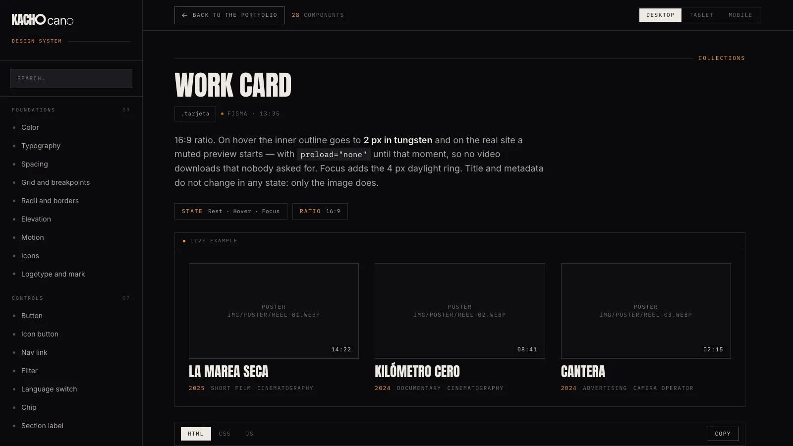
Open it and use it: 28 components with their code ready to copy
The complete documentation site, with the search, the dial running and the three widths. It opens in a new tab and carries its own button back to this page.
A system for a darkened room
The temptation on a brief like this is to reuse the system you already have. It would be faster and it would be worse: this site is not a design portfolio, it is a cinema, and the decisions that work in one do not work in the other.
That is where the first thing written in the file comes from, and it is a prohibition: there is no light theme and there must not be one. It is not a technical limitation; it is the rule that stops somebody “improving” the system six months from now by adding a day mode.
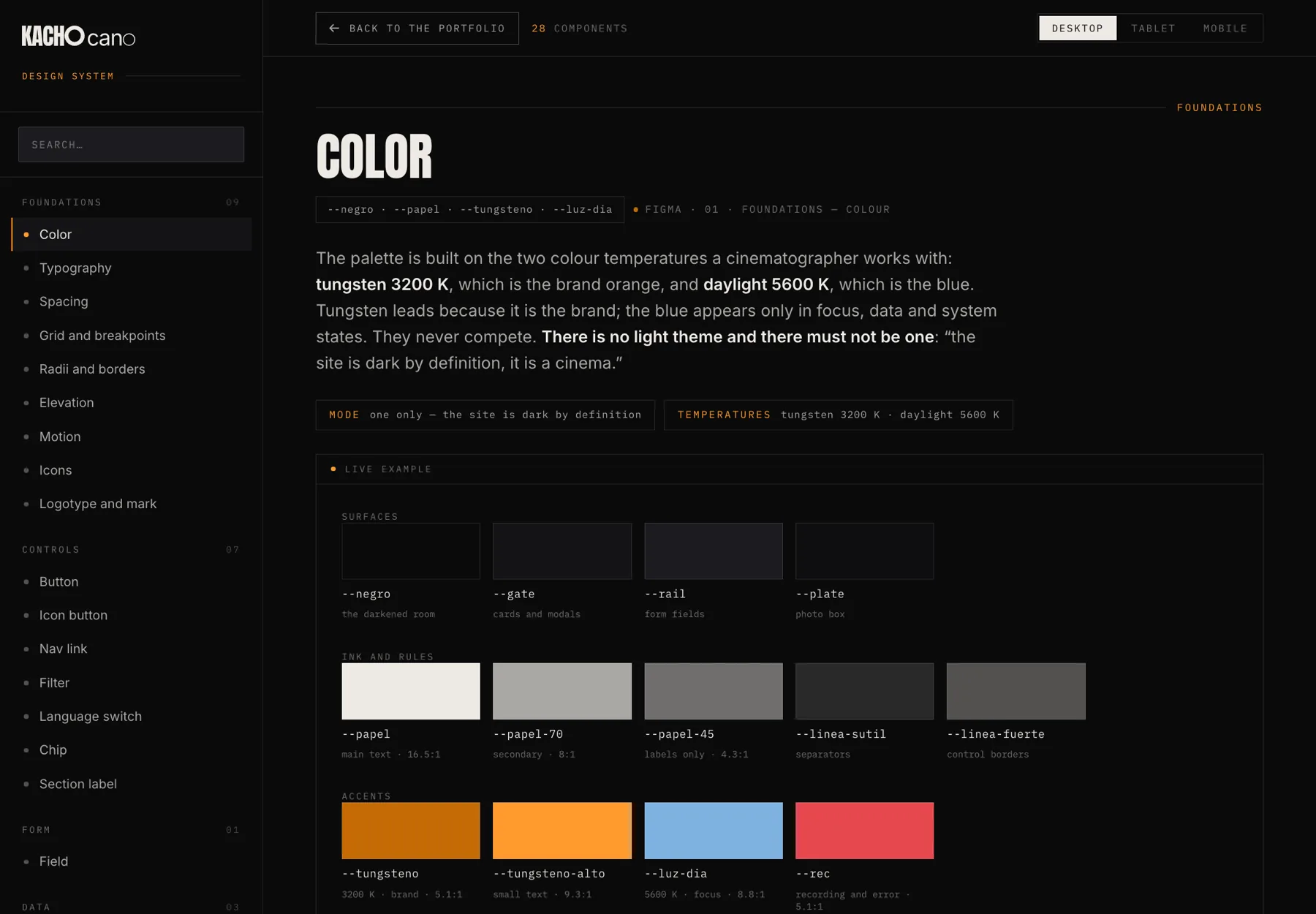
The second is the palette, and it does not come off a colour wheel either: it is the two temperatures a cinematographer works with.
Documented components
In seven groups, from foundations to set piecesTokens in tokens.css
Lines of library
180 tokens · 810 components · 306 JSColour mode
Dark. And it is written that there will be no otherThe hard rule of the palette
--tungsteno is never applied to text below 18 px. That is what --tungsteno-alto is for. It is the difference between passing AA contrast and failing it, which is why it is written in the file and not in the head of whoever builds the page.
Four decisions and no exceptions
As in any small system, what holds it up is not the number of components but the number of rules nobody breaks. Here there are four, and they are in the README before they are in any component.
01 · Two temperatures, and they do not compete
Tungsten 3200 K (#c46b05) is the brand. Daylight 5600 K (#7fb2e0) is the system: focus, data and states. From that comes a consequence that surprises people and is correct: the focus ring is always blue and never orange, because focus is system, not brand.
Figma · 01 Foundations — Colourcss/tokens.css
02 · The scale is fluid, not three layouts
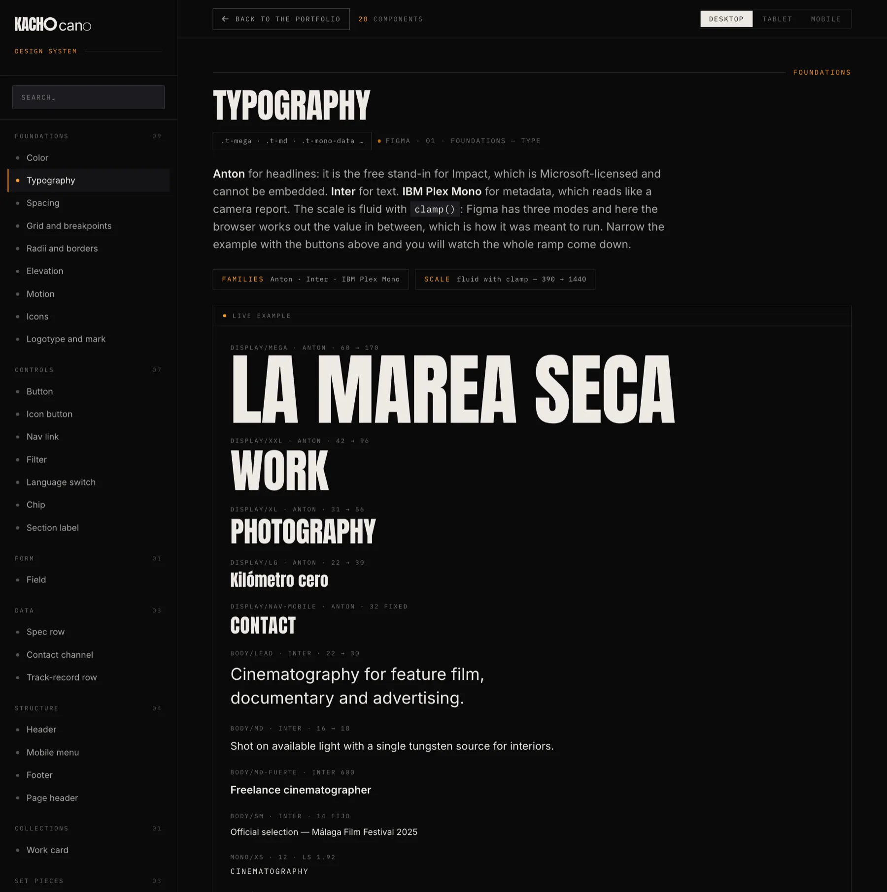
Figma represents type and spacing with three modes (390 · 768 · 1440). In code they are clamp(): the browser interpolates and there are no jumps between breakpoints. The gutter is clamp(1.25rem, 4vw, 4rem).
That detail has to be said at handover: at 768 px the browser computes 30.72 and Figma rounds it to 32 to stay on the scale of 4. Do not nail the pixels against the design — anyone who does not know that will lose an afternoon trying.
Anton · Inter · IBM Plex MonoFluid scale 390 → 1440
03 · The hard edge
Almost everything runs at radius 0: buttons, fields, cards and modals. The pill belongs to the chip and the radius of 34 is the corner of the phone, and of nothing else. There are only two shadows in the whole system, and both have a specific job: cutting the device out against the black, and lifting the centre of the dial.
Everything else separates by surface and rule, which is how a darkened room behaves.
Radii · 0 · 2 · 4 · 8 · 999 · 34Two shadows, and no more
04 · Motion is not decoration
Five durations, each with a job: 180 for whatever answers the pointer, 420 for modals and the menu, 620 for the photo’s journey to the centre of the dial, 900 for the cross-fade between pieces and 7000 for each segment of the reel.
Under prefers-reduced-motion everything drops to 0.001 ms. That is not an extra: it is what makes the dial usable for the people who need it, and it is written into the system so it does not fall out at the first refactor.
Durations · 180 · 420 · 620 · 900 · 7000 msAll off under reduced motion
The dial, measured against the photograph
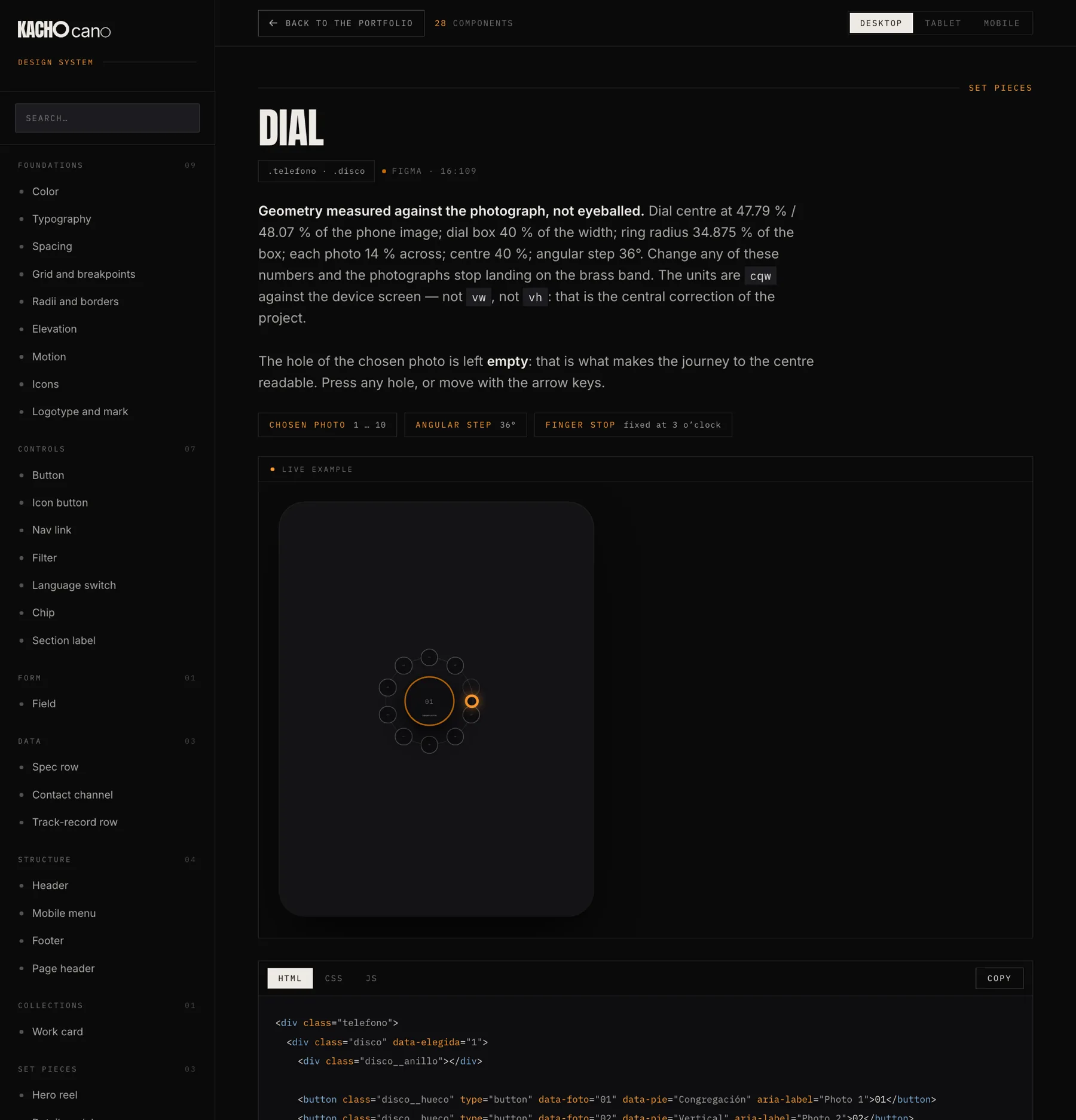
The photography section puts ten images where the ten numbers of a rotary dial would be. It is the piece that gives the site its character and the easiest one to break, because its geometry is not eyeballed: it is measured against the photograph of the phone.
Centre at 47.79 % / 48.07 % of the image; dial box at 40 % of the width; ring radius at 34.875 % of the box; each photo at 14 %; centre at 40 %; angular step of 36°. Change any of those numbers and the photographs stop landing on the brass band.
And the central correction of the project: the units are cqw against the device screen, not vw and not vh. With viewport units the dial slipped out of place as soon as the phone changed size inside the page.
The empty hole is not an oversight
When a photograph travels to the centre, its hole in the ring is left empty. That is what makes the journey readable: without it, the image in the centre looks like it appeared out of nowhere. It is documented so nobody “fixes” it by filling it in.
What cannot be left to whoever builds the page
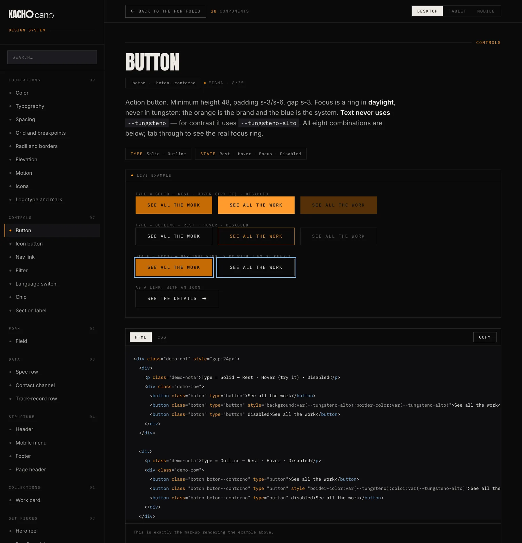
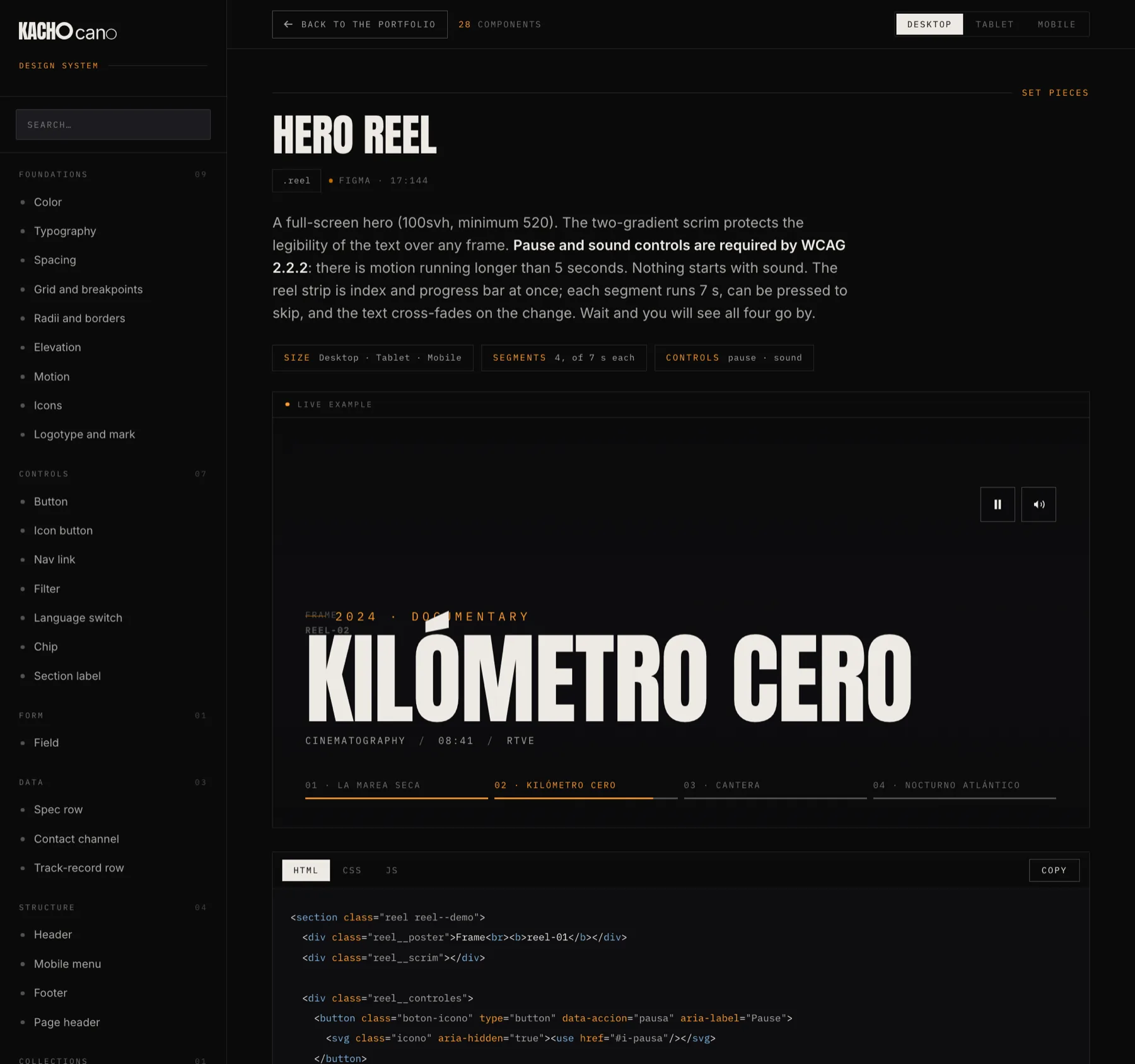
The icon buttons are 44 px touch targets: WCAG 2.5.8 asks for 24 and the stricter criterion is applied here. The footer links carry vertical padding to reach those 24 with 11 px text. The reel’s pause and sound controls are mandatory, because there is motion running longer than five seconds. The focus ring is 2 px in daylight, with 3 px of offset, across the whole system.
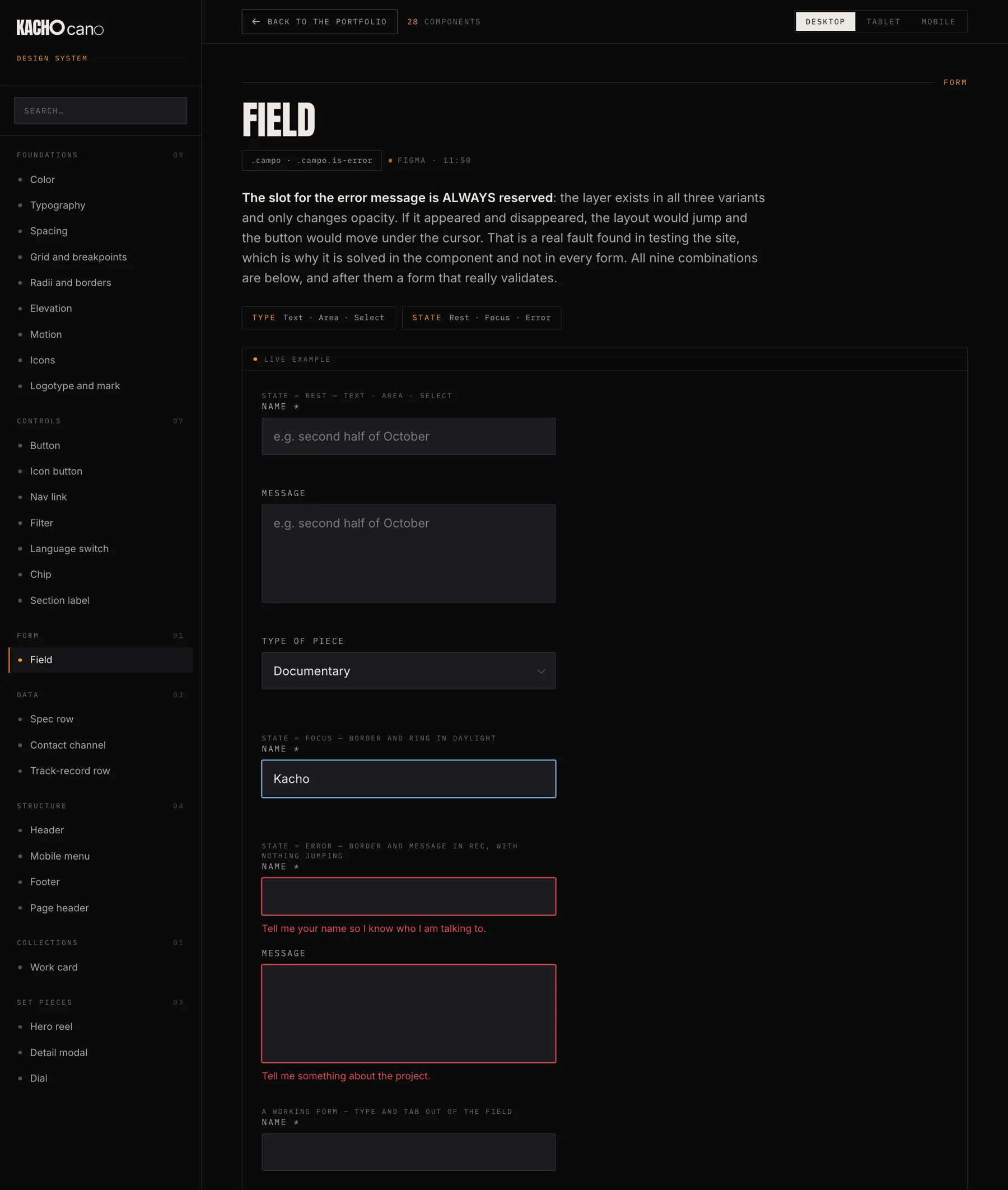
And one detail that comes straight out of a real test: the slot for the field’s error message is always reserved. The layer exists in all three variants and only changes opacity. If it appeared and disappeared, the layout would jump and the button would move under the cursor exactly when somebody is about to press it.
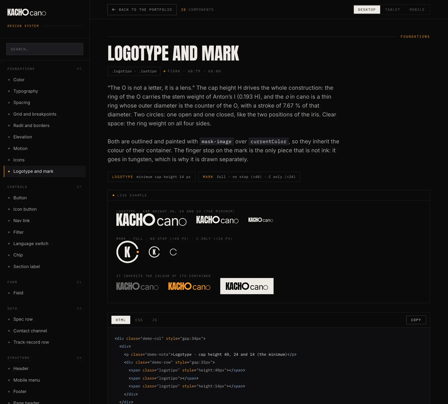
“The O is not a letter, it is a lens”
The mark is painted with mask-image over currentColor, so one file serves for ink, for tungsten and on a light background. The finger stop on the mark is the only piece that is not ink — it goes in tungsten — and that is why it is drawn separately, as a pseudo-element. Below 40 px the stop comes off; below 24, only the C remains.
The library, working
The whole documentation site is right below: search for a component, turn the dial, open the detail modal, narrow the example to tablet or mobile and copy the code. Everything you see is the library using itself.
To go through it properly, open it with the button above — and from there, the Back to the portfolio button in the top bar brings you straight back to this page.
Also in Spanish · one self-contained 244 KB file
Where it comes from
Kacho Cano is a four-piece project spread across three disciplines. This library is the tool the site was built with; the diagnosis and the design are on the audit and UX/UI page, and the mark that signs it on the identity one.
The control on the right jumps between all four.
Next in Front-end development
Djehuty Project · The site in React