Work / Graphic / GMF Reformas · Brand identity
A brand for 27 years of work without one
Project 20 of 28 in the archive 03 of 11 in Graphic design See the whole discipline ↗
The brief
GMF Reformas has been renovating homes in Aranjuez and southern Madrid since 1998, holds the best rating in the municipality, and had no identity: a generic logo, a website inherited from a free template and a different set of stationery on every document.
The audit that came first had settled the diagnosis —the reputation exists, the shopfront does not—, so the brand did not have to invent anything: it had to look like what the company already is. Serious, clean, true to its word.
How it was solved
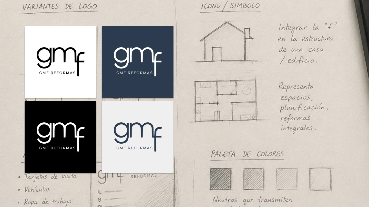
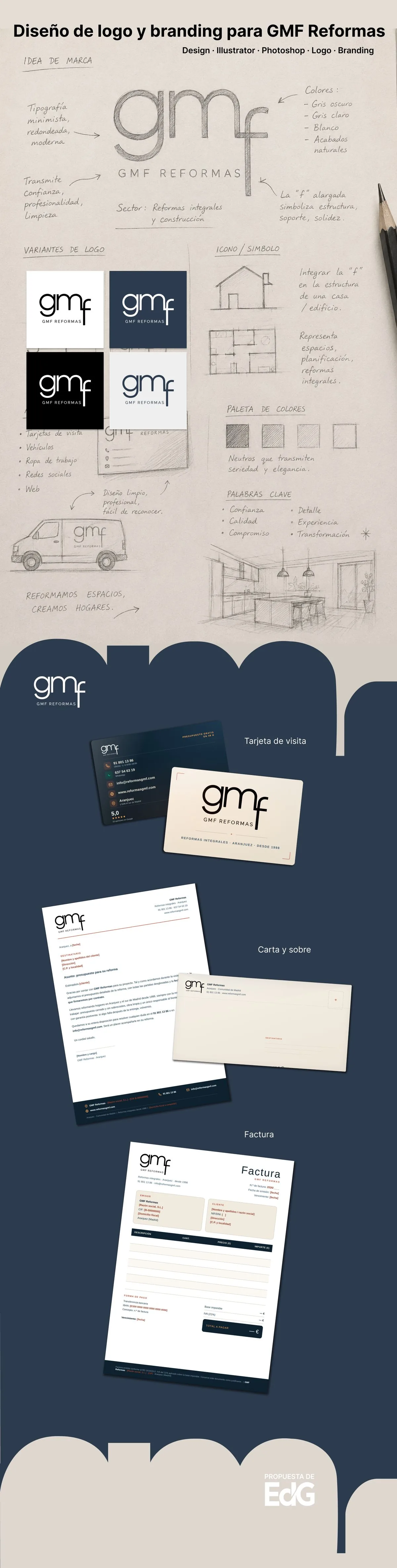
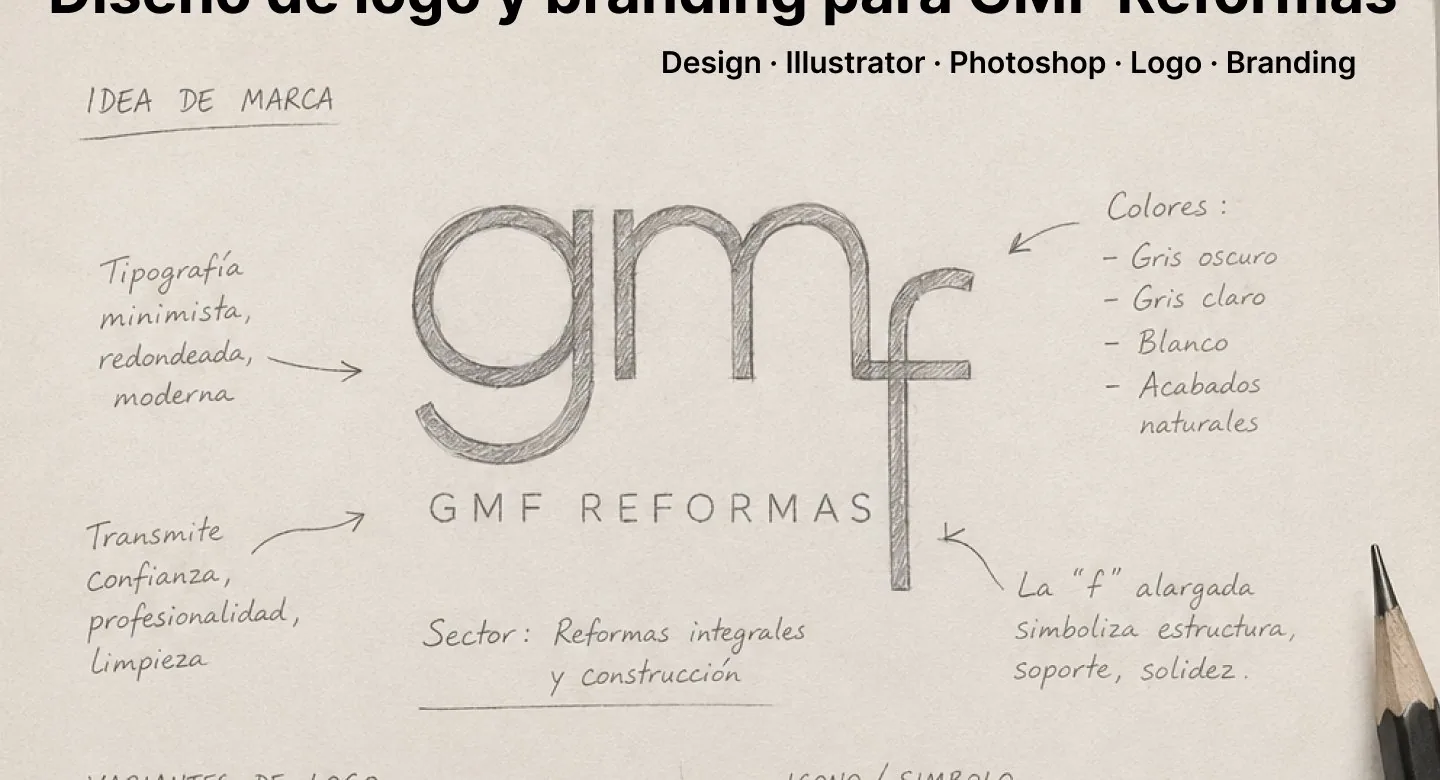
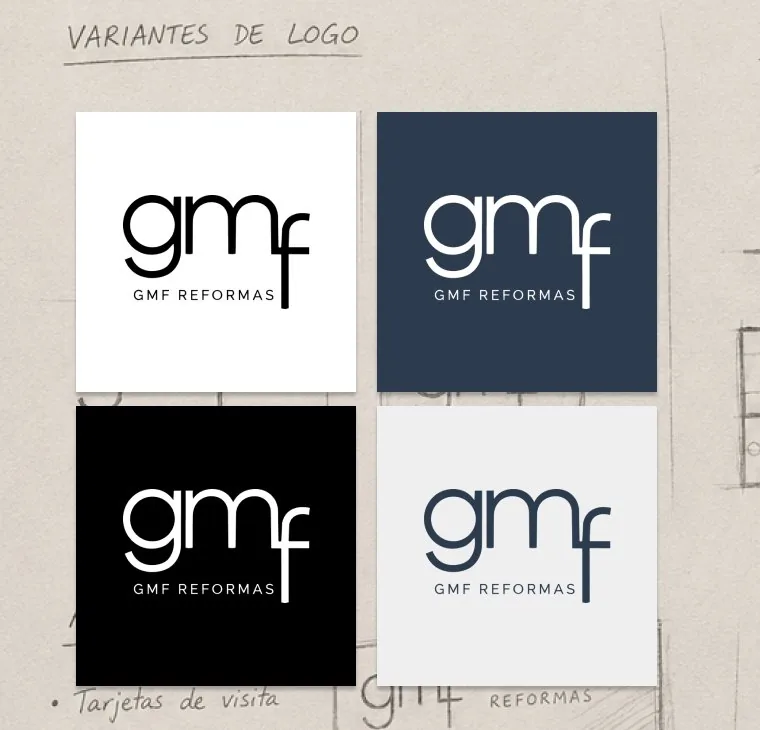
The logo starts from a minimal, rounded lowercase typeface with the elongated «f» acting as structure: it is the stroke that holds the whole thing up and the one that, in the sketches, folds into the section of a house. Support, solidity, built space.
The palette is all neutrals —dark grey, light grey, white and natural finishes— because in this business the colour comes from the finished job, not from the brand. Four logo variants cover light, navy, black and cream backgrounds without repainting anything.
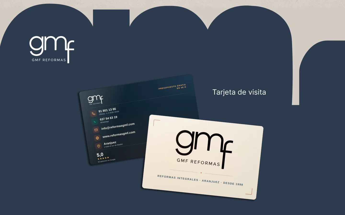
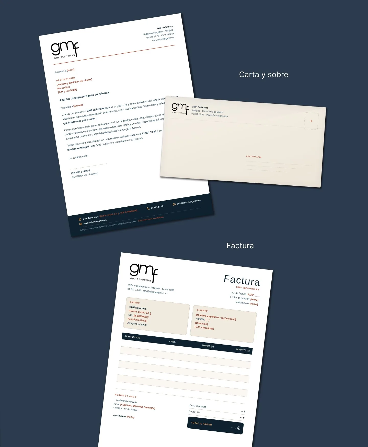
The system closes with the pieces the company actually uses every week: a business card with the free quote and the 5.0 stars on the back, letterhead, envelope, invoice, van livery, workwear and social profiles.
Next in Graphic design
EdG · Business card