Elena de Gregorio®
Available for 2026
EN ES

Work / Product UX/UI / Portfolio 2026 · Audit of my own site

An eight on design and a three on conversion

A CRO & UX audit of this very site: 40 pages, 4,090 lines of CSS and JavaScript and 23 MB of assets reviewed one by one, with seventeen prioritised findings, personas, flows, a measurement plan and an experiment programme. With none of the failing grades edited out.

CRO & UX audit · Research · UI design and system — 2026

Project 07 of 28 in the archive 07 of 09 in Product design UX/UI See the whole discipline ↗

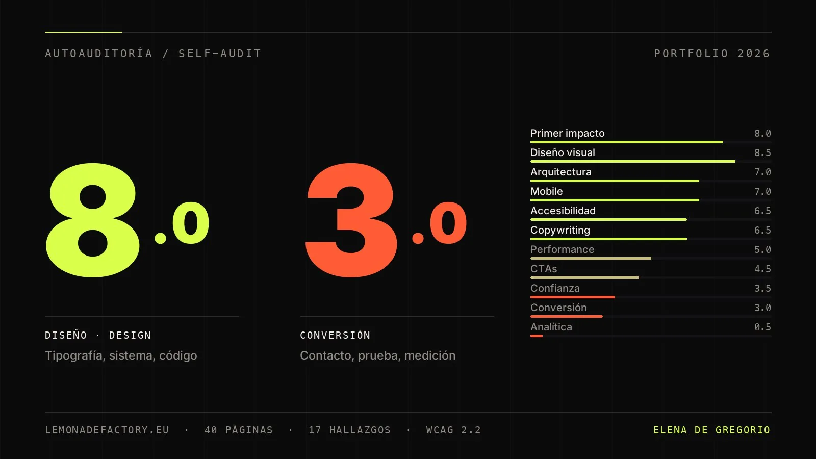
Audit cover: a score of 8.0 on design and 3.0 on conversion, next to the scorecard of the eleven dimensions assessed

Client

EdG Studio · Elena de Gregorio

Discipline

Product design UX/UI · CRO

Year

2026

Role

Audit, research, UI design and design system

Scope

40 pages (EN + ES) · 4,090 lines of CSS/JS · 23 MB of assets

Method

Nielsen heuristics · WCAG 2.2 · cognitive walkthrough · benchmarking

Deliverable

Twenty-block report plus the Figma file: system, components and prototype · the library in code ↗ · the business card ↗

Focus

Conversion · trust · accessibility · measurement

The project, in two halves

Part 01

UX audit & research

(00) — The thesis

This site doesn't have a design problem. It has a conversion problem: it shows craft and asks for nothing in return.

8.0

Average score across design, system and technical execution

First impression, visual, architecture and mobile
3.0

Score for the contact flow on the day of the audit: the form ended in a mailto:

Resolved in August 2026 · the form now really sends
0

Testimonials and outcome metrics anywhere on the site

With the quote slider already coded and unused
0.5

Measurement: no analytics, no events, no heatmaps

None of the above can be checked against data today

Why I publish the audit of my own site

A portfolio shows outcomes; an audit shows judgement. This document applies to my own site exactly the method I apply to a client —code review, cognitive walkthrough, heuristics, calculated contrast ratios and benchmarking— and publishes the result without filtering out the failing grades. Every finding is verified in the source code or in the browser; anything I could not measure without traffic data is flagged as to verify rather than presented as certainty.

Update — two findings have been resolved

This report is published with a date on it and does not get rewritten: the scores and the seventeen findings are the ones from the day of the audit, exactly as they came out. What does change is the status of each finding as it gets fixed, marked in the table in chapter 10 and in the chapter the finding belongs to.

  • Finding 02 · the form ends in a mailto: — Resolved. The form now POSTs to a relay (Web3Forms) which forwards the message to the inbox; the mailto: is kept as a visible fallback for when sending fails, the success message is now truthful, and there is an anti-spam honeypot. It works without JavaScript too.
  • Finding 15 · orphan punctuation mark — Resolved. The word splitter in the contact headline can no longer separate the question mark from the word in front of it.
Status as of 16 August 2026 · 2 of 17 resolved
  • evidence Checked in the code or in the browser
  • inference Designer's synthesis on top of the evidence
  • to verify Needs traffic data that doesn't exist yet
  • resolved Fixed after the report was published
(01) — Executive summary

The diagnosis in one sentence

As a shop window for craft, the site plays in the top league: careful typography, a clean token system, light and dark themes, two complete languages, zero dependencies and sophisticated motion that respects prefers-reduced-motion.

As a channel for winning work, it did not function on the day of the audit. The social links point at the platforms' generic front pages, the form relied on a mailto: that failed silently —Resolved—, there isn't a single testimonial or outcome metric in the case studies, and there is no analytics: it is still impossible to know how many people arrive, how far they get and where they drop out.

Scorecard · 11 dimensions
DimensionScoreReading
Visual design and consistency8.5A real system, not styling: tokens, fluid scale and colour per discipline
First impression / above the fold8.0Passes the blink test: role, three disciplines and location without scrolling
Information architecture7.0Two levels, filterable archive and shareable URLs; debatable labels
Mobile experience7.0Genuinely optimised, not shrunk; loses the availability signal
Accessibility6.5Well above the average portfolio, with specific and cheap gaps
Copywriting and value proposition6.5A memorable voice with no figures behind it
Speed and performance5.0Light code, heavy images: 23 MB with no srcset
Calls to action4.5Right where they exist, missing where they pay most
Trust and social proof3.5Placeholder social links and not one testimonial
Conversion flow3.0The form sent nothing and the site said it did · Resolved
Data and analytics0.5Zero measurement: no claim can be checked

The five fixes that recover the most conversion

01

The social profiles are placeholders

Verified in the menu and the footer: a bare href="https://www.linkedin.com/in/edgfree/". A recruiter's most likely click lands on LinkedIn's front page. Beyond losing the lead, it gives away an unfinished site — the opposite of "code that holds".

Ten minutes of work · Critical
02

The form ends in a mailto:

On a machine with a configured mail client it works. On webmail, or on a work phone with no default account, nothing opens — and the site still shows "your mail client is open". The user believes they have made contact.

One hour · Resolved
03

The case studies don't prove an outcome

The template —brief, solution, images, next— reads well but has no result block and no close towards contact. The metrics from the GAME case exist: they are buried inside a JPG instead of written as text.

One to two days · High
04

Nothing is measured

No GA4, no Plausible, no Clarity, not a single pixel anywhere in the file tree. Without a baseline there is no way to know whether a change improves anything, or to justify the next one.

Half a day · High
05

23 MB of unoptimised images

No image uses srcset or modern formats. With cards rendered at around 420 px, serving 1,200 px JPGs is three to four times more than needed, and on mobile it shows.

Half a day · High

What costs a week and what costs a day

The five fixes above add up to less than two working days and turn a shop window into a measurable channel. The second wave —outcomes in the case studies and three testimonials— carries the most persuasive weight and takes longest, because it depends on other people. That order is deliberate: plug the leak first, fill the tank second.

(02) — Method

What I analysed, how, and with which limits

Auditing your own work carries an obvious bias, and the only defence against it is method: check in the code what you claim, calculate what can be calculated, and declare what you could not measure.

Not one conclusion in this report rests on an aesthetic impression.

Scope of the analysis
BlockMaterial analysedMethod
Code auditHTML of the 40 pages across both language trees, 4,090 lines of CSS and JavaScript, 23 MB of assetsLine-by-line reading, asset inventory
Browser inspectionDesktop at 1366 px and mobile at 375 px: menu, form, validation, themes and navigationLive functional verification
Heuristic evaluationNielsen's ten heuristics over home, archive, case study and contactStructured review with assigned severity
Cognitive walkthroughThe two core tasks: "assess in order to hire" and "get in touch"Step by step, marking every leak
AccessibilitySemantics, focus, ARIA, reduced motion and contrastWCAG 2.2, relative luminance calculated
BenchmarkingSix international reference portfoliosComparison of conversion patterns, not of aesthetics
Declared limits
Not verifiedHow it would be checked
How visitors actually behaveGA4 + Microsoft Clarity over four weeks
How many enquiries the mailto: loses todayImpossible by definition: the failure is silent for both parties
Field metrics (LCP, INP, CLS)PageSpeed Insights and the CrUX report, with real traffic
Full screen-reader navigationManual protocol with NVDA and VoiceOver
Whether the claim communicates what it intendsFive-second test with 25 participants
(03) — First impression and architecture

Crystal-clear identity, no invitation to act

What a visitor sees on arrival: four role labels, the headline "Design that ships & code that holds", the "Available for 2026" chip and the navigation. Within three seconds it is clear who is behind the site and what she does — well above the sector average.

What they don't see: any work, and anything to do. The first viewport is one hundred per cent typography.

What already works

  • The message passes the blink test: role, three disciplines and location with no scrolling required.
  • The availability chip is an excellent trigger to act; very few portfolios have one.
  • The client ticker peeks in at the edge of the fold: early social proof, well placed.
  • Honest, shallow architecture: home → filterable archive → case study, two levels.
  • The archive has dual views, filters coloured by discipline and shareable URLs (#ux, #front, #graphic).

What needs fixing

  • The preloader adds around 2.3 s of artificial wait before anything appears: a fixed 1,900 ms counter plus the curtain. It waits for no real loading.
  • No call to action in the first viewport: the only clickable thing under the headline is "Scroll".
  • No work visible without scrolling; work appears two screens later.
  • "Index" as the label for home is ambiguous: it sits next to the archive's "index" view.
  • Contact isn't a page: it depends on index.html#contact, with a curtain, a page load and a scroll in between.
  • Services and process exist only on the home page: anyone landing on a case study never sees them.

The preloader, in context

It is the first impression for someone arriving from LinkedIn with forty-five seconds of attention and fifteen other portfolios in the next tab. A 000-to-100 counter on a site that would be ready almost instantly is pure waiting. The recommendation is not to remove it —it belongs to the language of the site— but to bring it down to 700 ms or less, or tie it to the actual loading of the hero.

(04) — Copy and calls to action

Memorable voice, implicit benefits, no numbers

The copy is among the best things on the site. "Design that ships & code that holds", "Three jobs, one head", "Skipping a step is where budgets die": it has a voice of its own, and the real differentiator —she designs, codes and does the graphics, with no handover— is well articulated.

The problem is that the promise never rests on a verifiable outcome, and that it is written for a design lead rather than for whoever signs the invoice.

Copy diagnosis
FindingDescriptionSeverity
Not a single business figure on the siteThe GAME case metrics —81.9%, 38%, +20/+45%— exist, but they live inside a JPG. A search engine can't read them and a fast reader won't eitherHigh
It speaks to designers, not to buyers"Tokens", "Figma governance" or "empty states" win over a design lead; an SME buyer needs timelines, process and deliverablesMedium
The form question filters too hard"What are you building?" rhetorically excludes anyone after brand or editorial work — and eight of the eighteen projects are graphicLow
Call-to-action inventory
LocationCurrent CTADiagnosisRecommendation
Hero, first viewport"Scroll ↓"A passive cue, not a call to action"See selected work" + "Start a project"
Header"Available for 2026", not clickableAn urgency signal going to wasteTurn it into a link to contact and keep it on mobile
Work block"See all 17 projects"Clear and numbered: well handled—
Contact"Send message" + visible emailVisually strong, functionally brokenA real endpoint and a copy-email button
End of case study"Next project"An exploration loop with no exit to contactA contact block at the foot of every case study
Archive and about"Start a project" / "Get in touch"Well written, but they jump to another pageRepeat the contact block, or give contact its own page

The rule applied is simple: every screen of scrolling should leave an action within reach. Today there are gaps of two and three viewports —process and figures— with no action available at all.

(05) — Conversion and trust

The critical point was that the form sent nothing

The form was well designed —three fields, floating labels, inline validation written in both languages, autocomplete— and it ended in a mailto:.

For anyone with a configured mail client, it works. For most people —webmail on desktop, a work phone with no default account— nothing opened, and the site confirmed the message was sent anyway. This was the critical finding of the report, and it is the first one to have been fixed.

"The user believes they have made contact; they haven't. It is the worst kind of conversion failure: invisible to both parties."

Main finding of the conversion block

What was actually shipped

The message is POSTed to Web3Forms, which forwards it to the inbox; method and action sit on the <form> itself, so the enquiry is delivered even if the JavaScript never loads. With JavaScript it is intercepted and sent over fetch(), which means the visitor is never taken off the page and is told what happened: a status line with role="status" announces sending, sent, or the error.

The design rule was that no enquiry is ever lost silently again: if the relay fails, the network drops or it takes longer than fifteen seconds, the text stays intact in the fields and a pre-written mail link appears. Bots are filtered with an off-screen honeypot and by discarding submissions made in under two seconds.

Checked in the browser across all nine paths, including the one where Web3Forms answers 200 with success:false
01

Replace the mailto: with a real endpoint

Formspree, Basin or Web3Forms keep the static-site, no-backend philosophy intact. The mailto: stays as a visible fallback, the success message becomes truthful, and a honeypot field is added against spam.

Resolved · August 2026
02

The visible email can't be copied

Next to the large email address there is no copy button with confirmation — a standard pattern in the reference portfolios. It is the preferred route for anyone who won't fill in a form.

Medium · thirty minutes
03

No lead qualification and no calendar

An optional select —project type and budget range— filters browsers and sets priorities. A calendar link ("book twenty minutes") adds a lower-friction alternative conversion.

Medium · two hours
04

The social links are placeholders

LinkedIn, Dribbble and GitHub point at the platforms' front pages. If a profile isn't presentable, removing the link beats leaving the placeholder: it gives away a half-finished site.

Critical · ten minutes
05

Zero testimonials, with the component already built

The JavaScript includes a fully working quote slider that no HTML uses: the infrastructure is ready and empty. After twenty years of practice, gathering three quotes is a week of emails.

High · one week
06

No legal notice or privacy policy

Unnecessary while there is no form backend and no analytics; mandatory the moment either exists. They also signal seriousness to a corporate client.

Low · two hours

What already builds trust

A real phone number and email, Madrid with a local clock, a downloadable CV, the "replies within one working day" promise and correct Person JSON-LD. The urgency of "Available for 2026" is credible and unobtrusive. The trust gap isn't one of tone: it's one of proof. What's missing is someone other than me saying the work delivers.

(06) — Accessibility, mobile and speed

A serious baseline, with specific and cheap gaps

Accessibility sits above the average portfolio: a real skip link, global :focus-visible, correct ARIA on the menu, the accordion and the form, and a complete —not cosmetic— implementation of prefers-reduced-motion. Without JavaScript the site remains one hundred per cent readable.

Contrast ratios are calculated, not eyeballed: body text ≈ 16.8:1 (AAA), secondary ≈ 5.8:1 and the accent on dark ≈ 17:1.

Technical findings
FindingMeasuredActionSeverity
9.9 px monospaced text on mobile9.92 px measured at a 375 px viewportRaise the clamp minimum from 0.62rem to 0.72remMedium
Light-theme secondary text at the limit#6b675f on #eeeae3 ≈ 4.6:1; on the raised surface it drops below 4.5:1Darken to #5d5951Medium
Alt text correct but flatIt describes the project, not the content of the imageRewrite the case-study alt attributesLow
"Available for 2026" disappears on mobileIt exists only on wide desktop: neither in the header nor in the menuAdd it to the menu and to the contact blockMedium
No image uses srcset23 MB of assets; a 420 px card downloads a 1,200 px JPG<picture> with AVIF/WebP and a JPG fallbackHigh
Individually heavy images946 KB for the largest; the portrait is a 772 KB PNGRe-encode to WebP at quality 75-80 and resizeHigh
Three type families from Google FontsThree requests plus render-blocking CSSSelf-host with subsetting; ui-monospace can replace one familyMedium
Vertical social imageThe 698 × 1109 portrait crops badly on LinkedInCreate a 1200 × 630 image with name, claim and workLow
Typographic bug: "? LET'S TALK"The word splitter isolates the mark and lets it wrap aloneAttach orphan punctuation to the preceding wordLow

Smooth scrolling, the debatable decision

Virtual scrolling gives the site an agency feel and is well implemented: it respects sticky positioning, the keyboard, touch and reduced motion. But it introduces perceptible lag with a wheel or a trackpad. It is an aesthetic bet with a usability cost, and it should be tested rather than defended on taste: lower the intensity and measure rage-scrolls and time on page.

(07) — Measurement plan

Nothing is measured today, so nothing can be checked

No GA4, no Plausible, no Clarity, no pixel of any kind: verified across the whole file tree. With no baseline, any promised improvement would be invented.

Proposed stack for a static, GDPR-compatible site: GA4 —or Plausible if you'd rather avoid a cookie banner— plus Microsoft Clarity for heatmaps, recordings and rage clicks. Hotjar would be redundant; Mixpanel, oversized.

Event plan
EventTriggerWhat it answers
form_start · form_submitFirst field filled · successful submissionPrimary conversion and form abandonment
email_click · email_copy · phone_clickClick on the email, on copy or on the phone numberSecondary conversions, entirely invisible today
cv_downloadCV downloadA strong signal of hiring intent
case_openEntry to a case study, with name and disciplineWhich work sells, and which discipline each source cares about
filter_use · view_toggleArchive filters and view switchValidation of the archive's architecture
outbound_socialExit to LinkedIn, GitHub or DribbbleThe real route taken by someone checking credentials
scroll_depth 25/50/75/90Home and case studiesDoes anyone reach the form? Does the preloader scare people off?
theme_toggle · lang_switchInterfaceReal use of the light theme and of the two languages

Headline indicators: contact rate —form, email and phone over sessions—, CV downloads, share of sessions with at least one case study opened, and average depth in the flagship cases.

(08) — Personas, flows and research

Two very different buyers share the same site

The audit defines two archetypes with opposite needs and a single site for both. One comes to verify seniority in sixty seconds; the other, to find out whether this is any use to them and what it costs.

The value percentages are working estimates, not measurements: there is no first-party data today to calculate them from.

01

Marta, 38 — Design Lead

Reviews fifteen portfolios in an afternoon and gives each one between forty-five and ninety seconds on the first pass. High design literacy: she spots craft — and placeholders — instantly. She wants process, decisions and outcome.

Primary persona · friction: preloader, cases without metrics, broken LinkedIn
02

Jorge, 47 — SME founder

A services business, browsing on mobile, to whom "design systems" means nothing. He needs to know whether I do "his kind of thing" —site, logo, cards—, roughly what it costs and how to talk to me now.

Secondary persona · friction: no prices or timelines, a form that does nothing
The real flow, step by step
StepWhat happens todayState
EntryA click from LinkedIn or from a referralFine
PreloaderA 000-to-100 counter for 2.3 s with no real loading behind itLeak
HeroRoles and claim. Nothing to act on: only "Scroll"Friction
Two screens of scrollingIntro and portrait, three discipline cards, archiveFine
Case studyBrief and solution, with no outcome and no testimonial; "next project" returns to the loopLeak
Checking credentialsThe LinkedIn click lands on LinkedIn's front pageLeak
ContactBack to index.html#contact: curtain, load and scrollFriction
FormThe mailto: opened nothing and the site confirmed the send regardlessResolved

The target flow

Hero in under 0.7 s with a double action · three featured cases with a visible metric on the card · case studies with a result block, a testimonial and a close towards contact · real credentials, with this site's own repository as proof of "zero dependencies" · contact with a backend, copy email, a calendar and visible availability. Two clicks from hero to case study, every path ends in contact, and every step leaves a measurable trace.

Proposed research plan · four weeks, almost no cost

What still needs validating with real users
WeekMethodSampleQuestion it answers
1Five-second test25 participantsWhat comes across from the hero? Does "Index" confuse people?
1-2Short twenty-minute interviews4 recruiters + 3 SME clientsWhat do they look for in sixty seconds? What's missing before they write?
2Unmoderated usability test, on mobile5 usersTask: "work out what she'd do for you, then contact her"
3Tree test of the archive15 participantsDo the three disciplines group the way people expect?
3-4Heatmaps and session recordingsReal traffic, 2+ weeksActual scroll depth, filter use and form abandonment

A statistical warning before proposing A/B tests

With typical portfolio traffic —under a thousand sessions a month— very few tests reach classical significance. The honest approach is to run the first three as before and after measurements over three or four weeks, and the rest as perception tests with twenty to thirty participants. Any proposal for an A/B testing programme at this volume deserves scepticism — starting with mine.

Experiment programme
#HypothesisVariant BSuccess metric
1The preloader increases bounce from cold traffic700 ms, or no preloaderBounce and 25% scroll depth in new sessions
2A hero action shortens the path to the work"See selected work" + "Start a project"% of sessions that reach a case study
3A real form multiplies enquiriesEndpoint, truthful success state and copy emailform_submit and email_copy per session
4Visible metrics raise interest in case studiesCard with an outcome badgeCard-to-case clicks, on home and archive
5The claim communicates less than a benefit-led oneAn alternative claim centred on the engagementFive-second test: recall of what I do
6Native scrolling reduces perceived frictionNative scrolling, or minimal easingRage clicks and time on page
(09) — Benchmarking

Six references, one for each missing piece

A selection covering the three sides of the positioning: product, front-end and graphics. The comparison is about conversion patterns, not aesthetics: on visual execution this site already plays in the top league.

All six beat it on exactly the same three things: work sooner, verifiable proof, frictionless contact.

What to adopt from each reference
PortfolioProfileWhat it does betterWhat to adopt
Dennis SnellenbergCreative developerStraight after the hero it shows featured work, and the email copies in one clickFeatured work right after the hero; a copy-email button
Adham DannawayUX/UI who codesThe same dual positioning, resolved with case studies that document process and outcome with figuresCase structure: problem → process → measurable outcome
Brittany ChiangFront-end engineerZero friction: real links, live projects and the site's own code public as a credentialA real GitHub with this portfolio's repository
Sean HalpinProduct designerWarmth and trust: availability always visible, testimonials woven in, contact at every scrollPersistent availability, on mobile too; short testimonials with a name
Malika FavreGraphics and illustrationThe work is the home page: an immediate grid, no preambleMore visual cards and grid view by default for graphic work
Jessica HischeLettering and graphicsExplicit terms of engagement: what she takes on, how she works and in what timeframeA "what it's like to work with me" block: engagement types, timelines and indicative range
(10) — Action plan

Seventeen findings, ordered by what they recover

Every finding carries an impact, a realistic effort estimate and a concrete action. The order isn't by theoretical severity: it's by the ratio between what it recovers and what it costs.

There isn't a single promised improvement percentage. Without a baseline —the site measures nothing today— any figure would be invented.

Prioritised table
#FindingImpactEffortConcrete actionStatus
1Placeholder social linksHigh10 minReal LinkedIn, GitHub and Dribbble URLs, or remove themOpen
2mailto: form with a misleading success stateHigh1-2 hA real endpoint, a truthful message and an anti-spam honeypotResolved
3Case studies with no outcomes or metricsHigh1-2 dA "result" block in the template; move the figures out of the JPG into textOpen
4No analyticsHigh (indirect)½ dGA4 and Clarity with the event plan from block 07Open
523 MB of images, no srcsetMedium-high½ dAVIF/WebP with srcset; portrait under 120 KBOpen
6A 2.3 s artificial preloaderMedium-high1 hCut to 700 ms or tie it to actual loadingOpen
7Zero testimonials, with the slider already codedHigh1 wkThree quotes with name and company in the existing componentOpen
8Hero with no call to actionMedium1 h"See selected work" and "Start a project"Open
9Availability invisible on mobileMedium1 hA clickable chip in the menu and in the contact blockOpen
10Contact depends on index#contactMedium2-3 hA contact block on archive and about, or a page of its ownOpen
11No lead qualification or calendarMedium2 hType and budget selects; a calendar linkOpen
129.9 px monospaced text on mobileLow5 minclamp minimum to 0.72remOpen
13Secondary contrast in the light themeLow5 min--fg-dim: #5d5951Open
14"Index" ambiguous in the navigationLow10 minRename to "Home" or drop the labelOpen
15Orphan-punctuation typographic bugLow30 minAttach punctuation to the preceding word when splittingResolved
16Vertical social imageLow1 hCreate a 1200 × 630 image with claim and workOpen
17No legal notice or privacy policyLow2 hLegal pages and consent as soon as analytics existsOpen

Roadmap

Phase 1 · week 1

Quick wins

Form endpoint Done · real social links · analytics and events · images in modern formats · preloader down to 700 ms · minimum monospaced size · light-theme contrast.

One working day: with that, the site goes from shop window to measurable channel. The first item is in; the rest is still open.

Phase 2 · weeks 2-3

Persuasion

A result block in the case template · metrics moved out of the JPG into text · three testimonials in the component that already exists · actions in the hero and at the end of each case · availability visible on mobile.

The wave with the most persuasive weight, and the one that depends on other people.

Phase 3 · weeks 3-6

Validation

The research plan —five-second test, interviews, tree test— and a first read of heatmaps and recordings with real traffic.

From here on, decisions stop being opinions. Including mine.

Phase 4 · ongoing

Experimentation

The experiment programme in order of impact, measured before and after, plus panel-based perception tests.

Documented iterative improvement, with the statistical scepticism this traffic volume demands.

  • The commitment of this audit: every finding is verified in the source code or in the browser.
  • Every finding carries a concrete action and a measurable success criterion, not a generic recommendation.
  • No improvement figure is promised while there is no first-party baseline.
  • Whatever could not be measured is declared as a limit, not dressed up as a conclusion.

Closing note

This document was produced in August 2026 on version 11 of lemonadefactory.eu, from direct analysis of the code and browser verification at 1366 and 375 px, with contrast ratios calculated to WCAG. Publishing it in full, failing grades included, is part of the argument: judgement is proven by applying it to your own work, not only to other people's.

Part 02

UI Design

(00) — The interface

The audit says what is broken. This half is what got drawn to fix it.

3

Widths drawn for every screen, rather than improvised at build time

Desktop 1440 · Tablet 834 · Mobile 390
2

Complete themes, built from the same variables swapped over

Dark and light, in Spanish and English
7

Screens per set, from the preloader to the error page

Preloader · Home · Work · About · Case · Menu · 404
1

Published library everything else is dragged out of

Components with variants, consumed from Assets

How to read this half

The eight boards run in the order they were made, not the order that flatters them: flow first, then the screens, then the system holding them up, and last the prototype that puts them to the test. All of them are captures of the Figma file and the FigJam board exactly as they stand today, panels and tool noise included.

Board 01

The map before the screen

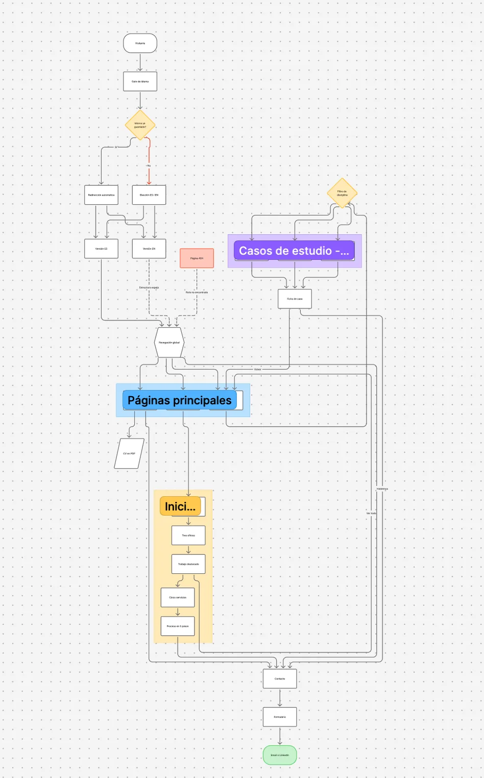
Before opening Figma I drew the whole site in FigJam: where the visitor comes in, what the language gate decides and how many steps there are between a cover and a sent email. The flow starts at language detection —redirect automatically if a choice is already stored, otherwise offer ES/EN— and opens from there into three branches: global navigation, main pages, and the case studies with their discipline filter.

Drawing it exposed what the audit would later say with numbers: every path ends in the same contact box, and that box was the weak link. The 404 and the CV download hang off the flow as side exits, not as dead ends.

FigJam · User flowPortfolio 2026

FigJam flow diagram: visitor, language gate, ES and EN versions, global navigation, main pages, case studies with discipline filter, 404, CV in PDF and the final path to contact, form and email or LinkedIn
EdG · User flow · FigJamFrom the language gate to the contact form
Board 02

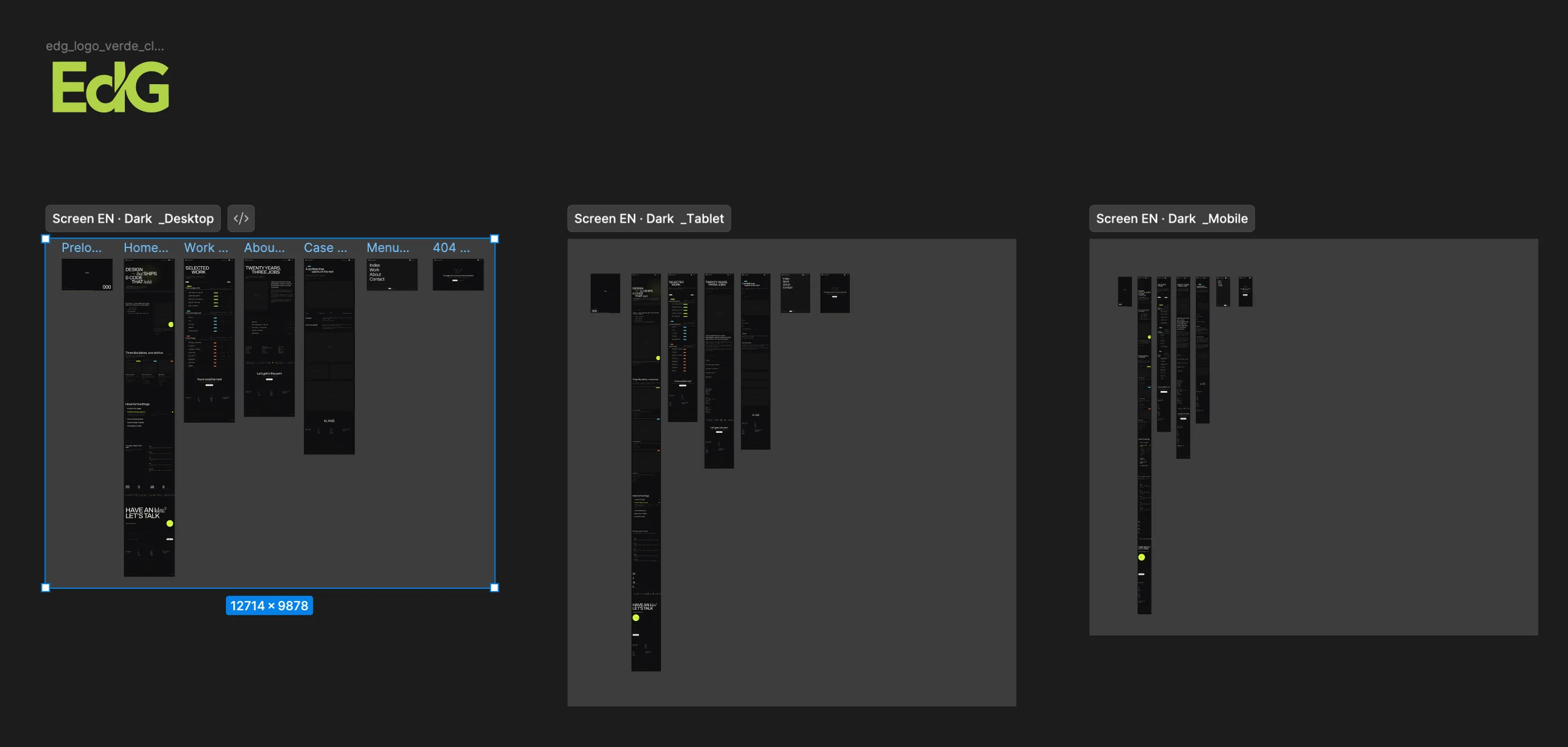
The same screens at three widths

The dark version built in Figma as three parallel runs of the same page: desktop 1440, tablet 834 and mobile 390. Every run carries the full set —preloader, home, work, about, case study, menu overlay and 404— so that how each block reorders can be compared vertically instead of assumed.

This is where the decisions the CSS later merely executes get made: when the navigation becomes a burger, when the three-column grid drops to one, and which column of the archive row leaves as the viewport narrows.

Figma · Screens · DarkResponsive prototyping

Figma canvas with three frames labelled Screen EN · Dark for desktop, tablet and mobile, each holding the preloader, home, work, about, case study, menu and 404 screens
EdG · Responsive Design · FigmaDesktop 1440 · Tablet 834 · Mobile 390
Board 03

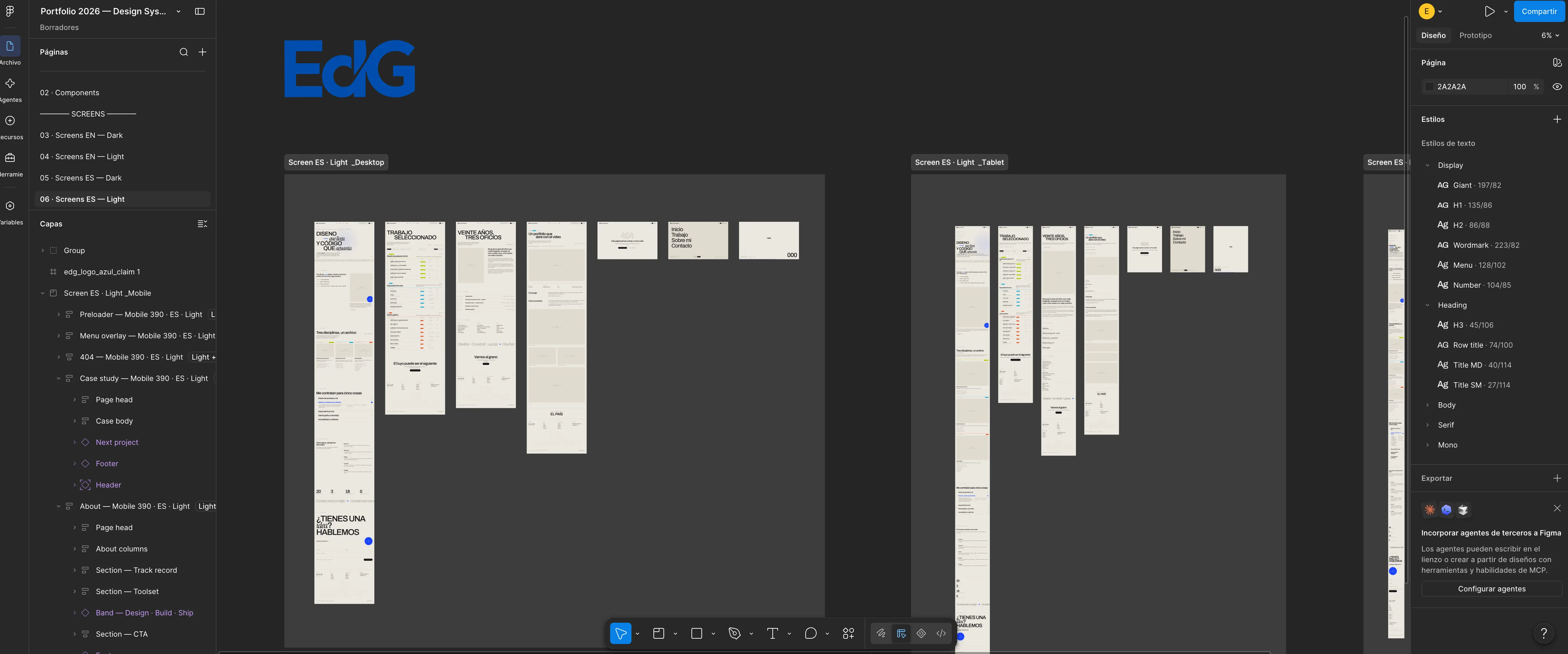
The same system, with the light reversed

The light theme is not the dark one with its colours flipped: text weight changes, shadows change, and the accent itself moves from green to blue to hold contrast against a bone background. These are the Spanish screens in their light version at all three widths, assembled from exactly the same components as the dark one.

Having the light mode drawn before writing the CSS is what lets the site's theme toggle be a swap of variables rather than a parallel stylesheet to maintain twice over.

Figma · Screens · LightDesktop, tablet and mobile

Figma canvas with the light-version screens: bone background, dark type and a blue accent, at desktop, tablet and mobile, with the file's layer tree on the left
EdG · Light Design · FigmaBlue accent, bone background, same components
Board 04

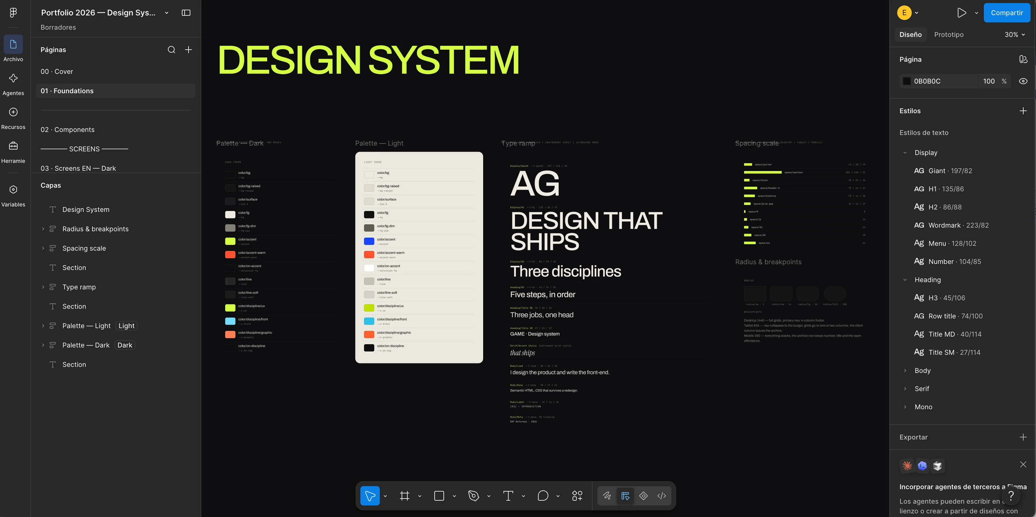
The system: colour, type, space and radii

The foundations of the file on a single board: both palettes —dark and light— with every colour named after its job rather than its hue (color/bg, color/fg-dim, color/accent, color/discipline/ux), the type ramp from Giant down to the mono of the labels, the spacing scale, and the radii with their breakpoints.

Naming by role is what makes the light theme free: color/accent is green or blue depending on the mode, and the component using it never finds out. The text styles in the right-hand panel —Giant, H1, H2, Wordmark, Menu, Number— are the ones that later live in tokens.css.

Figma · FoundationsPalettes · Type ramp · Spacing · Radius

Design System page in Figma with the dark and light palettes named by role, the type ramp, the spacing scale and the table of radii and breakpoints
EdG · Design SystemColour by role, not by hue
Board 05

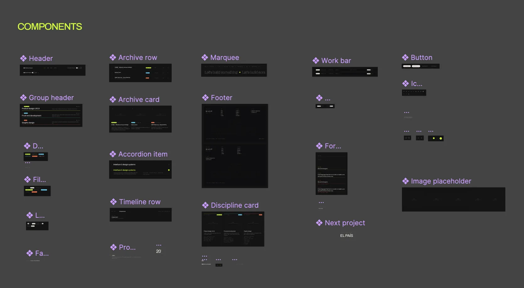
Components, each with its variants

The components page: header, archive row and archive card, marquee, work bar, button, group header, accordion item, timeline row, discipline card, footer, form, next-project block and the pending-image placeholder. Each one built as a component with its own variables —state, size, discipline, theme— instead of as five near-identical copies.

The real gain showed up at build time: when the archive row changed height, it changed across all forty screens at once, and the front-end only had to copy that decision once.

Figma · ComponentsVariants and properties

Figma components page labelled COMPONENTS, showing header, archive row and card, marquee, work bar, button, accordion, timeline row, discipline card, footer and image placeholder
EdG · Components · FigmaOne component per piece, with its variables
Board 06

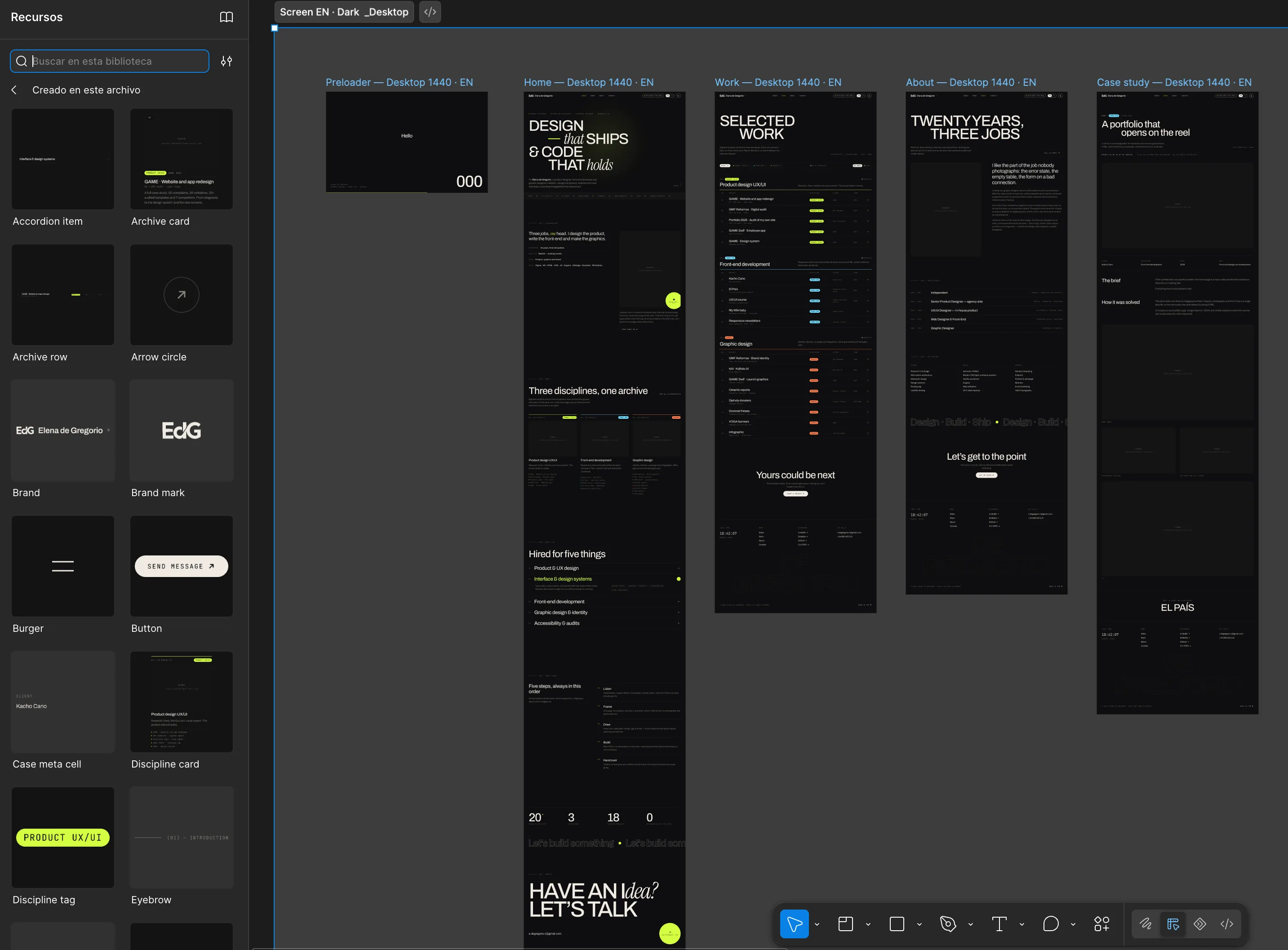
The published library, seen from inside

The same components, published as a library and consumed from the assets panel: accordion item, archive card, archive row, arrow circle, brand, brand mark, burger, button, case meta cell, discipline card, discipline tag, eyebrow… Next to it, the screens assembled end to end out of instances of that library.

It is the proof that the system is a system and not a mood board: if a whole screen can be assembled by dragging pieces out of the library, the library is complete.

Figma · LibraryAssets and the screens built from them

Figma assets panel with the published component library on the left and, on the right, the preloader, home, work, about and case study screens assembled from those instances
EdG · Design System · AssetsThe library and the screens that come out of it
Board 07

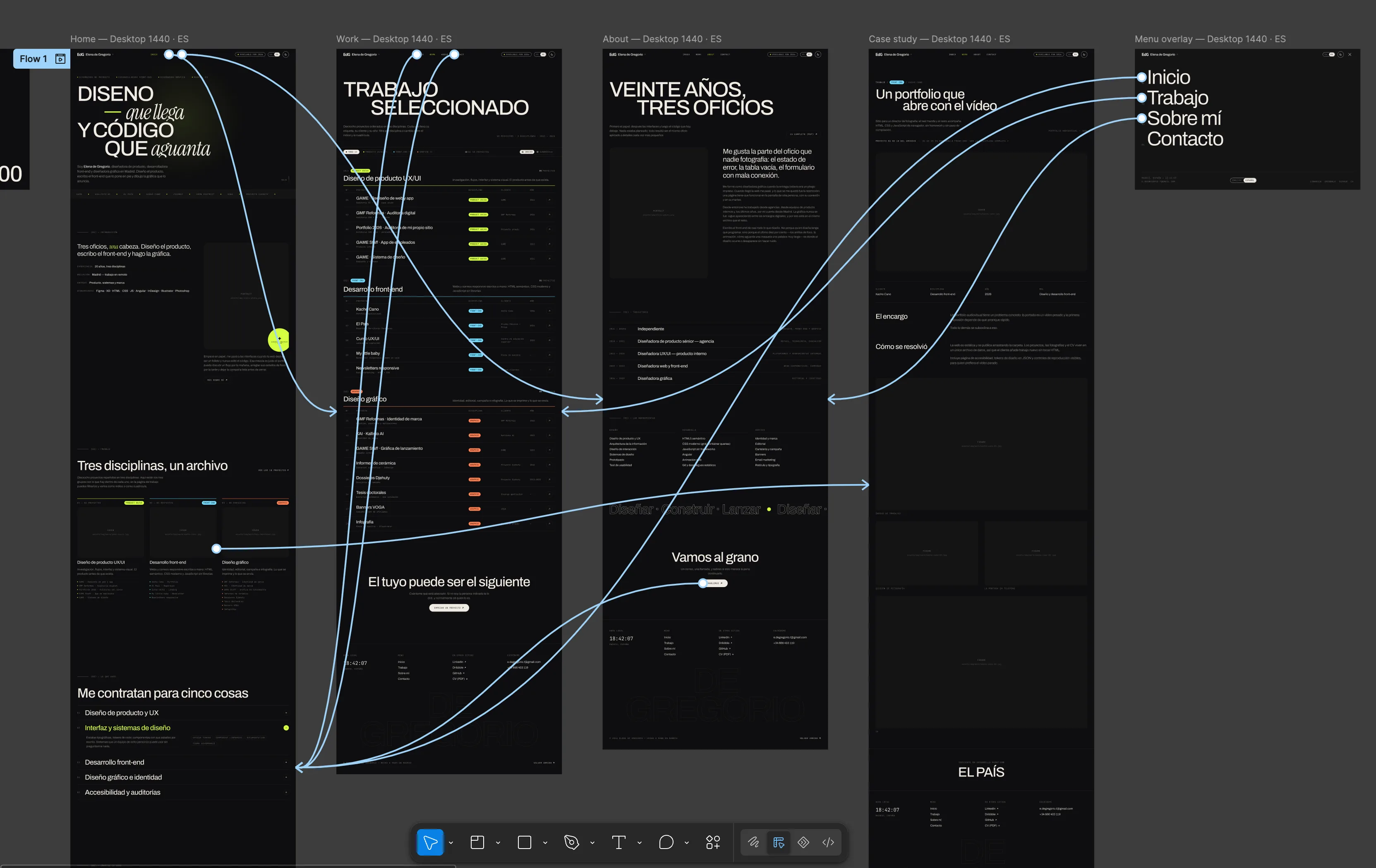
The prototype you can actually click

The prototype layer over the screens: every blue line is a real connection between an element and its destination —the header to home, work, about and contact; the discipline card to its section of the archive; the archive row to its case study; the burger to the menu overlay and back.

With this the prototype is walked the way the site would be walked, which is the only way to find the dead ends before they get built: on the first pass the case study had no route back to the filtered archive, and the browser's back button had to do the work.

Figma · PrototypeConnections and interactions · Flow 1

Figma prototype mode: the home, work, about, case study and menu overlay screens joined by blue connection lines running from the header, the discipline cards and the archive rows
EdG · Prototyping · FigmaReal connections, ready to be tested
Board 08

And this is how it moves


The result in the hand: the work archive scrolling on a real phone, the front-end development rows giving way to the graphic design section and the discipline tags changing colour as they do.

It is the last check of the cycle —what was drawn in Figma against what the browser gives back on a real phone— and the piece that closes the interface half of this project.

Mockup · Capture of the siteThe archive, scrolling on mobile

Photographic mockup: a hand holds a phone with the portfolio work archive scrolling, from the front-end development rows to the graphic design section
EdG · Mockup · ScrollThe archive, in motion

This is where the front-end comes from

All of the above is built and running: the system designed in this Figma file exists in code, with 37 components and 57 tokens, and it can be opened, searched and copied whole on the front-end development page. This site is made with it — and so is the business card, which prints those same tokens at 55 × 85 mm.

Next in Product design UX/UI

GAME Staff · Employee app