Work / Front-end / EdG Design System
This portfolio, taken apart into 37 pieces
Project 12 of 28 in the archive 03 of 08 in Front-end development See the whole discipline ↗
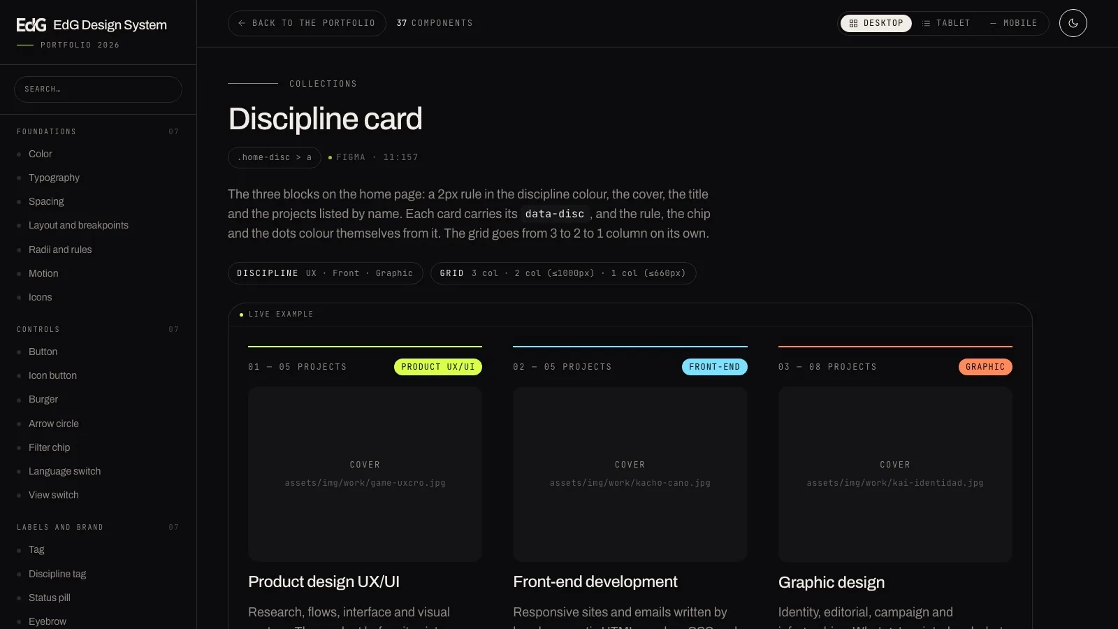
Open it and use it: 37 components with their code ready to copy
The complete documentation site, with the search, both themes and the three widths. It opens in a new tab and carries its own button back to this page.
A design system that only lives in Figma is not a system
The audit of this portfolio ended in a Figma file with the palette, the type ramp and the components put in order. That is exactly where most design systems die: handsome on the canvas and never translated into the browser.
Nobody building a page opens Figma to find out how many pixels a radius is. They open the inspector on another page and copy. And by the third copy the system no longer exists.
So the system was written in code: the same tokens, the same components and the same states, in files you can link to. This site is built with them, and the library is the proof.
Documented components
In seven groups, from foundations to formTokens in tokens.css
Lines of library
200 tokens · 1,068 components · 317 JSComplete themes
Canonical dark and light, without duplicating a componentThe rule that decides everything else
No component has a colour or a size written by hand. They all read variables from tokens.css. Change one token and the whole library changes — and that is what separates a system from a folder of snippets.
Three ideas and not one exception
A small system survives if it has few rules and breaks none of them. These are the three, and they are written in the README before they are written in any component.
01 · Everything comes from the tokens
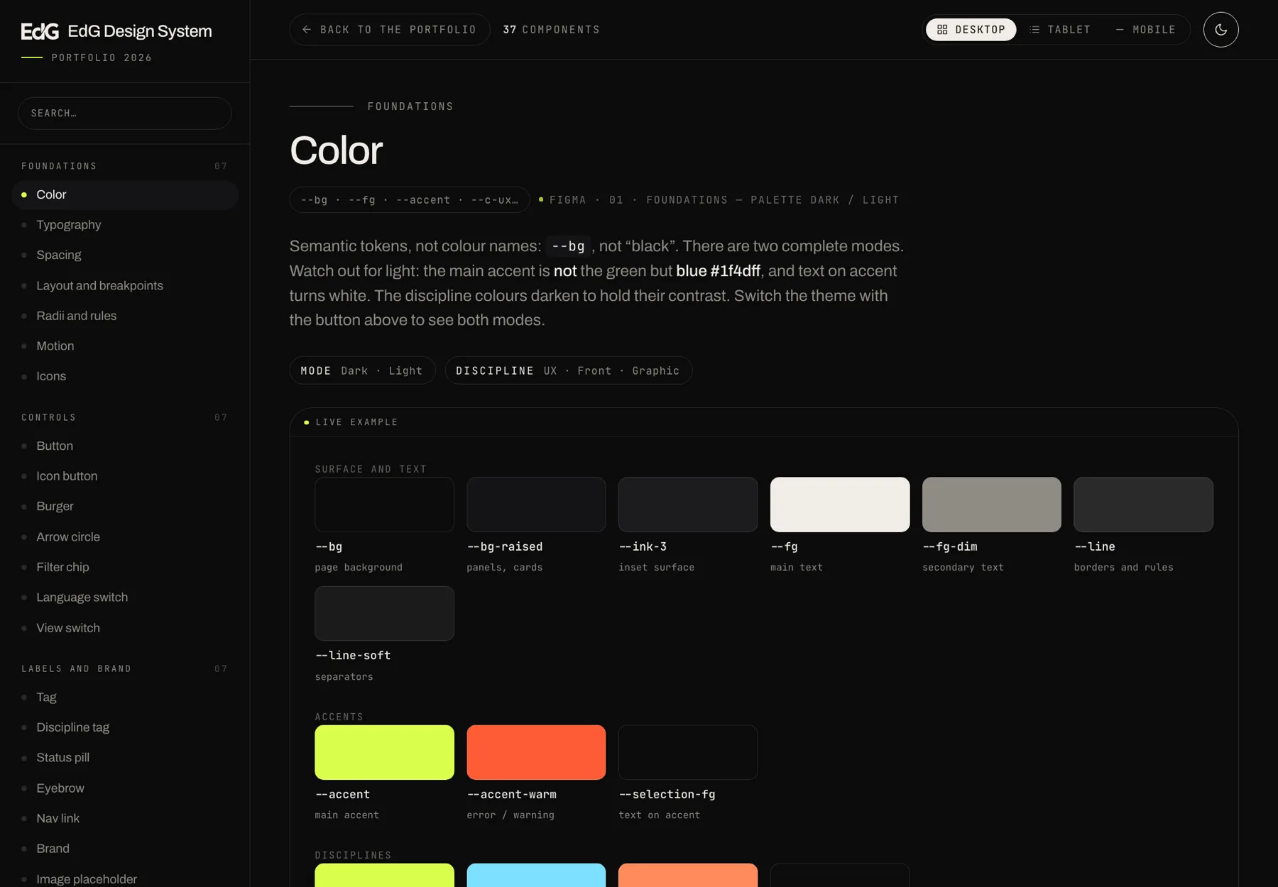
The tokens are semantic, not descriptive: --bg, not “black”. That allows two complete modes — canonical dark and light — without duplicating a single component. Watch out for light: the main accent is not the green, it is blue #1f4dff, and text on accent turns white.
Figma · 01 Foundations — Palettecss/tokens.css
02 · The accent is inherited
Putting data-disc="ux | front | graphic" on a component — or on any ancestor — reassigns --accent, and with it the rule, the chip, the dots and the hover states of everything inside. One attribute on a section recolours the whole section.
It is the reason the work archive can paint three disciplines with a single set of components instead of three.
Three accents · UX · Front · GraphicOne single component
03 · The responsive lives in the tokens
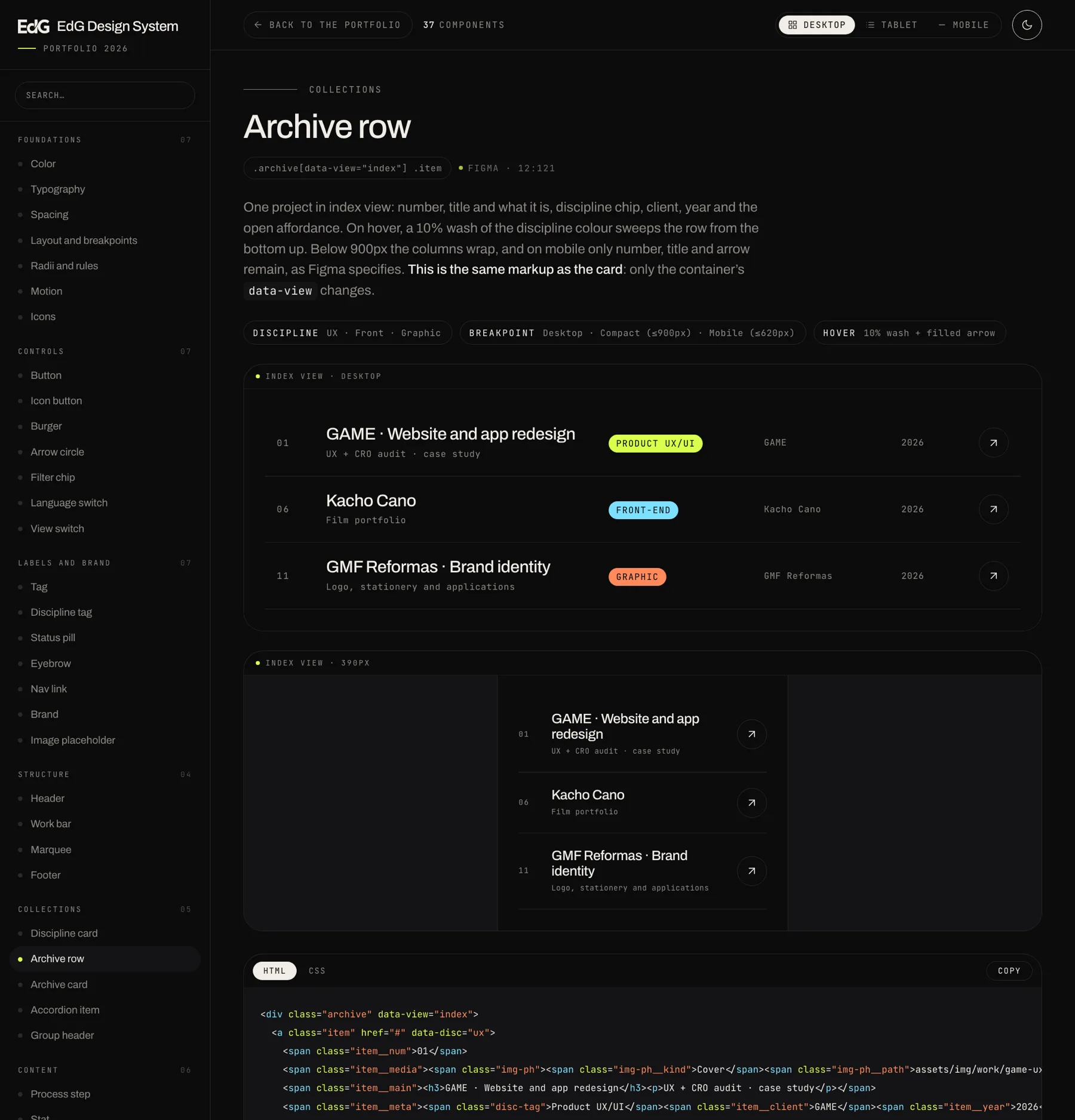
Figma defines three measurement modes — Desktop 1440, Tablet 834 and Mobile 390. In code they are two media queries in tokens.css that rewrite the type ramp and the spacing. Nothing else.
Components only add media queries when they change structure: the header brings out the burger, the footer collapses columns, the archive row stacks. Everything else comes down on its own.
Breakpoints · ≤900px · ≤620px--t-h2 86 → 59 → 40
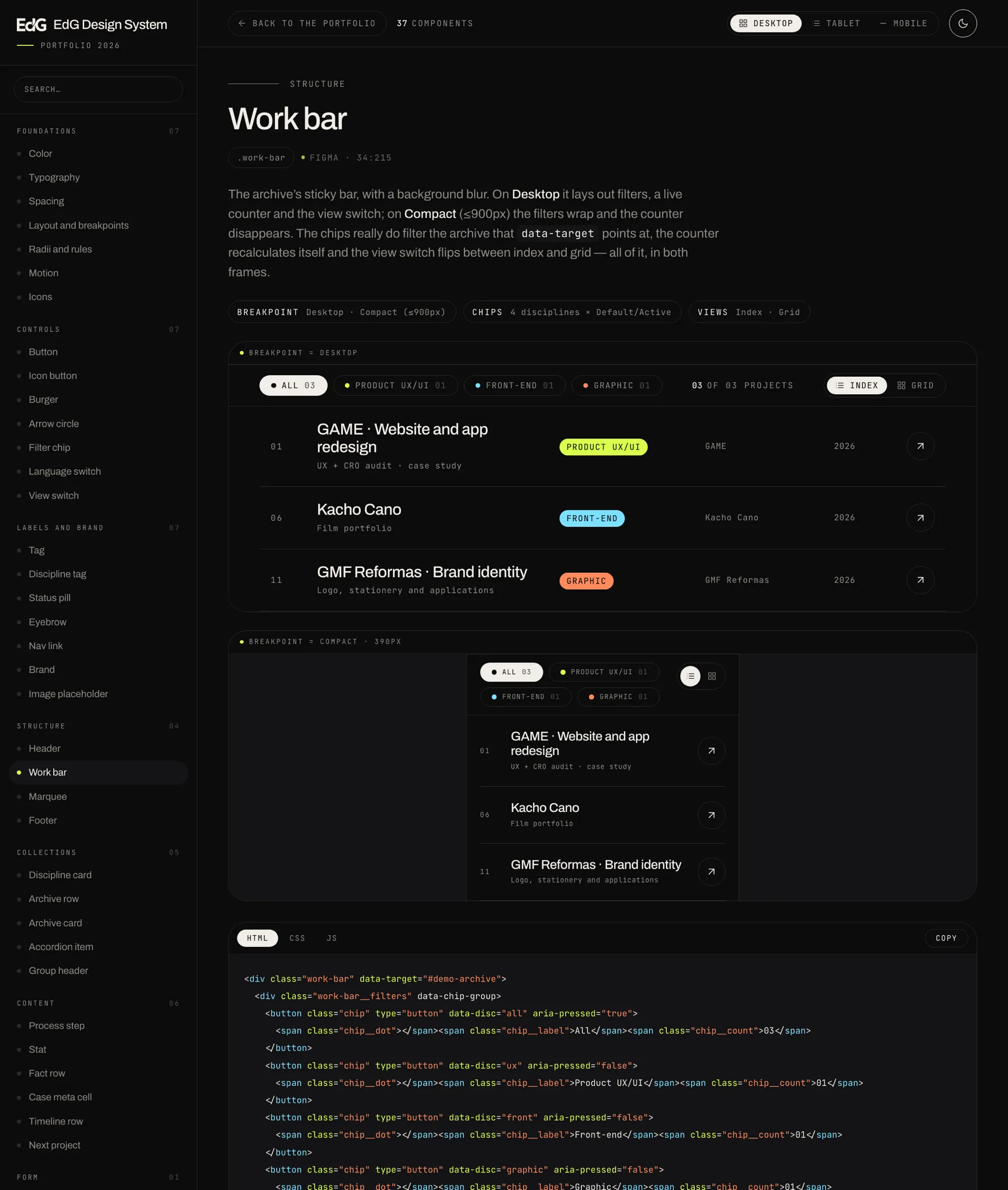
The example and the code are the same file
The classic trap in documenting components is that the example is drawn by hand and the snippet is written separately: by the third change, both are lying. Here the catalogue’s HTML is at once what gets rendered and what gets copied. If the example works, the snippet is right. There is no way for them to disagree.
And every example is painted inside an iframe with its own viewport, loading exactly the same tokens.css, components.css and edg-ds.js that get handed to the team. Being a real width, the media queries respond: the Desktop / Tablet / Mobile buttons show the actual behaviour, not a mock-up of it.
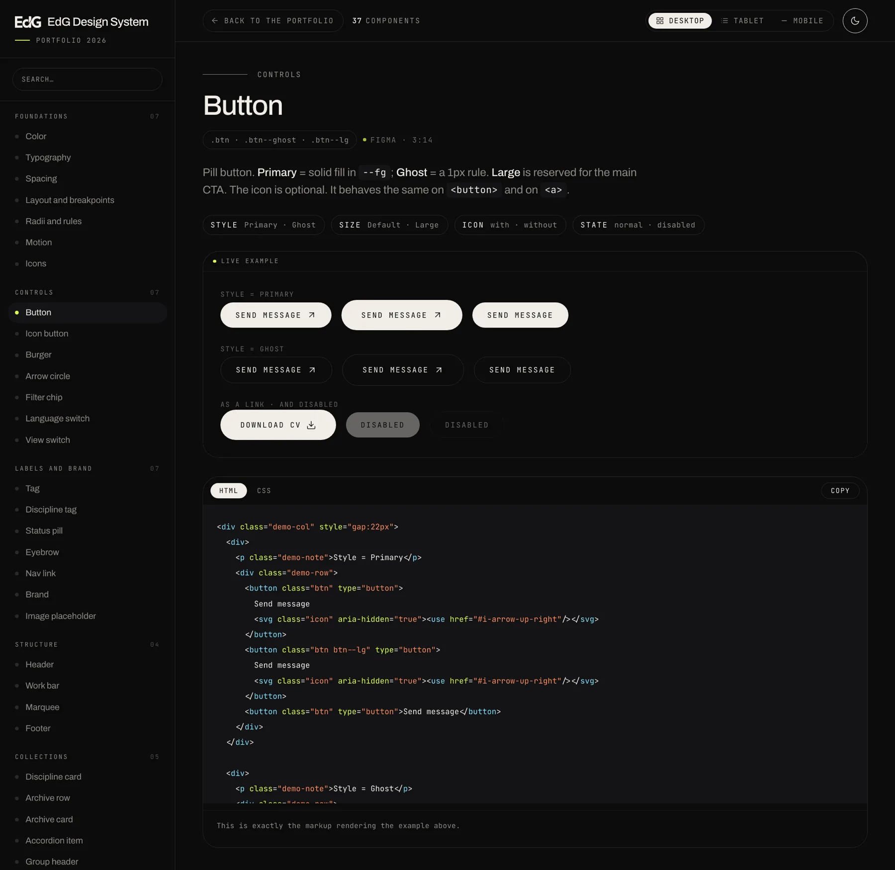
What every page carries
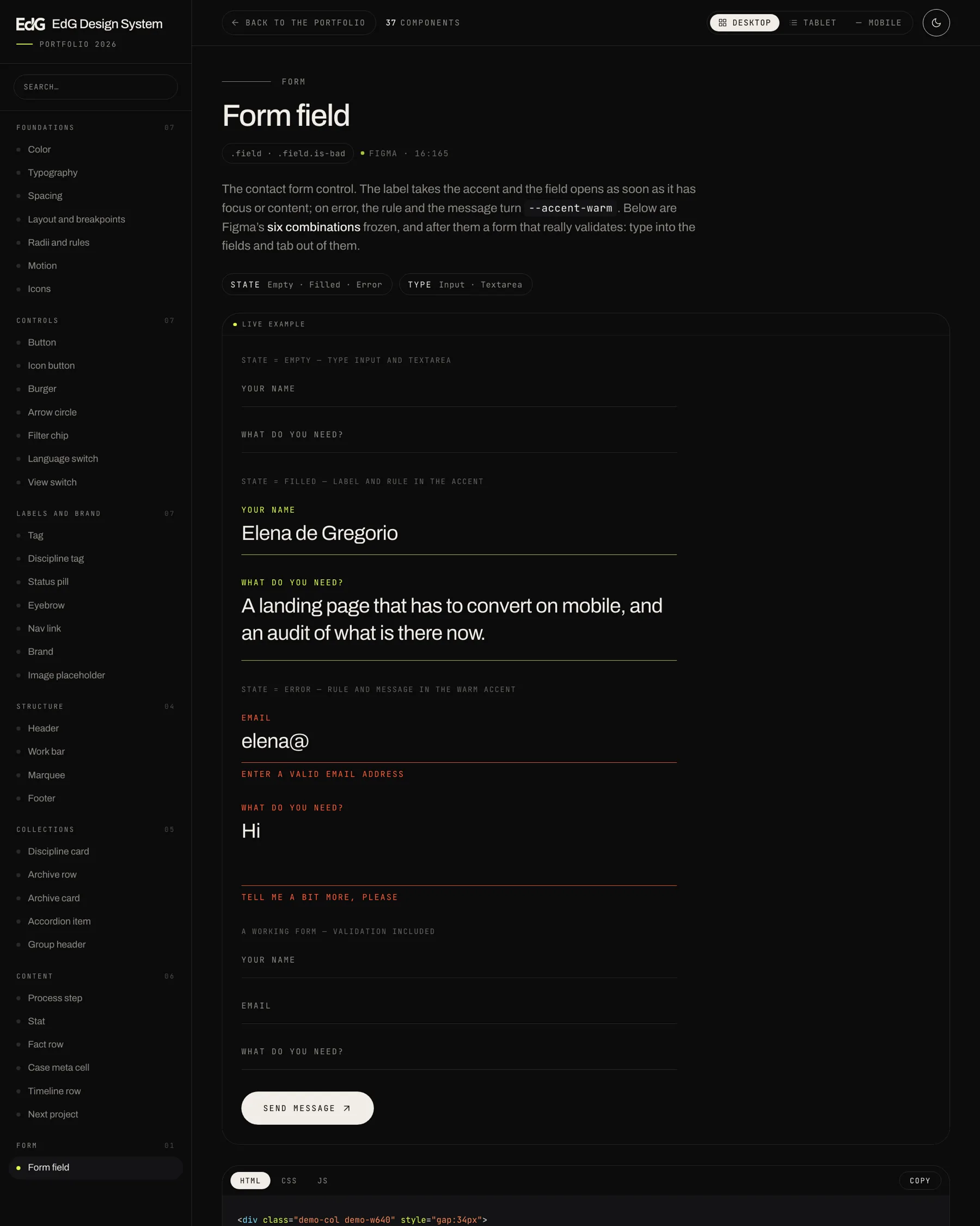
The component name, its classes, the exact Figma node it comes from, a description of what it is for, the variants table as it stands in the design file, the example with all its combinations, and the code in three tabs: the markup, the real block from components.css, and the JavaScript you need to call, if you need any.
The CSS shown is not a copy: it is read from the /* @c: id */ … /* @end */ markers in the components file itself at build time. That cannot fall out of sync either.
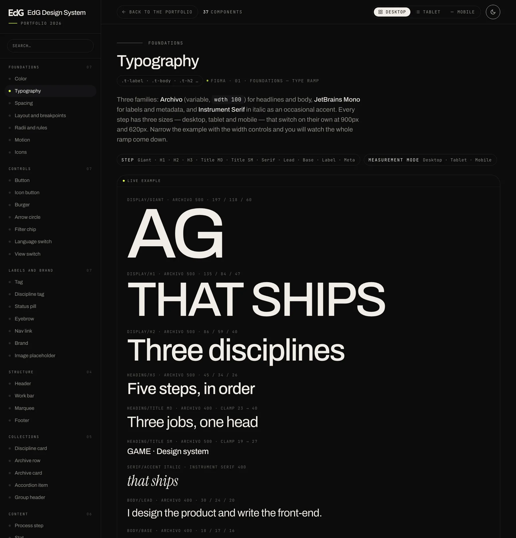
State lives in ARIA, not in loose classes
The chips, the view switch and the language switch carry their state in aria-pressed; navigation in aria-current="page"; the burger and the accordion in aria-expanded; the archive counter in aria-live. The CSS hooks onto those attributes. A component cannot look active without being active, because the same attribute paints it and announces it.
The rest follows: decorative icons with aria-hidden, a dedicated :focus-visible ring in the accent, and the marquee, the pulse and the drawn rules all stopped under prefers-reduced-motion.
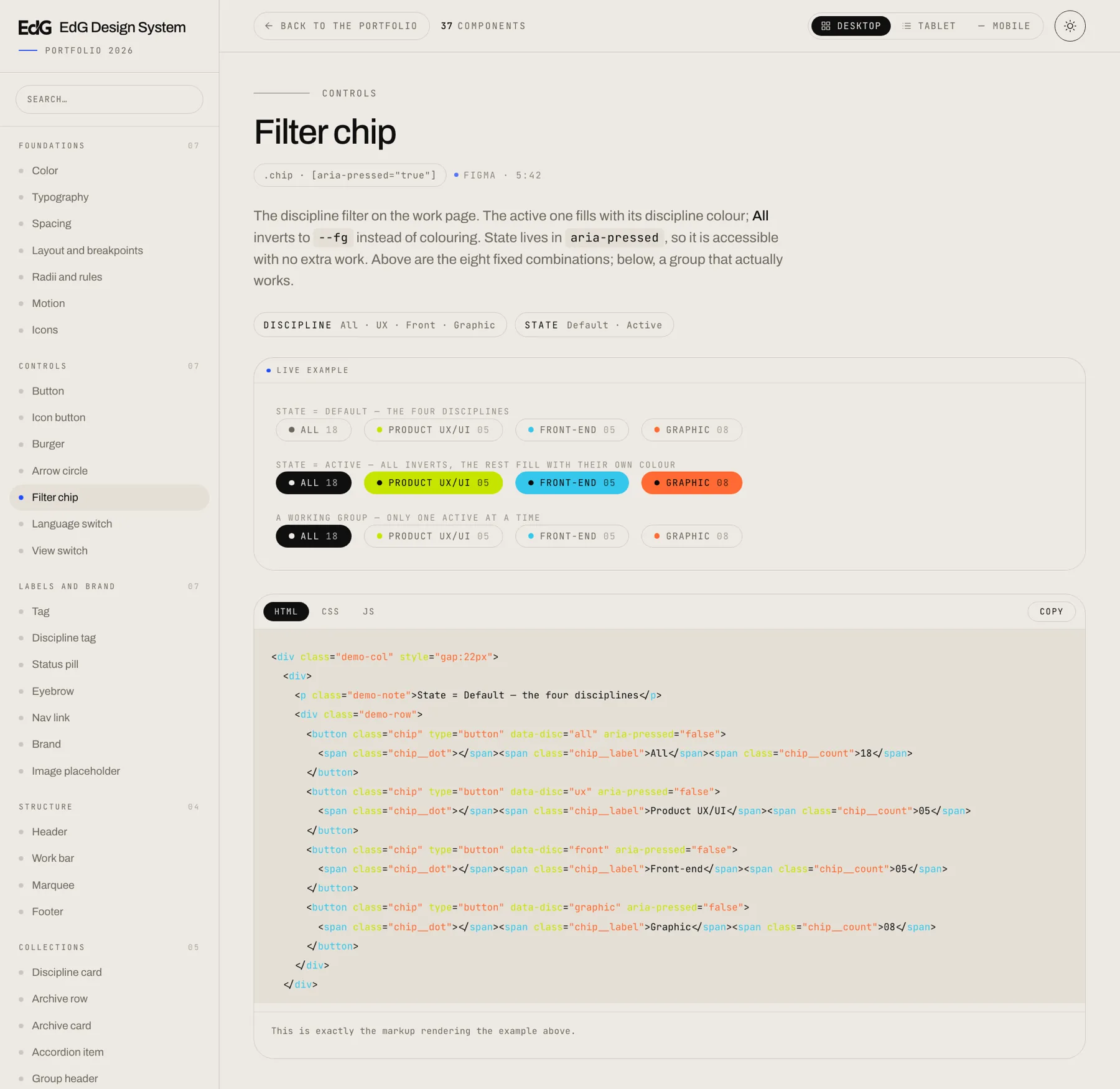
One logo, one file
The brand mark is not placed as an image but as a mask: the file lives in the --logo token and the component paints it with background: currentColor. A single file goes white on dark, black on light and takes the discipline accent when it has to, without maintaining three versions of the same logo.
The library, working
The whole documentation site is right below: search for a component, switch its theme, narrow the example to tablet or mobile and copy the code. Everything you see is the library using itself.
A frame is a good place to prove something exists and a bad place to use it. To go through it properly, open it in a tab — and from there, the Back to the portfolio button in the top bar brings you straight back to this page.
Also in Spanish · one self-contained 340 KB file
Where it comes from
This project has three parts and they live in different disciplines. The diagnosis, the research and the design of the system are in the product UX/UI page: the audit of this portfolio. What you are reading is the second: that system written in code and documented so somebody other than me can use it. The third takes it off the screen: the business card, printed in these same tokens.
The control on the right jumps between the two.
Next in Front-end development
Kacho Cano