Work / Product UX/UI / GAME Staff · Employee app
A whole working day on one screen
Project 08 of 28 in the archive 08 of 09 in Product design UX/UI See the whole discipline ↗
A workforce spread across four systems
GAME has two populations who work in very different ways and shared the same tools: shop-floor staff, who clock in standing up and check things in thirty seconds between customers, and head-office staff, sitting in front of a monitor all day.
What they needed to know was scattered: hours in one place, holidays in another, announcements in email, and the org chart in a PDF nobody could find. On top of that, coordinators had no team view at all: finding out who was on sick leave, who was working from home and who was in store meant asking.
The brief came from the board and HR, with IT watching from the start to scope what could realistically be integrated.
Screens designed
97 desktop · 34 app · 25 internal networkProducts in one
Web portal, mobile app and internal social networkSystem boards
Colour, type, buttons, icons and componentsNavigable prototypes
Built in Figma and tested before any buildThe constraint that ordered everything else
The desktop was designed at 1366 px, not 1440. That is not a preference: it is the real resolution of the machines in the shops. Designing at 1440 and trusting it to «scale down» would have meant the most important row of the dashboard falling below the fold on exactly the screens where there is least time to go looking for it.
The system first, the screens after
With 156 screens ahead and three products that had to look like the same thing, the first move was not to draw a screen: it was to fix the foundations. Colour, type, buttons, icons and components, each with its variants and its states, before any view was signed off.
The practical consequence is that a new screen stopped being a design decision and became an assembly job. And when the build came around, what had to be translated into code was not 156 drawings but a handful of parts.
Colour
GAME's magenta is the brand, and it is reserved for what is actionable: what you press, what is active, and what needs attention. Everything else lives in two neutral scales — a light one for surfaces and a dark one for text — because a data-heavy interface that colours everything stops having any hierarchy at all.
#A70084Pressed state and text on light#CE0091Primary: buttons, active icons#F306C2Hover and accents on dark#222831Headings and figures#687273Secondary text and labels#AFB5B3Disabled text and hints#F3F3F3The ground the cards rise from#F8F8F8The top face of each blockFour states, and why there are four
In a time-and-attendance tool, most of what the screen says is the state of something: a request approved, a shift incomplete, a notice pending, a clock-in error. Each state carries three tones — solid for the icon, mid for the border and washed for the pill background — so that a state is never communicated by solid colour on white alone.
#3DDA2AApproved · shift complete · #ADE6A7 · #D5F8D1#EBB635Pending · under review · #E9C672 · #FBF0D2#A1D8F5Announcements and notes · #C9E8F8 · #E2F0F7#F02E2EAbsence · incident · #F5827E · #F7BFBCTypography
One family for the whole interface: Poppins. Geometric, large in the x-height, and with figures of equal width — which on a screen full of times and ticket numbers matters more than the character of the letterform. The scale is deliberately short — four sizes — because a long scale is an invitation for every screen to invent its own.
Buttons: two themes, two sizes, three hierarchies
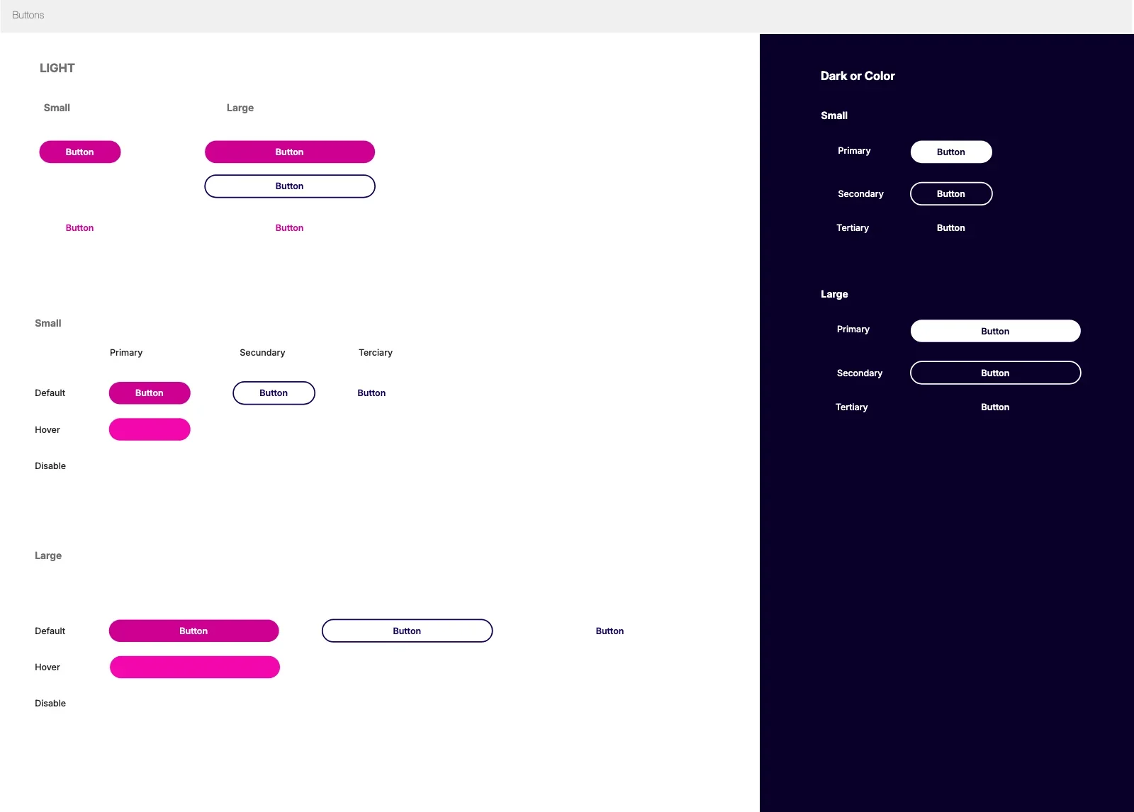
The board does not draw a button: it draws the entire matrix. Light theme and dark, small and large, primary, secondary and tertiary, and for each combination its default, hover and disabled states. It is more work on the board and less work for everybody else: whoever builds it never has to guess what a disabled secondary looks like on dark.
Figma · Styles and components — Buttons1 board · 36 combinations
Icons with names, not numbers
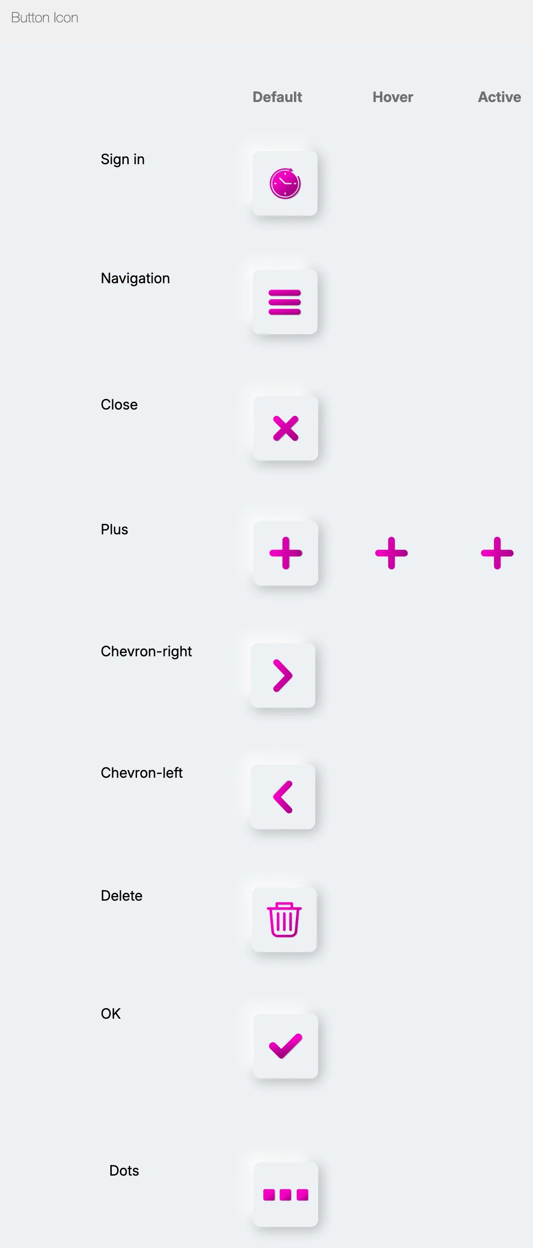
Nine icon buttons, each with its name written beside it: Sign in, Navigation, Close, Plus, Chevron, Delete, OK, Dots. It looks like mere tidiness, and it is what lets a conversation between design and development happen in writing without attaching a screenshot.
Figma · Styles and components — Button_Icon9 icons · 3 states
The component that solved the coordinator problem
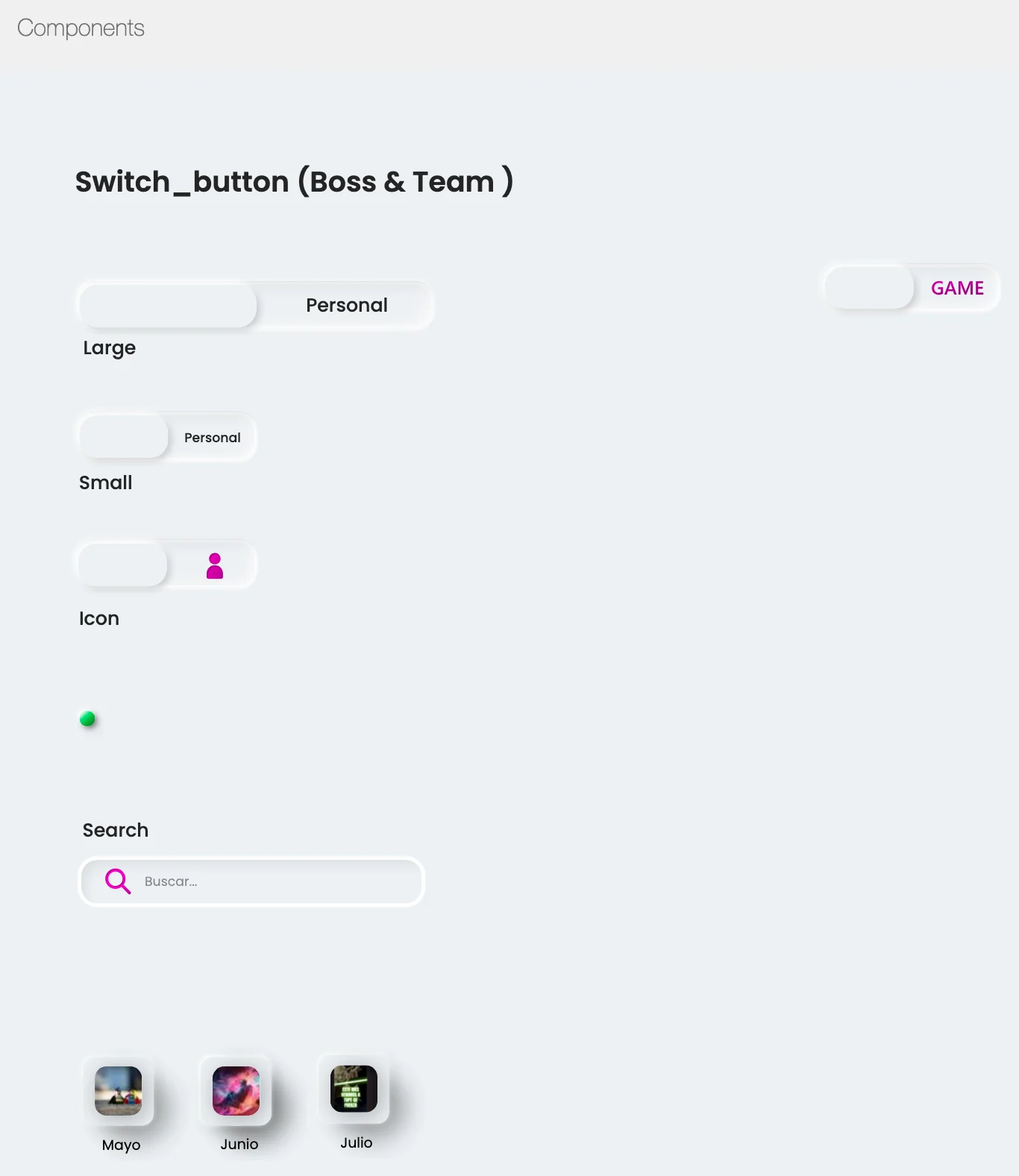
One of the components is not decorative: the «boss / team» switch_button. A coordinator is also an employee, and needs both views without leaving the application or switching account. Solving it as a system component — rather than as a separate screen — is what kept half the product from being duplicated.
Figma · Styles and components — Componentsswitch_button · fields · search
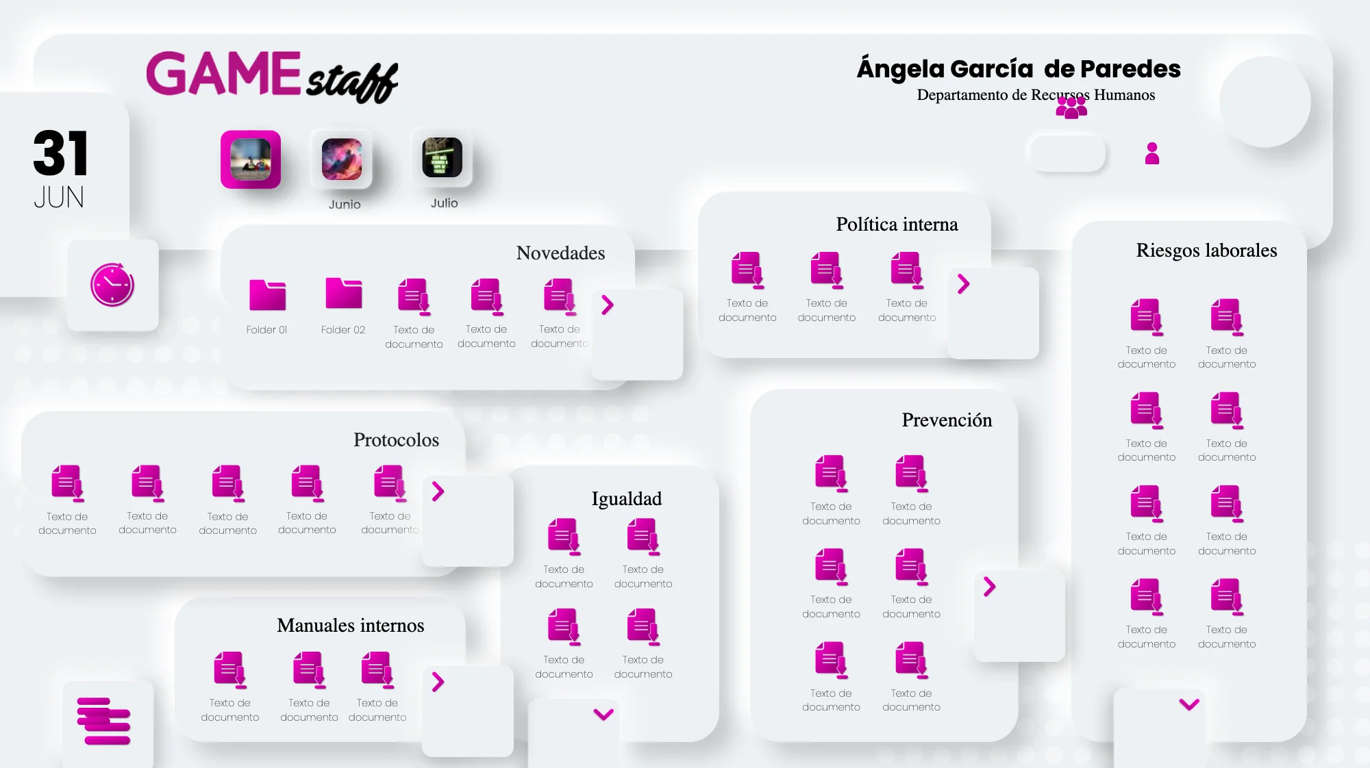
A dashboard you read at a glance
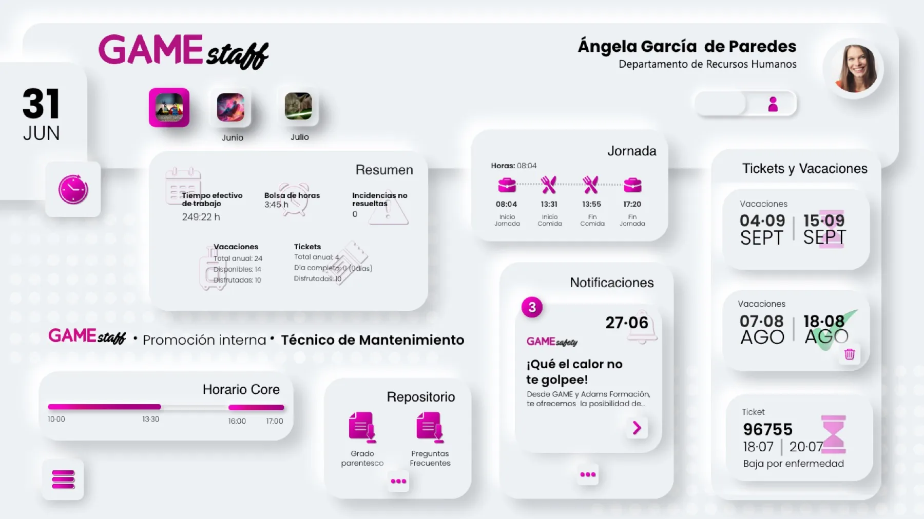
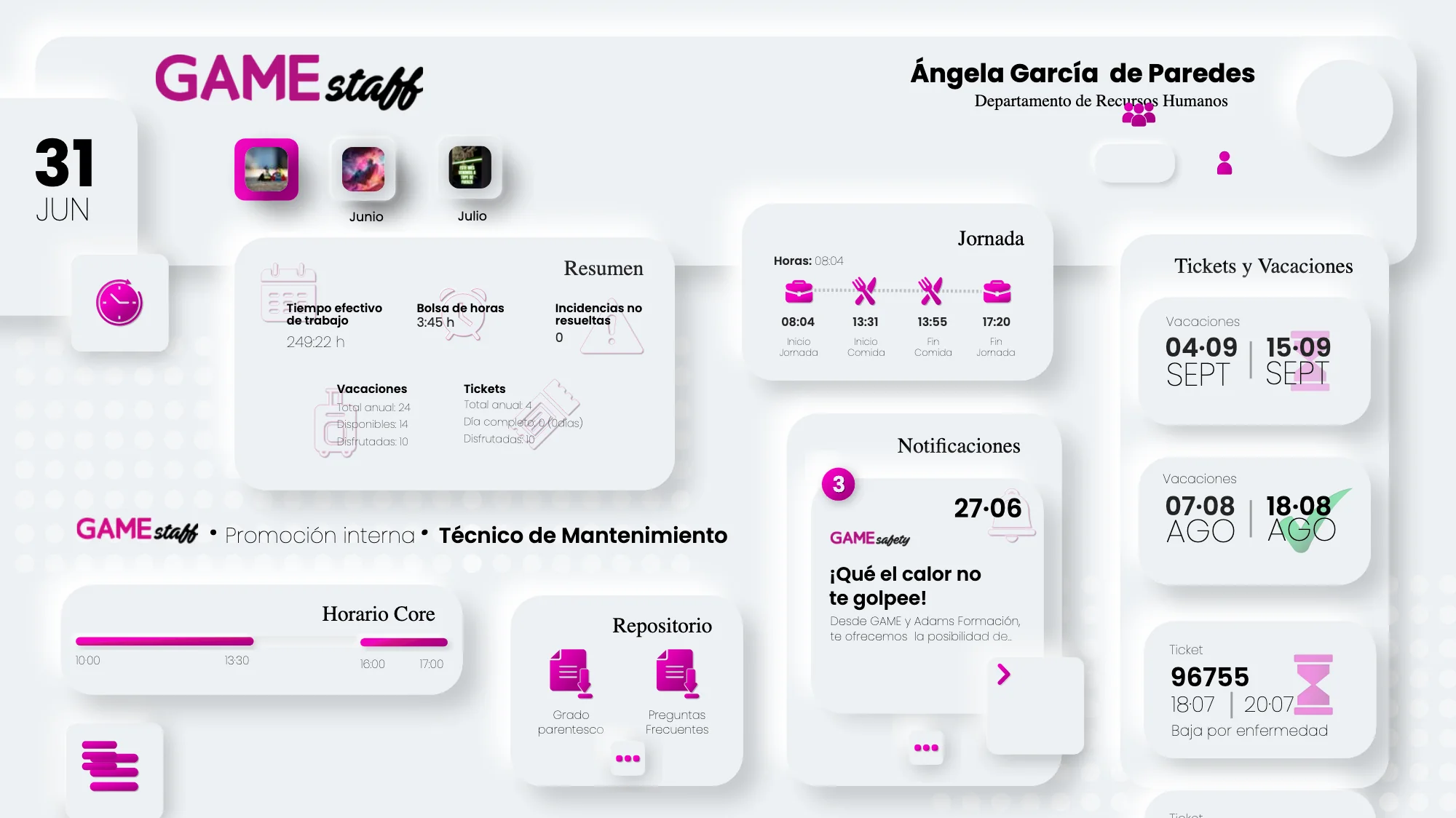
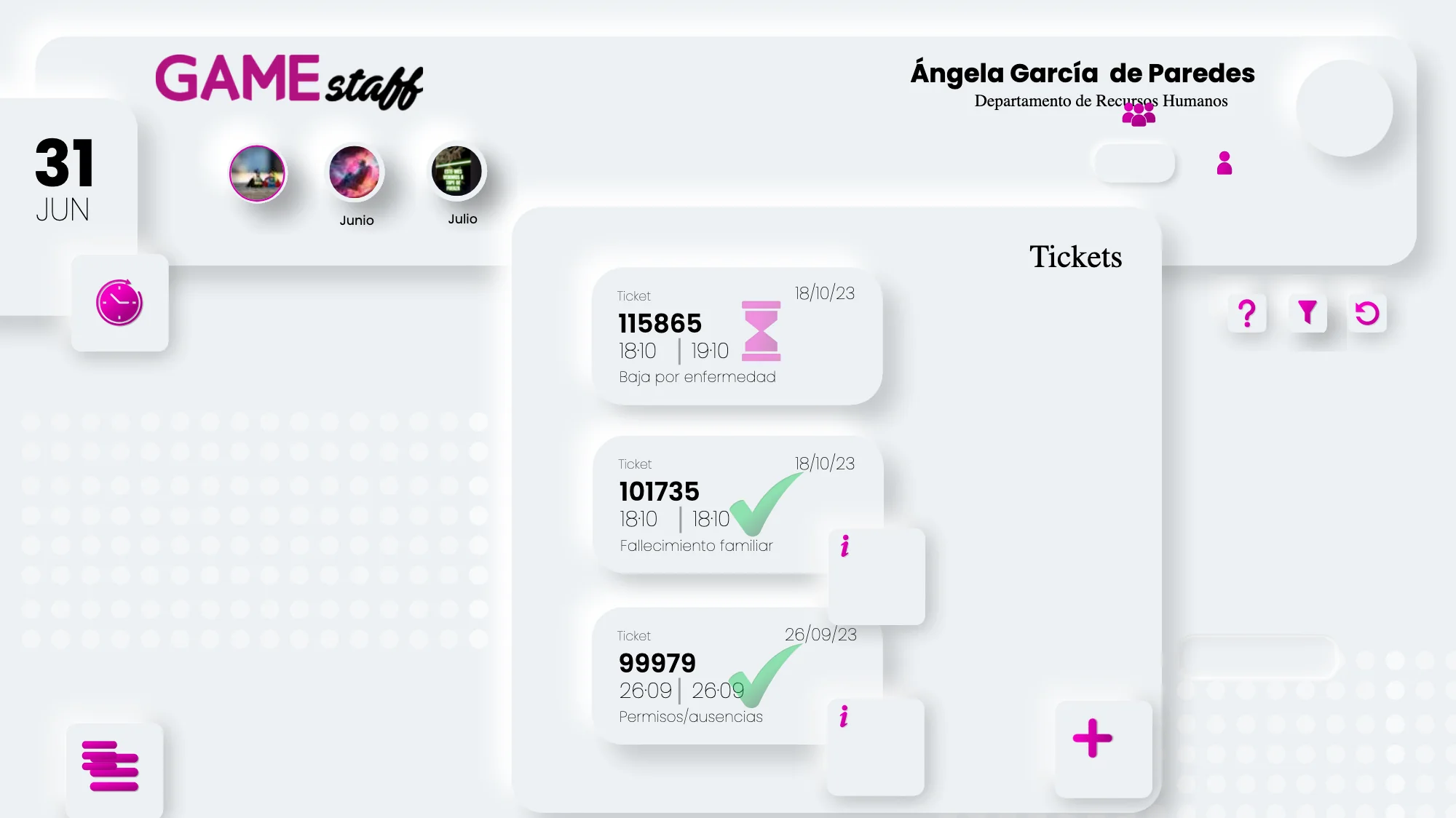
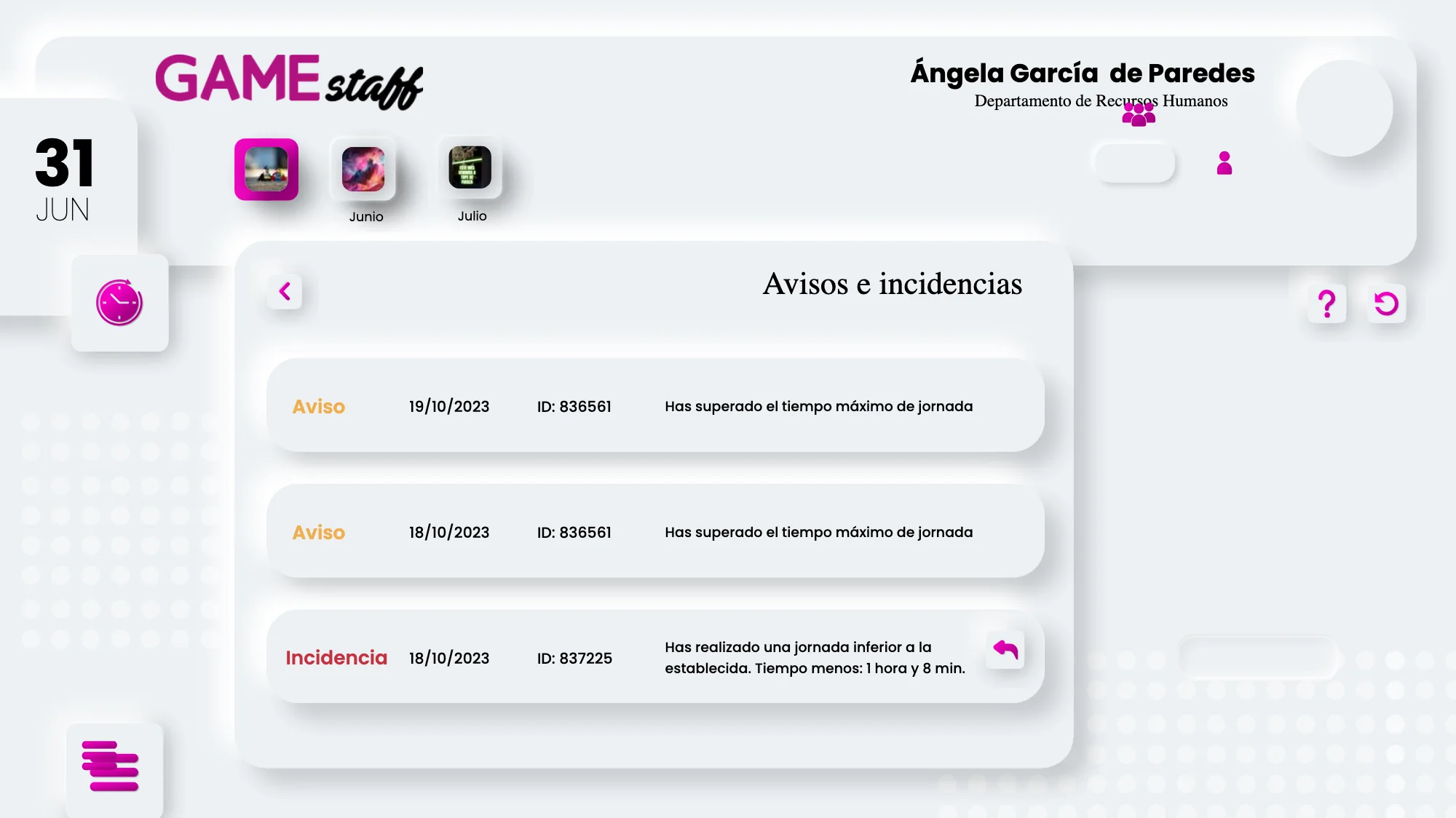
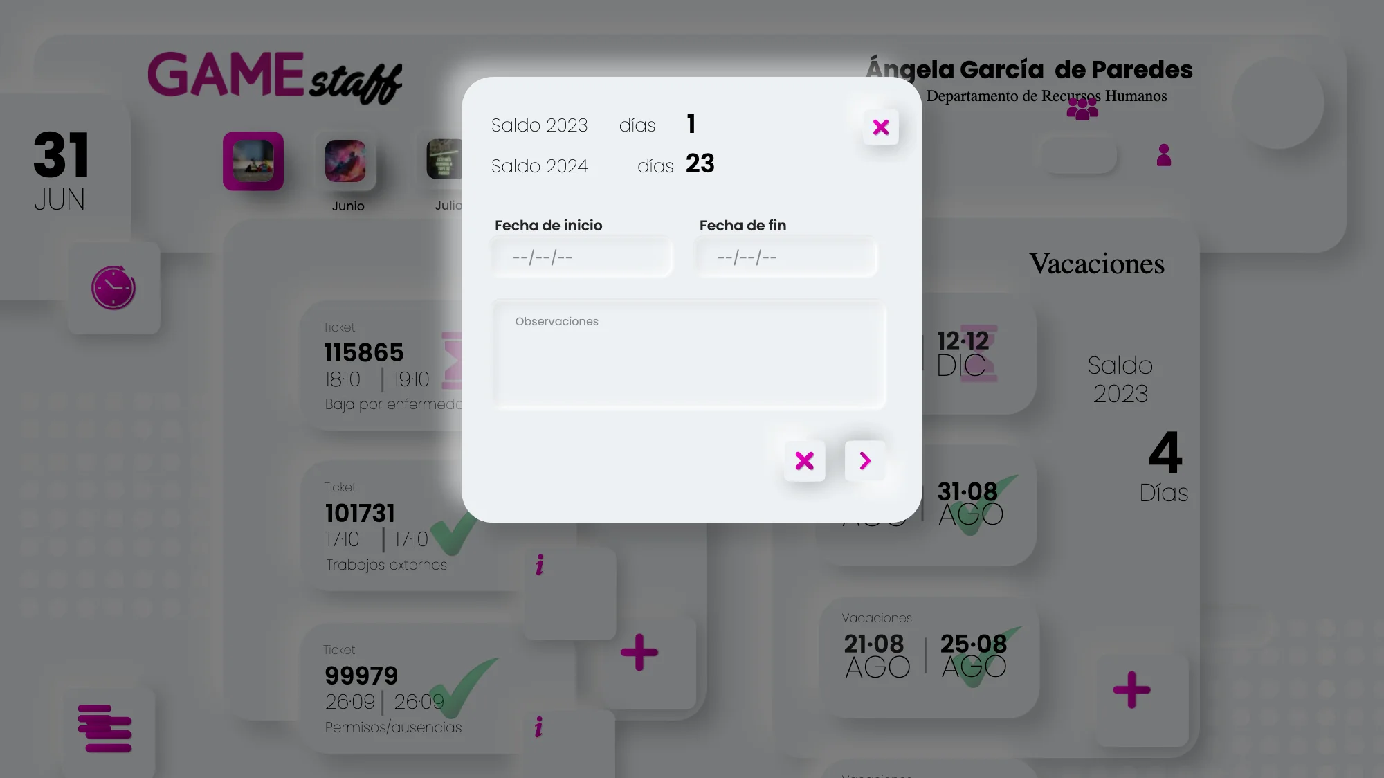
The main view orders the screen by urgency, not by department: today first — the shift in progress and the state of the team — and then the month: tickets, holidays and incidents.
Blocks are separated with soft surfaces and gentle shadows instead of rules and boxes. On a screen this dense with data an outline tires the eye, whereas relief lets it jump from block to block without having to read them all.
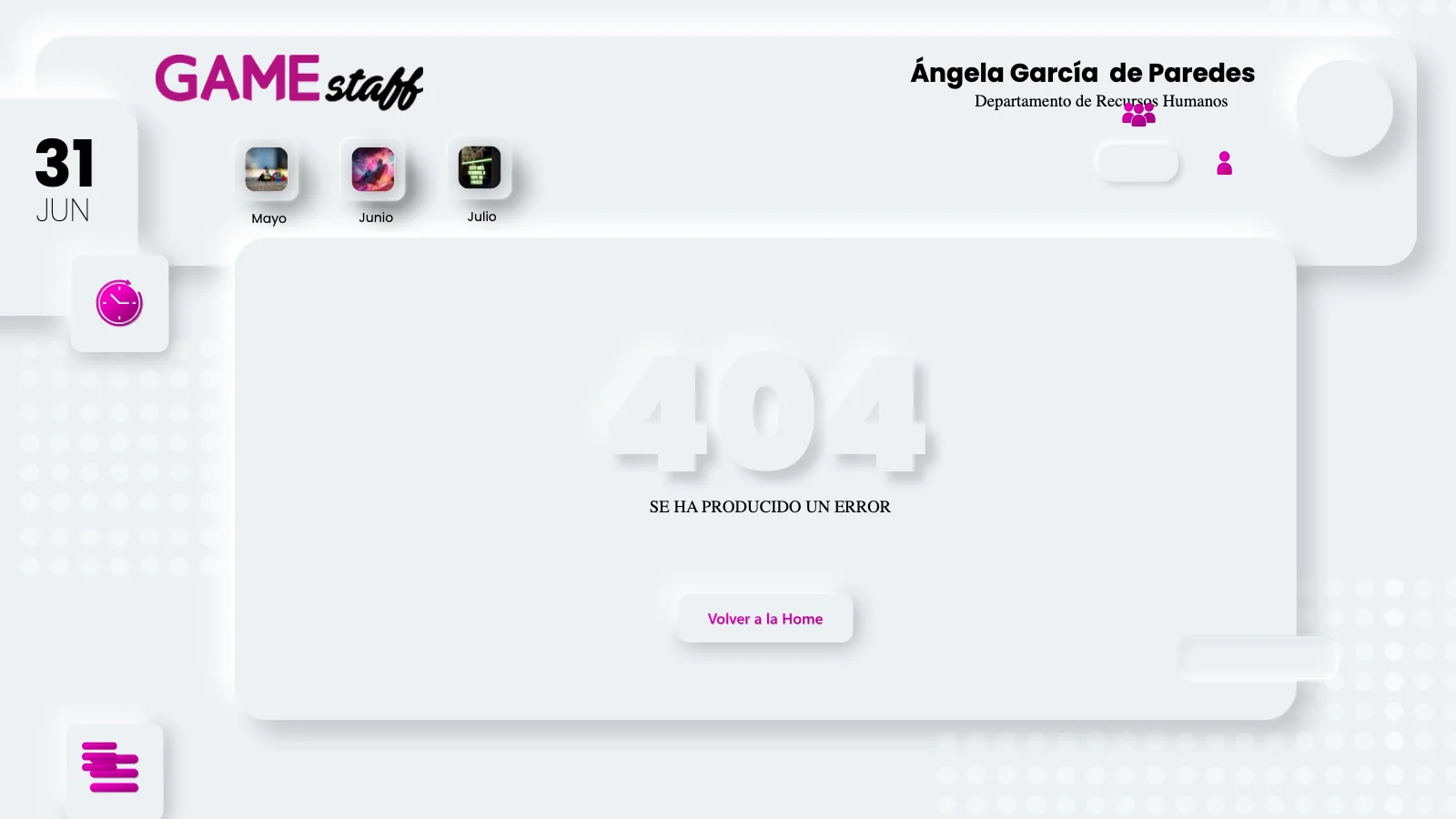
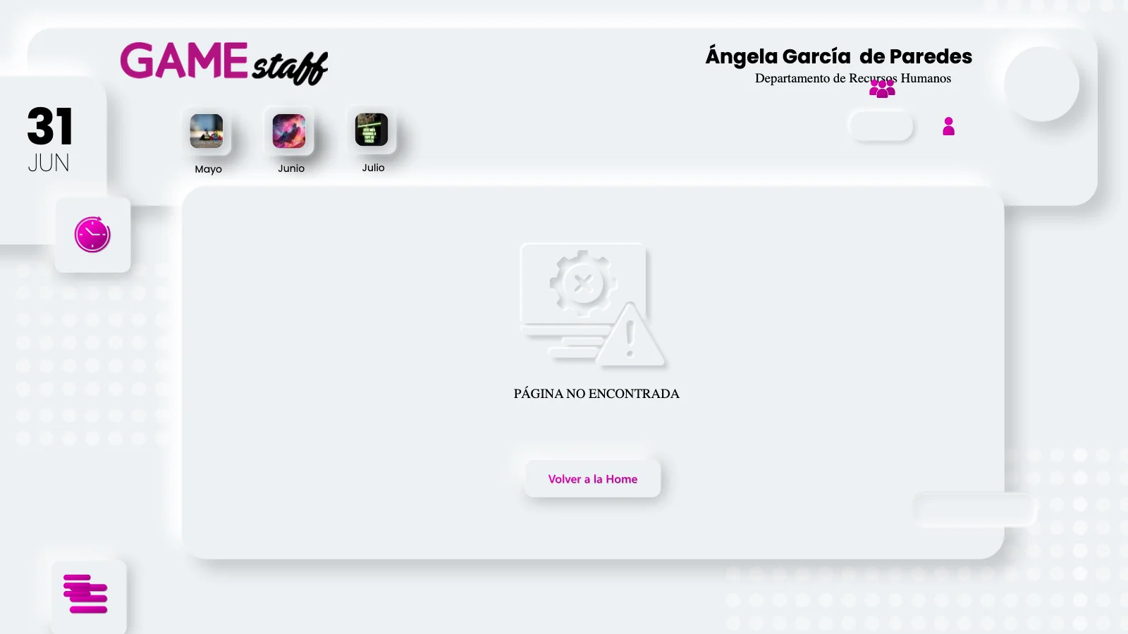
The screens that usually go undrawn
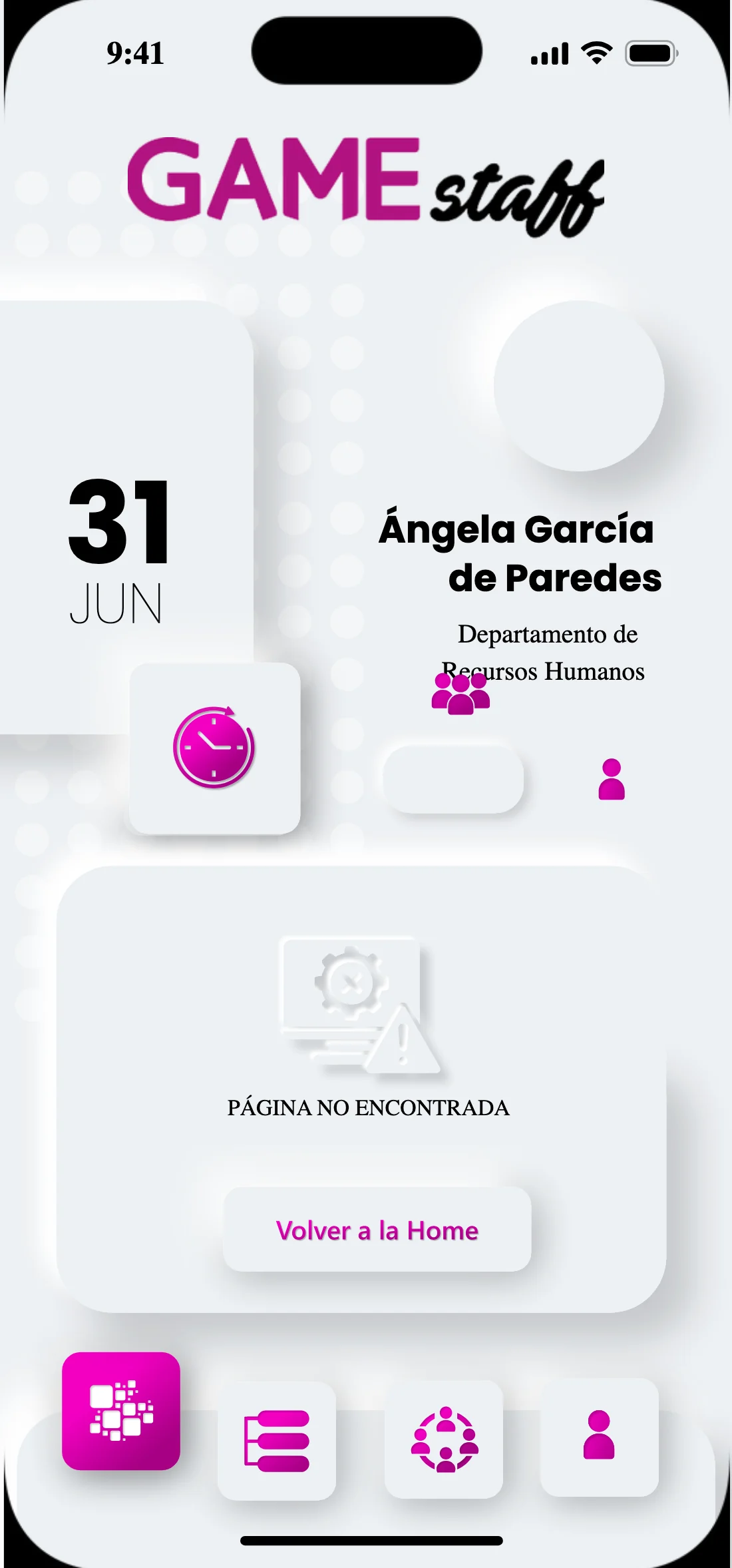
The 404 and the empty state are designed with the same care as the dashboard, and with a way out: both carry a button back to the home screen. An internal tool is precisely where someone gets lost most easily, because nobody chose to be there.
Clocking in on your feet, in thirty seconds
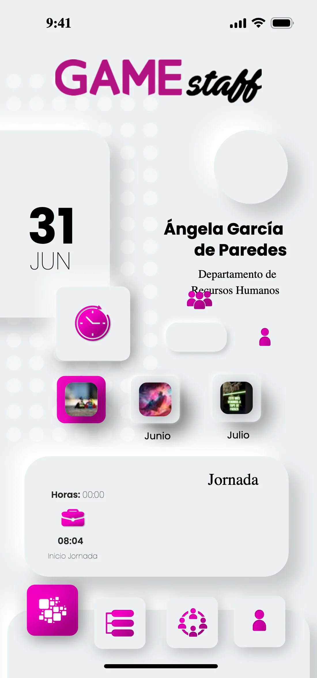
The app is not the dashboard shrunk. Shop-floor staff open it to do one specific thing and leave, so clocking in rises to the first thing you see and the rest is ordered as a list underneath.
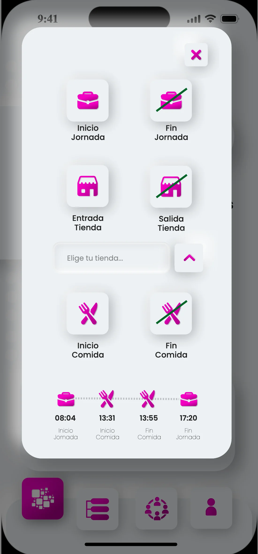
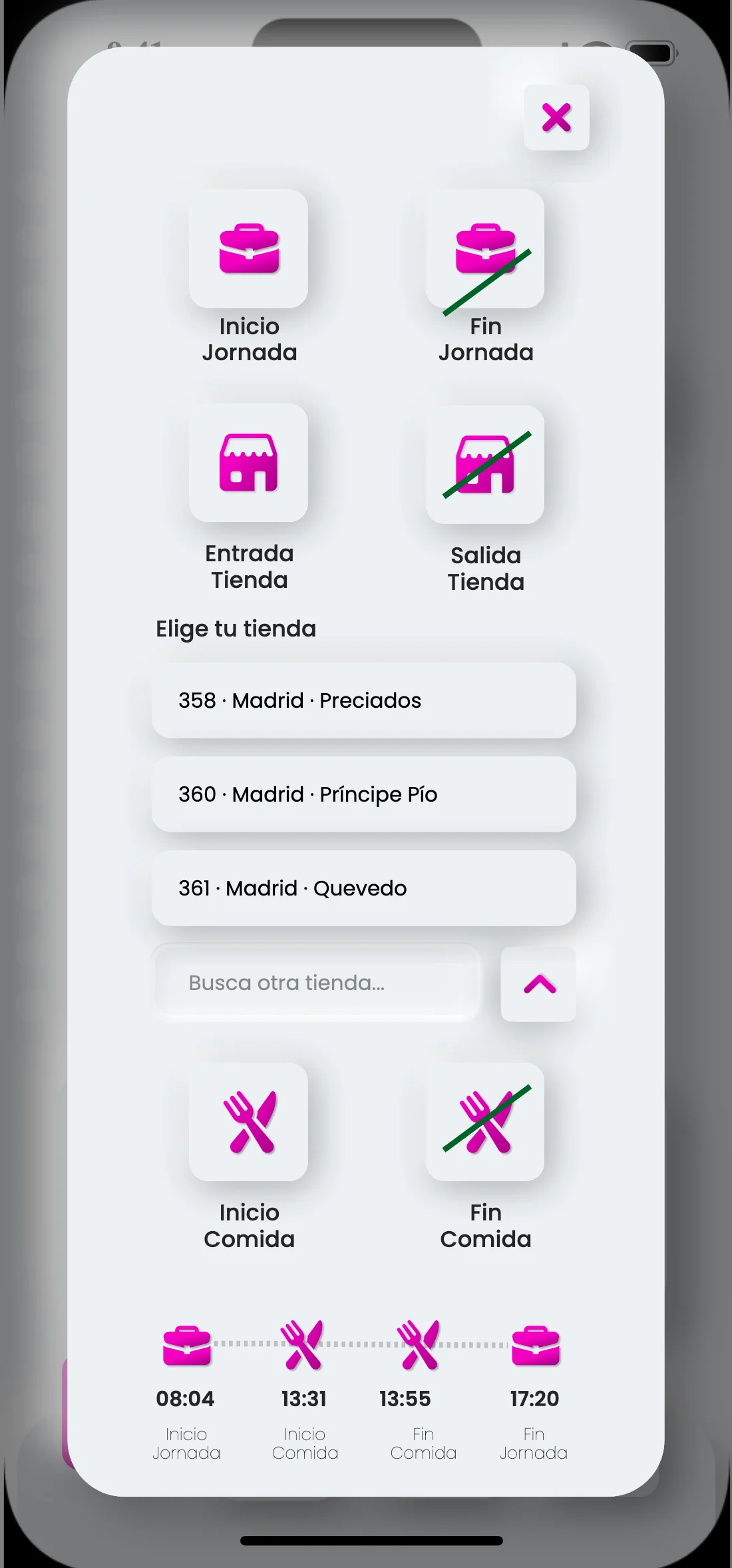
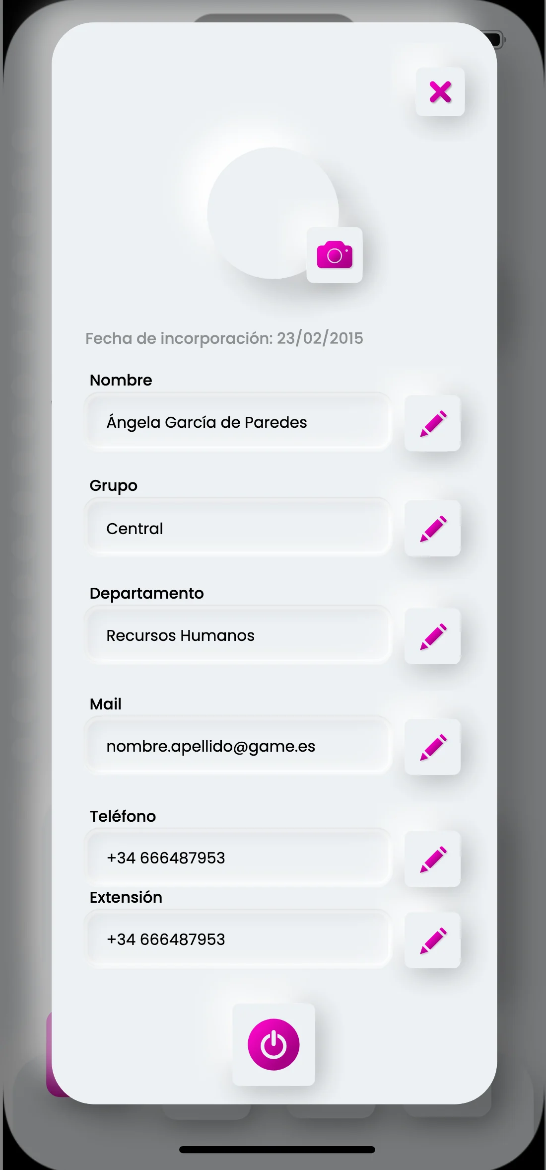
The clock-in screen splits the working day into six large buttons — shift start and end, store in and out, break start and end — with the time already marked under each. And because some people cover shifts across several stores, choosing the store is a step inside clocking in, not a setting buried in the profile.
Everything the app does, as one list
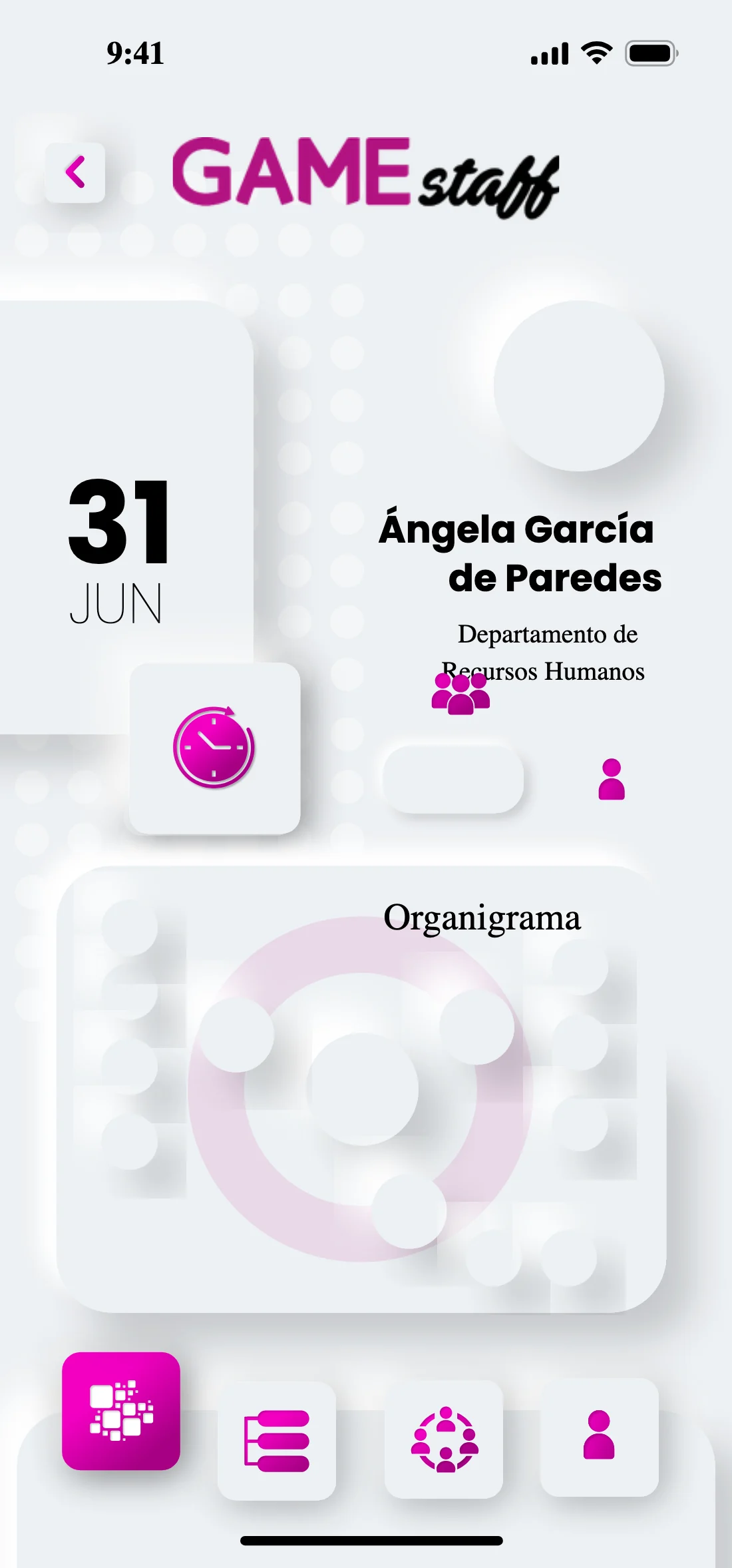
Schedules, notices, tickets, holidays, the META4 portal, notifications, whistleblowing channel, profile, information, training, internal promotion and GAME Flex. Twelve entries in a flat list rather than a three-level menu: on a shop floor, every level of depth is a reason not to open the application again.

It could be used before it existed
What you see in the two videos is not the built site: it is the Figma prototype. The screens are wired together in the prototype tab with their interactions in place, so that pressing play lets you navigate the design as though it were a working application.
That made two things possible. First, testing with six colleagues before a line of code was written: seeing whether clocking in was understood without being explained, whether the team view could be found, and fixing what did not work while fixing it still meant moving a layer.
Second, showing. I recorded these two videos myself to present to the board, to HR and to part of the IT department how GAME Staff had to behave — the employee clocking in, the coordinator reviewing who is on sick leave, who is working from home and who is in store, and holiday requests passing through their approval.
Why it was tested before the build and not after
The six sessions ran on the prototype, not on a build. A change in Figma costs an afternoon; the same change in built code costs a week and an argument. Testing at the only moment when the design is still cheap to move is what made sure that what reached the build stage was already a defended version.
And then I built it
The project did not end when the Figma file was handed over: I also did the entire front-end build of the application. The 156 screens I had designed, I took into code myself.
Designing and building the same thing changes both halves of the work. On one side the handover disappears: there is no delivery to interpret, no back-and-forth to establish how wide that gap is or what colour that border goes on hover, because the same person makes both decisions.
On the other, and this matters more, the system stops being a document and becomes the structure of the code. The three magentas, the two neutral scales and the four states were not copied screen by screen: they went in once, and everything else came out of them. It is the reason the button board covered the whole matrix from the start — when the person who is going to build it knows it will be her, writing down the disabled state on dark stops being diligence and becomes foresight.
Architecture and flows
Employee, coordinator and HR156 screens
Desktop, app and internal networkDesign system
Colour, type, buttons, icons, componentsFront-end build
The whole application, taken into codeA thousand people, one application
The whole company uses it: head office — management and employees —, logistics, the coordinators who rotate between stores, and the staff of some 230 shops of two or three people each. In all, a workforce of about a thousand people.
Before writing a line of code I interviewed HR and Management, and six colleagues tested the navigable prototype; what failed turned into concrete changes. And clocking in, holidays and sick leave stopped living in separate systems.
People on the payroll
Head office, logistics, coordinators and some 230 shopsSystems unified
Clock-in, holidays and sick leave, no longer separateColleagues in the test
With concrete changes drawn from what failedNo handoff
Design, research and front-end build, the same personNext in Product design UX/UI
GAME TV · Retina
A social network that never leaves the company
HR asked for this part, and it was designed from scratch: a social platform that runs inside the company, so that any employee can publish without going through a newsletter or a departmental email.
What makes it a company tool rather than a copy of Instagram is the reach of each post: you choose whether it goes to all of GAME, to GAME Central only, or to GAME Stores only. It is a single control, and it is the one that stops an internal note from head office arriving as noise in 230 shops.