Work / Graphic / EdG · Business card
A design system that fits inside 55 × 85 mm
Project 21 of 28 in the archive 04 of 11 in Graphic design See the whole discipline ↗
The brief
I make a living from three trades most people hire separately: product design, front-end and graphics. In a meeting that takes two minutes to explain. On nine centimetres of card it does not: either you pick one and lie by omission, or you list all three and the card turns into a miniature résumé.
The card had to solve that, and a second, less obvious thing: prove the craft in the same object that advertises it. Nobody reads a case study off a business card; they look at it for three seconds and decide whether the website is worth opening. Those three seconds are the brief.
The idea
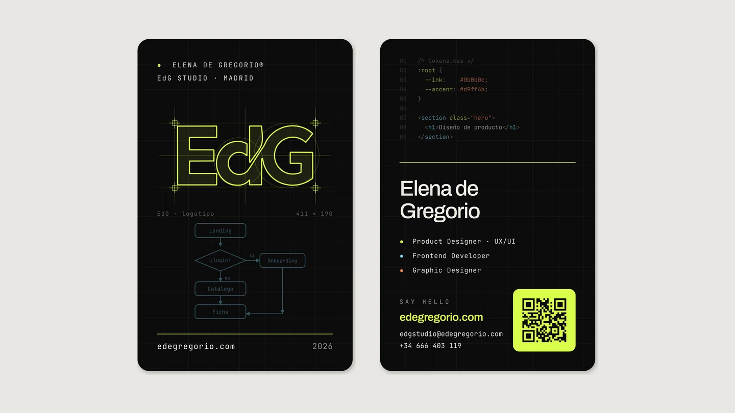
The card does not represent the design system: it is a printed instance of it. Nothing on it was invented for the occasion. The background is --ink, the accent is --accent, the three dots beside the roles are the three discipline colours the archive already uses on every tag, and the two typefaces are the ones you are reading right now.
Two decisions follow from that and order everything else. First: the card is dark, like the site, even though a dark card costs more to print and shows every fingerprint. Second: each face shows a trade at work instead of naming it — the front is a construction drawing, the back is code — and the third trade, graphics, is the object itself.
The front: the logo as a drawing
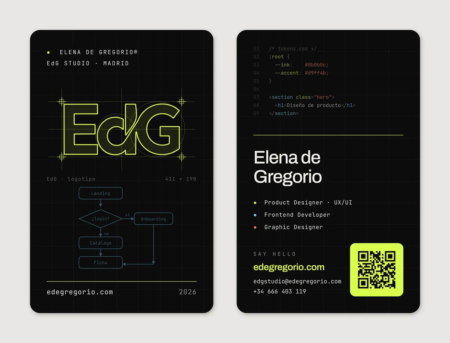
The front shows the logotype half-built: the grid left visible, registration marks in all four corners, the construction circles of the d and the G still there, and a caption giving the drawing its real measurement, 411 × 190. It is a card that shows the scaffolding instead of the building, because the scaffolding is what gets hired.
Below it, a flow diagram — Landing, login?, Onboarding, Catalogue, Product page — drawn in the front-end blue. Four boxes and two branches: enough for someone who works in product to recognise the trade before reading a single word, and enough for someone who does not to read it as a graphic pattern.
An accent rule closes the face, with the domain on the left and the year on the right. That rule is the same device that separates blocks on the website; here it works as a waterline.
The back: the code and the person
The back opens with nine numbered lines of tokens.css, syntax-highlighted for real: the declaration of --ink and --accent, and below it a hero section with its h1. This is not typography dressed up as code — it is the fragment that actually opens this site's stylesheet, and the two values it declares are the two colours the card itself is printed in.
Then the rule, and from there the classic hierarchy of a business card takes over: the name large in Archivo, three roles in mono each with its coloured dot, the contact details, and an accent-green QR that opens this portfolio —edegregorio.com, the site you are on—. Name, trade, contact, way in. The experimental half is at the top; the half that has to work across a meeting table is at the bottom.
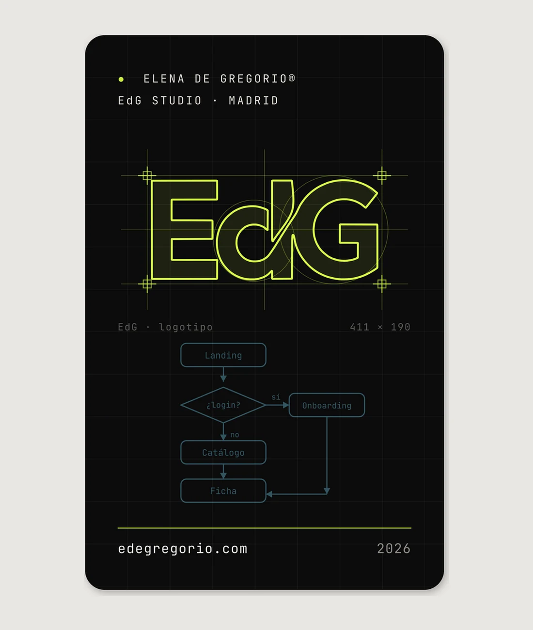
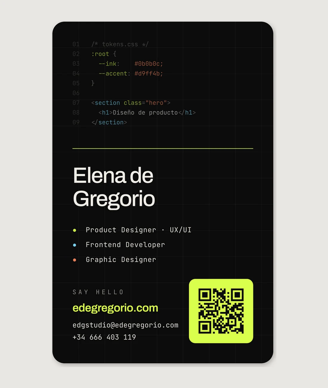
tokens.css on top, the usual hierarchy underneath, and the QR that opens the portfolio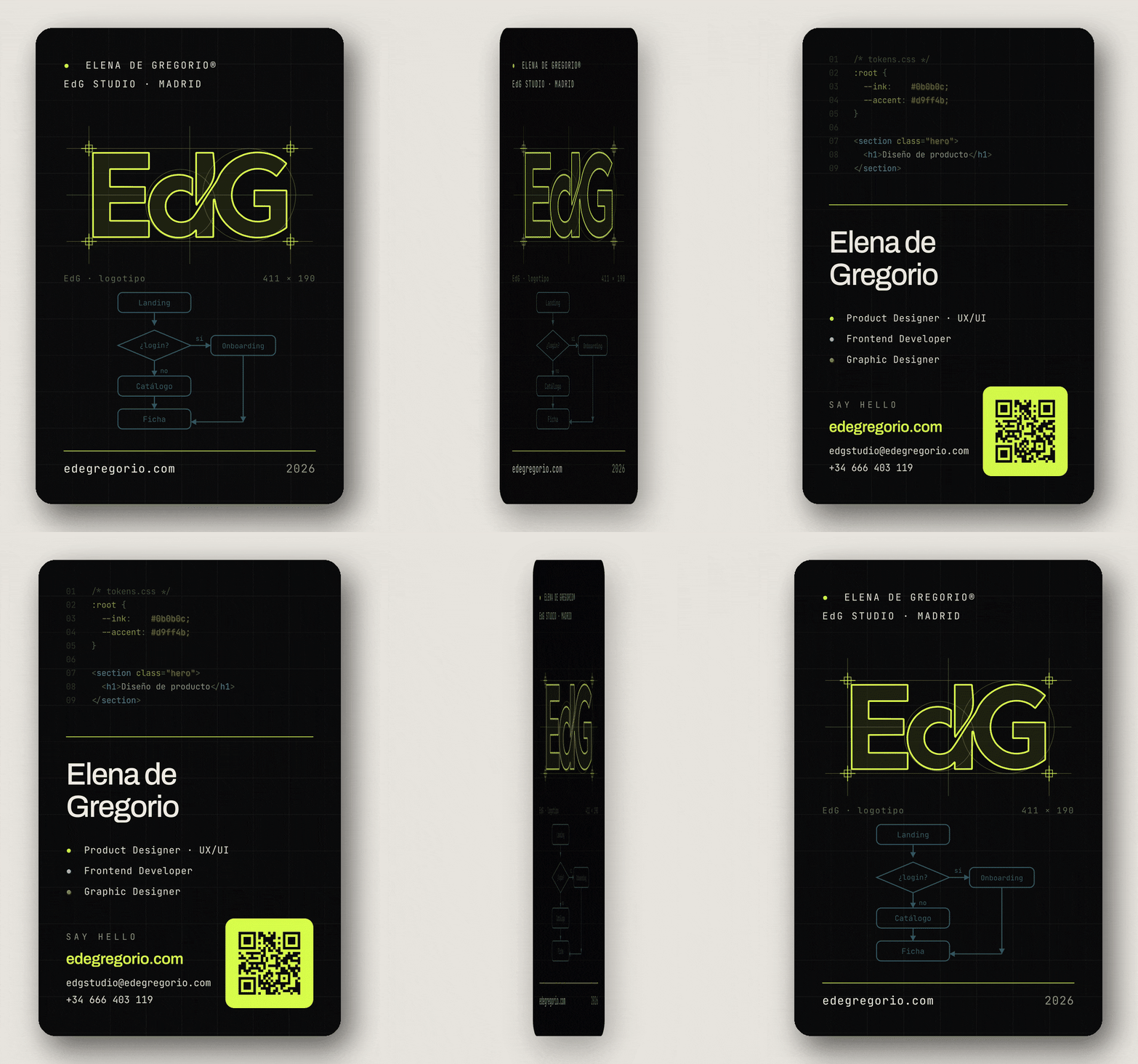
The QR opens this portfolio
The green square on the back is not filler decoration: it points at edegregorio.com, this very portfolio. It is the only element on the card that does something as well as saying something, which is why it is printed in the accent rather than in grey: it is the bridge between the paper and the archive of projects you are reading now. The domain is written out underneath, for anyone who would rather type it or has no camera to hand.
Three dots you already know how to read
The three roles carry no icons and no colour labels invented for paper. They carry the same three colours this site's archive uses on every case, every filter chip and every breadcrumb. Someone who gets the card first and opens the site later arrives with the colour code already learnt; someone who does it the other way round, likewise.
#d9ff4bAlso the brand's global accent: rules, links and the QR that opens the portfolio#7ee0ffThe flow diagram on the front is drawn in this blue#ff8a5cThe third dot; on this piece the discipline is the whole object#0b0b0cThe background of both faces, the same as the site in dark modeWhat paper cannot give you
The accent green #d9ff4b lives outside the CMYK gamut: in four-colour process on coated stock it comes out muted, closer to olive than lime. That is acknowledged and documented in the artwork file, with two possible outputs — plain four-colour, or a fluorescent spot ink for the accent — depending on what the job justifies paying for. Promising on paper a colour that only exists on screen is exactly the kind of detail that separates a design from print-ready artwork.
From screen to paper
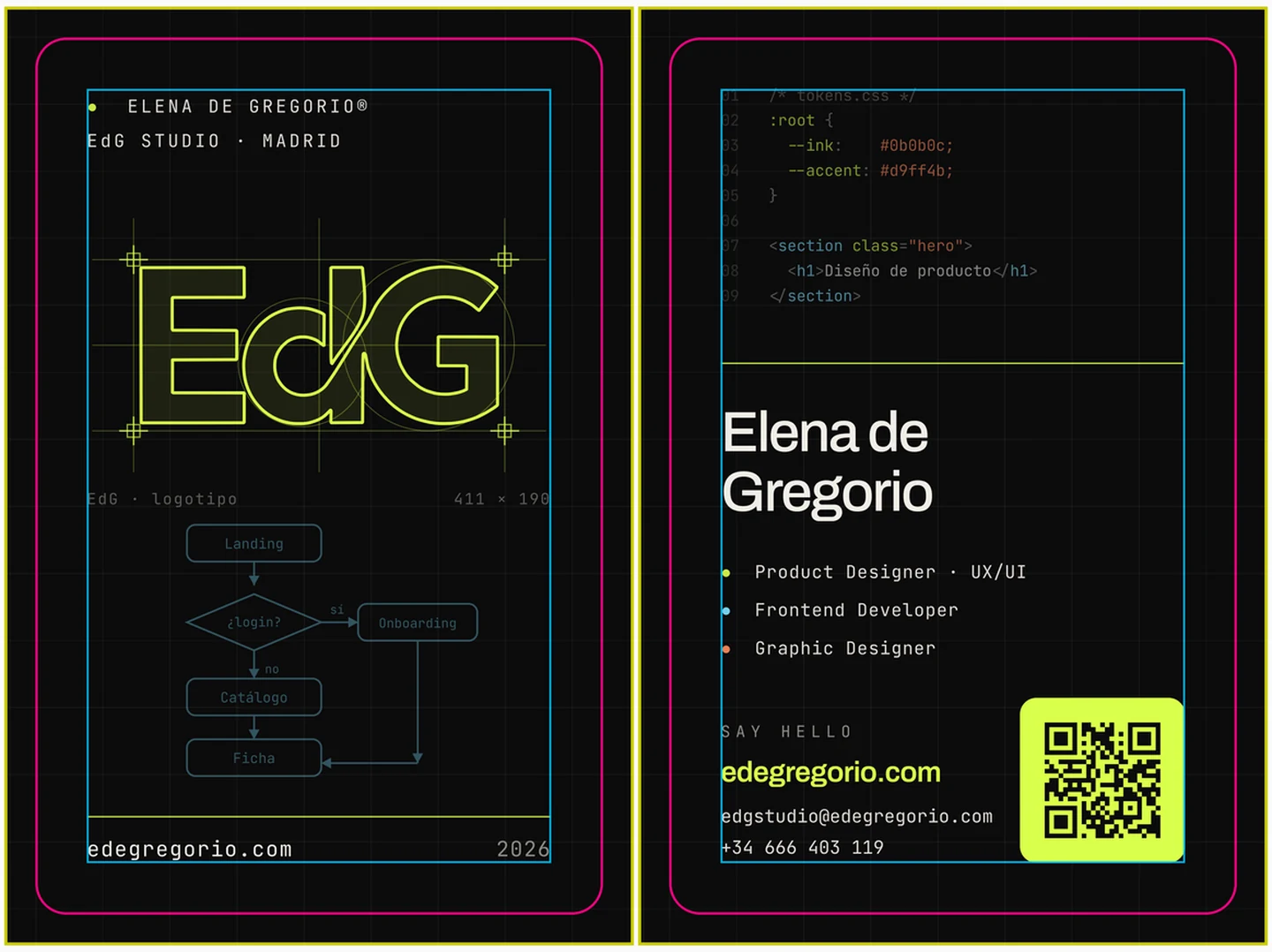
A handsome design that reaches the printer with no bleed, no safe margin or still in RGB is not a design: it is the printer's problem. The artwork was closed with the same checks a client's job would get.
| Parameter | Value | Why |
|---|---|---|
| Trim size | 55 × 85 mm | Portrait, so the name and the QR sit in the half you see as you pull it out of a wallet |
| Document with bleed | 61 × 91 mm | 3 mm per edge; with a full-colour background, trimming without bleed leaves a white sliver |
| Safe margin | 5 mm from the trim | No contact detail falls inside the guillotine's tolerance band |
| Colour space | CMYK, no leftover RGB | The press PDF holds no RGB object at all; the conversion is decided here, not in the supplier's RIP |
| Background black | Rich black | 100 K alone across a full flood reads washed out and grey; a rich build gives it density back |
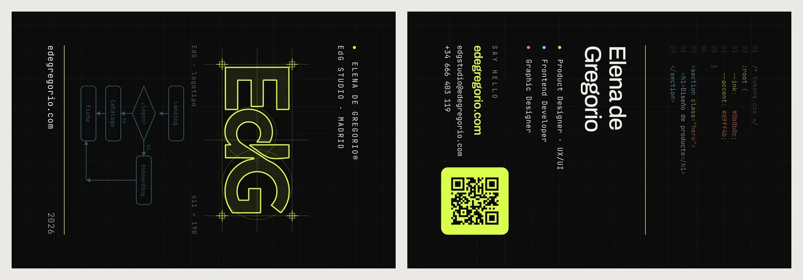
| Landscape version | 85 × 55 mm | Same grid rotated, for suppliers who only run landscape |
| Imposition sheet | Front and back paired | Delivered already imposed, so nobody has to guess how the faces pair up |
Where it comes from
This project — my own portfolio — is split across three disciplines, and this page is one of the three. The diagnosis and the design of the system are in the product UX/UI audit; the system written and documented is in the EdG Design System page, with its 37 components and 57 tokens. This card is the third part: that same system, off the screen.
If you want to see where the #0b0b0c and the #d9ff4b printed on the back come from, they are declared — and copyable — in the library. The control on the right jumps between all three.
The library that declares these colours
The two values the card prints on its back are real tokens, not a quotation. They can be opened, searched and copied whole on the front-end development page, along with the other 55 and the 37 components this site is built from.
Next in Graphic design
KAI · Kallisto AI