Work / Product UX/UI / GAME TV · Retina
The stores' channel, run from one desk
Project 09 of 28 in the archive 09 of 09 in Product design UX/UI See the whole discipline ↗
Hundreds of screens and no remote control
Every GAME store has screens playing trailers, releases and promotions. What it didn't have was a central way to govern them: deciding what plays, in which stores and between which dates was a process scattered across emails, shared folders and goodwill.
Retina was born to close that gap. It is the GAME TV platform: the marketing team and merchandising leads assemble a sequence — video, image and audio on a timeline —, pick the stores or groups that will play it, and give it a start and an end date. The system does the rest.
The design challenge was the balance: underneath, it is a video editor, with channels, tracks and per-clip properties; on the surface it had to be usable by someone whose job is not editing video, but making sure Friday's campaign reaches 230 stores at once.
Screens designed
With their states: lists, empties, modals and errorsModules
Editing, sequences, stores, files, templates and usersUser profiles
Administrator and merchandiser, with different permissionsAccent colour
A neon teal over a near-black interfaceWhy the interface is dark
It is not an aesthetic preference: it is the convention of video tools, and here the content is the star. On a near-black background, the preview and the thumbnails show the exact colour they will have on the store screens, and the interface disappears around them.
A short system, fixed before the screens
Before drawing the editor, the foundations were fixed in Figma: colour, typography and components, each on its own board. With 47 screens ahead, every decision taken once is a decision that doesn't have to be argued 47 times.
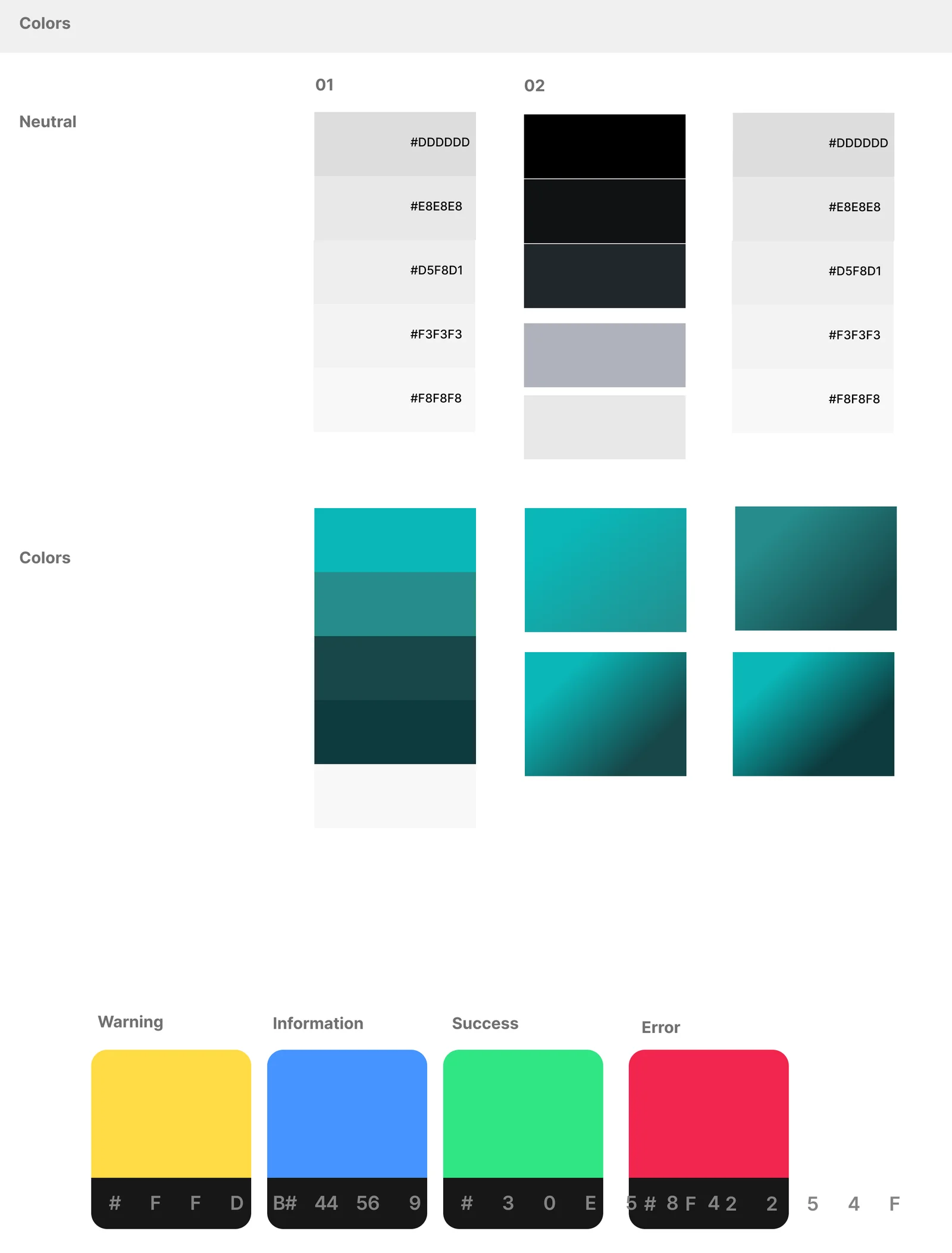
The palette is deliberately narrow: two neutral scales — a dark one for the tool and a light one for surfaces and documents —, a single teal accent that marks everything actionable, and the four status colours. Nothing else.
Colour
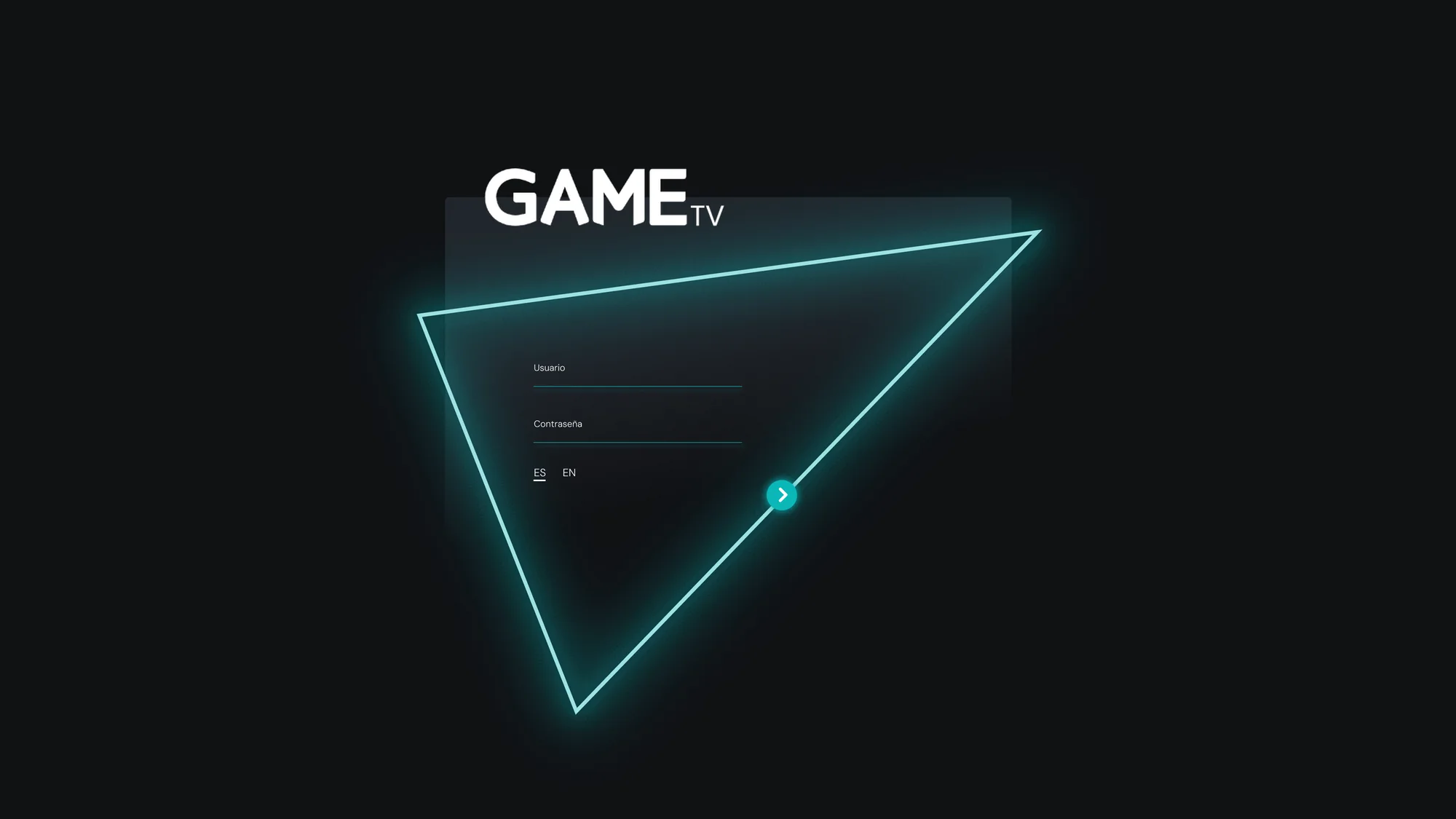
The teal is the GAME TV brand and behaves like a neon light: it is the stroke of the login triangle, the outline that runs around the properties panel, and the colour of everything that can be clicked. The dark neutrals build the tool; the light ones, the surfaces that rise out of it.
#0AB7B8Actions, links, active state and the neon#268C8CHover and secondary elements#174749Tinted surfaces and gradients#0E3B3EThe dark end of the gradients#000000The canvas of the whole tool#101114Panels and bars#21262CCards, rows and fields#AFB2BCSecondary text on darkThe four statuses
On a broadcast platform, almost everything that matters is the status of something: a sequence on air, an upload in progress, a date-overlap warning, a file error. Four colours, always the same, so the eye never has to learn anything new from one module to the next.
#30E584On air · upload complete#FFDB45Pending · date overlap#4694FFNotes and neutral states#F2254FFile failure · sequence downTypography
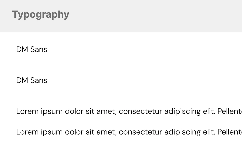
One family for the whole platform: DM Sans. Geometric and large of eye, it holds up well at the small sizes of tables and store codes, and its roundness softens an interface that is already dark and technical by default.
The colour board, with both scales
The board doesn't show loose colours: it shows both full scales and the brand gradients, each with its value written beside it. The teal gradients — from #0AB7B8 to #0E3B3E — are the ones dressing the audio thumbnails and the import area, and they are defined here once, not improvised screen by screen.
Figma · Game TV Design — Colors2 scales · 1 accent · 4 statuses
Typography documented, not assumed
DM Sans, with its weights and its paragraph sizes, on its own board. It looks like little and it is exactly what whoever builds it later needs: knowing which family, which weights and what each one is for, without reverse-engineering screens.
Figma · Game TV Design — Typography1 family · 3 weights
The neon is not decoration: it is hierarchy
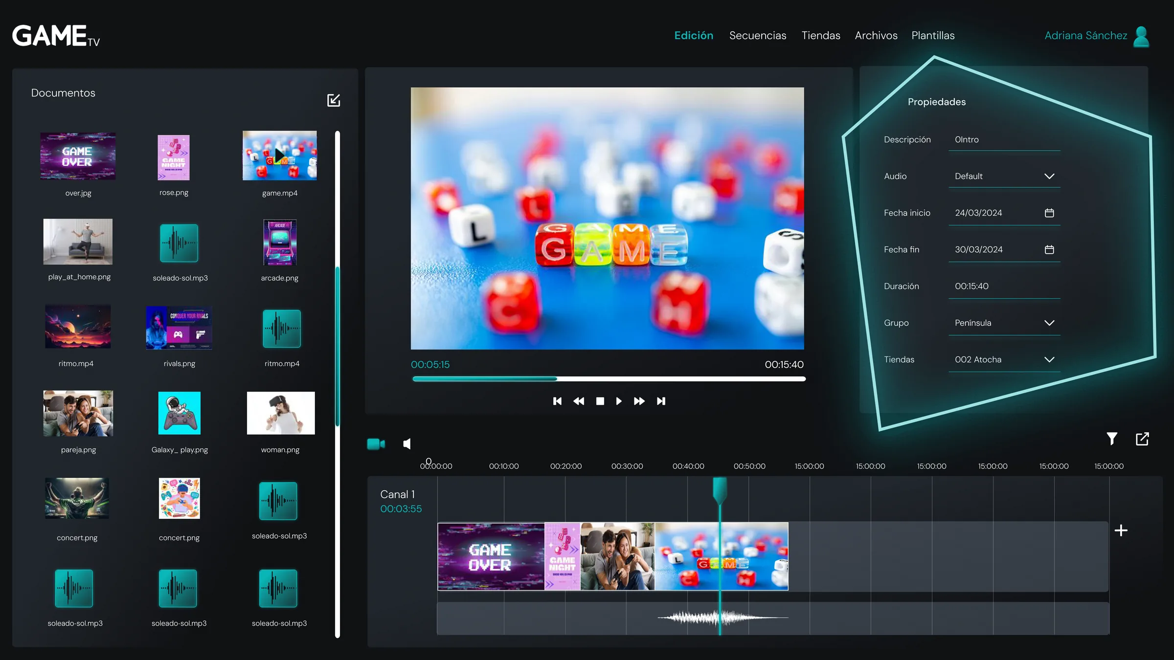
The neon stroke drawing polygons across the interface — the login triangle, the pentagon around the properties panel, the frame of the modals — does a concrete job: it marks where the screen's action is. In a dark, dense tool, it is the equivalent of underlining with light the one area that matters right now.
A video editor that doesn't intimidate
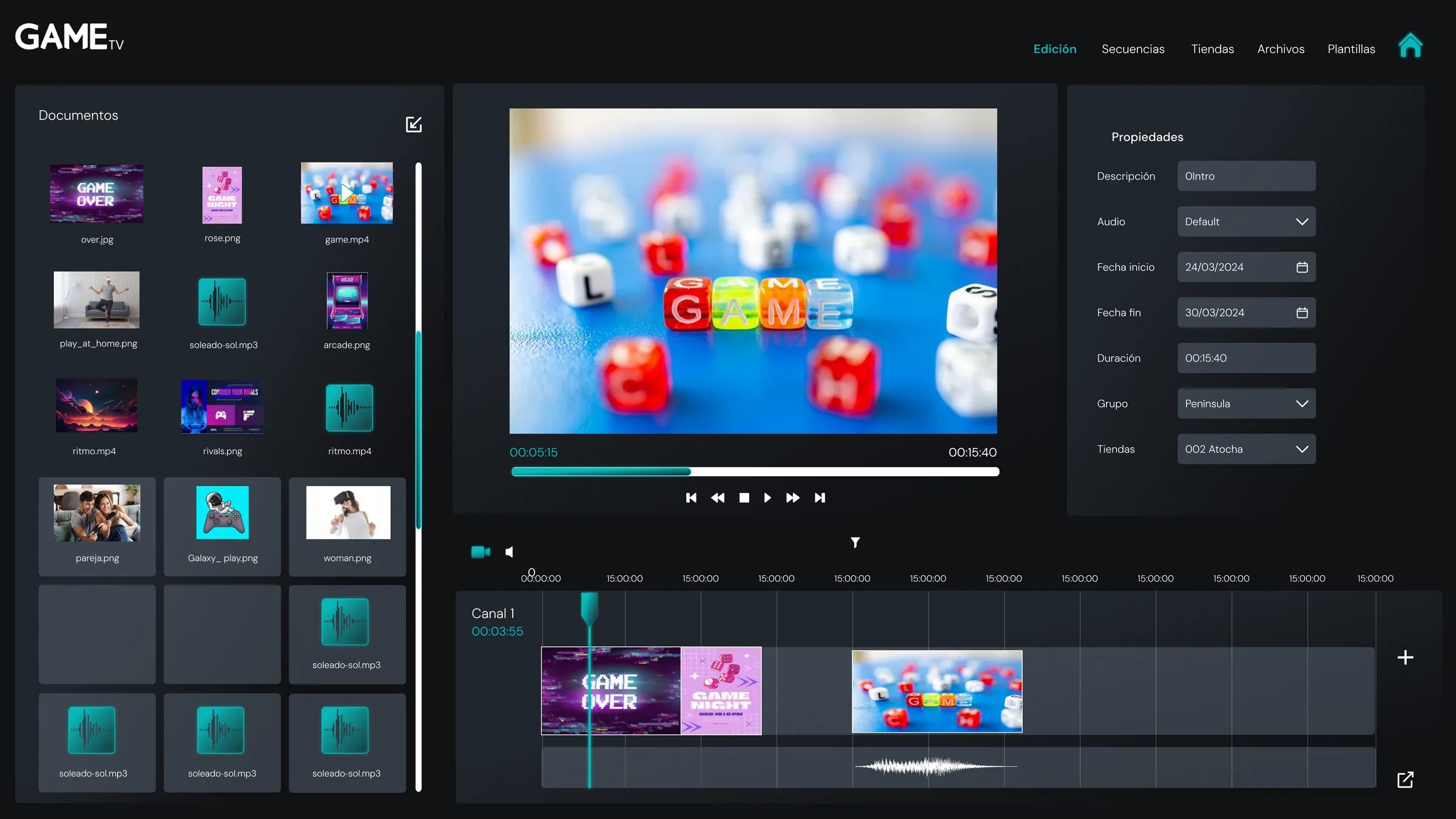
Retina's central screen is laid out like any professional editor — and at the same time, like none of them. On the left, the documents: everything imported, each with its thumbnail. In the centre, the preview with its playback controls. On the right, the clip's properties: start and end dates, duration, group and store. At the bottom, the channel: the timeline where clips are dragged, ordered and trimmed.
The difference from a real editor lies in what isn't there: no effects, no transitions, no colour grading. Everything that was removed is a mistake that can no longer be made at eleven at night before a launch.
Video, image and audio with the same gesture
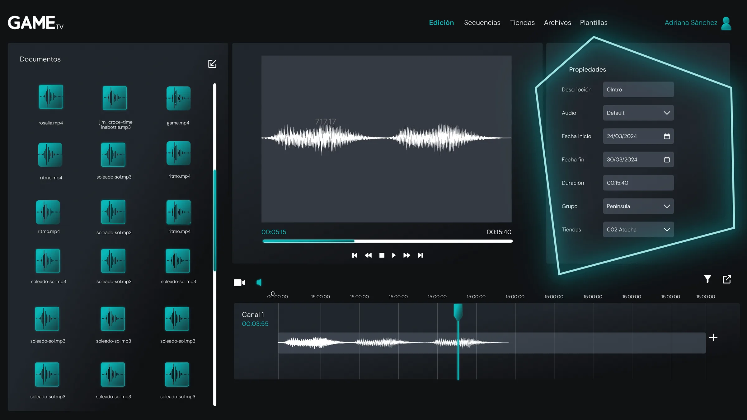
A video clip, a still image and an audio spot behave the same way: they are dragged from the documents panel onto the channel, and their properties are edited in the same right-hand panel. Learning one module is learning them all — the audio track only swaps the preview for its waveform.
From the cutting desk to 230 stores
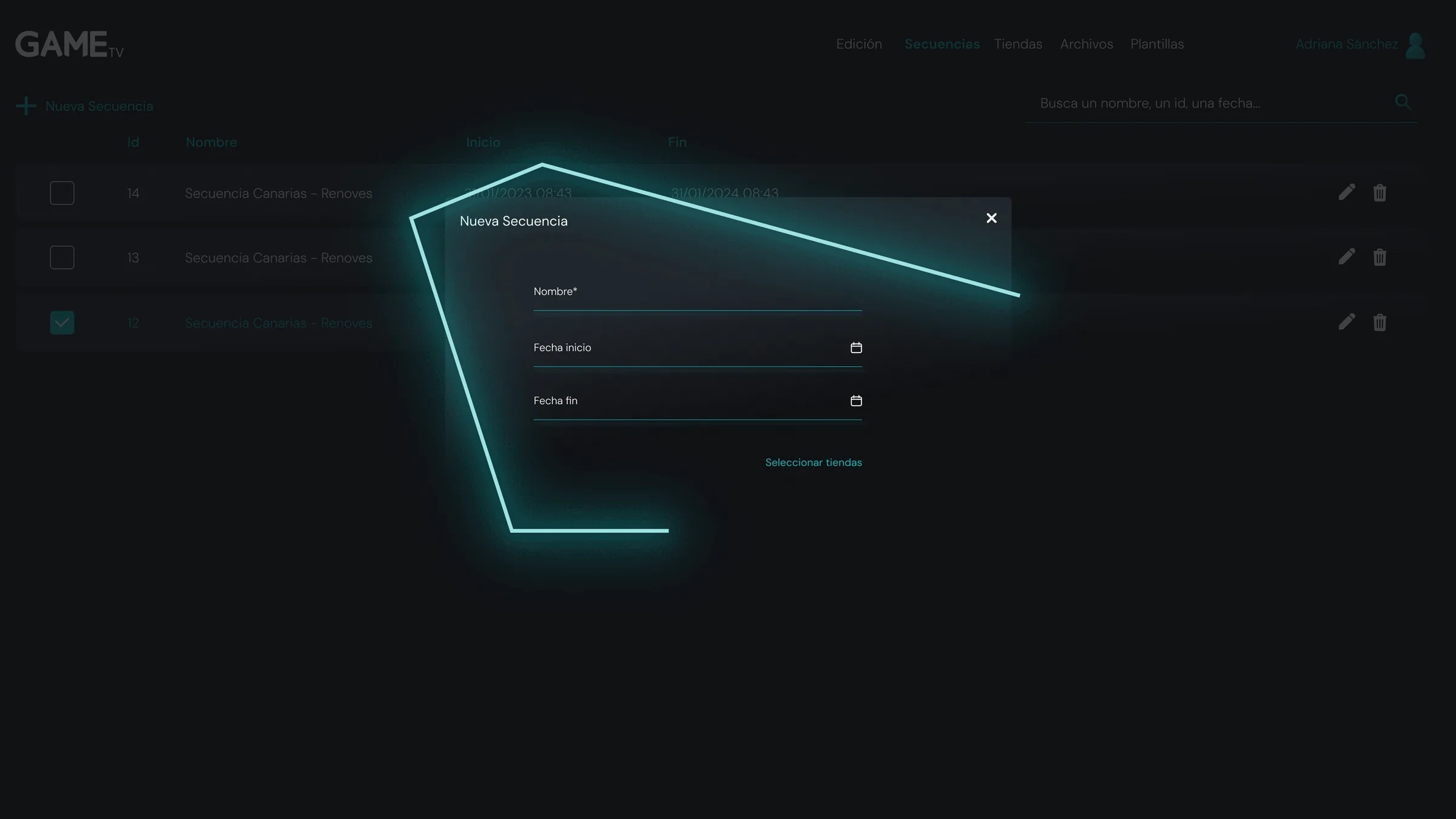
A sequence is Retina's unit of work: an assembly with a name, a start date and an end date. The list shows them as a flat table — id, name, start and end — with search by name, id or date, because that is how the team asks for them.
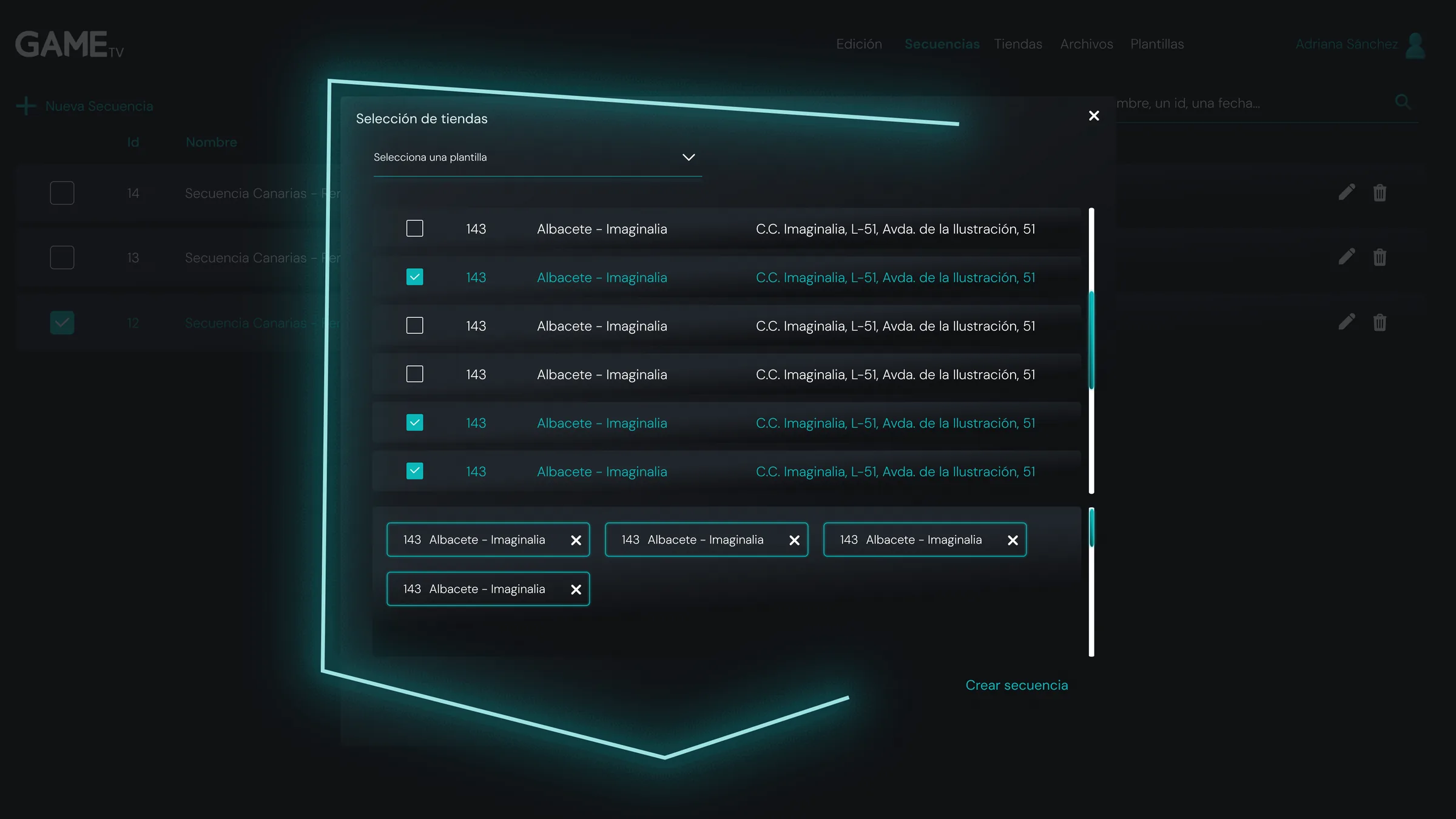
Creating a new one asks for exactly three fields, and the fourth step is the one that matters: choosing the stores. The selector lets you tick store by store, apply a saved template or reach for groups — Península, Canarias — and keeps the chosen ones in sight as chips that come off with a single cross.
The decision that prevents the expensive mistake
The costliest error on a platform like this is not cosmetic: it is broadcasting the wrong campaign to the wrong stores. That is why the selected stores don't hide behind a counter — they stay laid out as visible chips before the sequence is created, and removing one costs a click, not a search.
Administration, in the same language
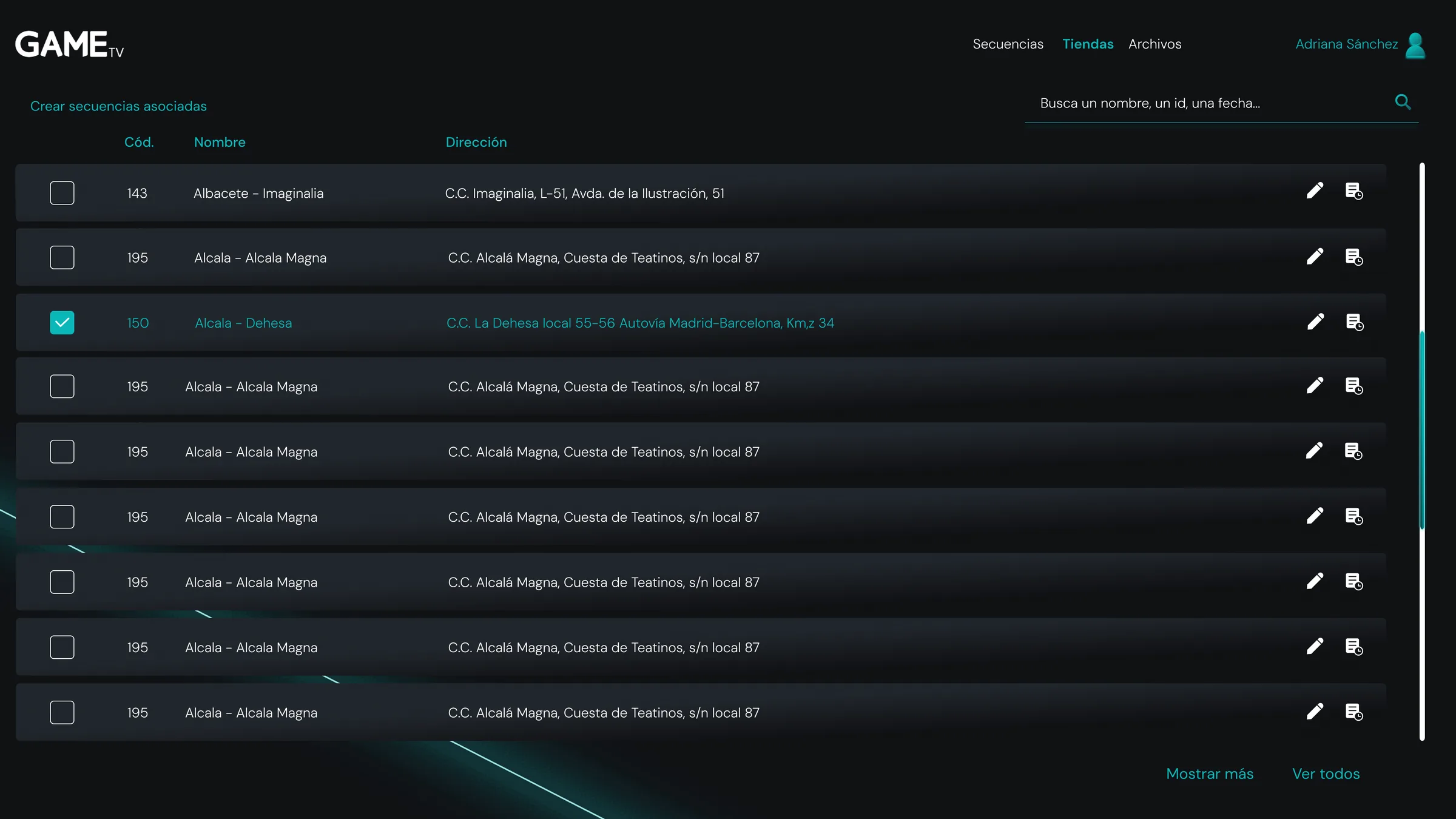
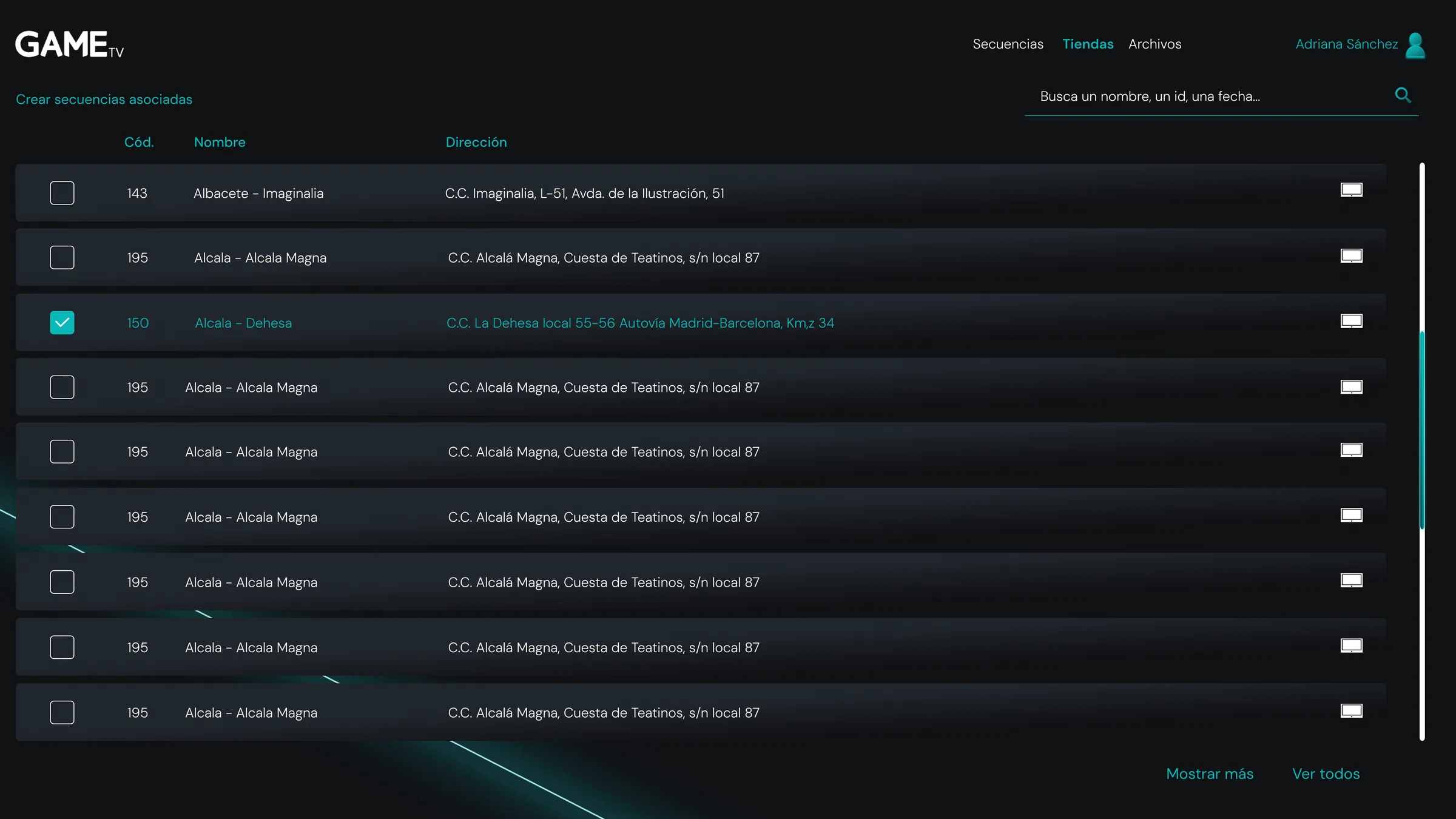
Around the editor sit three management modules, and all three speak alike: dark table, search at the top, actions at the right of every row. Stores are listed with their code, their name and their full address, and they group — Península, Canarias — so nobody has to tick 230 boxes each time.
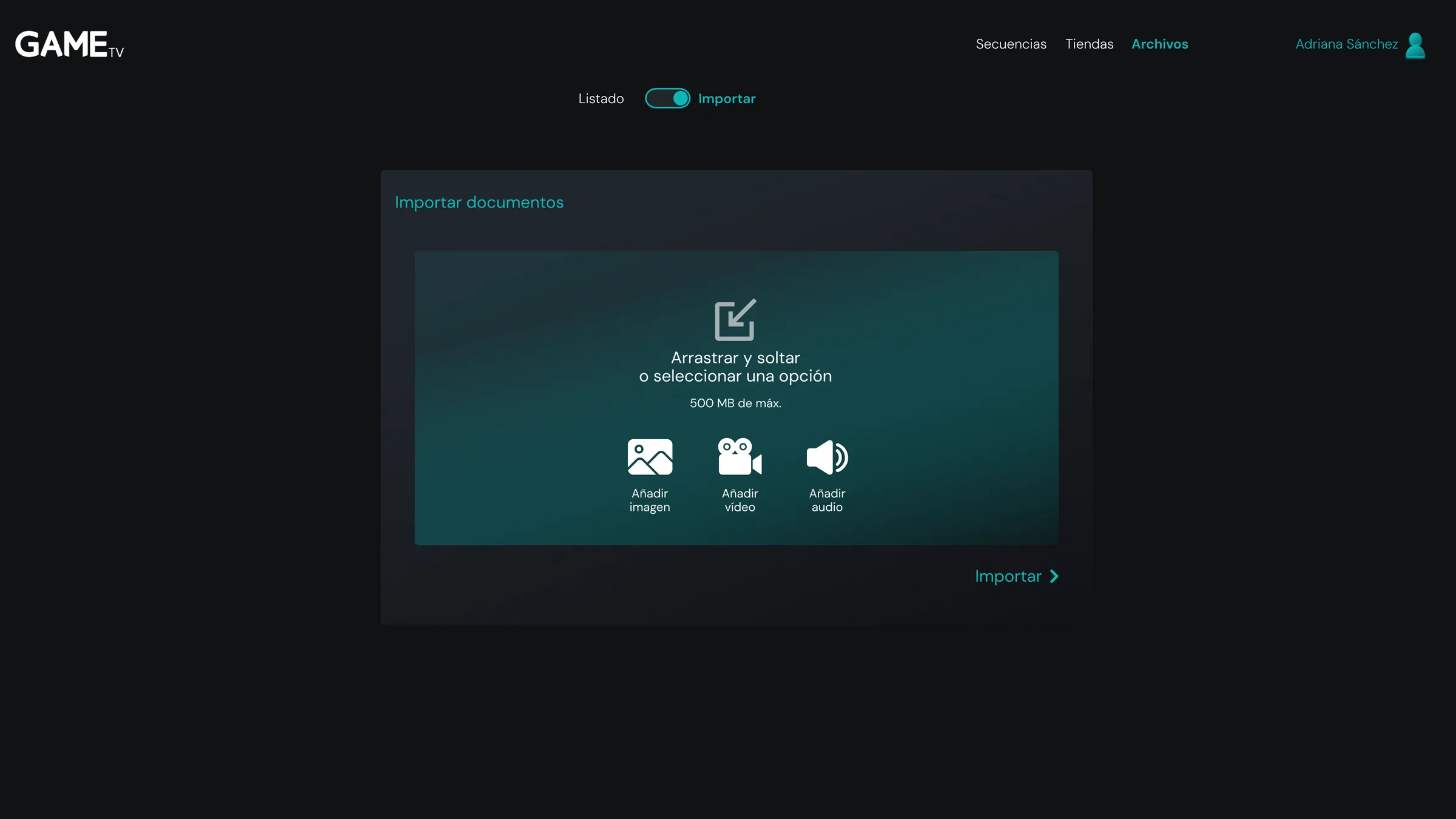
Files come in through an import screen with drag and drop, three clear doors — image, video, audio — and the 500 MB limit written where it can be seen, not in an error message after the upload has already been waited on.
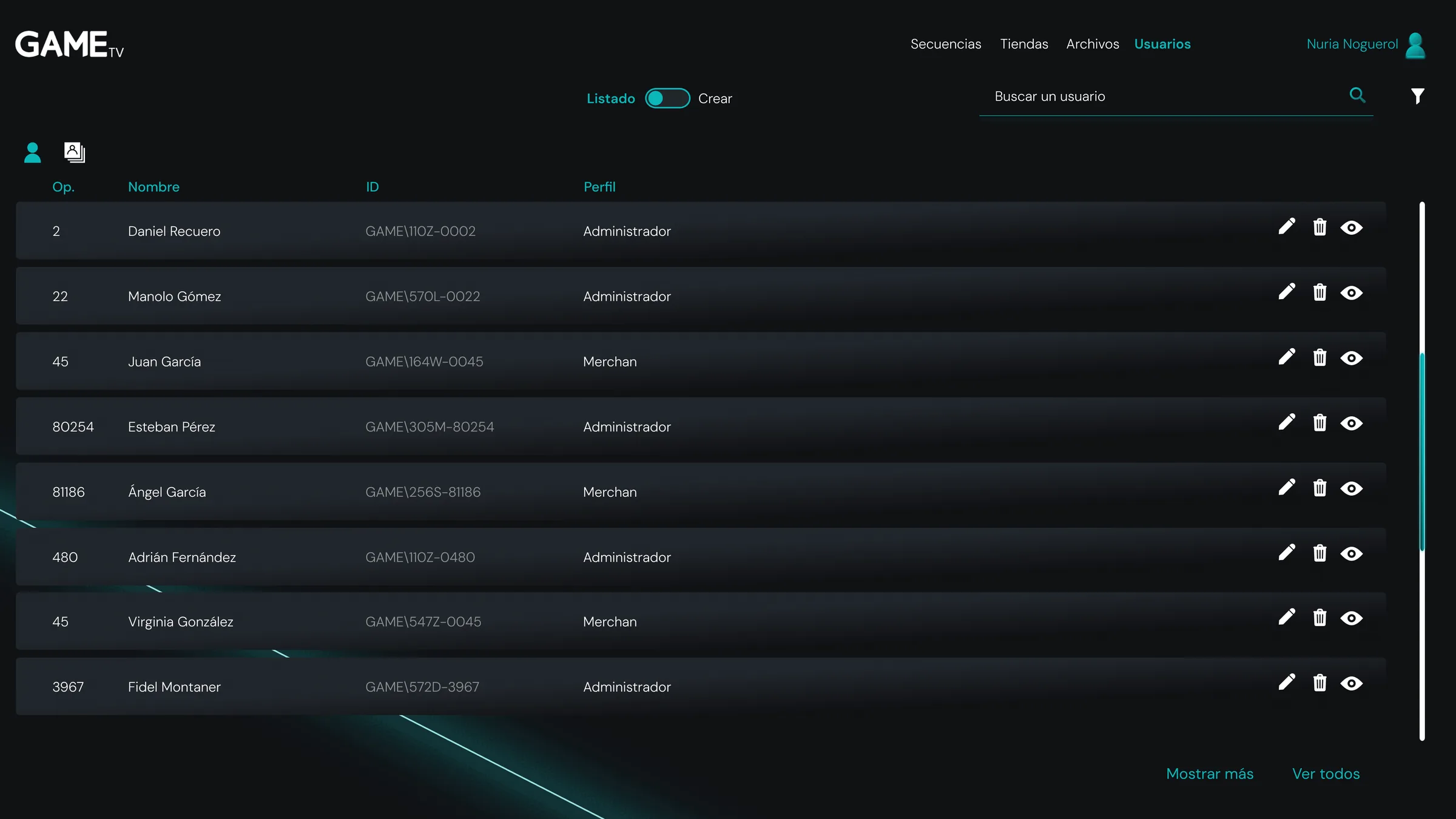
And users are managed with two profiles: administrator, who governs the platform, and merchandiser, who assembles and broadcasts. Each sees their own, and the list shows every person's profile next to their corporate id.
Architecture and flows
From assembly to broadcast, no manual needed47 screens
Editor, lists, modals and statesDesign system
Colour, typography and components in FigmaA language of its own
The GAME TV neon, brought into the interfaceFrom three hours to forty-five minutes
Preparing a campaign for the store screens went from about three hours to about forty-five minutes. Not a desk estimate: it is what the two people at head office who assembled the broadcast every week report, before and after Retina.
A good part of the saving comes from unification: where there used to be three applications — one for video, one for the in-store music and one for campaigns — there is now a single platform, and the 230 stores broadcast from it.
Preparing a campaign
Measured with the two head-office people who did itApplications unified
Video, in-store music and campaigns, on one platformStores broadcasting
The whole GAME network schedules from the platformCompanies have bought it
Sold as a product under the Retina brandFrom internal tool to product
GAME stopped keeping the platform to itself: it sells it to other chains with in-store screens under the commercial name Retina. At least two companies have already bought it.
Next in Product design UX/UI
Traveler, app for iOS and Android