Micro-price, no subscription
€0.99 to €2.99 per tour, yours to keep. No direct competitor sits there without a yearly fee.
Work / Product UX/UI / Traveler, app for iOS and Android
Project 01 of 28 in the archive 01 of 09 in Product design UX/UI See the whole discipline ↗
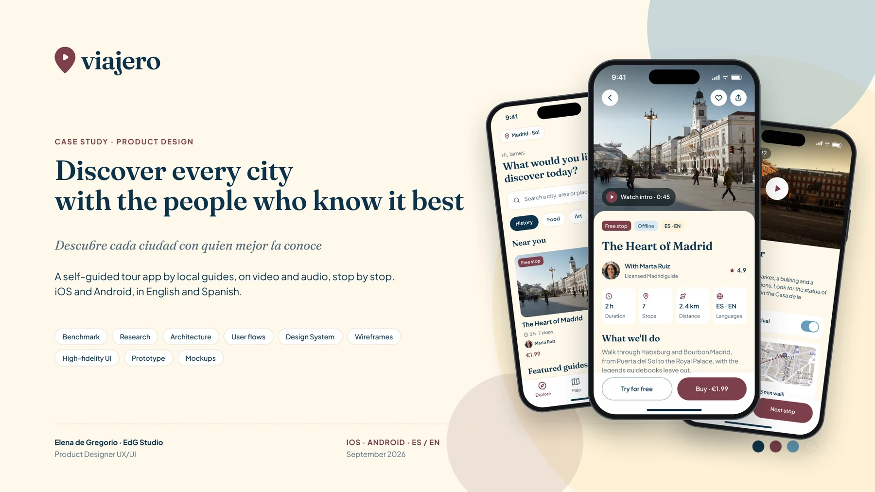
Traveler —Viajero in Spanish, the name on the app— grows out of an old concept of mine, Yourney: a marketplace of self-guided tours made by local guides, with one free stop to try, micro-prices and one-tap payment. I wanted to keep the problem and the features, but not the app: name, brand, architecture and design are all new.
The brief was clear: iOS and Android, following each platform's guidelines, and truly bilingual, in Spanish and English, because the traveller arriving in Madrid and the one leaving Madrid need the same thing in different languages.
I did the whole project in Figma, in the order I follow with any client: first the market and the users, then the structure, and the interface last.
Apps analysed
Six direct and five indirect, from VoiceMap to Google MapsWireframes
The whole flow in grey, from onboarding to the reviewHigh-fidelity screens
13 screens × iPhone and Android × Spanish and EnglishBilingual strings
Figma variables with Español and English modesI started by sizing the opportunity with market data. Spain welcomes almost a hundred million international visitors a year, and most experiences are still sold away from the phone. App-based self-guided tours exist, but they are still a minority: one traveller in eight has tried one.
The product takeaway is direct: if the format still has to be discovered, price and a free trial have to remove all the risk of trying it. And trust doesn't come from a synthetic voice, it comes from a person: nine in ten travellers think a local guide is the best way to get to know a place.
International visitors to Spain
2025, +3.2%. Source: INE, FRONTURHave taken an app-based self-guided tour
35–47% among 18 to 34 year olds. Source: ArivalPrefer a local guide
As the best way to explore. Source: GetYourGuide / WakefieldOf activities are booked on mobile
Up from 11% in 2019. Source: Arival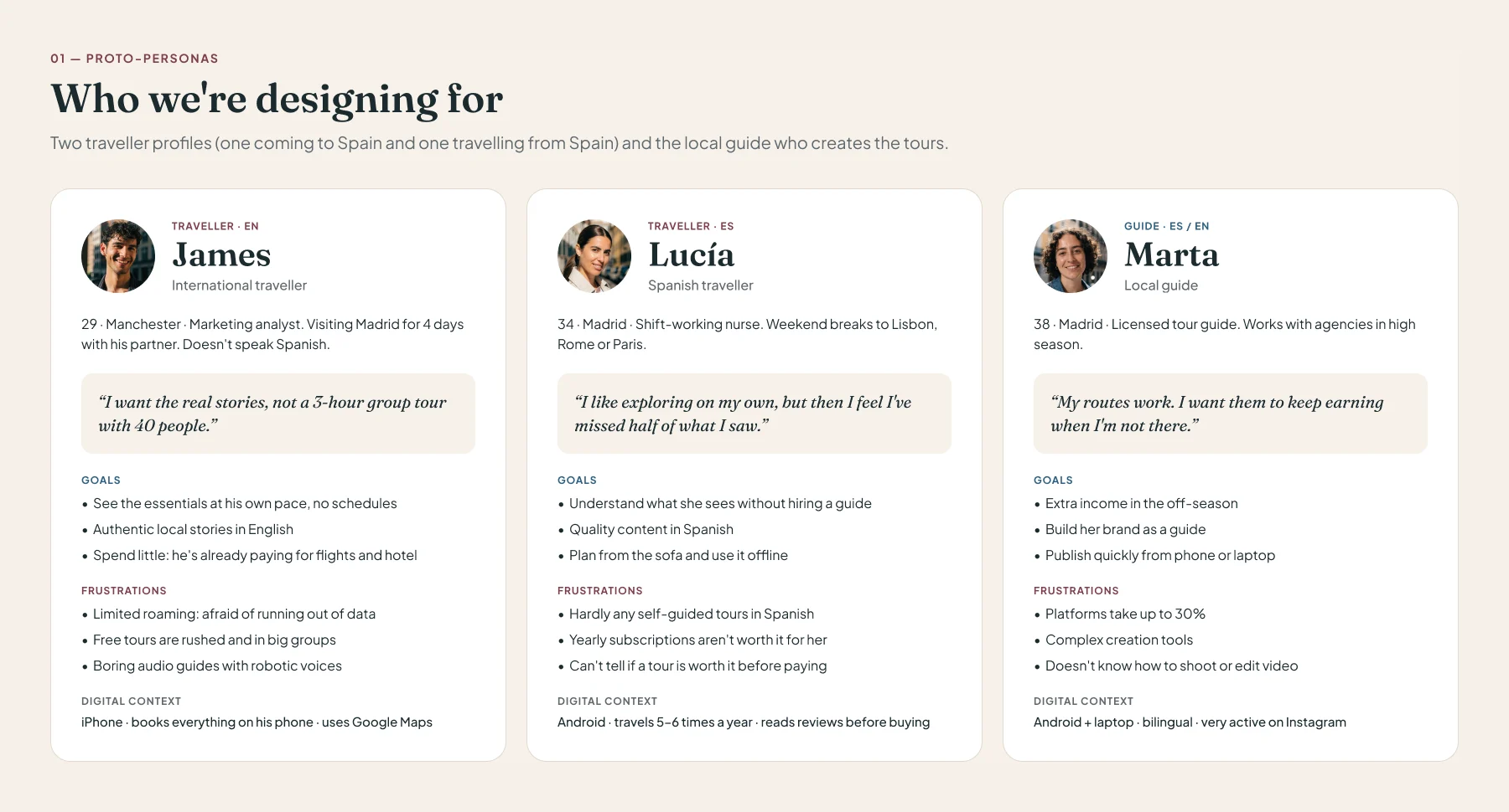
James, Lucía and Marta come from the benchmark and from secondary data, not from interviews. That is why the research ends with six measurable hypotheses and a plan to validate them with real users before taking anything for granted.
I analysed six direct competitors, self-guided tour and audio-guide apps, and five indirect ones: marketplaces with a guide present, free tours and place discovery. I read their App Store and Google Play listings and, above all, their users' complaints, which is where the missing design lives.
The pattern repeats: cheap means generic —synthetic voice, AI-generated content, lists of places— and authentic means expensive: a guided marketplace tour costs €15 to €60, and VoiceMap $4 to $20 per tour.
| App | Type | iOS · Android | Price or model | Spanish |
|---|---|---|---|---|
| VoiceMap | Direct | 4.8 · 4.6 | $4–20 per tour | UI yes · hardly any tours |
| SmartGuide | Direct | 4.7 · 4.7 | $1.99 per city · €19.99 a year | Yes, with AI and synthetic voice |
| izi.TRAVEL | Direct | 4.4 · 2.3 | Premium €1.49–10.99 | UI yes · uneven content |
| GPSmyCity | Direct | 4.0 · 4.3 | $14.99–20.99 a year | UI yes · content in English |
| Action Tour Guide | Direct | 4.8 · 4.7 | $10–17 per tour | No |
| Rick Steves Audio Europe | Direct | 4.3 · 4.5 | Free | No |
| GetYourGuide | Indirect | 4.9 · 4.9 | 25–30% commission | Yes |
| Civitatis | Indirect | 4.8 · 4.0 | Apple Pay, Google Pay, PayPal | Native |
| GuruWalk | Indirect | 2.9 · 3.8 | €10–20 tip | Yes |
| Airbnb Experiences | Indirect | 4.8 · 4.7 | 20% commission | Yes |
| Google Maps | Indirect | 4.7 · preinstalled | Free, ad-funded | Yes |
| Traveler | — | Native iOS and Android | €0.99–2.99 per tour, no subscription | Native in Spanish and English |
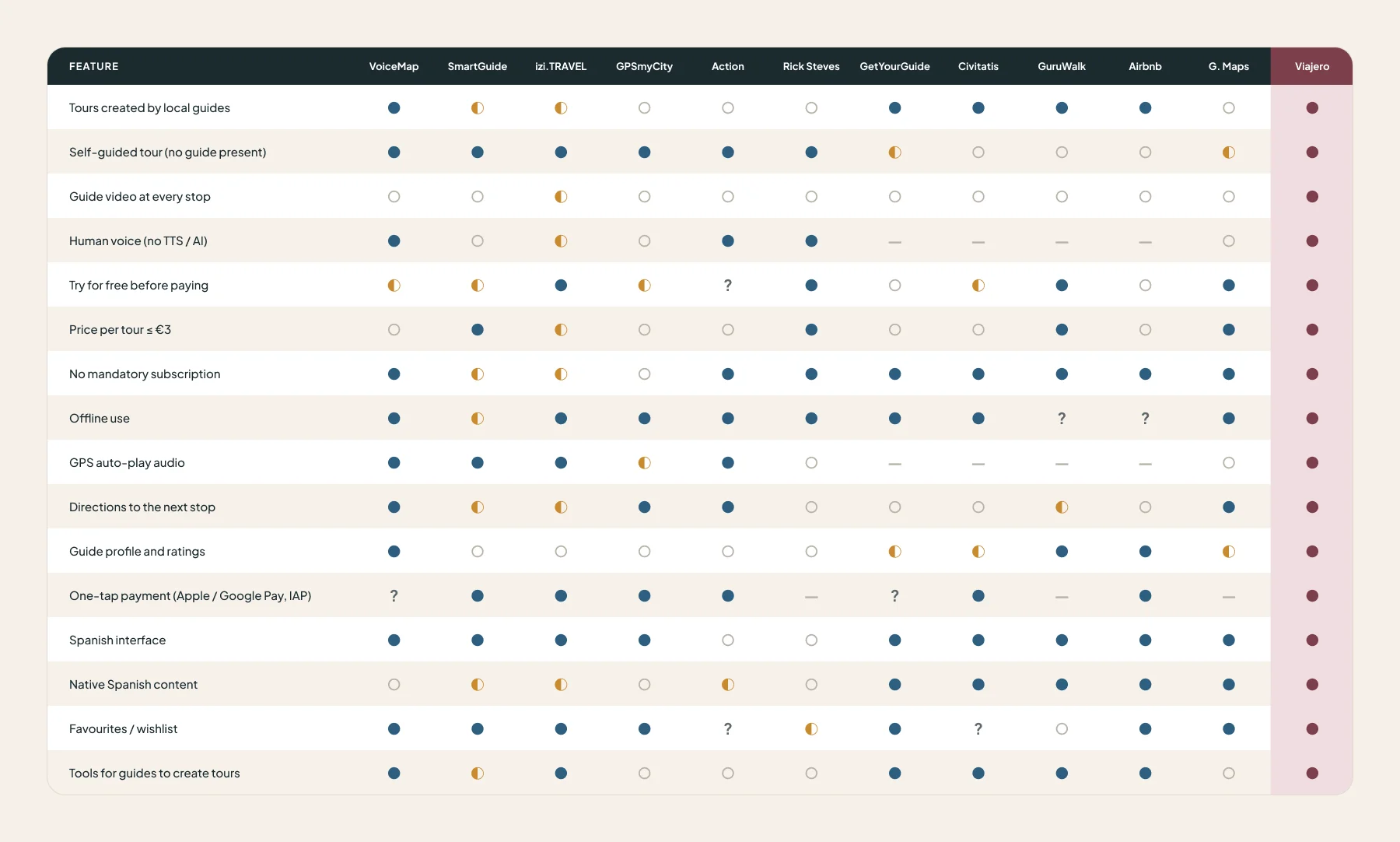
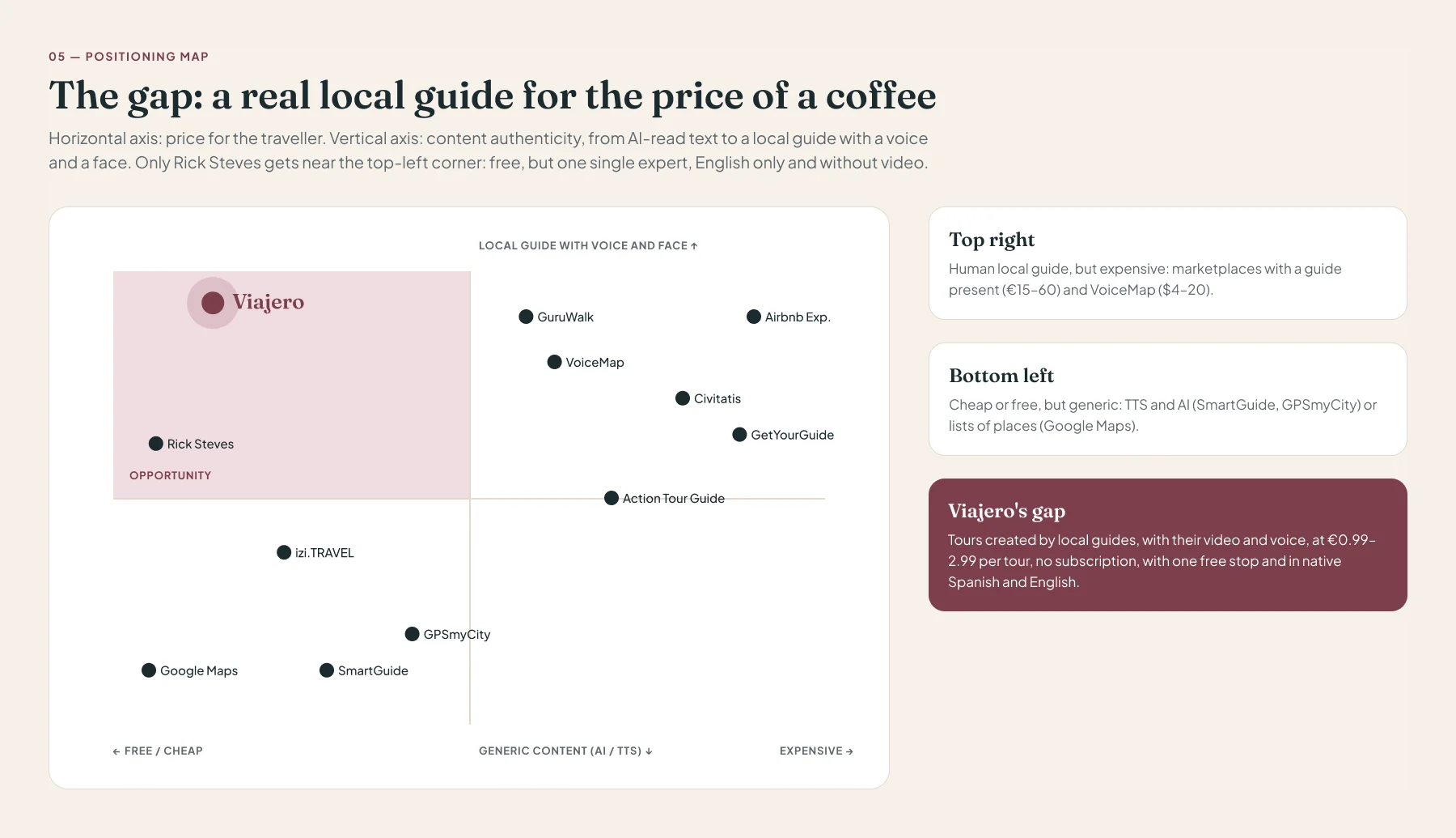
Only Rick Steves gets near the "authentic and cheap" corner: it's free, but it's one single expert, English only and without video. No app combines a local guide on video, micro-pricing without a subscription and native content in Spanish and English. That combination is Traveler's proposition.
Each design decision points at a specific complaint from competitors' users or at a gap in the matrix. They then became MVP requirements, prioritised with MoSCoW, and hypotheses to measure.
€0.99 to €2.99 per tour, yours to keep. No direct competitor sits there without a yearly fee.
AI scales, but it doesn't move anyone. The local guide's face and voice are the edge over TTS, on the tour page and at every stop.
Tours created in both languages, not machine-translated, and a tour-language filter independent from the app language.
The whole first stop, no sign-up, not an audio snippet. Zero risk to try.
At €1–3, typing a card kills conversion. Apple Pay and Google Pay, and the account is created at checkout.
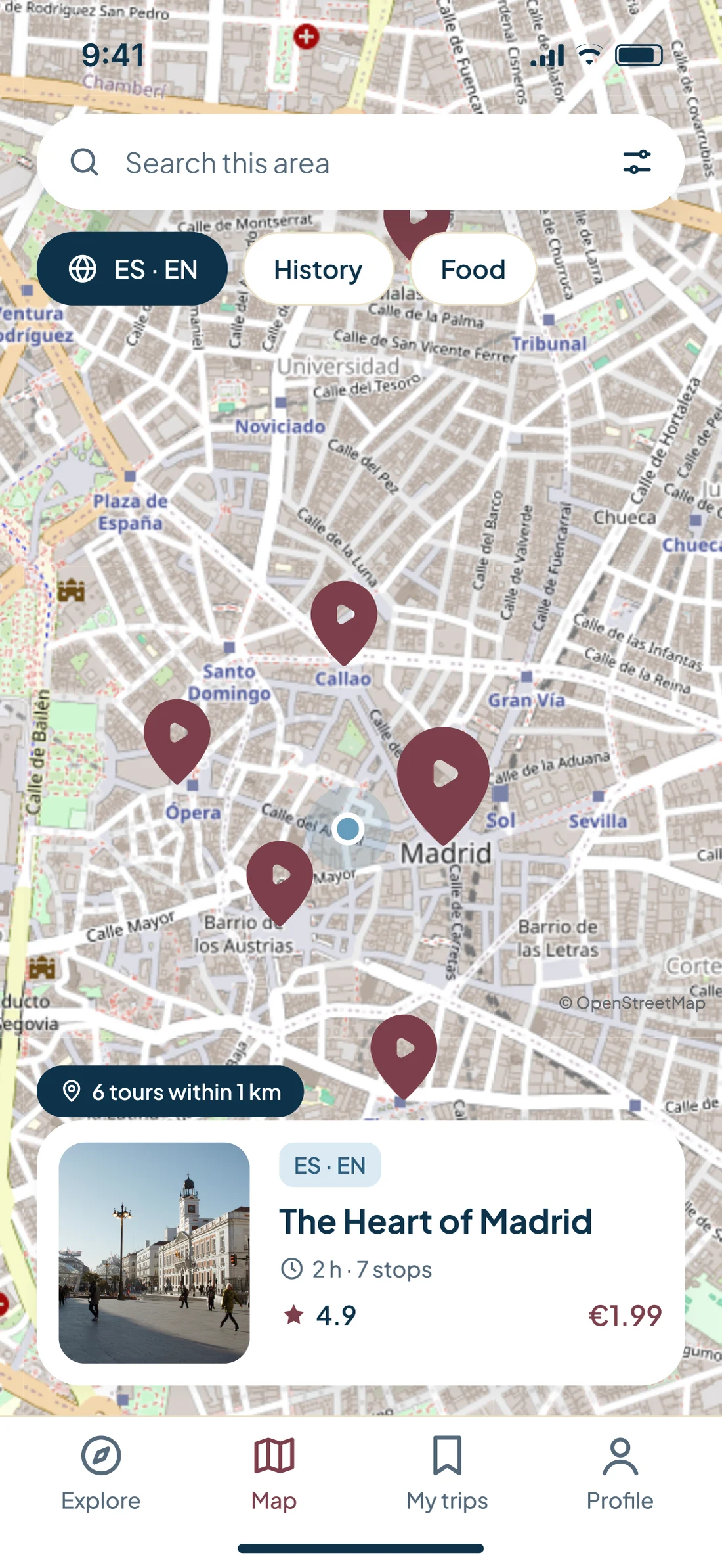
Fear of roaming is James's number one frustration. "Downloaded · 84 MB" before leaving the wifi.
High contrast, large text and large controls to use it while walking in the sun. GPS audio with a visible switch.
Stops, minutes of video, distance and duration in view, to avoid the misleading listings of the marketplaces.
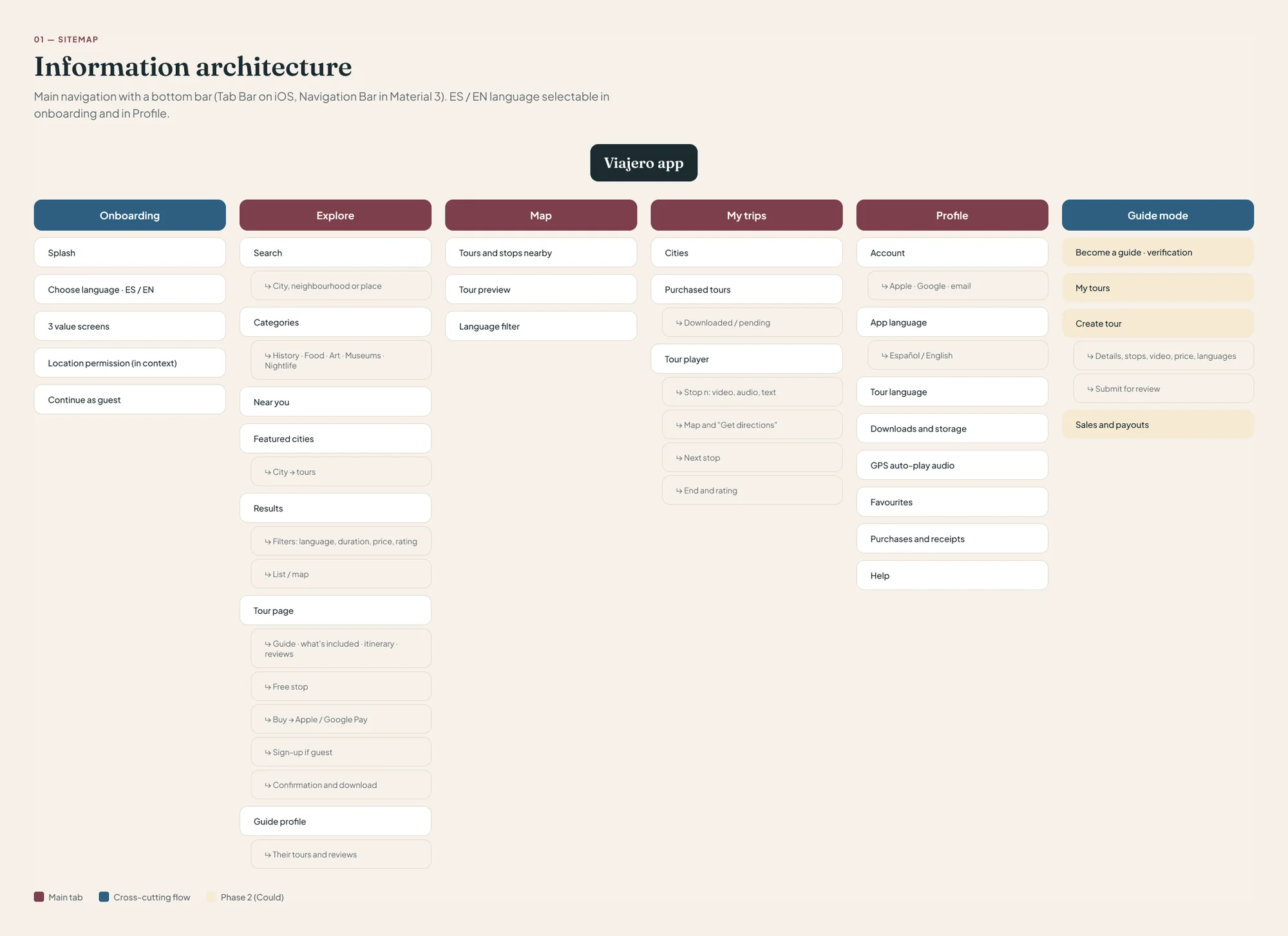
The app is organised into four destinations: Explore, Map, My trips and Profile. On iOS it's a Tab Bar and on Android a Material 3 Navigation Bar, in the same order, so someone switching phones doesn't have to relearn anything. Onboarding and guide mode are cross-cutting flows.
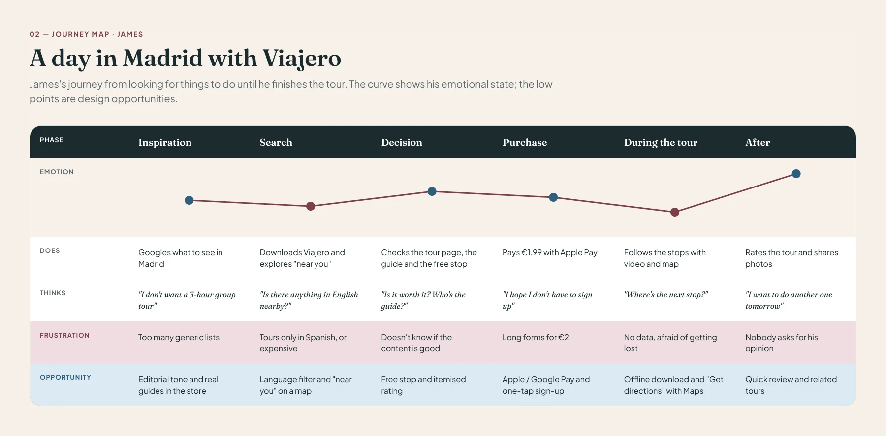
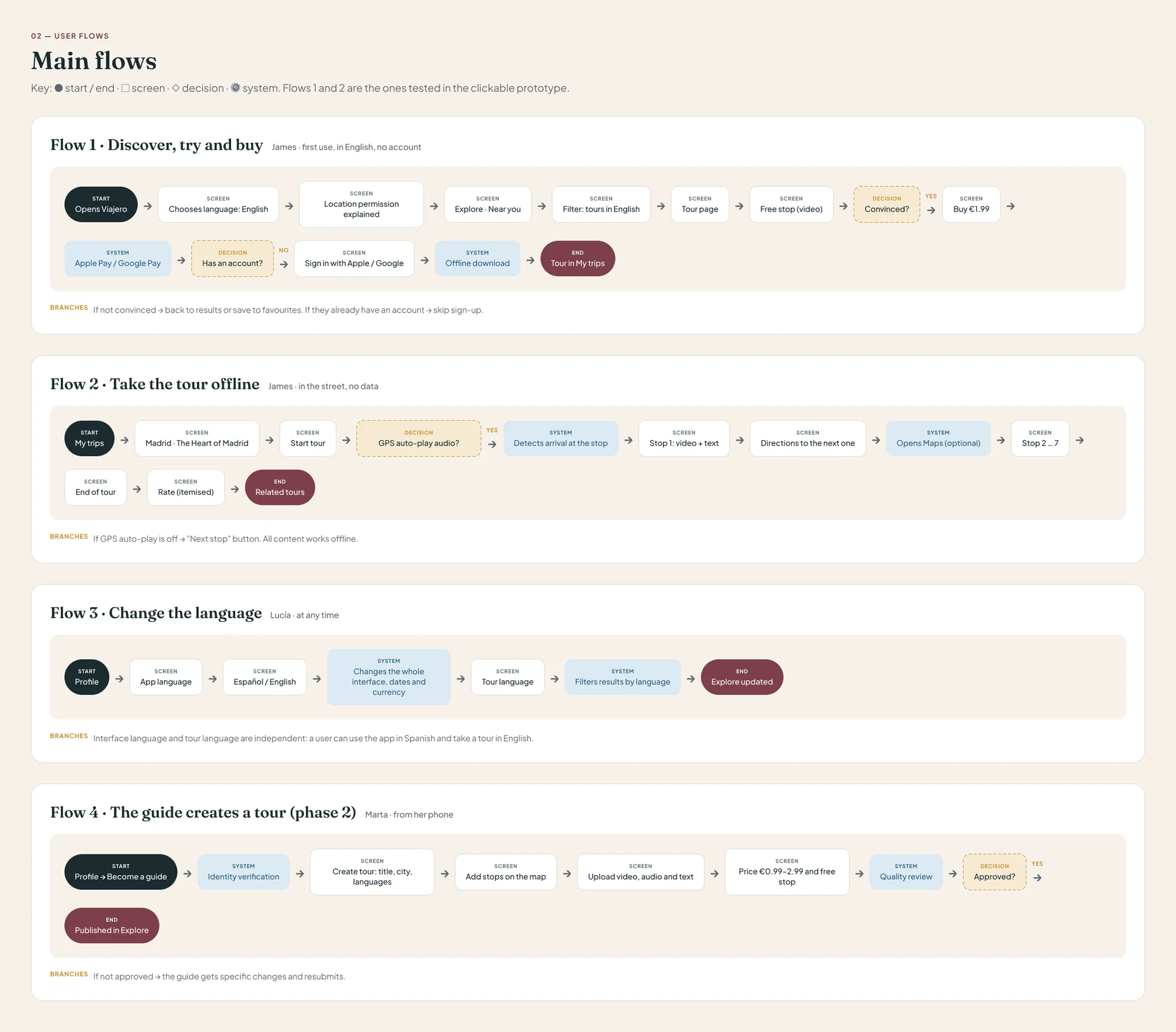
I mapped four journeys with their branches: discover, try and buy; take the tour offline; change the language; and, for phase 2, the guide creating a tour. The first two are the ones tested in the clickable prototype.
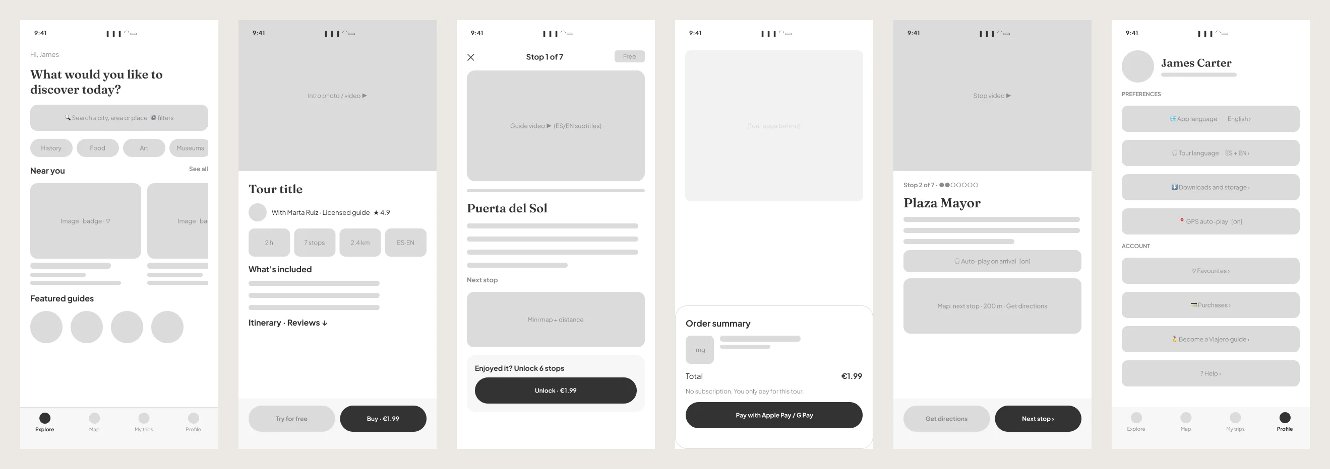
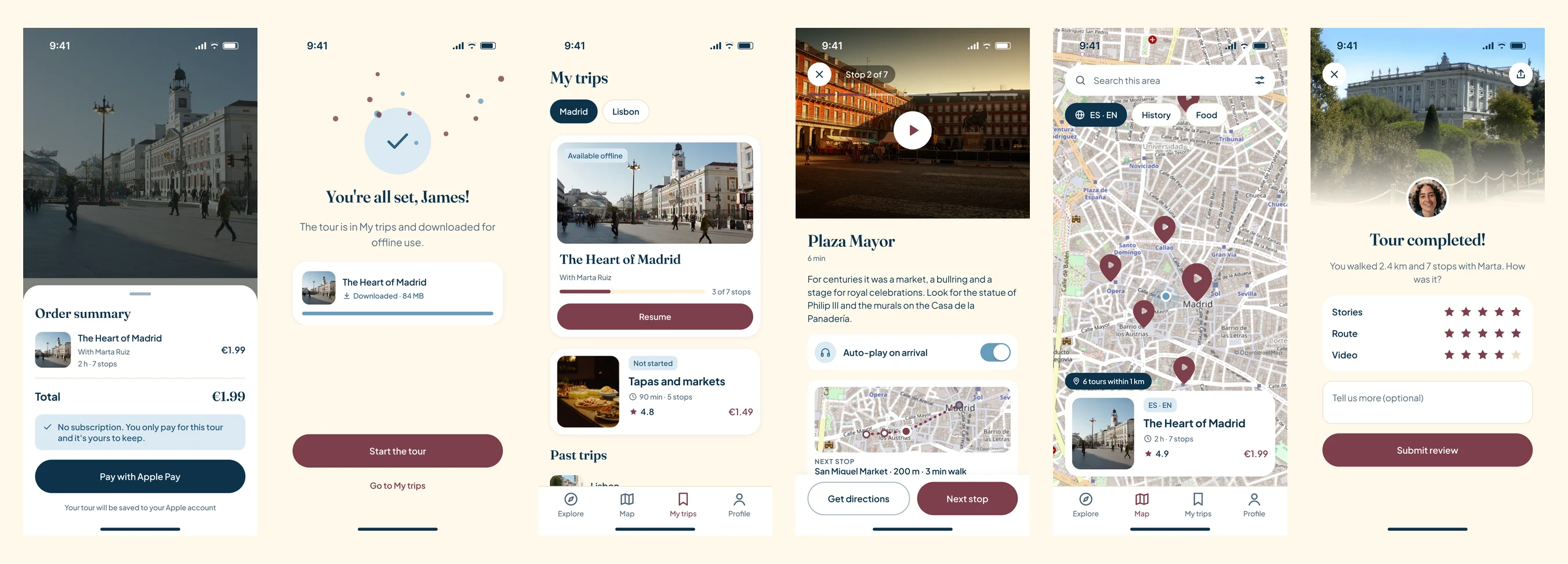
Twelve low-fidelity wireframes cover the whole flow, from onboarding with the language picker to rating the tour. Grey and unbranded, to discuss what goes on each screen and in what order.
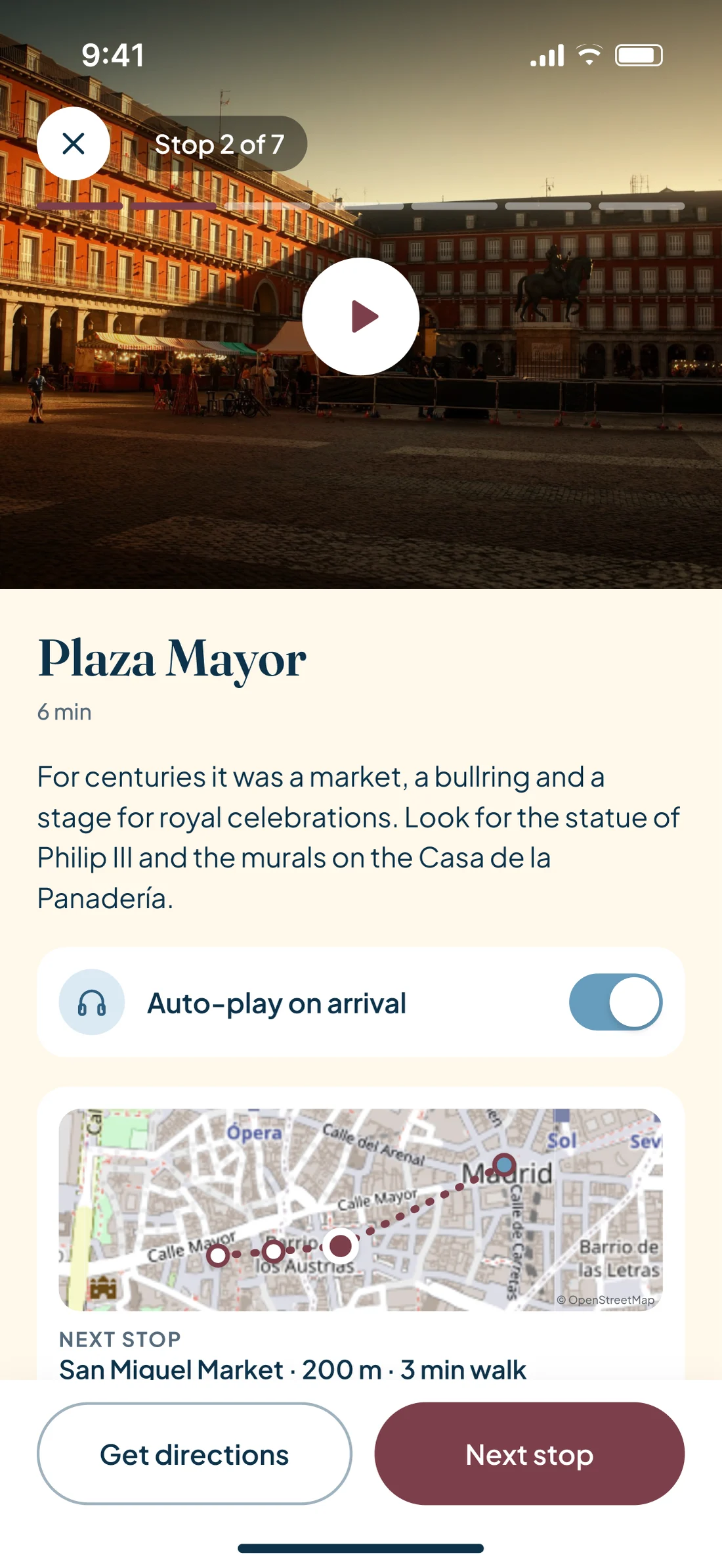
The important calls were made here: the free stop ends with the unlock in view, payment is a native sheet over the tour page, and the player puts the video on top and "Next stop" always within thumb reach.
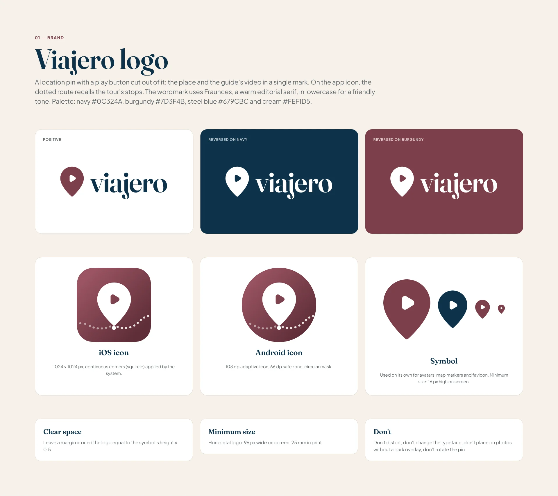
The logo is a location pin with a play button cut out of it: the place and the guide's video in a single mark. On the app icon, a dotted route hints at the tour's stops. The wordmark uses Fraunces, a warm editorial serif, in lowercase.
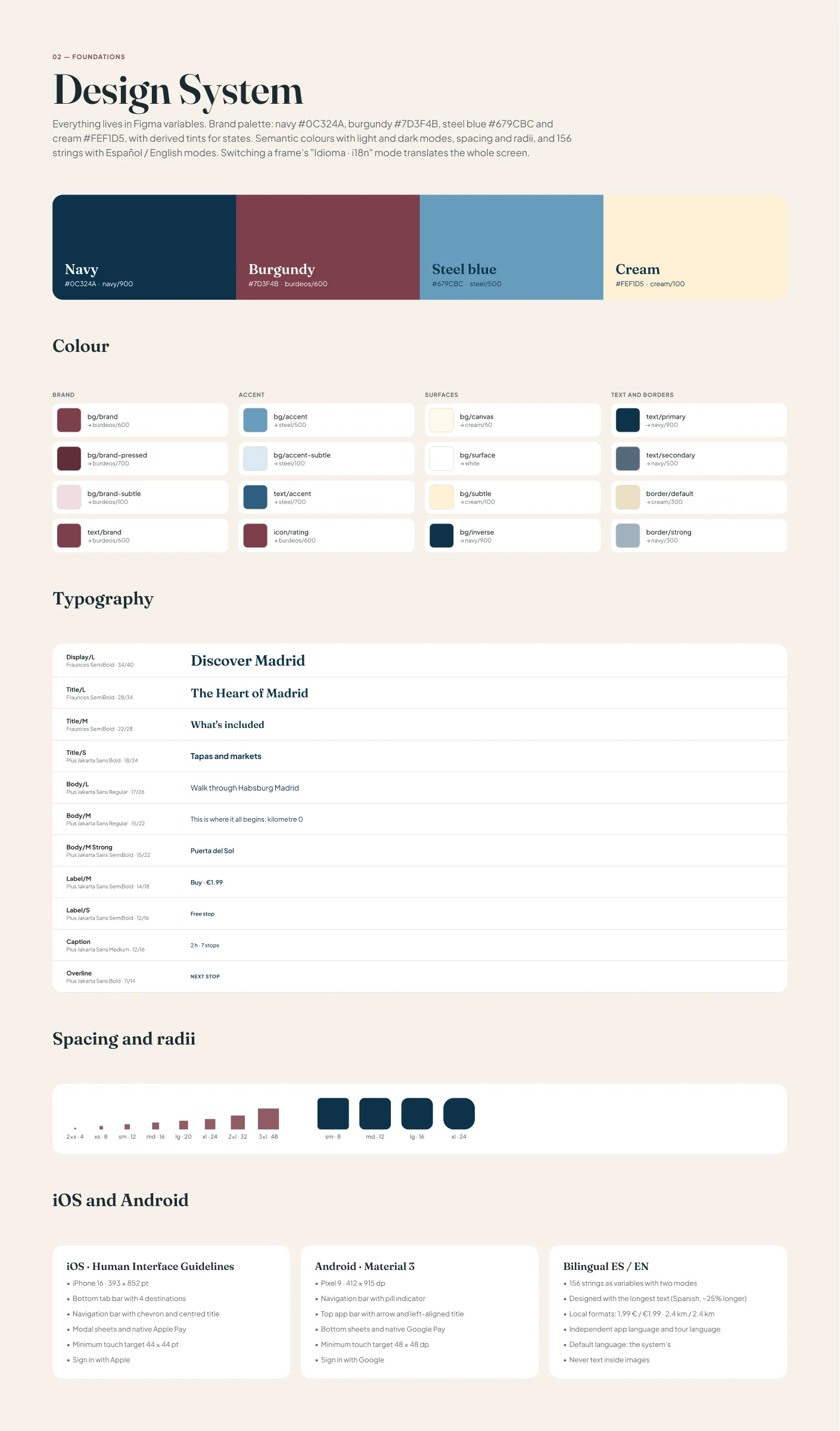
The palette is short on purpose: navy for text and structure, burgundy for what's actionable, steel blue for accents and information, and cream as the background, because pure white fights with the city photos. White on burgundy passes AA contrast.
#0C324AHeadings, body text and dark backgrounds#7D3F4BButtons, price, map pins and active tab#679CBCInformation, states and the map route#FEF1D5Soft backgrounds and highlighted surfaces#FFF8EAThe canvas of every screen#5F2E38Pressed state and errors#2E5F80Links and accent text, AA contrast#54697ASecondary text and metadataTwo families. Fraunces for headings, tour names and prices: it gives the app the tone of an editorial travel guide. Plus Jakarta Sans for everything else, because in the street, in the sun and on the move, what matters is reading at a glance.
Colour primitives, semantic colours with light and dark modes, spacing and radii, and a language collection with 156 strings in Español and English modes. Components use semantic tokens only, so a palette change happens in one place and reaches all 52 screens.
Figma · 04 · Design System — Foundations4 variable collections · 11 text styles
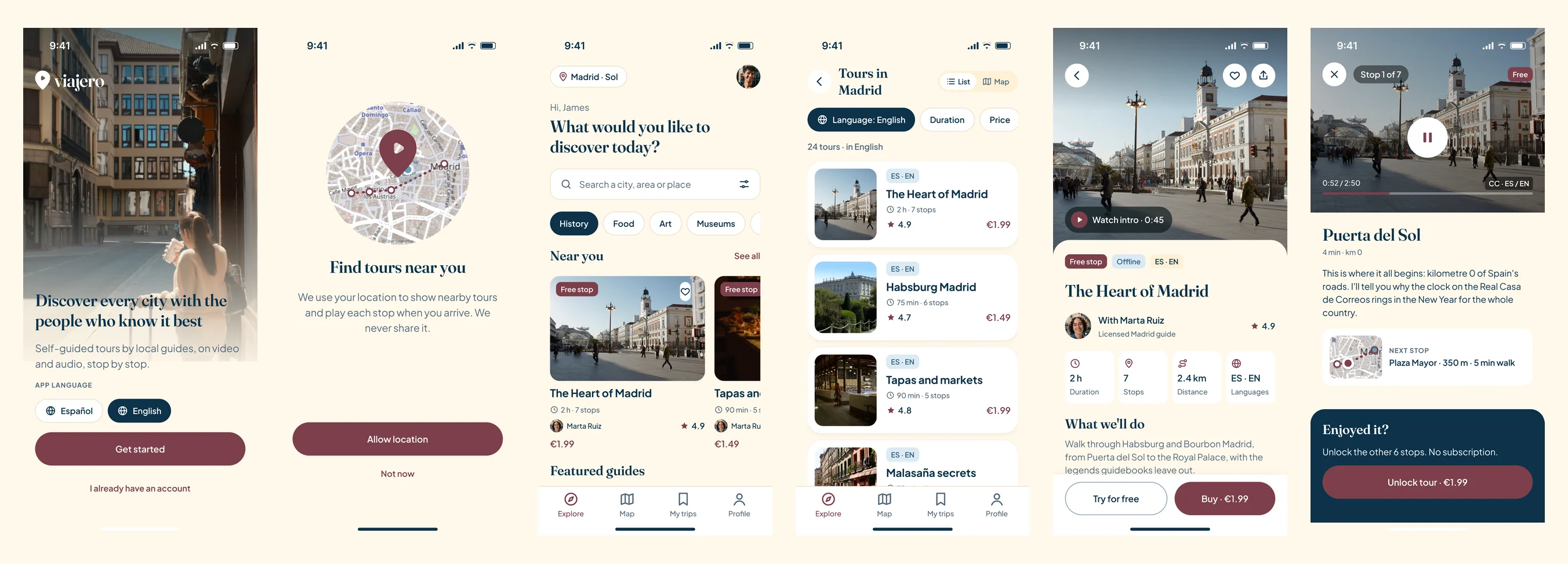
The photos of Madrid and the portraits were generated with AI in Higgsfield, all with the same late-afternoon light so everything feels like one brand. The maps are real: OpenStreetMap tiles with the tour route, a pin for each stop and proper attribution.
The tour page answers, on a single screen, the three doubts from the journey map: who the guide is, exactly what's included and whether it's worth it. That's why it carries the rating broken down into stories, route and video, and the "Try for free" button next to the buy button.
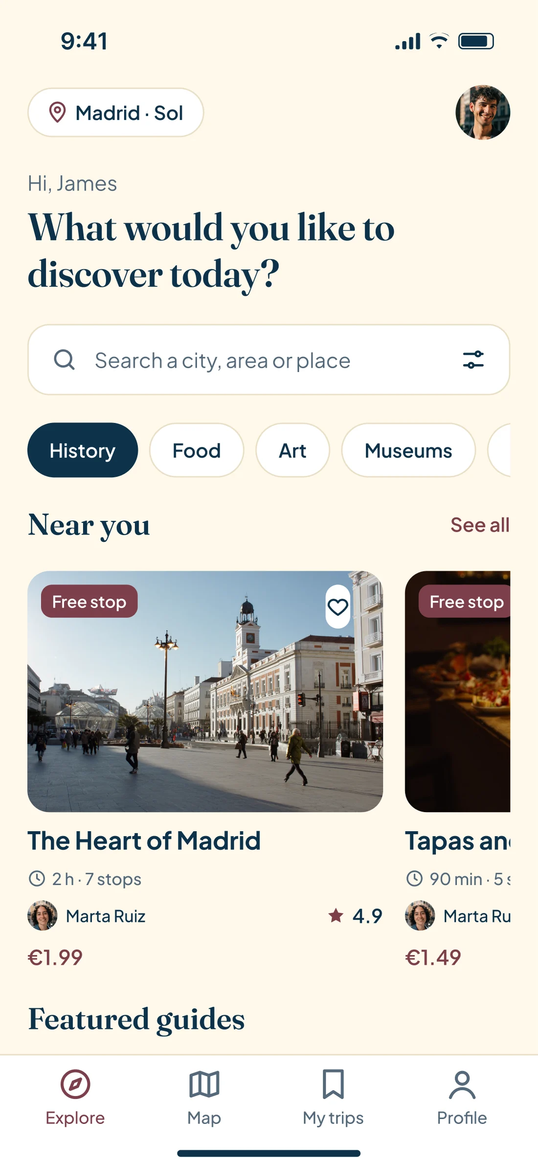
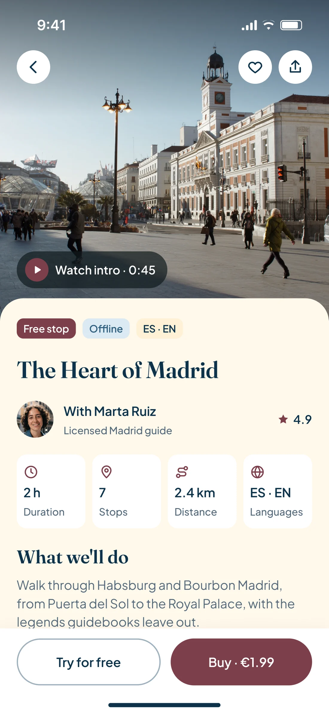
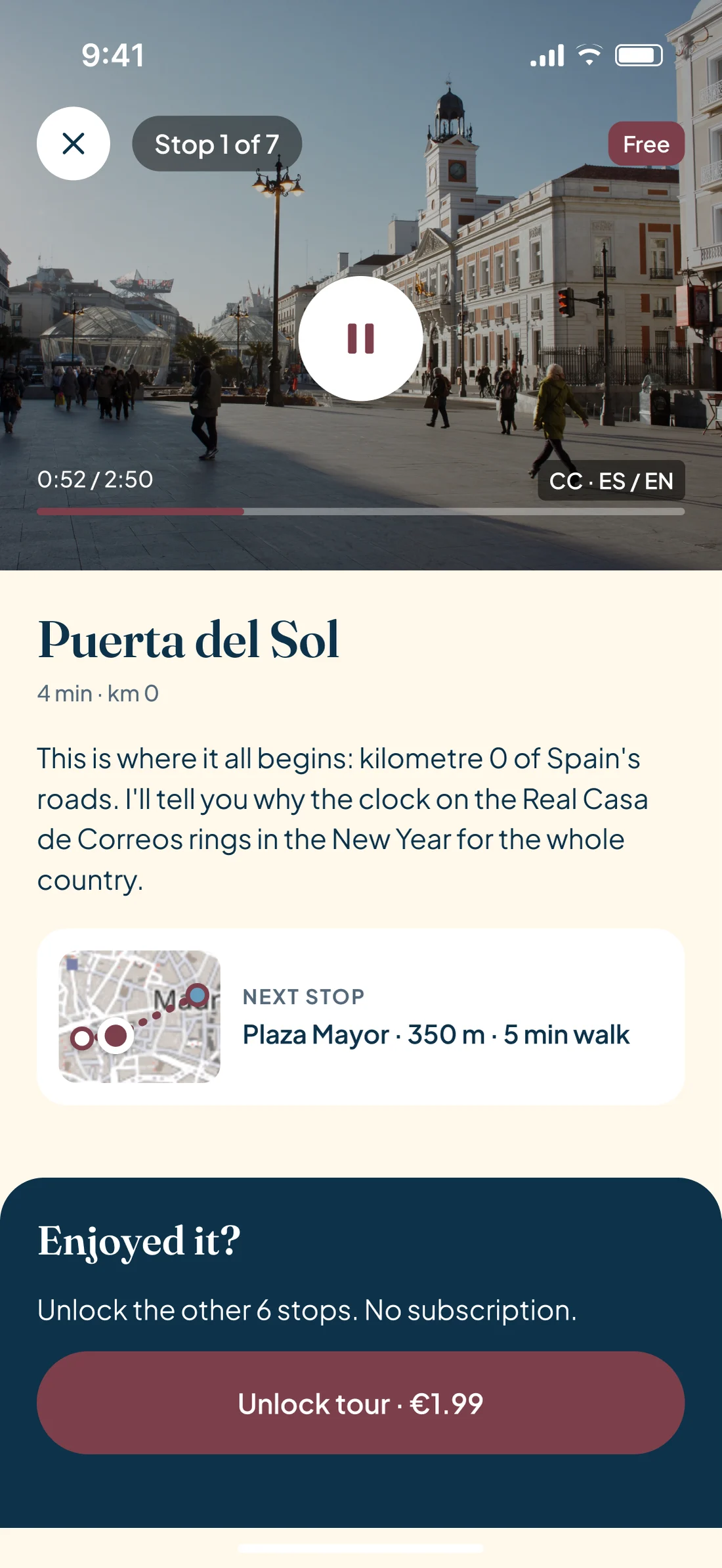
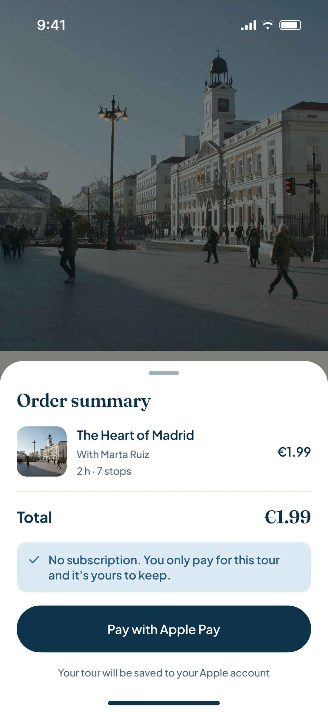
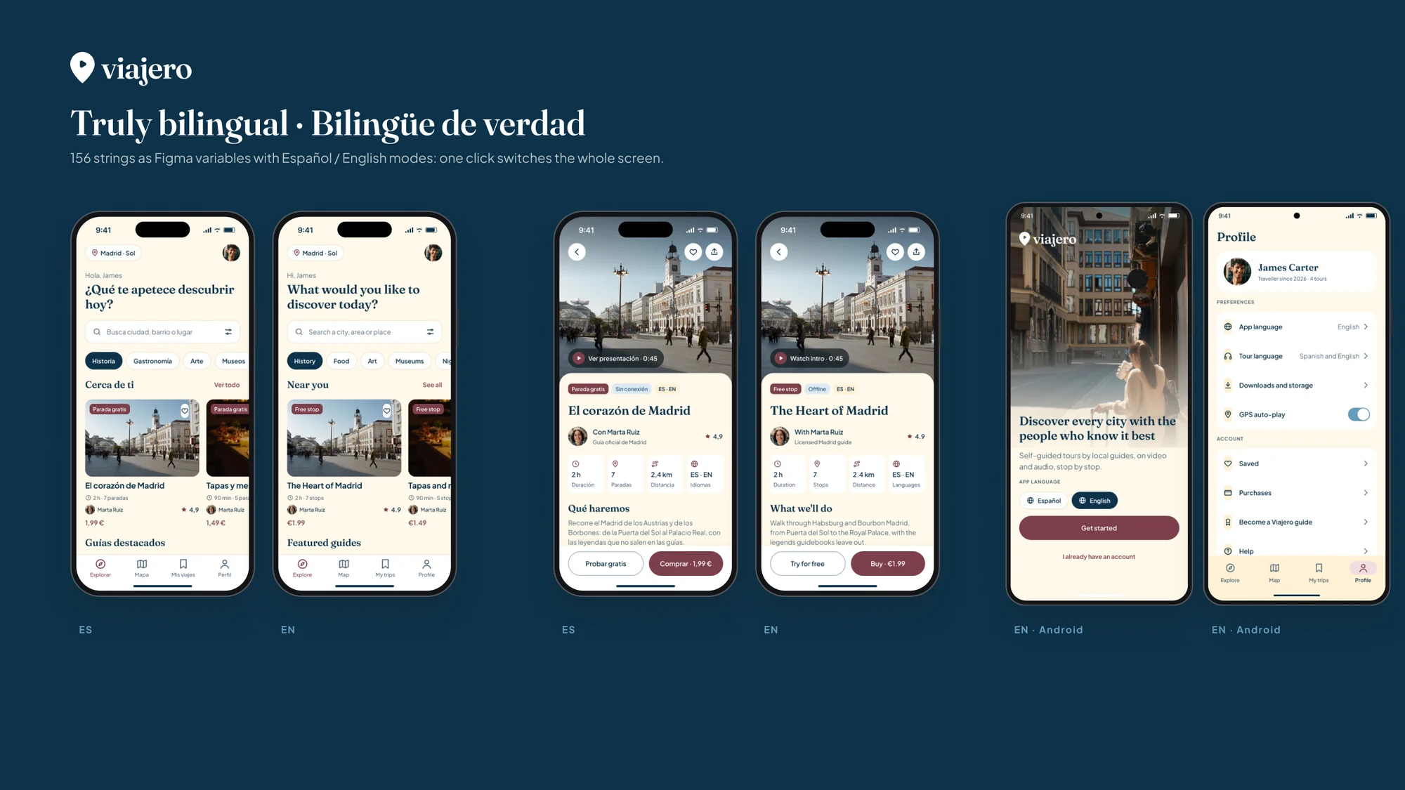
Every interface string is a Figma variable with two modes. Switching a frame from Español to English translates the entire screen, and each variable carries its code name for iOS (L10n) and Android (R.string), ready for development.
I designed with the longest text, Spanish, which runs around 25% longer. Formats are localised too —1,99 € versus €1.99, 2,4 km versus 2.4 km— and the app language is independent from the tour language: you can use the app in Spanish and take a tour in English.
All 13 screens exist on iPhone, following the Human Interface Guidelines, and on Android with Material 3: a navigation bar with a pill indicator, top app bar, bottom sheets, Google Pay and 48 dp touch targets.
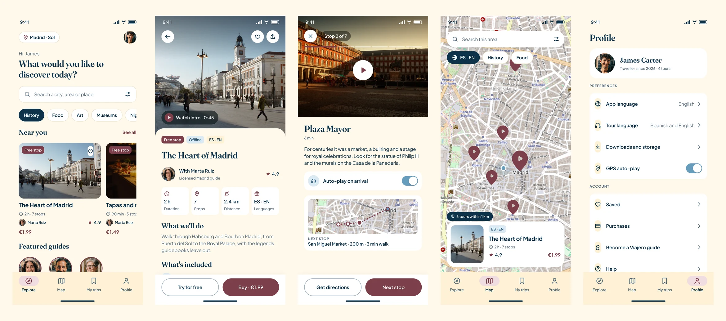
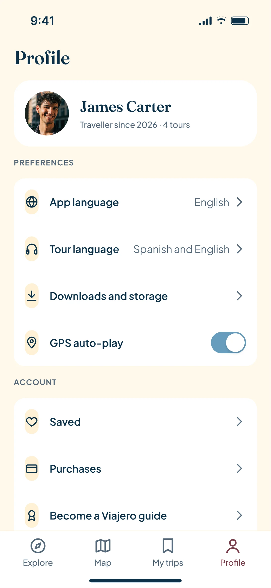
Lucía wants the app in Spanish and an English tour if it's the only one in Lisbon; James wants the exact opposite in Madrid. Merging both settings would have forced one of them to read in a language they don't want. So the tour-language filter lives in the results, and the app language in onboarding and the profile.
The Figma prototype links all 52 screens with 164 connections and four starting points: iOS and Android, in Spanish and in English. Long screens scroll under a fixed navigation bar, and carousels and filters scroll horizontally, just like the real app.
The video walks through the flow that matters most: explore, open a tour, try the free stop, pay with Apple Pay, find it downloaded in My trips and take it stop by stop, all the way to the final review.
The mockups place the real Figma screens inside an iPhone and a Pixel, so what you see is the exact design, and it updates if the design changes.
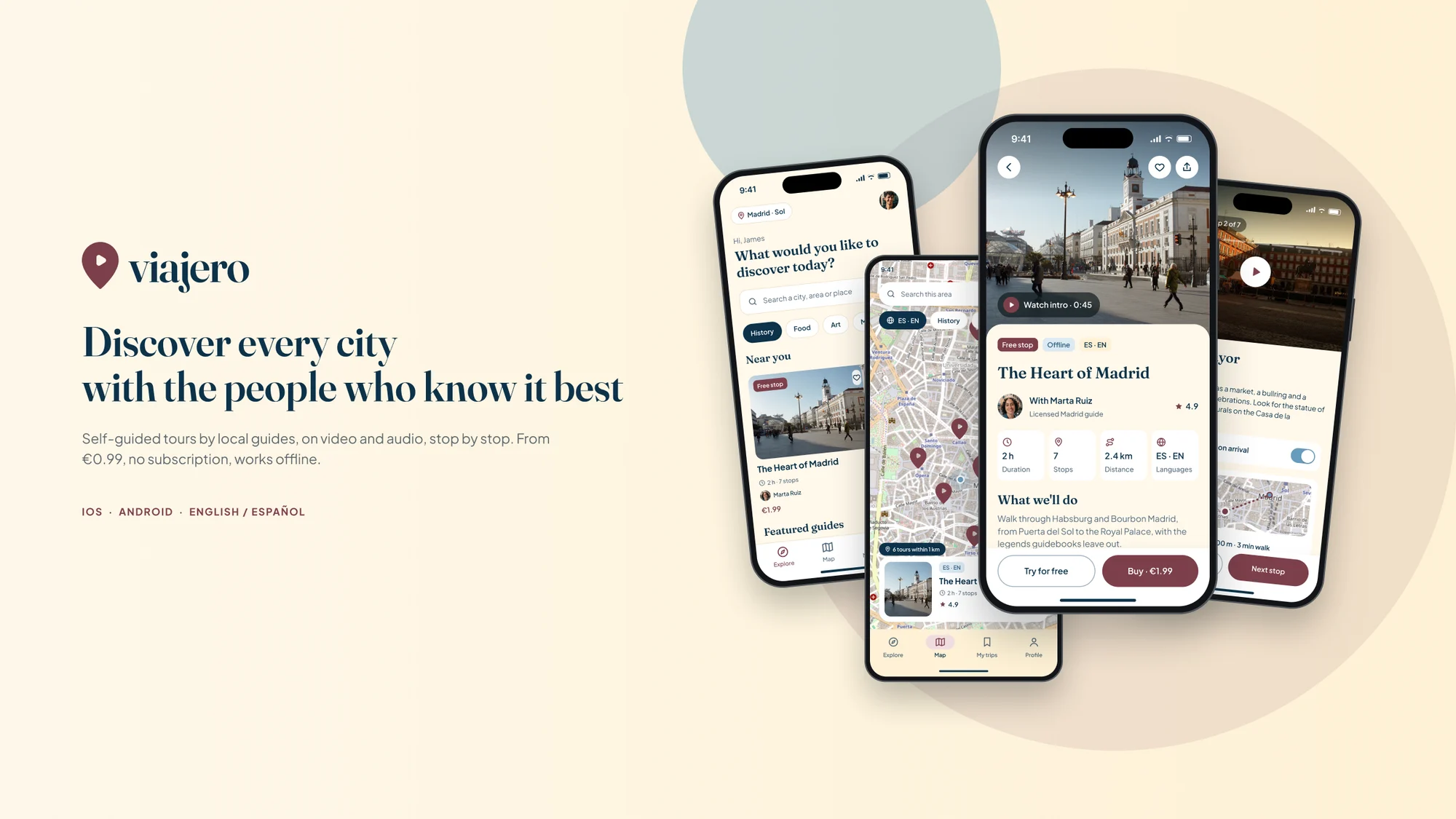
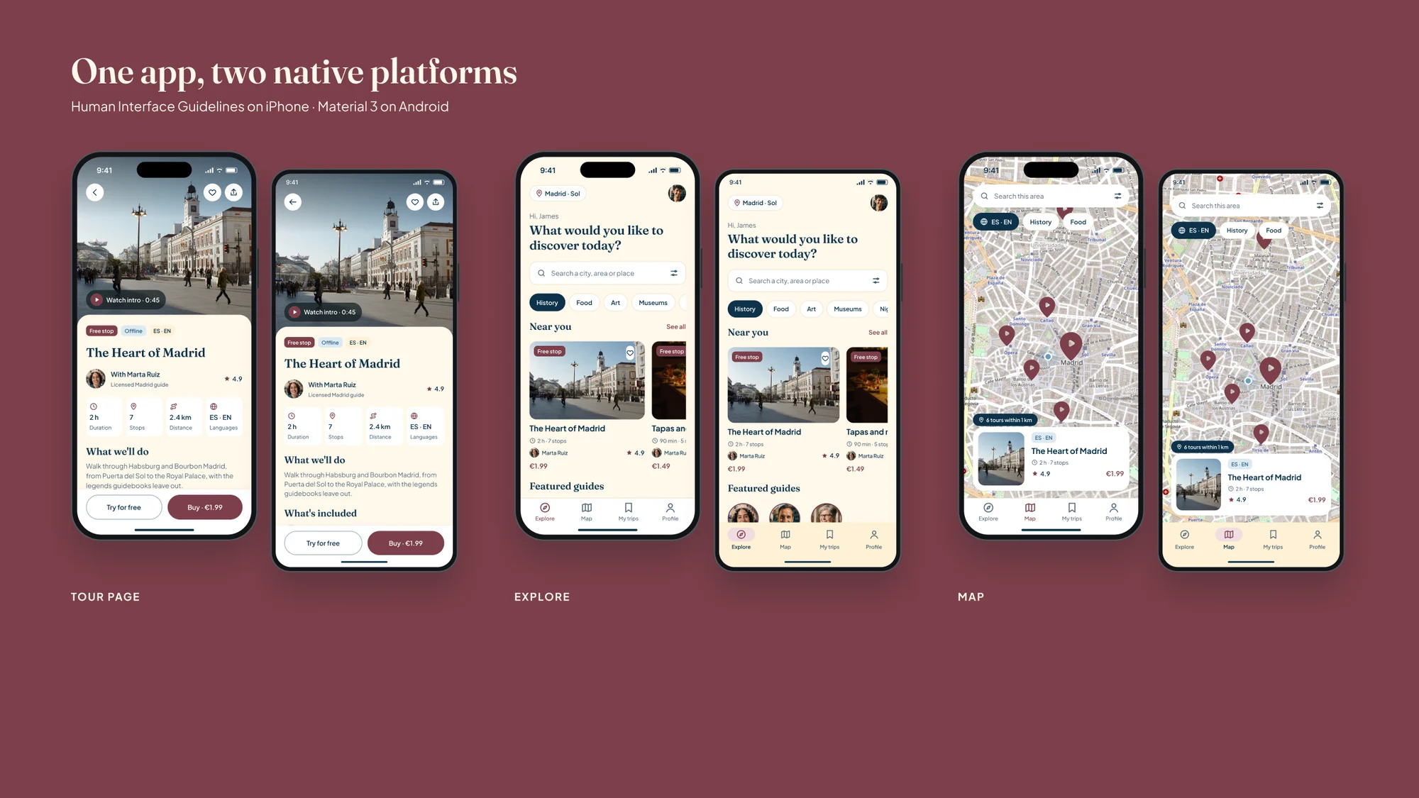
Traveler is a concept: it has no users, so I don't show conversion figures I haven't measured. What it does have is every decision tied to a real complaint or a market gap, and six hypotheses written with their metric so they can be tested.
The next step is a usability test with five or six travellers —half Spanish speakers, half English speakers— on the prototype, and three guides publishing a test tour. Then iterate and open phase 2: the guide app.
| Hypothesis | What we believe | How we'll know |
|---|---|---|
| H1 · Free stop | Trying a full stop without signing up increases purchases | ≥ 25% of those who finish it buy the tour |
| H2 · Micro-price | €0.99–2.99 with no subscription reduces hesitation | Decision on the tour page in under 90 s |
| H3 · Guide on video | The guide's face and voice build more trust than an audio guide | Trust ≥ 4/5 in the test |
| H4 · Natively bilingual | The language filter finds a tour in under 1 min | Task success ≥ 90% |
| H5 · Visible offline | Seeing the download status removes the fear of roaming | 0 doubts about whether it's downloaded |
| H6 · Guide app | A simple editor lets a guide publish in under 1 h | 3 of 3 guides publish unaided |
Benchmark and research
Eleven apps, four market sources, personas and journey mapArchitecture and flows
Four tabs and four journeys with their branchesBrand, system and screens
Logo, variables, 12 wireframes and 52 screensBilingual prototype
iOS and Android, 164 connections and videoINE, FRONTUR · Arival, research on tours and activities · GetYourGuide and Wakefield Research, 2024 · App Store and Google Play listings for the eleven apps and their user reviews, checked on 27 September 2026 · Maps © OpenStreetMap contributors.
Next in Product design UX/UI