Ten covers, one grid
Project 18 of 28 in the archive 01 of 11 in Graphic design See the whole discipline ↗
The starting point
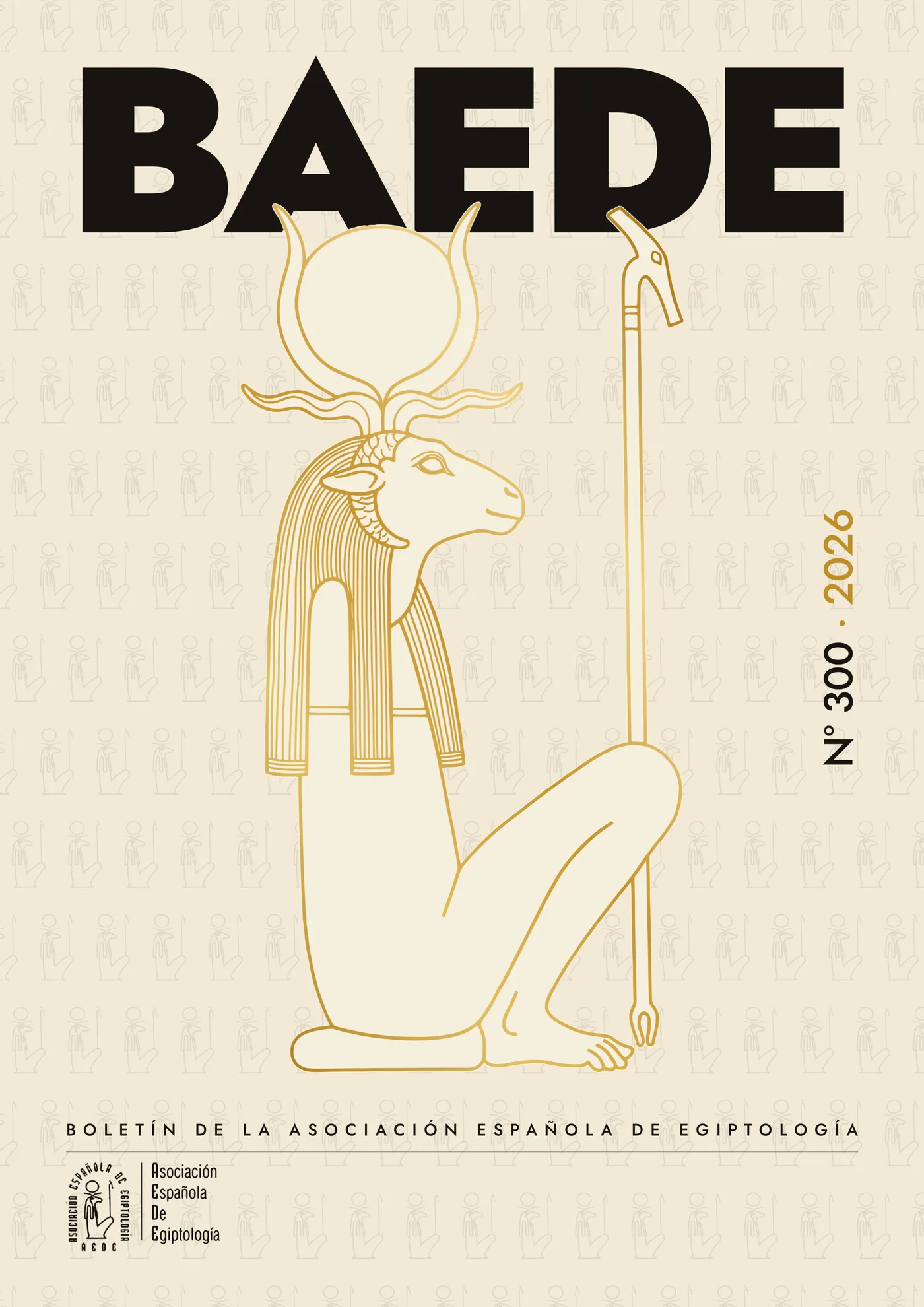
BAEDE is the journal of the Spanish Association of Egyptology: research papers read well beyond the university. The cover, though, has been solved the same way for years — a line illustration, the association's full name centred on top of it, and the issue number on a rule at the foot.
The problem is not that it looks dated. It is that the title prints over the drawing and the two eat each other; that it takes four lines of text before you know which journal you are holding; and that nothing carries over from one issue to the next. Every cover starts from scratch.
How it was solved
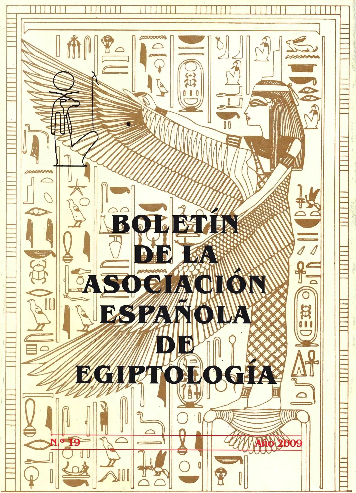
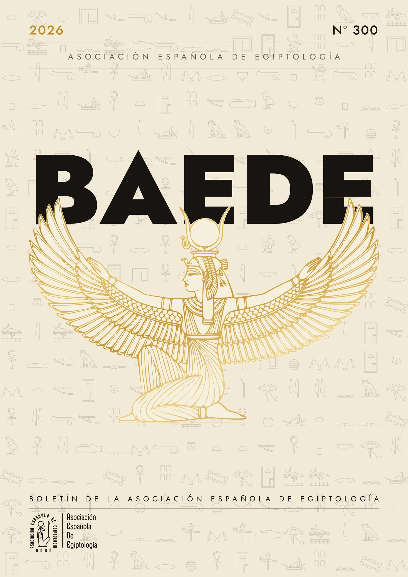
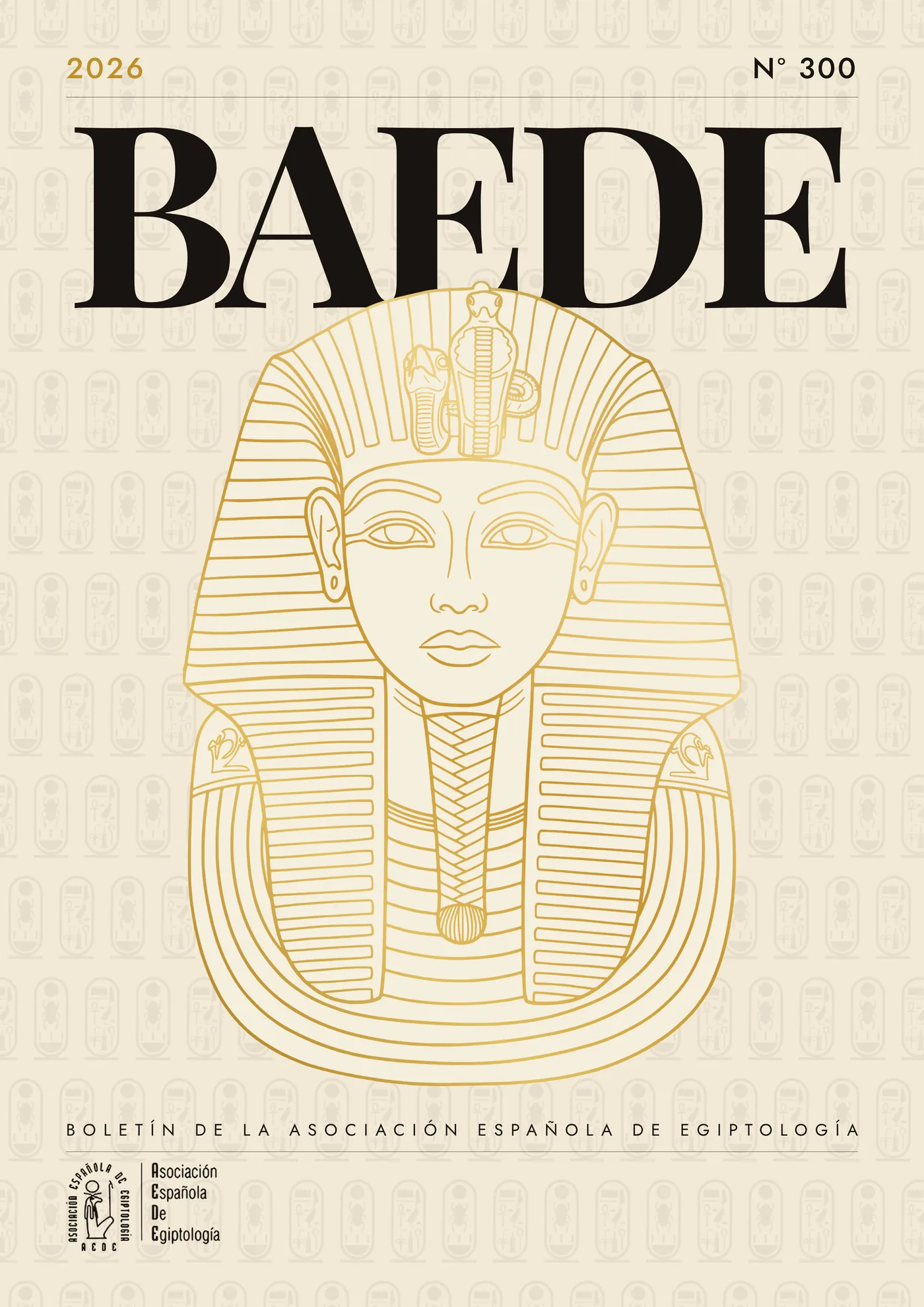
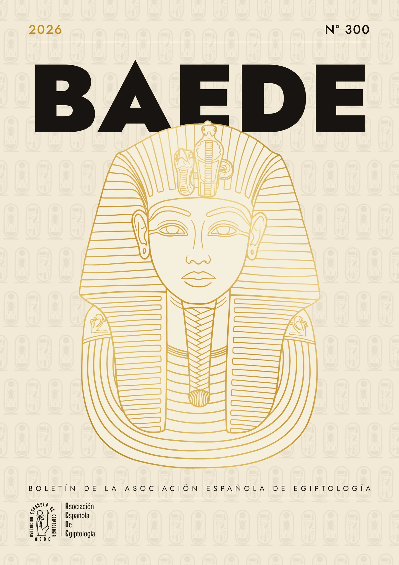
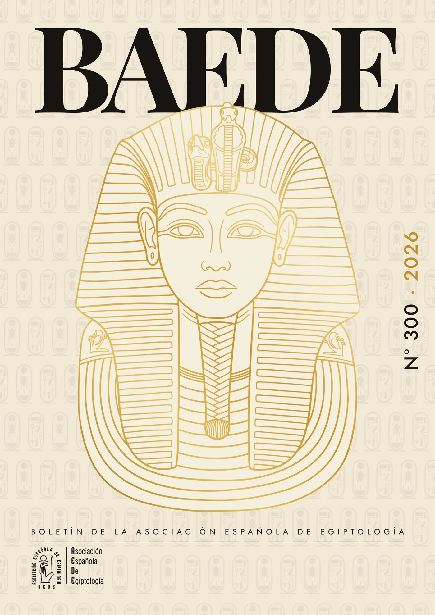
A cover system rather than a cover. The grid fixes four anchors: the BAEDE acronym set large at the head, the year and issue number in the top corners, the full name on a single line at the foot, and the association's logo bottom left.
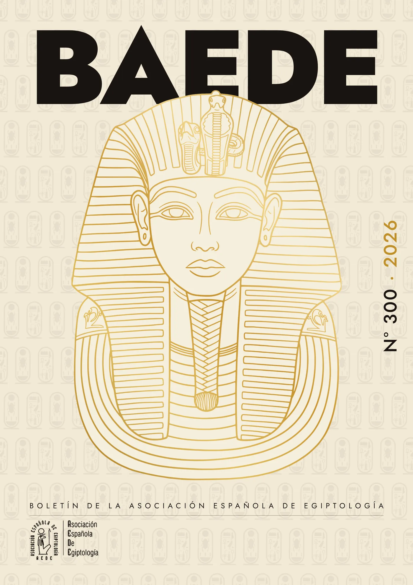
What changes from issue to issue is the image: a single-colour line drawing traced from a piece of the Egyptian repertoire itself, over a hieroglyphic pattern printed almost at the edge of visibility, which gives texture without competing for attention.
Six versions were presented on that base first, and they are really three crossed decisions: which illustration leads, whether the acronym is serif or sans, and whether the numbering sits in the header or turns vertical down the right margin.
What the journal gains
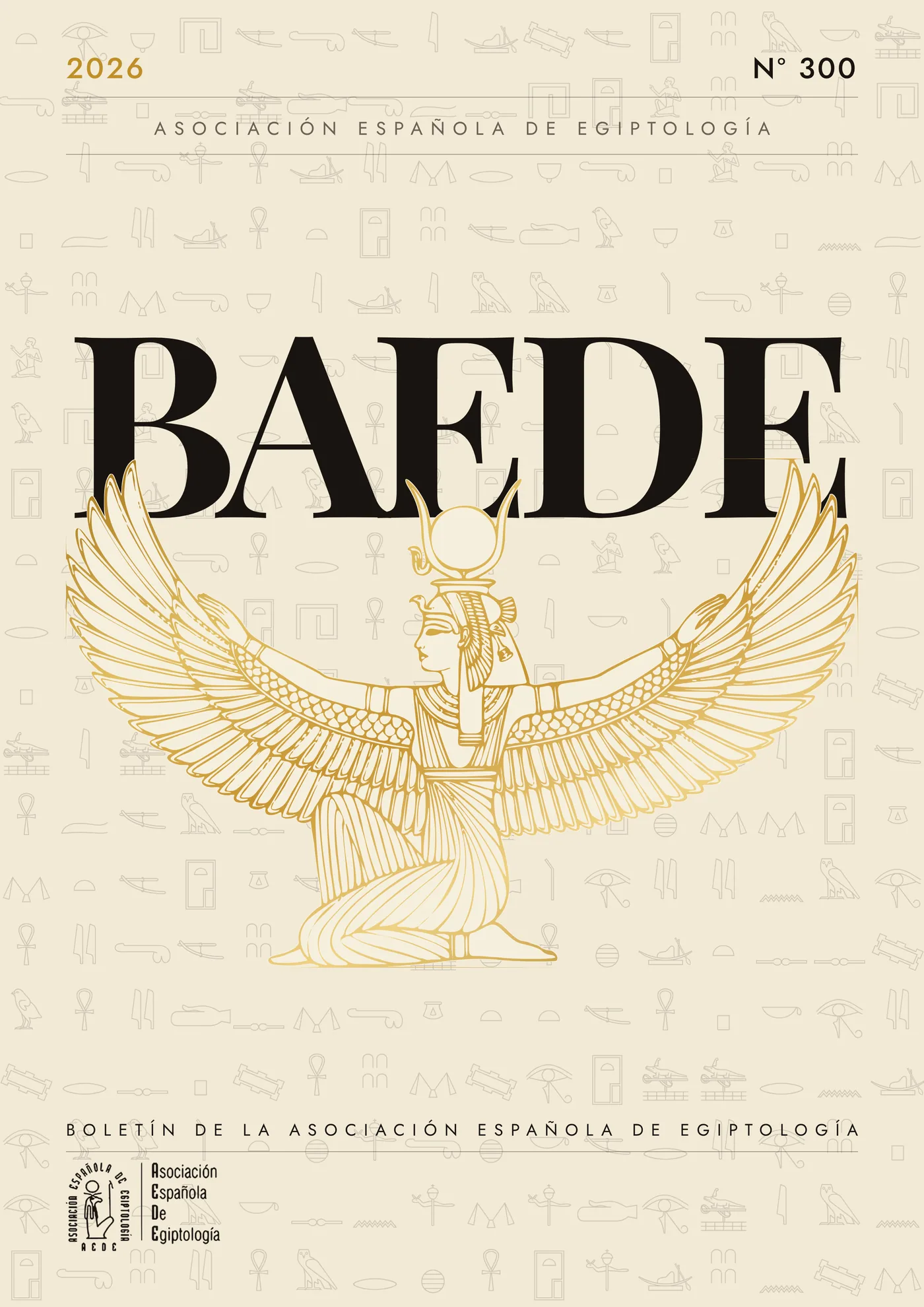
With the acronym at the head, the bulletin is recognisable from across a room and also as a thumbnail in a catalogue or a repository, which is where most of its readers now find it. The full name does not disappear: it moves to the foot, on one line, where it is read once you already know what you are holding.
And because the grid does not depend on the image, the collection holds together: change the drawing every issue and the covers still read as the same journal. It is the same reasoning behind the Djehuty Project dossiers.
Every version was delivered as vector artwork — illustration and background pattern on separate layers — so the association can set the following issues without rebuilding the cover each time.
Herishef, already in the logo
The first six versions borrowed two images from the general repertoire: a winged Isis and Tutankhamun's mask. Both hold a cover. Neither says anything about this particular association.
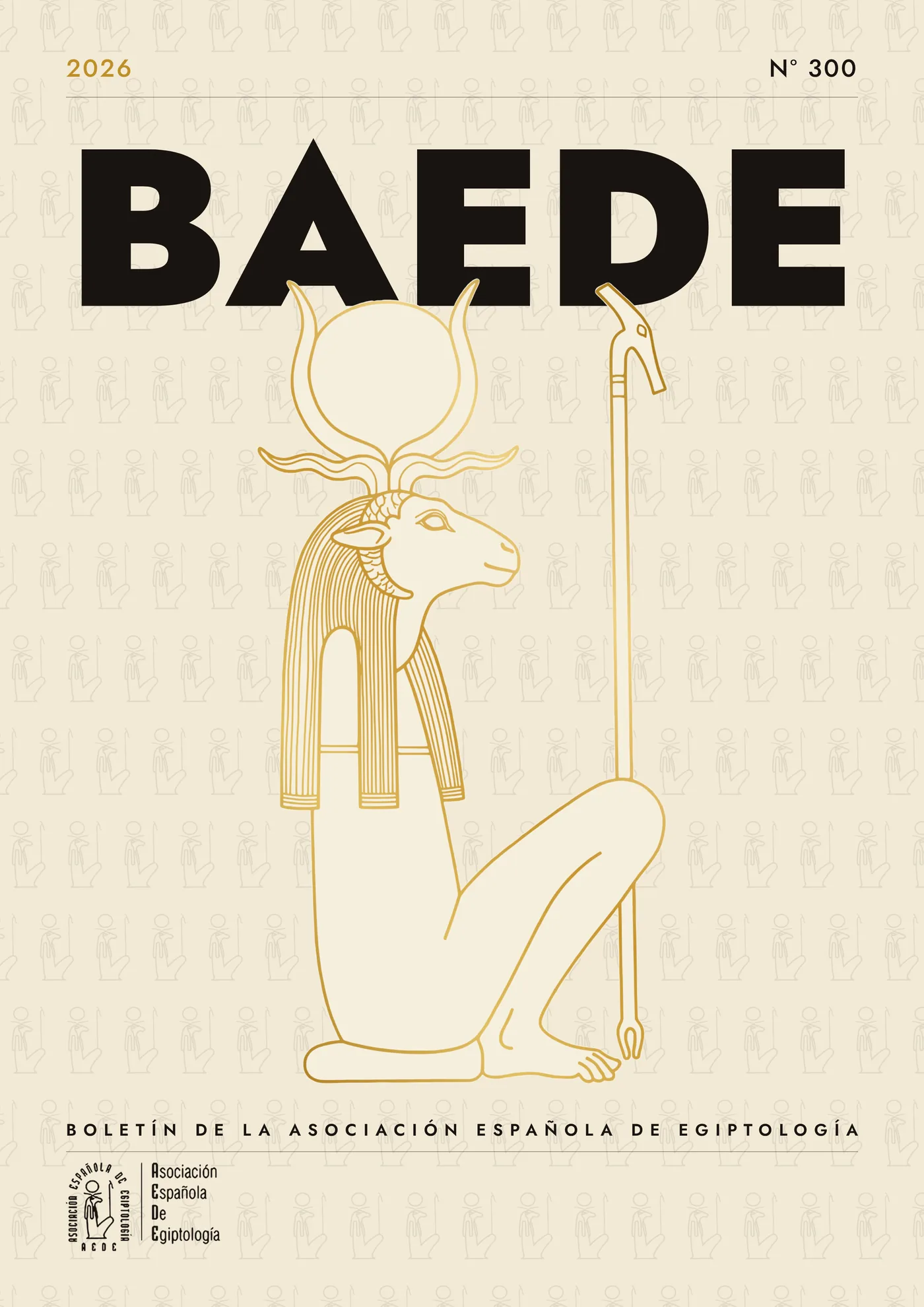
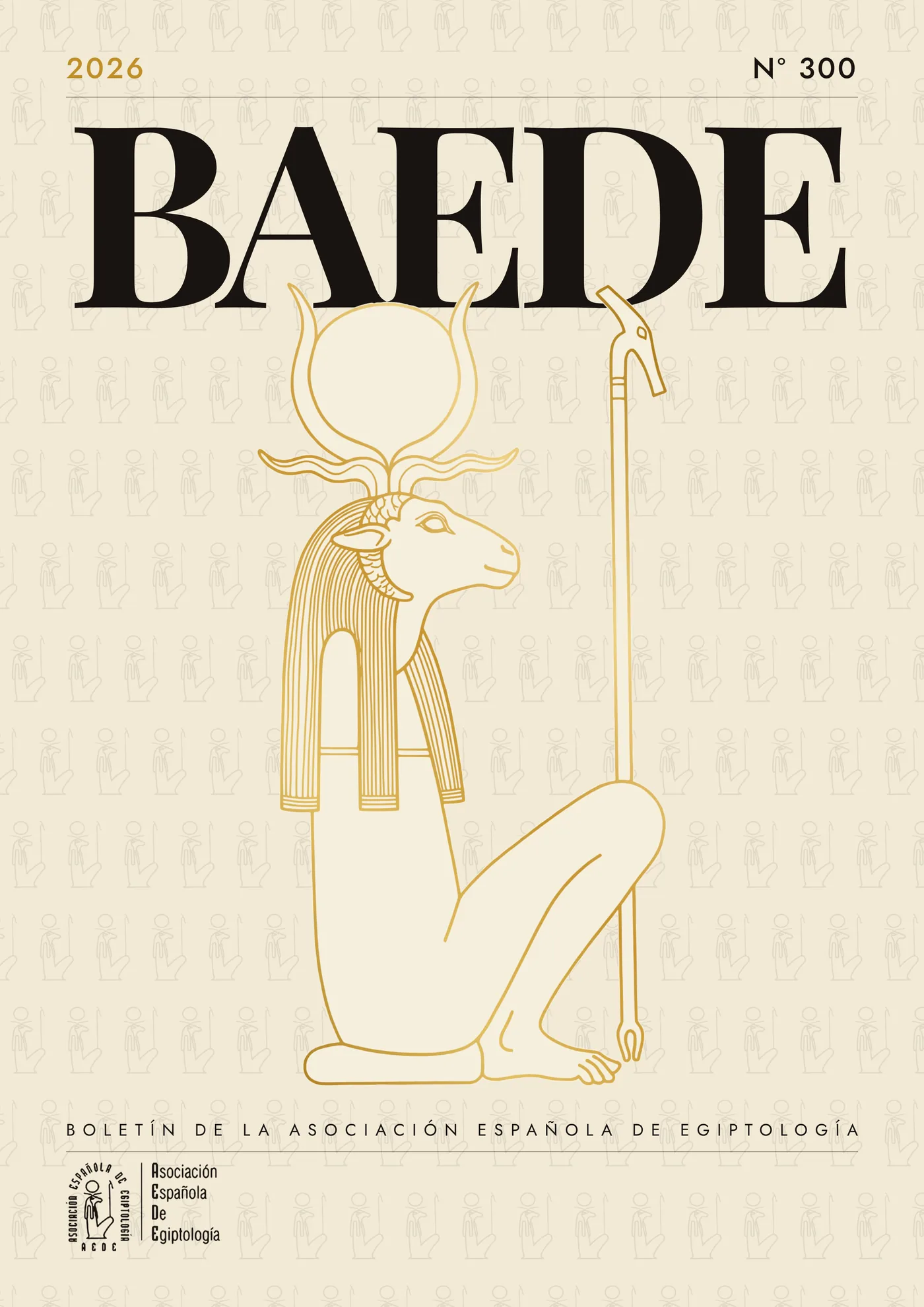
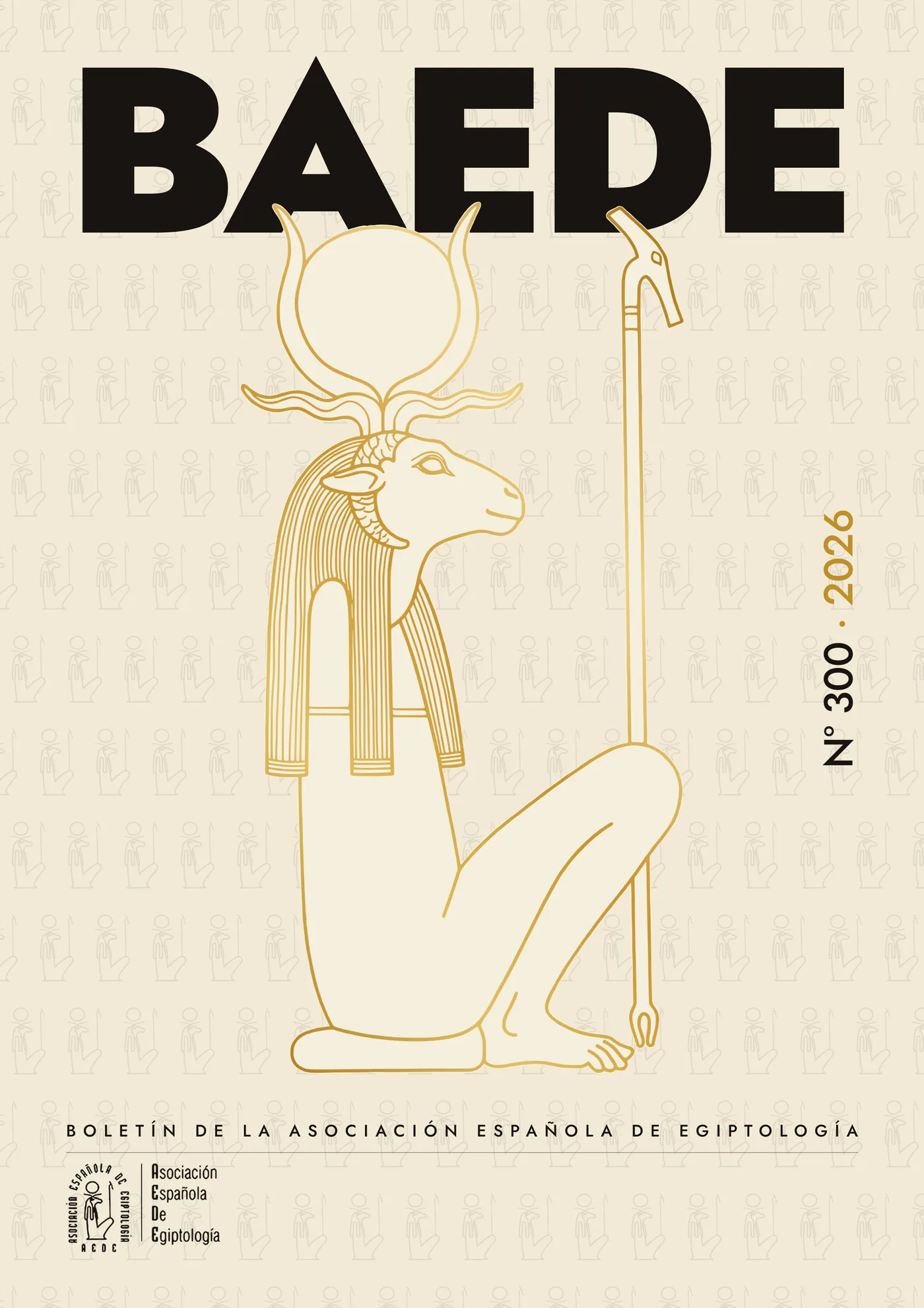
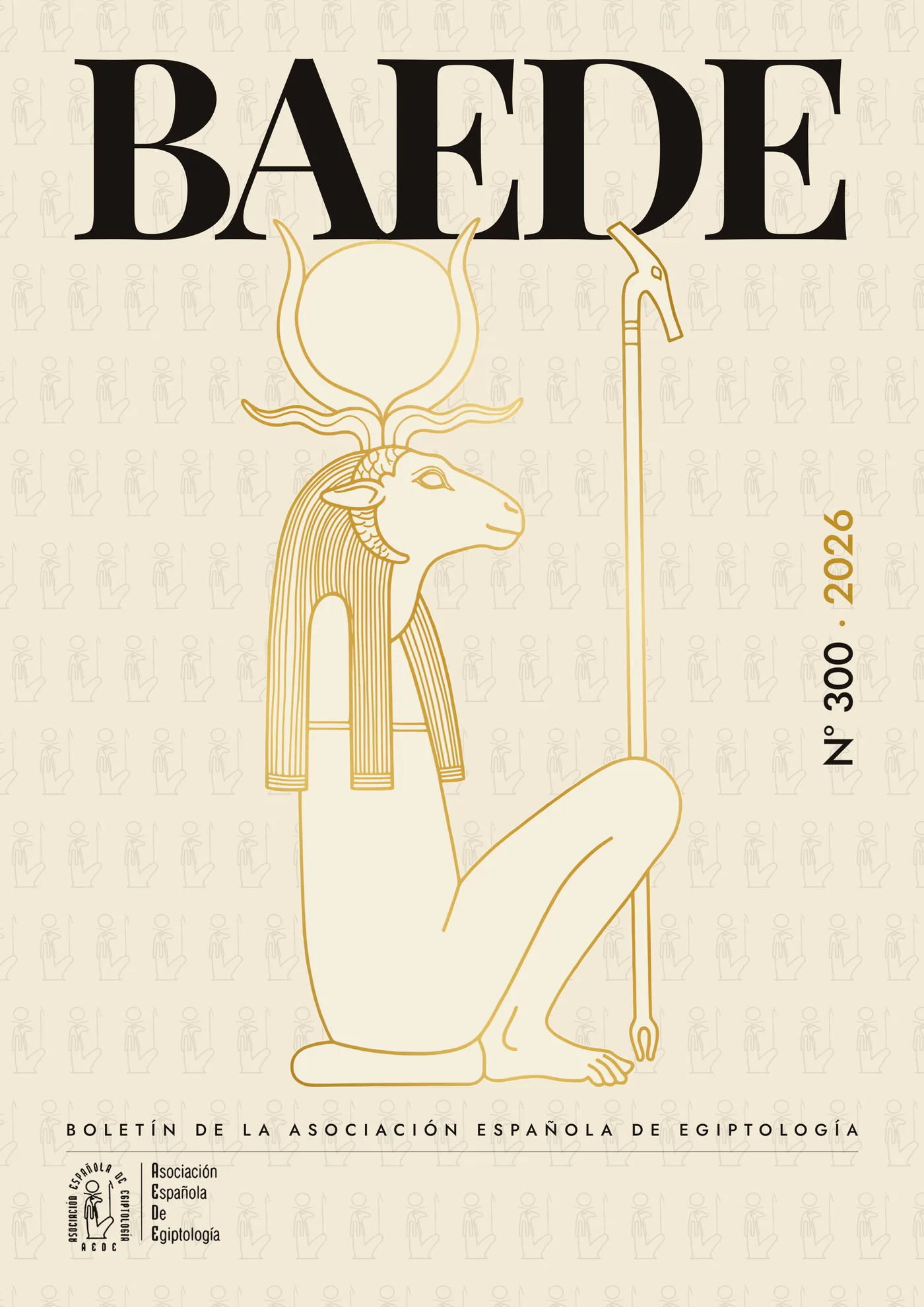
The logo of the Spanish Association of Egyptology has always carried Herishef — the ram-headed god of Herakleopolis Magna, seated, the sun disc between his horns and the was sceptre in his hand. He was already on the cover: bottom left, 28.5 mm wide, while the board above drew something else entirely.
These four versions redraw Herishef at cover scale, in the same gold line and over the same hieroglyphic pattern. Mark and image stop pulling in different directions: the logo at the foot becomes the thumbnail of what fills the whole board.
They are the same crossed decisions as before, minus the first: the acronym in sans (Jost Black) or serif (Playfair Display), and the numbering in the top corners or turned vertically against the right margin.
Why this family is, in all likelihood, the one that gets printed
None of the four needs explaining. A reader opening the bulletin recognises on the board the same figure the association has carried in its seal for decades: it is the cheapest argument a cover can have — nothing new to teach — and the only one that does not depend on the taste of whoever decides. The sans version with vertical numbering is the one taken through to the full jacket, because letting the acronym bleed off the top frees the whole height of the box for the figure.
The full jacket
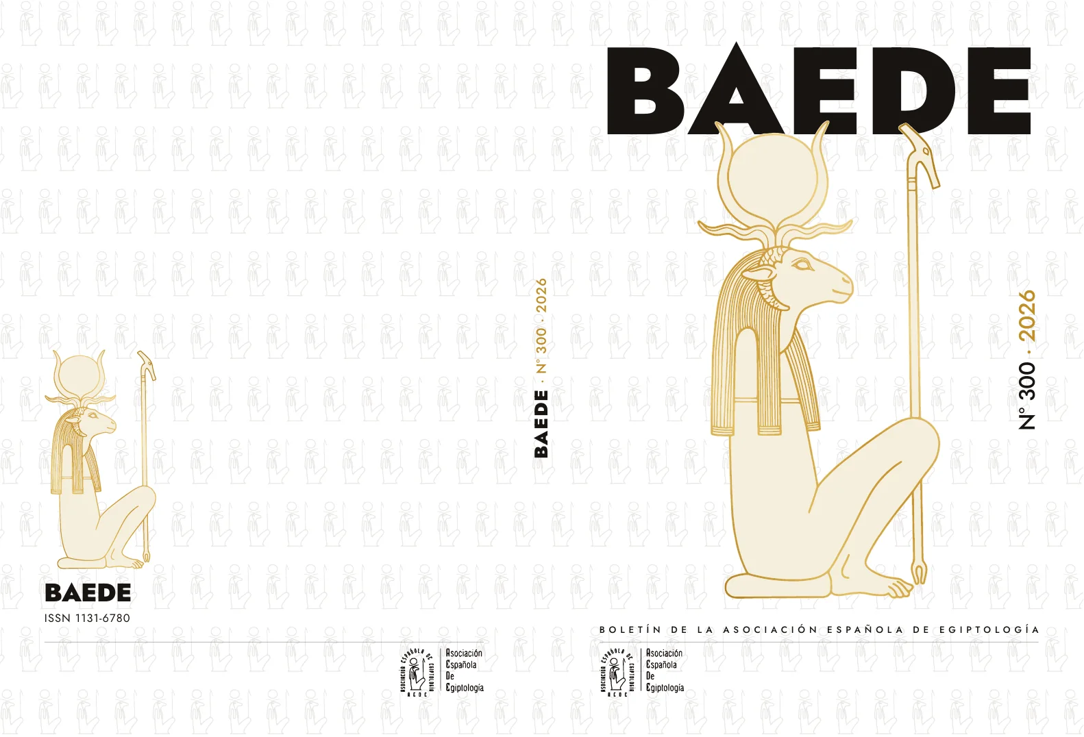
A cover is not sent to print on its own. What goes is the whole sheet: back cover, spine and front cover in a single 359 × 242 mm document, with 3 mm of bleed on all four sides and the folds marked at 172 and 187 from the left trim edge.
The spine is set at 15 mm, which on 90 gsm offset comes to roughly 300–320 pages. It is the one measurement in the document that has to be confirmed with the printer before exporting, because it depends on the paper actually bought.
The back cover repeats the board in miniature — the same figure at 35.7 × 70 mm against the left margin — and closes with the ISSN. What ties the two faces together is the baseline: the ISSN on the back and the bulletin's name on the front sit at exactly the same height, so text, rule and logo close level on both.
The geometry of the sheet
The grid was not invented for the jacket: it is the same one that held the ten covers, four anchors fixed and everything else free. Scaled up to the whole sheet, this is what has to be respected.
- The acronym. Jost Black at 118.4 pt, to the width of the box, baseline 42 mm from the top trim.
- The figure. Herishef at 82.2 × 161.4 mm, centred on the board, starting 37.3 mm down.
- The numbering. Issue number and year turned vertically, axis 16.3 mm from the right trim.
- The foot. Bulletin name, a rule at 45 % black and a 28.5 mm logo sitting on the bottom margin.
| Zone | Element | Typeface and size | Position |
|---|---|---|---|
| Front cover | BAEDE | Jost Black · 118.4 pt | To the width of the box; baseline 42 mm from the top trim |
| Front cover | Herishef | Vector illustration | 82.2 × 161.4 mm, centred, starting 37.3 mm down |
| Front cover | Issue number and year | Jost Medium · 21.26 pt · tracking −13 | Vertical; axis 16.3 mm from the right trim |
| Front cover | Bulletin name | Jost Medium · 8.79 pt | To the width of the box, above the rule |
| Front cover | Rule and logo | 45 % black · 28.5 mm logo | At the foot, against the left margin |
| Spine | BAEDE · Nº 300 · 2026 | Jost | Centred and rotated across the 15 mm |
| Back cover | Herishef, small | Vector illustration | 35.7 × 70 mm, against the left margin |
| Back cover | BAEDE | Jost Black | At the foot, above the ISSN |
| Back cover | ISSN 1131-6780 | Jost Regular · 2.8 mm | 12 mm in from the margin, on the front cover's baseline |
| Back cover | Rule and logo | 45 % black · 28.5 mm logo | Rule to the width of the box; logo against the right margin |
The two families
The whole jacket is set in two typefaces and nothing else. Jost — geometric, open licence, an avowed descendant of Futura — carries all of the information across four weights. Playfair Display Bold appears only where the acronym is set in a serif.
Playfair is not used on the jacket that was built, which is the sans one, but it ships with the delivery all the same: it sets the acronym on the serif versions, and without it those two cannot be opened.
Two things the client's file had wrong
The document came from Affinity Publisher and carried two things you do not see until you open it to look. First, a typo: the code on the back cover was set as ISNN instead of ISSN, which is what the initials stand for — International Standard Serial Number; the number itself, 1131-6780, was right. Second, two automatic font substitutions: the issue number and year were coming out in Helvetica and the bulletin's name in Jost Regular, because Jost Medium was not installed on the machine that opened the file. Both belong in Jost Medium. That is why the delivery ships the fonts alongside the artwork instead of assuming they are in place.
Colour
Five values for the whole sheet, none of them picked on screen for the look of it: the black that carries the acronym, the gold of the line, the beige of the simulated paper and a grey at 21 % for the background pattern. They are delivered in RGB with the instruction to convert to CMYK using the printer's profile, because the gold is the one that shifts most in four-colour.
#191410The acronym, the text and the rules on both boards.#C08F27The vertical numbering and the outline of the sceptre.#B07F22 → #EFD285Herishef is not a flat tint: the line opens from dark to light gold, top to bottom.#F6EFDDThe fill of the figure, one step up from the ground.#9A938AThe hieroglyphic pattern at 21 %: texture, not drawing.What gets delivered
- The sheet as a layered PDF — ground, illustration and text — which Affinity Publisher turns into document layers.
- The same sheet flattened, which is the one to send to the printer.
- The artwork as SVG, for Affinity Designer or Illustrator.
- The five fonts: Jost Regular, Medium, SemiBold and Black, and Playfair Display Bold, both under the SIL Open Font License.
- Final output as PDF/X-4, with 3 mm bleed and crop marks, converted to CMYK with whichever profile the printer specifies.
Next in Graphic design
Kacho Cano · Identity