Be the design furniture app
The three affordable design brands have no app. The download is earned with what only an app can do: AR, saved rooms and delivery tracking.
Work / Product UX/UI / Olmo app for iOS
Project 02 of 28 in the archive 02 of 09 in Product design UX/UI See the whole discipline ↗
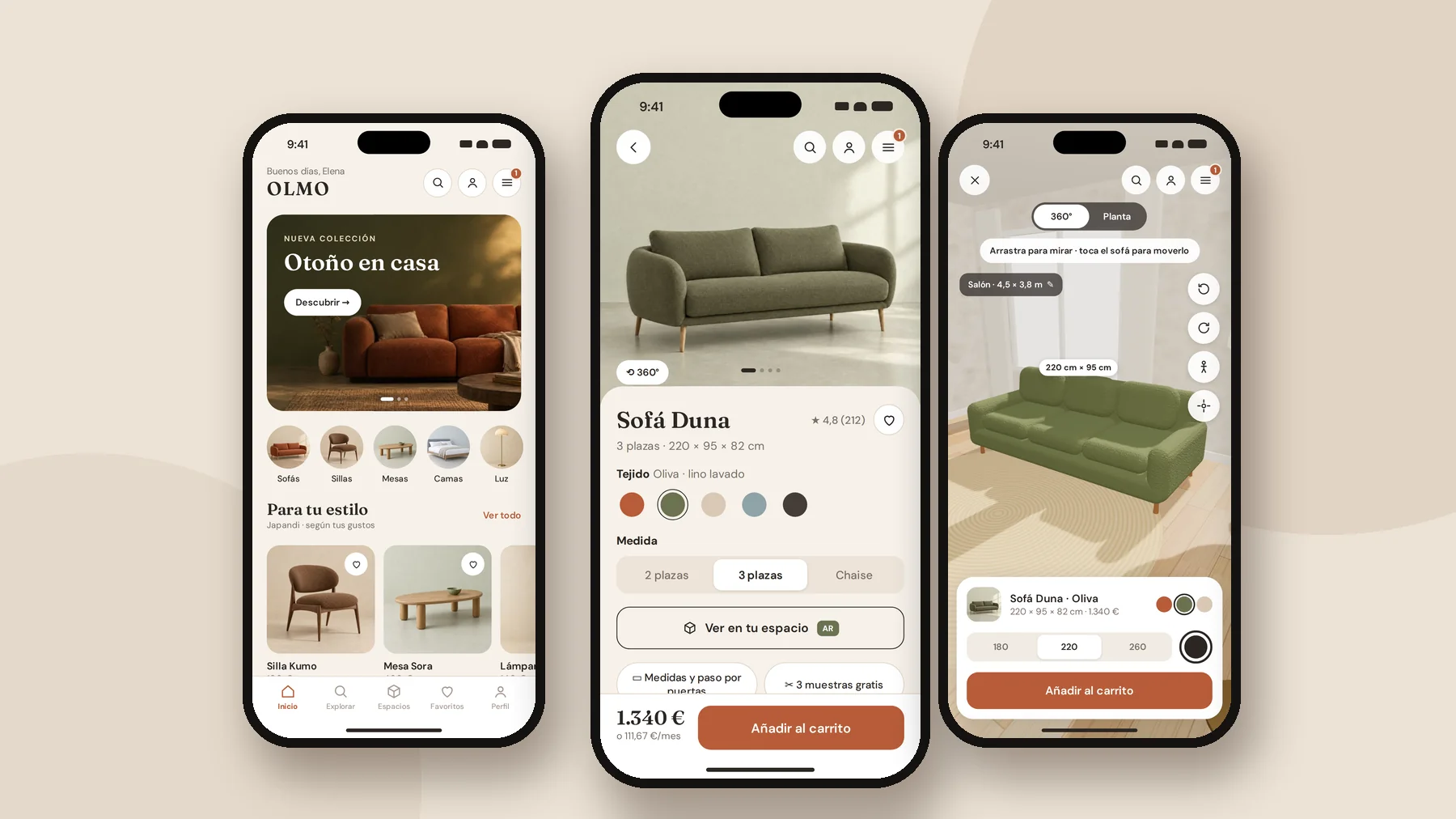
Olmo is a brand I invented to work on a real problem: selling expensive furniture from a phone. A Madrid design furniture brand, warm and made of natural materials, with a physical store and an app that is not just the website squeezed down.
Furniture has something fashion does not: you cannot try it on. You imagine it. And what people imagine is almost always the same: whether it fits the space, whether it goes through the door, whether the fabric matches the photo and what it will cost in the end with delivery and assembly.
I worked the whole project end to end, in the same order I follow with a client: understand the market first, then decide, and only then draw.
Brands analysed
IKEA, Westwing, Kave Home, Sklum, Maisons du Monde and five moreUser flows
Purchase, first use and photo searchWireframes and hi-fi screens
From grey boxes to final design, same screensClickable prototype
Figma with Smart Animate plus an HTML build with the 3D AR viewerI started with the market and with how people buy furniture online: sector data for Spain and the usability research from Baymard Institute and Nielsen Norman Group, which test real users on furniture stores.
The finding that changed the project was about augmented reality. Everyone uses it as a hook, yet in Baymard's tests 87% of users who saw the "view in your room" button chose not to use it. Not because they don't want to see it at home, but because the experiences they know work badly: imprecise controls, models that resize by accident and colours that don't match the photo.
Furniture retail in Spain
2024, +1.5%. Source: DBKOnline share
Furniture, lighting and home. Source: DBKAverage cart abandonment
40% because of extra costs. Source: BaymardSkip the AR they find
In furniture user tests. Source: BaymardStart the product page with images
Versus 46% in general e-commerceLook for shipping on the product page
And 43% of stores don't show it thereNo in-scale images
Of the sites Baymard reviewedOf apps have a mediocre product page
Worse than desktop (52%) and mobile web (62%)AR doesn't win by being there; it wins by being done well. If the sofa resizes when you touch it or shows up in another colour, it destroys trust instead of building it. That is why Olmo's AR viewer has locked scale, the exact fabric you picked and centimetres in view, and sits after the gallery and the measurements, not before.
I compared the stores competing in Spain for the same customer, plus two international references, on the same criteria: whether they have an app, what they do with AR, how they handle delivery and assembly and which payment methods they offer.
The finding is a gap: Kave Home, Sklum and Maisons du Monde, the three affordable design brands, have no shopping app. On mobile they only sell through the website. The ones that do have an app all sit at 4.7 stars, so the bar is not having an app, it's making it worth the download.
| Brand | iOS app | AR / 3D | Delivery and assembly | Payments |
|---|---|---|---|---|
| IKEA | Yes · 4.7★ | IKEA Kreativ: scans the room and erases your furniture | Inside the home · Taskrabbit assembly from €23 | Own financing · no Apple Pay online |
| Westwing | Yes · 4.7★ | Virtual try-on, unspecified | Carrier with time slot · assembly unpriced | Card, PayPal, Klarna |
| Zara Home | Yes · 4.7★ | No | — | — |
| Leroy Merlin | Yes · 4.7★ | Photo search and paint simulator | 2-hour pickup · 24-hour delivery | — |
| Kave Home | No | Sofa configurator on the web | Delivered unassembled · agency assembly | Apple Pay, Klarna, Scalapay |
| Sklum | No | No | Installation +€19.99, requested by phone | Apple Pay, Klarna, SeQura |
| Maisons du Monde | No | AI that redesigns your room | Delivery by appointment · 2-hour pickup | Apple Pay, Klarna, Alma |
| Wayfair (ref.) | Yes · 4.9★ (US) | View in Room 3D and planner | Real-time tracking | — |
| Castlery (ref.) | — | Web AR, no app | — | Up to 3 free fabric swatches |
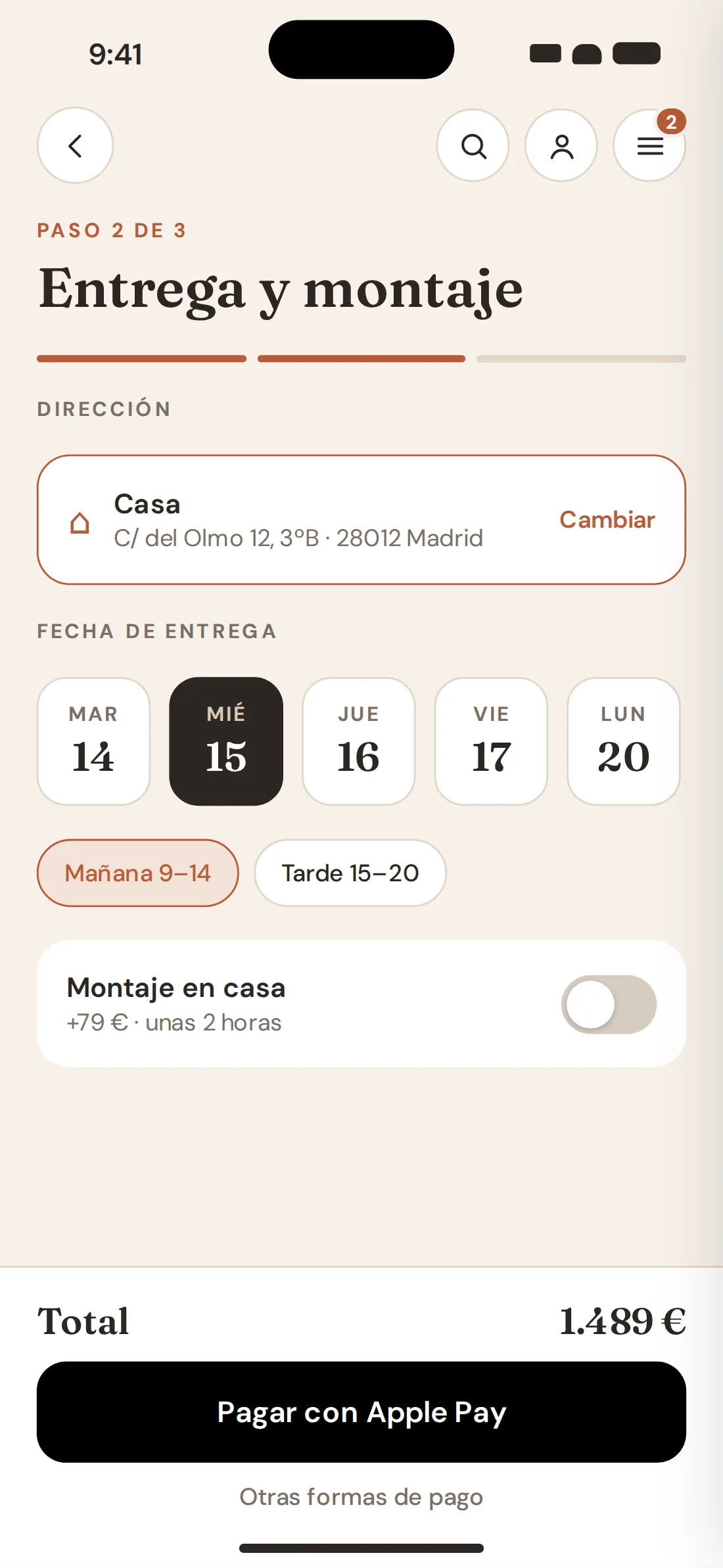
| Olmo | Yes | Real-scale 3D viewer, 360°, floor plan and your own 360° photo | Date, time slot and assembly on the product page and at checkout | Apple Pay and monthly price in view |
At Sklum you book assembly by calling customer service, Westwing publishes no price and Kave Home doesn't show one in its help article. Only IKEA calculates it at checkout. On a €1,300 sofa, assembly and delivery date are part of the price, and hiding them is exactly what triggers abandonment over extra costs.
The research and the benchmark produced eight opportunities. None is an opinion about taste: each points to a data point or a specific gap in the comparison, and each became a design decision.
The three affordable design brands have no app. The download is earned with what only an app can do: AR, saved rooms and delivery tracking.
87% skip it. It comes after the gallery and measurements, with locked scale, the exact fabric and a camera-free alternative.
People leave when they don't understand them. Dimensions and door clearance one tap away, with Madrid's old flats in mind.
Castlery sends three for free. In Olmo you order them from the product page, next to the fabric picker.
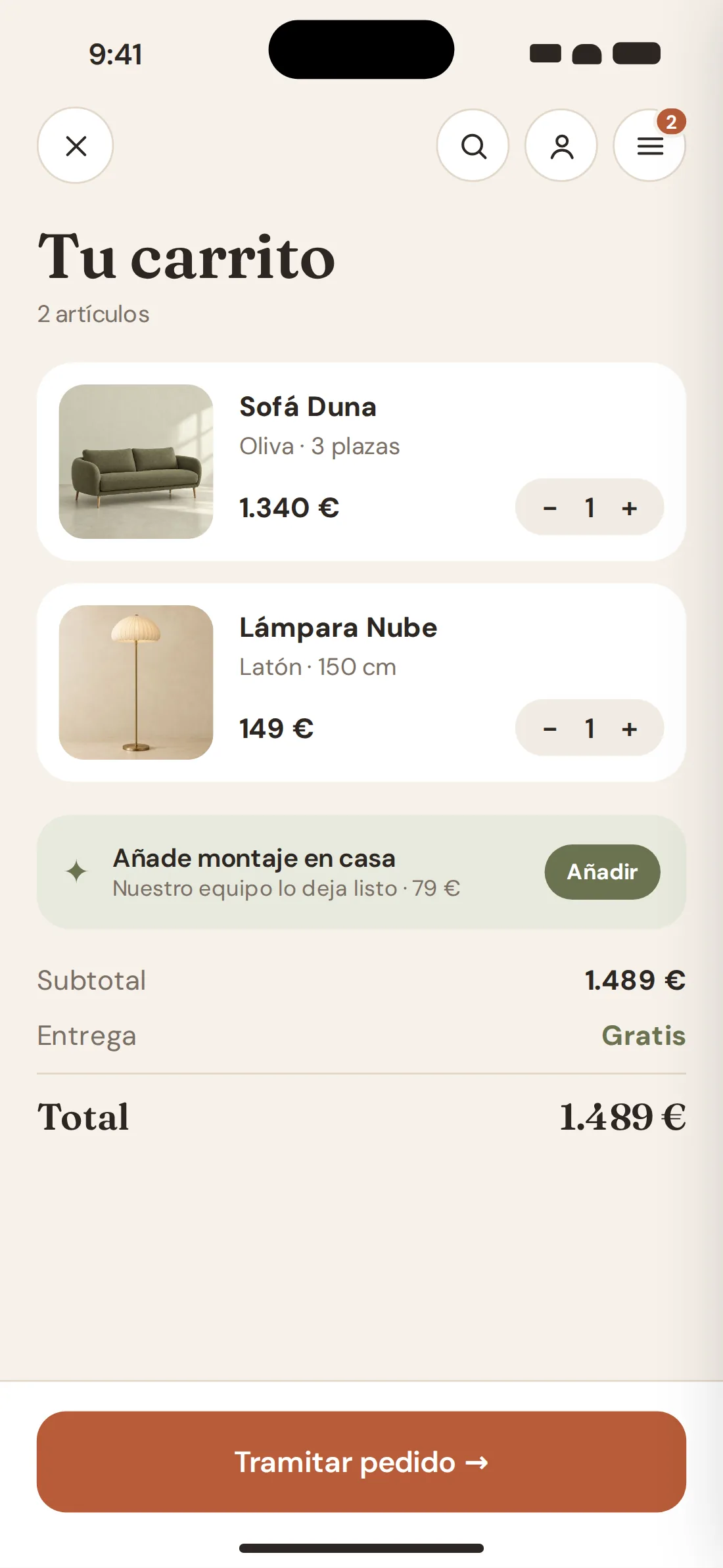
64% look for shipping on the product page. Date, time slot and priced assembly are visible before checkout.
Design competitors pair Apple Pay with instalments. The monthly price sits under the price and the final total shows before paying.
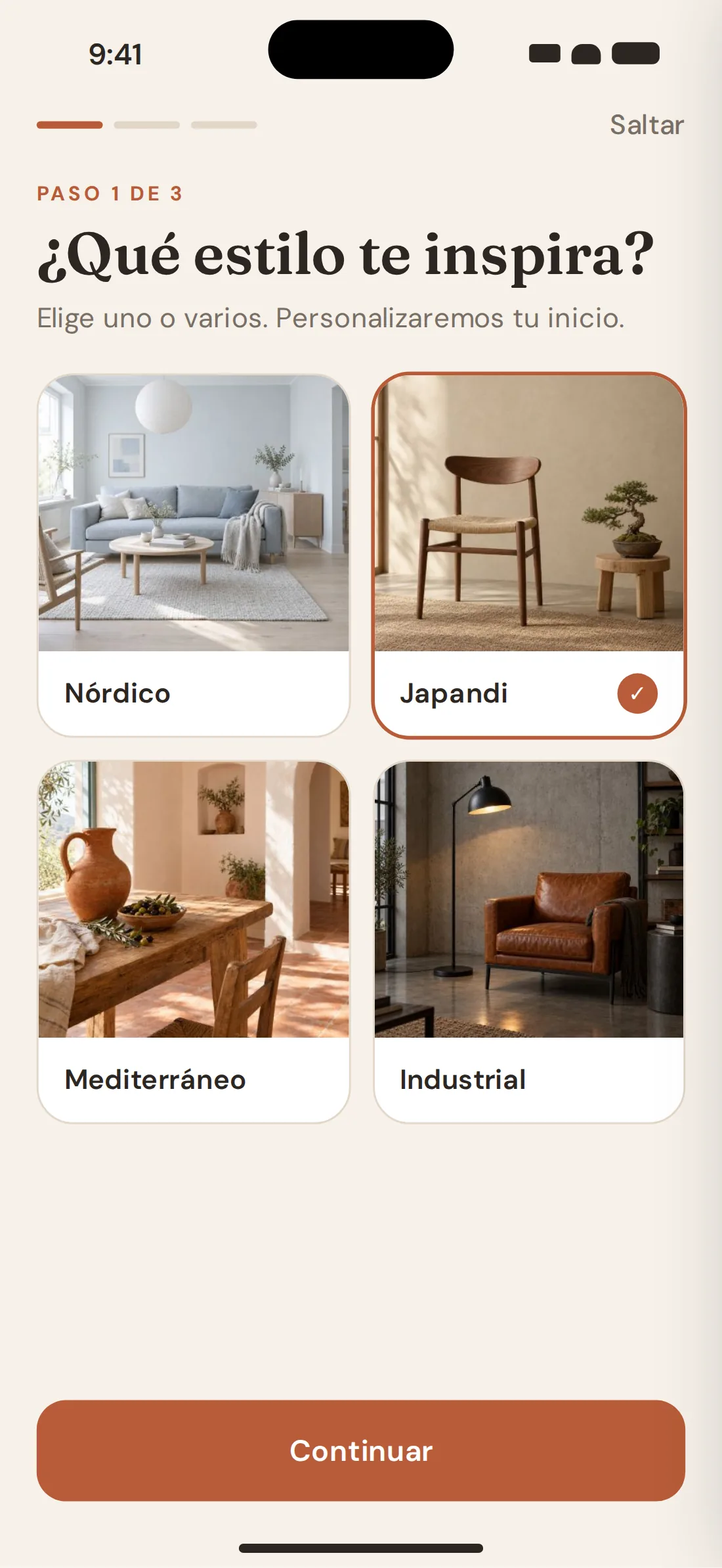
Westwing's style quiz is editorial. Olmo's feeds the home screen: "For your style" comes from what you pick.
63% of stores don't let you browse customer photos. It's the product's next iteration.
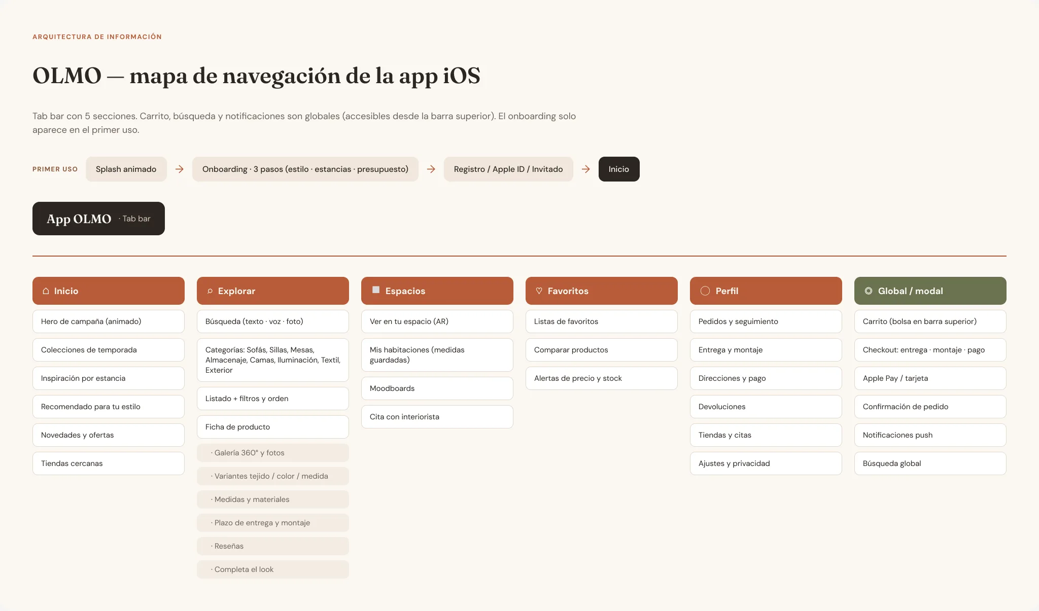
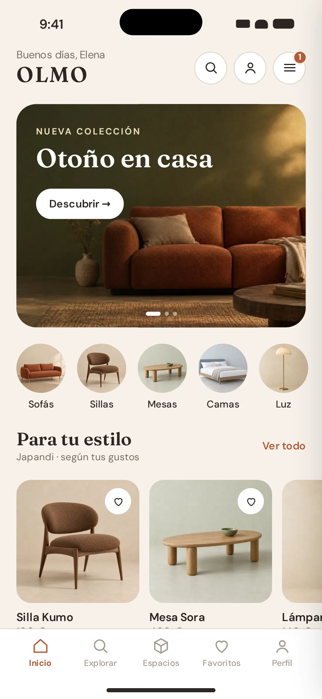
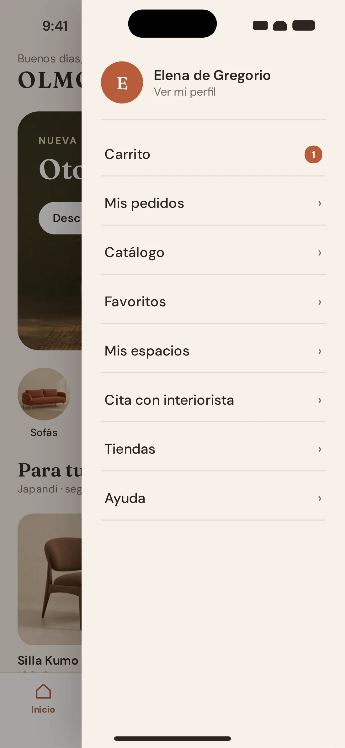
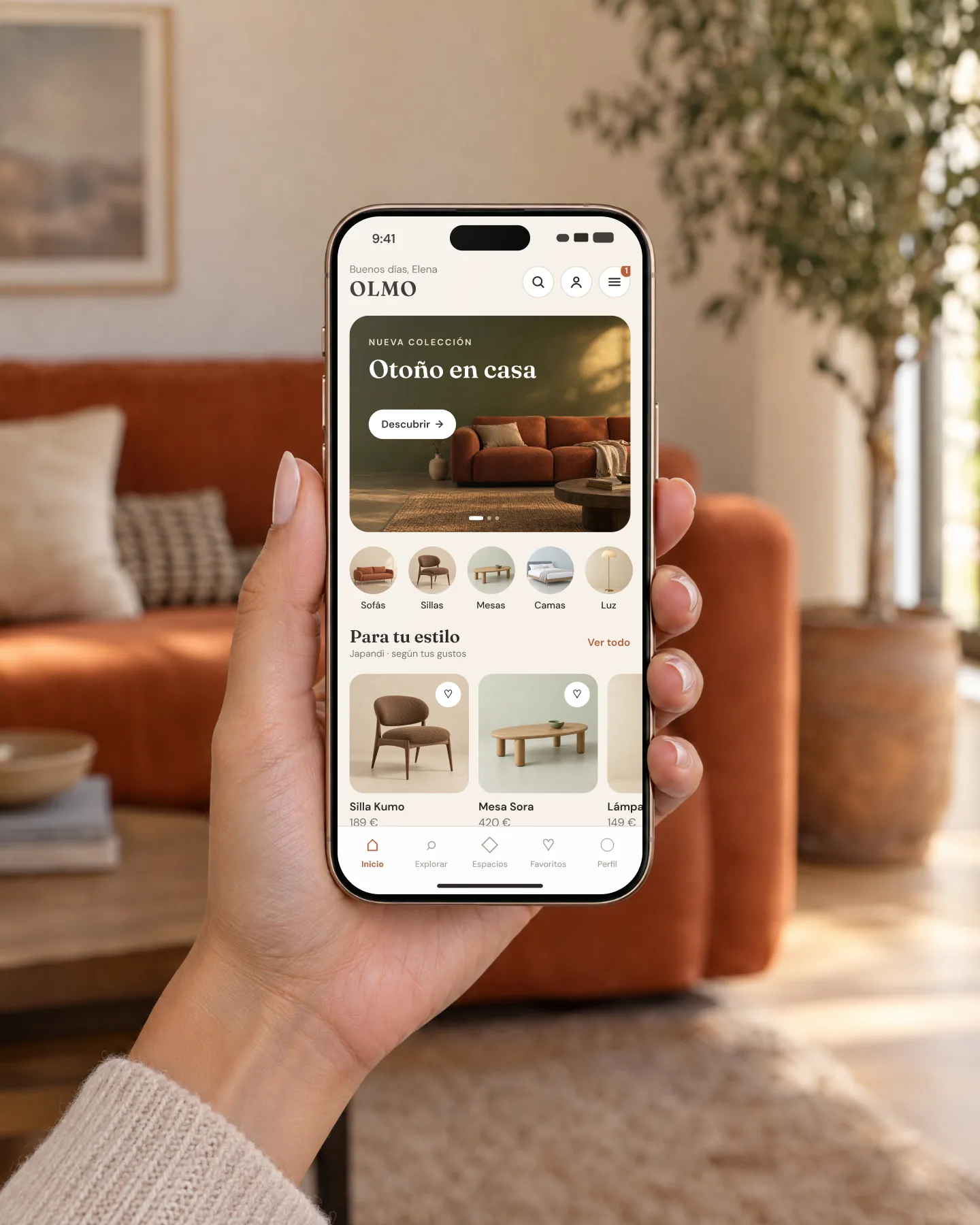
The app is organised in five tabs: Home, Explore, Spaces, Favourites and Profile. Search, profile and menu always sit top right on every screen, and the cart lives inside the menu with its counter, so the header doesn't grow with every new feature.
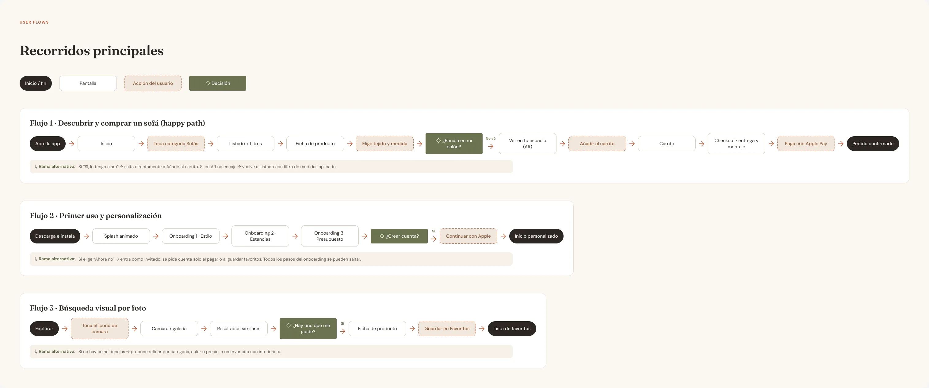
I mapped three journeys with their alternative branches: discovering and buying a sofa, first use and photo search. The branch I cared about most is in the first one: if the sofa doesn't fit in AR, the app takes you back to the list with the size filter already applied instead of leaving you at a dead end.
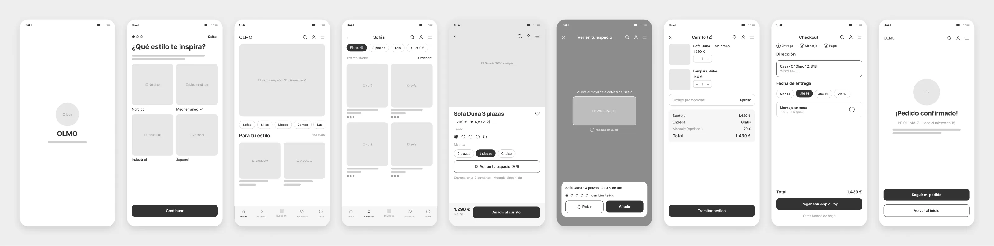
The nine wireframes cover the whole purchase flow, from splash to confirmation. They are grey and unbranded on purpose: at this stage the discussion is what is on each screen and in what order, not the colour of the button.
Low fidelity as they are, they were already wired as a prototype in Figma, and each screen carried a note with its planned animation. That way motion was decided with the flow in mind rather than added at the end as decoration.
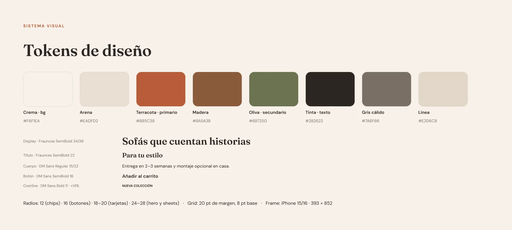
The palette comes from the product itself: linen sand, bouclé terracotta, oak and olive. They are the colours of the fabrics the brand sells, so the interface never competes with the sofa photo; it frames it.
Terracotta is reserved for what you can act on. Olive is secondary and belongs to AR. The background is cream, not white, because pure white makes product photos look cut out.
#F6F1EAThe surface of every screen#EADFD2Product backgrounds and segmented controls#B85C38Buttons, active tab and counters#8A5A3BAccents#6B7250AR, confirmations and assembly#2B2622Headings and figures#7A6F66Secondary text and labels#E2D6C8Borders and dividersTwo families. Fraunces, a serif with the character of an editorial catalogue, only for headings and prices. DM Sans for everything else, because on buttons, labels and dimensions what matters is reading at a glance.
Colour, type, radii and grid on one board. Radii scale with the object: 12 for chips, 16 for buttons, 18–20 for cards and 24–28 for the hero and sheets. 20 pt margins, an 8 pt base and the iPhone 15/16 frame, 393 × 852.
Figma · 00 · Cover — Design tokens8 colours · 5 text styles
The motion spec is written like the colour spec: with values, and with the reason behind each one. An animation without a reason is the first thing cut when a project runs late.
| Interaction | Transition | Duration | Why |
|---|---|---|---|
| Splash | The logo draws in one line | 600 ms | Introduces the brand without delaying entry |
| Card → product page | Shared element: the photo grows | 500 ms | The product never leaves your sight |
| Fabric change | Crossfade between real photos | 450 ms | Immediate feedback on the variant |
| AR · place | The sofa drops with a soft bounce | 750 ms | Shows it has anchored to the floor |
| Add to cart | The product flies to the menu | 700 ms | Says where it went without a toast |
| Payment → confirmation | Drawn check and brand confetti | 500 ms | The only moment of celebration |
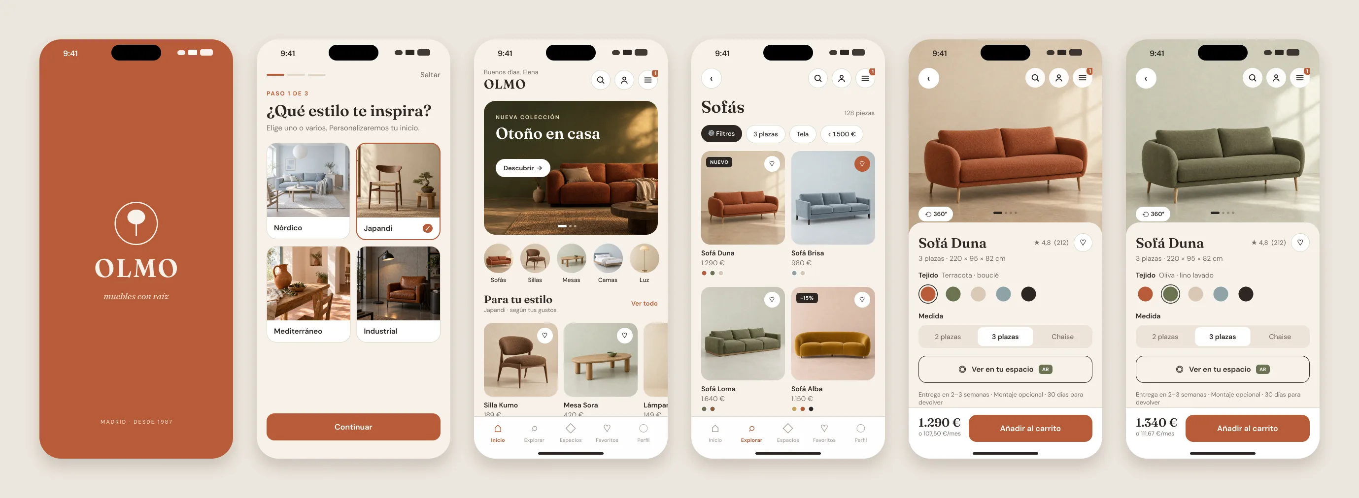
The product and room photos are AI-generated in Higgsfield, making sure every sofa shares the same light, angle and floor. That is what makes a catalogue look like one brand and not a collage of suppliers.
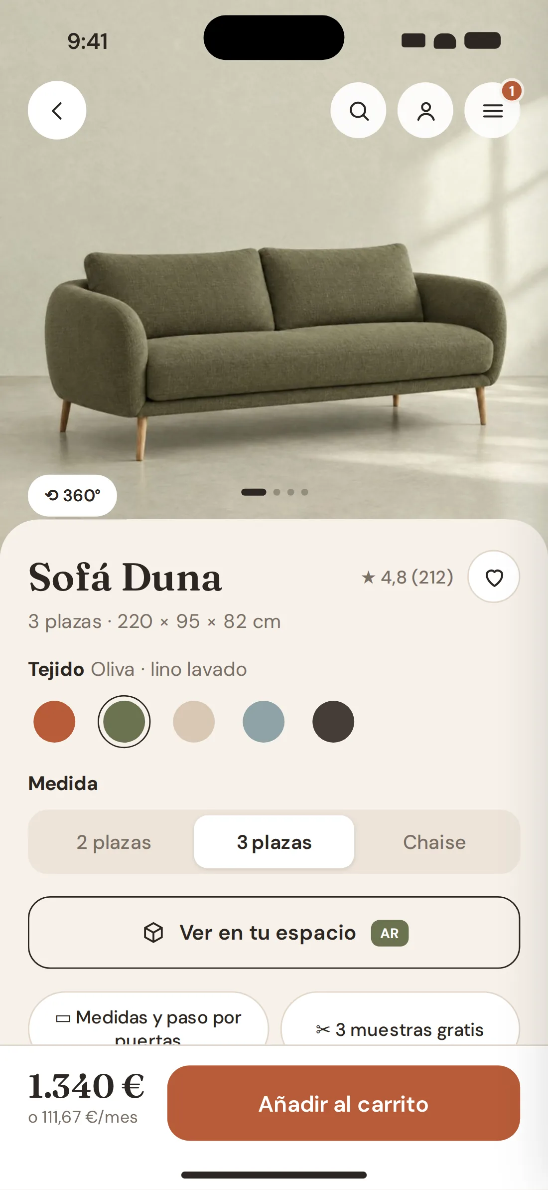
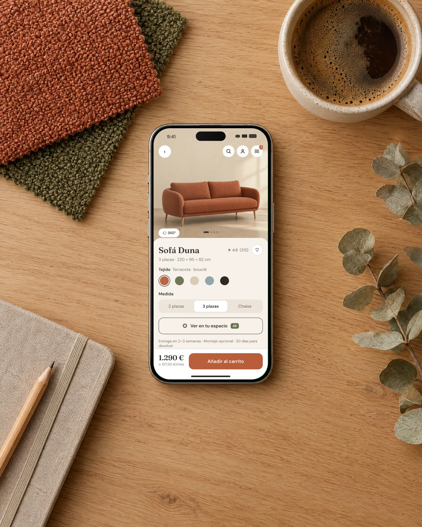
The Duna sofa page has its five fabrics photographed in the same framing, so changing fabric changes the whole photo, not a colour filter on top. The monthly price sits under the price, and dimensions with door clearance and three free swatches are one tap away.
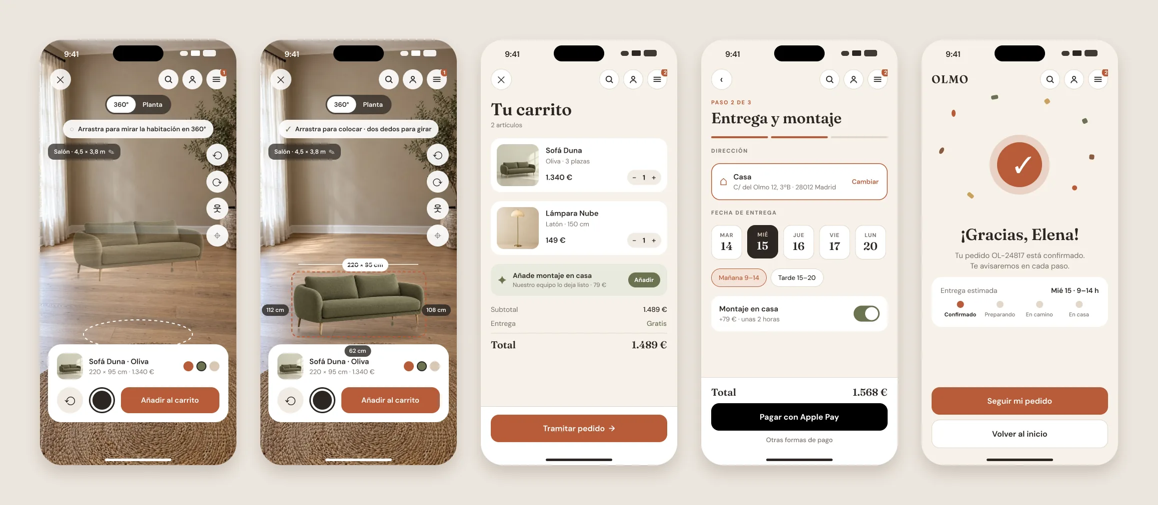
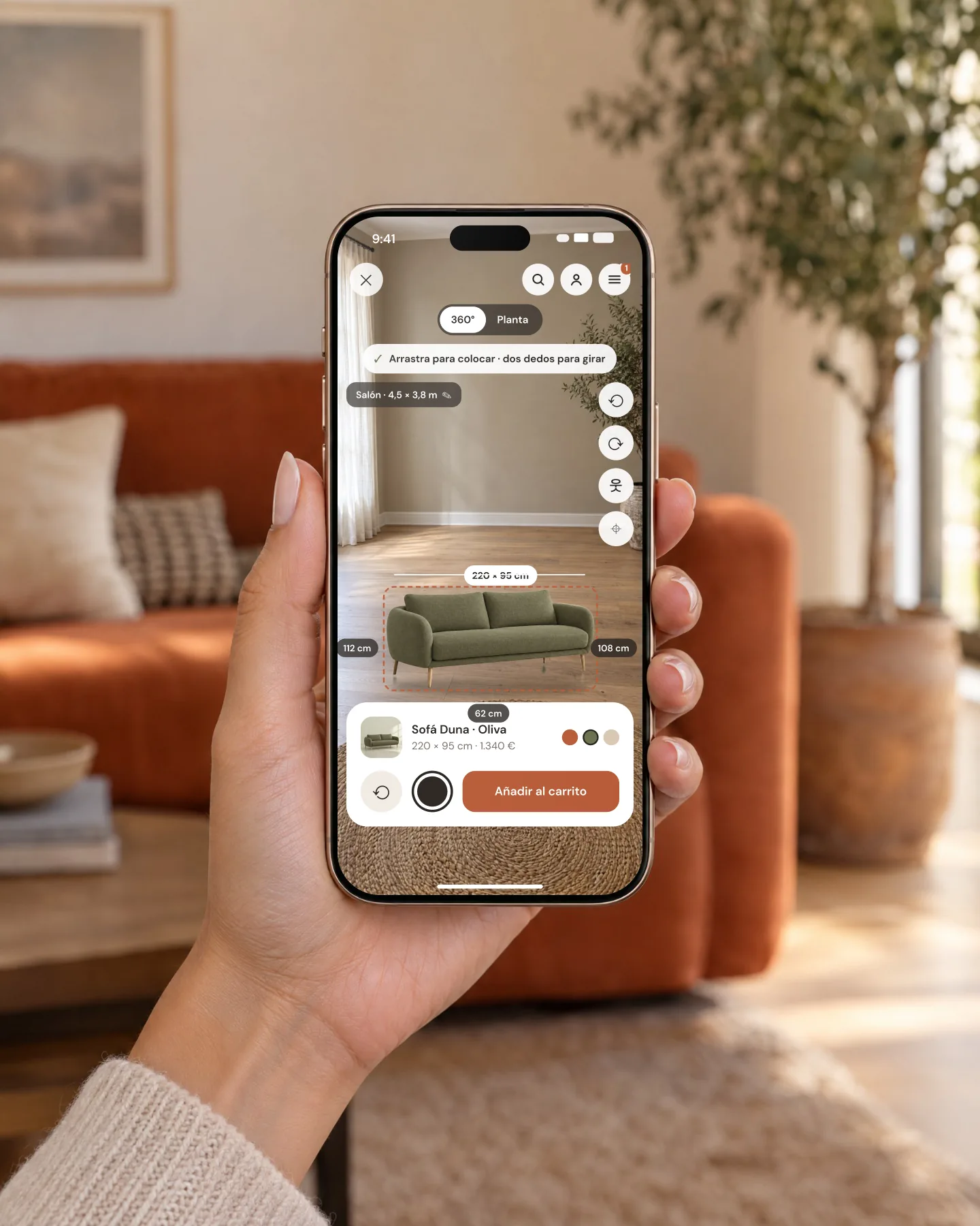
The first version of the viewer was the one everybody makes: the sofa on top of a photo of the room. When I tried it I found the same problem Baymard describes: the sofa looked small, couldn't be moved and there was no way to tell whether it fit. So I rebuilt it as a 3D viewer.
You look around the room in 360° by dragging. You tap the sofa and take it anywhere on the floor, rotate it with two fingers, and it never changes size: it always measures its 180, 220 or 260 cm. While you move it you see the centimetres left to each wall, and if it hits the plant or the lamp, it says so in red.
There is a floor plan view for precise placement, a 1.70 m person for scale and two ways to use your own home: enter your living room's width and length, or upload a 360° photo taken with your phone from the middle of the room.
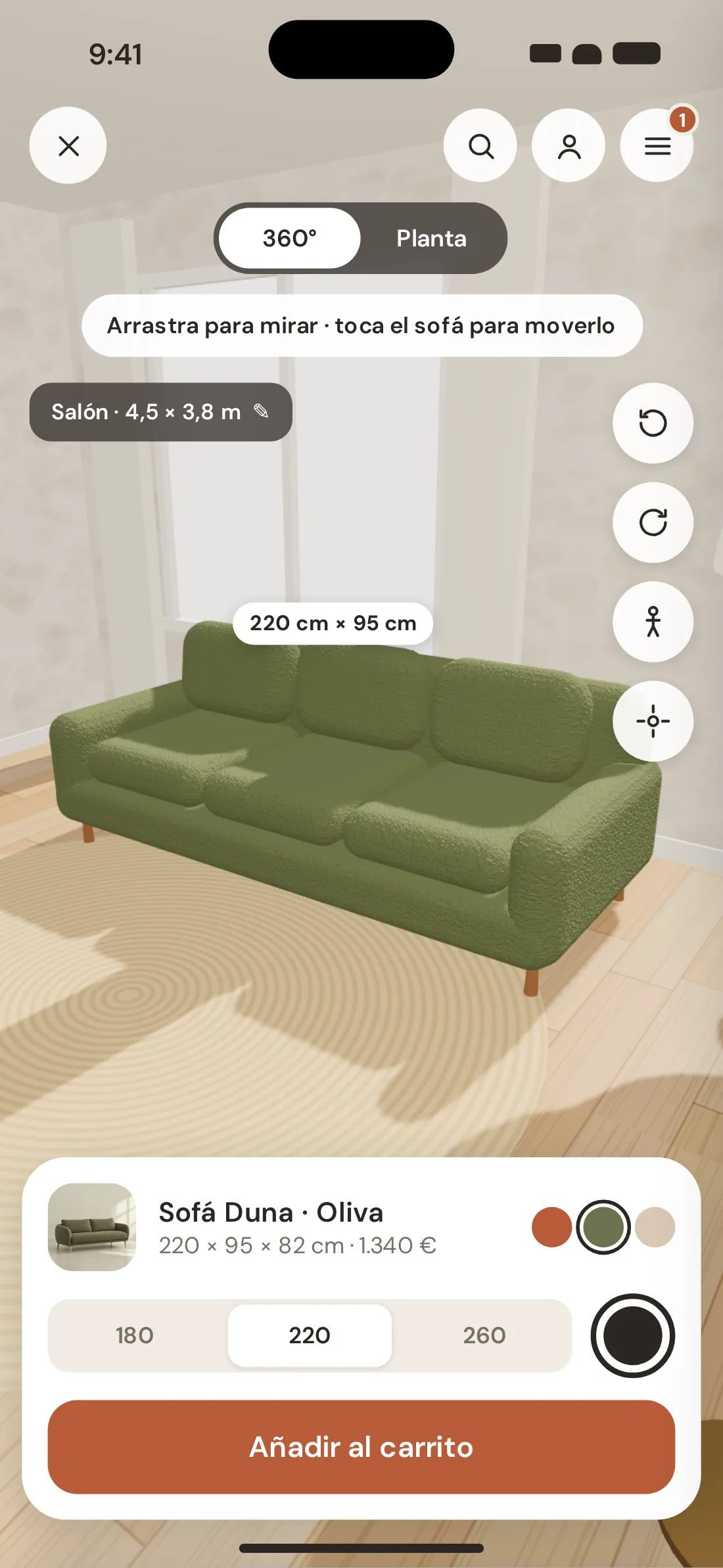
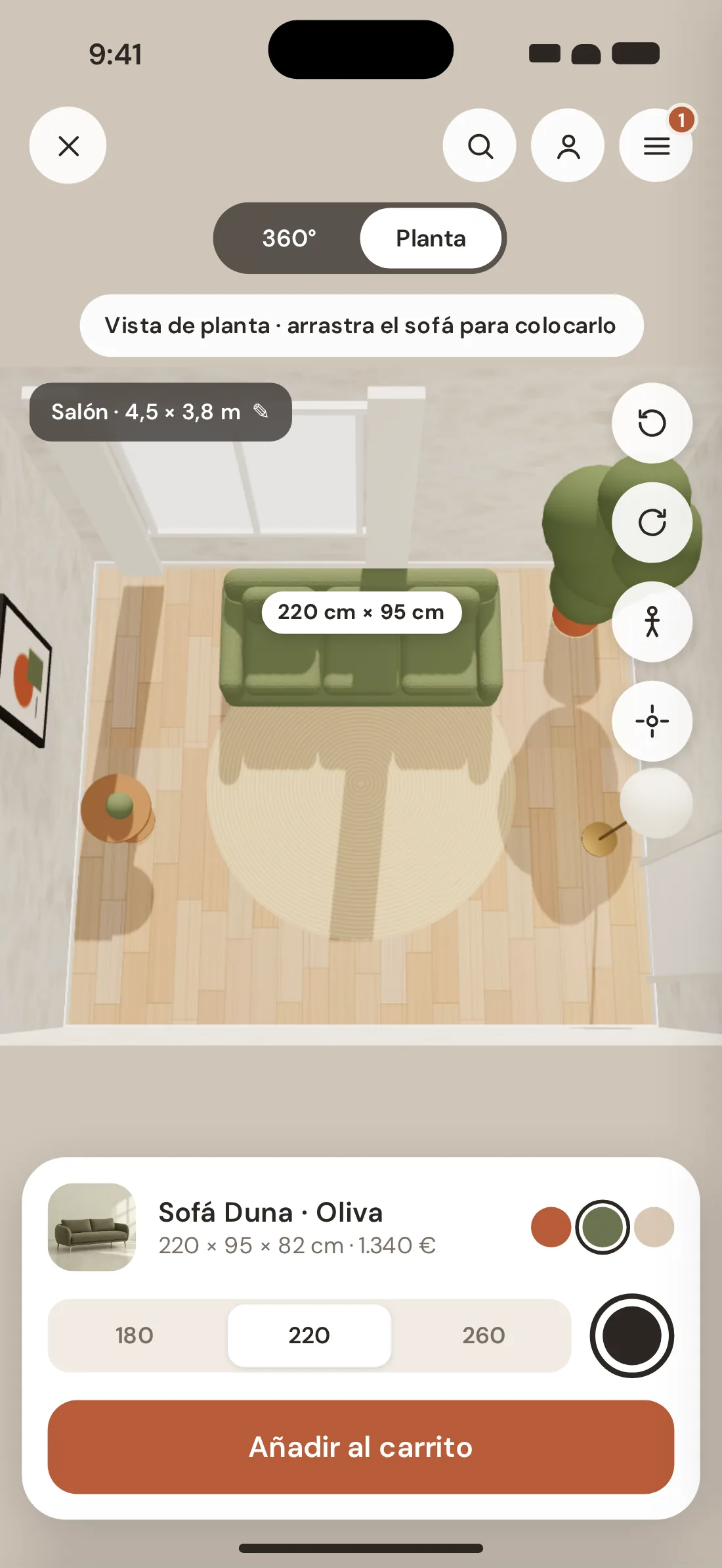
In almost every viewer you can pinch to make the furniture bigger or smaller. It's convenient, and it's exactly what makes the viewer lie. In Olmo pinching zooms the view, never the sofa: if you want another size, you pick another size and the model changes, with its price.
What you see in the video is the clickable prototype running, not an edit: every tap is marked with a circle. I built two versions. In Figma the screens are wired with Smart Animate, Push, Move-in and Dissolve. In parallel I built an HTML, JavaScript and Three.js version with the real animations, the side menu, a cart that recalculates and the 3D AR viewer.
The coded version has a product reason: an AR viewer can't be prototyped in Figma. To know whether moving a sofa with your finger makes sense, you have to be able to move it.
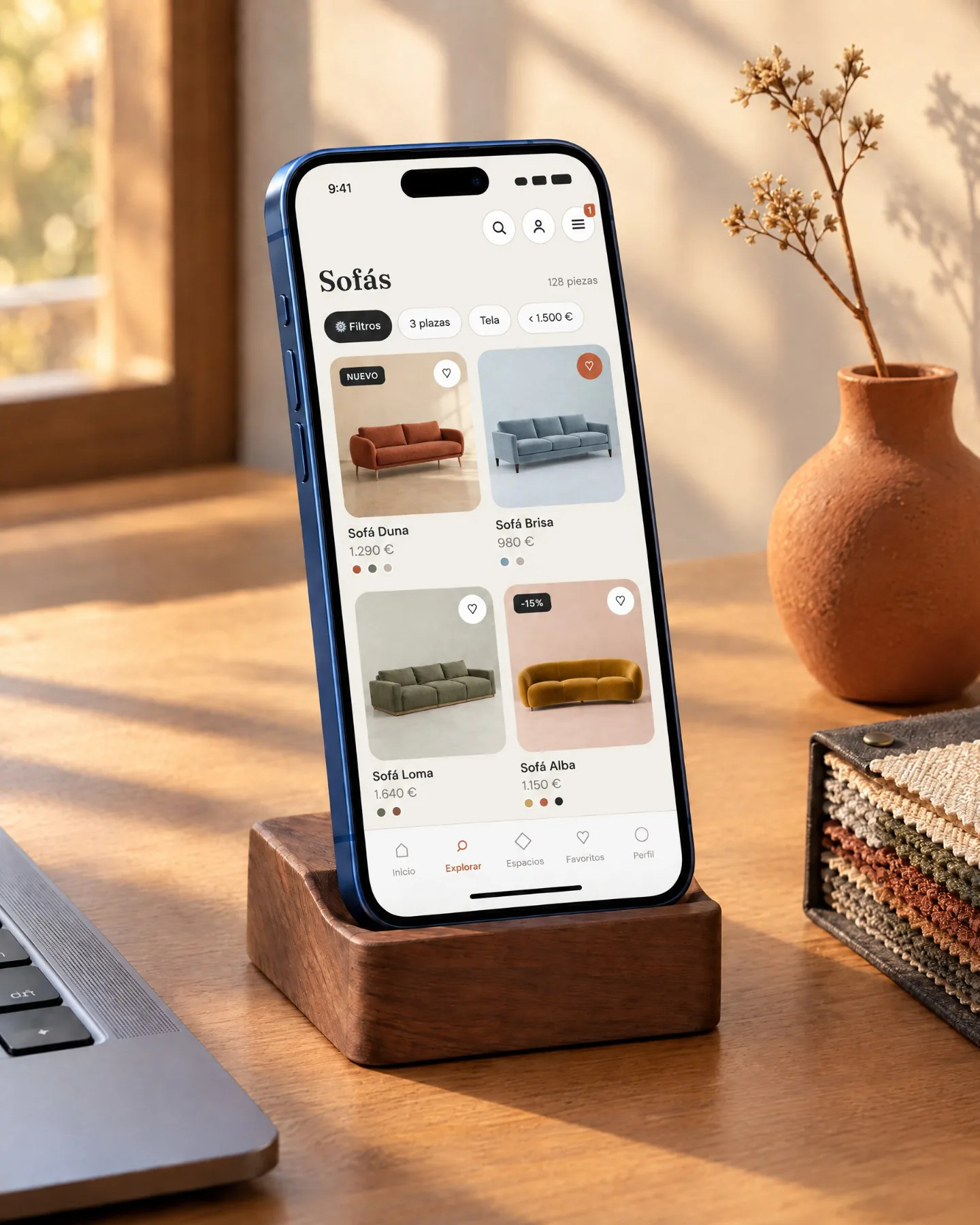
A mobile design is judged on a phone. I generated the scenes in Higgsfield with a green screen on the phone, located the rectangle and placed the real Figma screens inside, so what you see on the iPhone is the exact design and can be updated if it changes.
Olmo is a concept: it has no users yet, so I don't show conversion figures I haven't measured. What it does have is every decision tied to a data point or a market gap, and a prototype that can be used to test them.
The next step is the one I follow on any product: usability testing with five or six people who bought a sofa online in the last year, with three tasks —find a sofa that fits a 2.40 m space, change its fabric and place it in AR— and then iterate. And in the next version, reviews with photos of real homes and end-to-end swatch ordering.
Research and benchmark
Market, Baymard, NN/g and ten brands comparedArchitecture and flows
Five tabs and three journeys with their branchesSystem and screens
Tokens, motion, 9 wireframes and 11 hi-fi screensPrototype with AR
Figma with Smart Animate and HTML with Three.jsDBK, furniture retail 2025 · Baymard Institute, furniture e-commerce UX, "View in Room" and AR, cart abandonment and shipping costs on product pages · Nielsen Norman Group, product pages · Brand data from their App Store listings and help pages, checked in September 2026.
Next in Product design UX/UI