Work / Front-end / SKÅL Madrid · The site in Angular
The form said “we’ve got your request” and nobody was getting it
Project 11 of 28 in the archive 02 of 08 in Front-end development See the whole discipline ↗
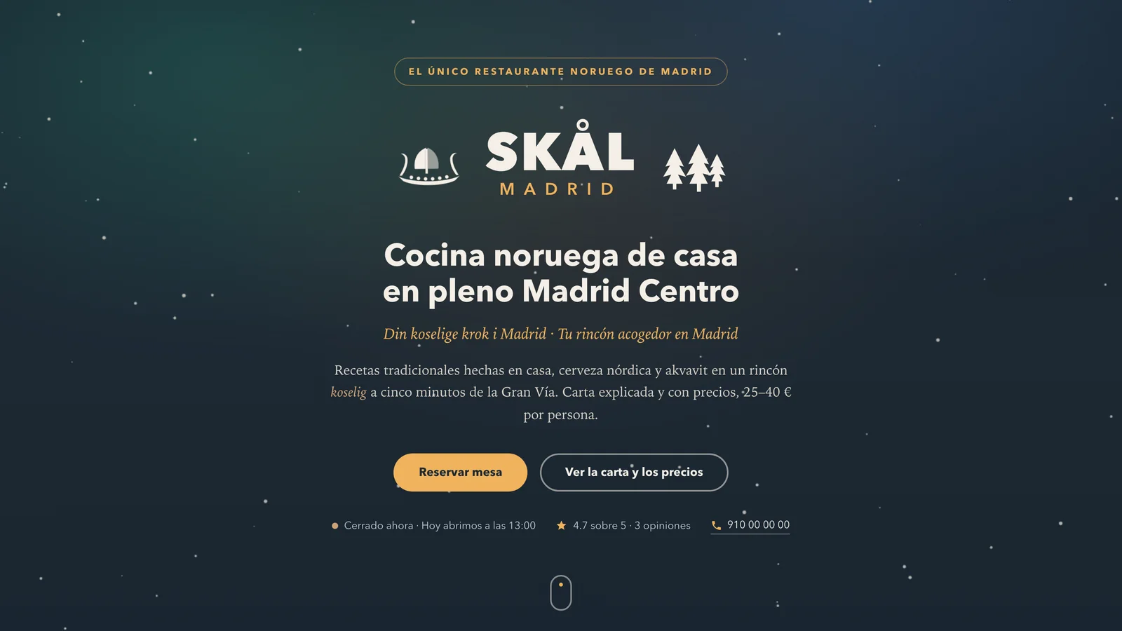
Open it properly: the menu, the gallery and the booking form
The frame below switches between desktop and phone, which is where most of the work went. To walk through the whole thing you need screen, so it also opens in a new tab.
An audit with three blockers
The previous version was not badly built: an honest one-pager, no libraries, the menu explained dish by dish —its greatest strength according to the benchmark— and not a single third-party request. The layout was not the problem. The problem was that the thing that matters most on a restaurant’s website did not work.
The UX/CRO report flagged three things as blockers. First: the booking form displayed “we’ve got your request” and the data never reached any destination. Every reservation made through the site was lost, and the customer turned up believing they had a table. Second: phone, address and social profiles were plain text, with nothing to tap. Third: in a business whose main argument is the room itself, not one photograph of it had been published.
The brief is to implement the report in full, not to reinterpret it. Thirteen actions, in their order and with their reasoning, and a visual identity that stays untouched.
Actions implemented
The thirteenth, a paid booking engine, is out of scopeBlockers cleared
The form, the contact details and the photographs of the roomAA colour pairings
The whole palette measured, none below WCAG 2.1 AAUnit tests
Over the opening hours and the booking validatorsThe identity stays as it was
The palette, the typefaces and the koselig tone come from the previous version and are not redesigned: they are moved into tokens so they can be changed in one place and land everywhere. The only colours that change are the four contrast failures the report measured, and they change just enough to pass: wood on cream goes from 3.11:1 to 5.11:1, and the legal text in the footer from 3.97:1 to 7.29:1.
Angular, but readable without JavaScript
The site is Angular 21 with standalone components, signals and zoneless change detection: no NgModule and no zone.js in the bundle. And it is prerendered (outputMode: 'static'), so each of the five routes compiles to a complete HTML document.
That last part is not a deployment detail, it is the decision that orders everything else: a search engine, a WhatsApp card and the first paint all receive real content, not an empty <app-root>. The entrance animations and the photo fade-ins only switch on when JavaScript is there — never the other way round.
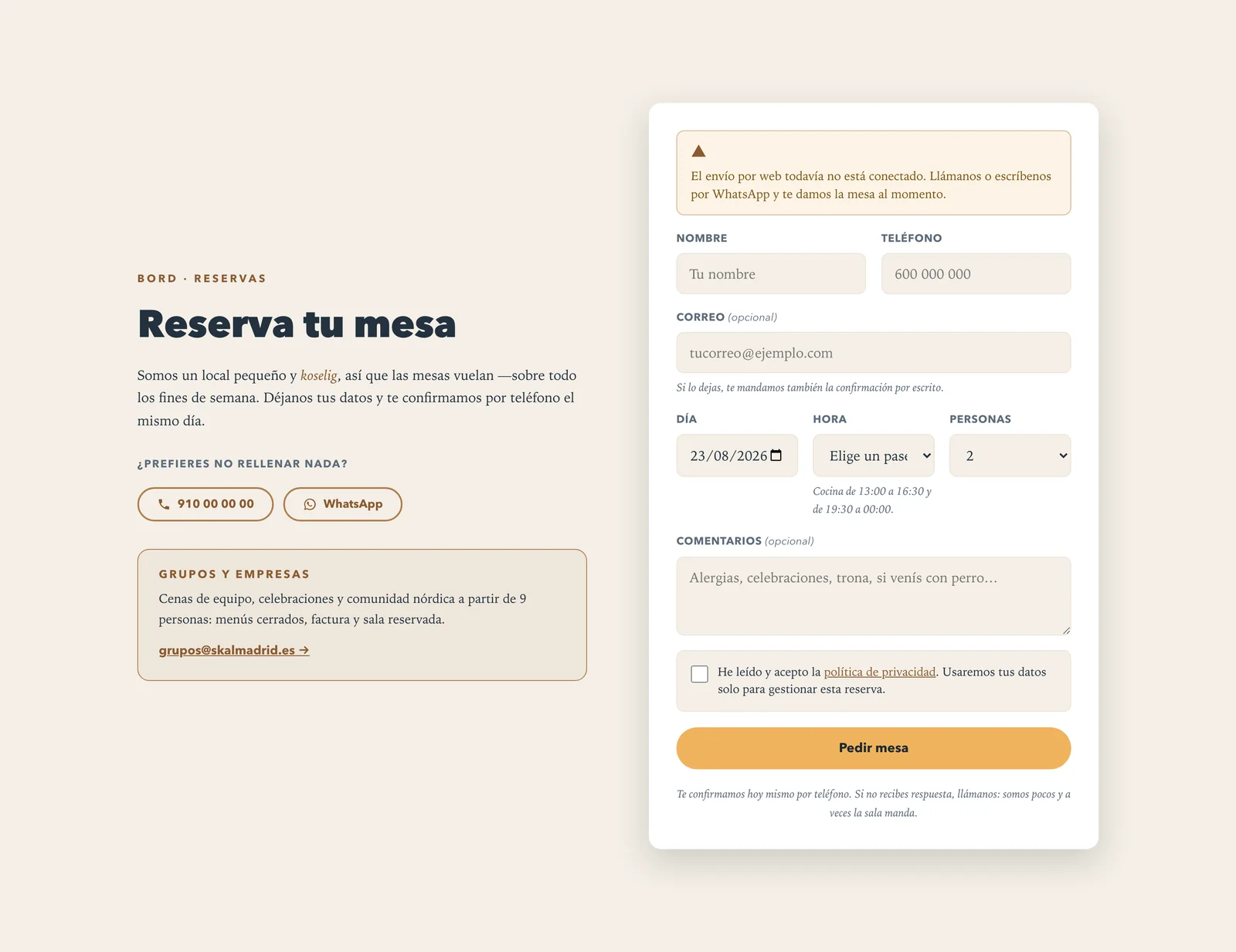
01 · A form that doesn’t confirm what hasn’t happened
The booking service sends the request by POST with a timeout, and tells a network failure apart from a server failure. The confirmation dialog is tied to the real result of the send: if the destination doesn’t answer properly, it doesn’t open.
And while the endpoint isn’t connected, the site says so before anyone types a thing and offers phone and WhatsApp instead of pretending it went through. That’s the amber band in the screenshot, and it is blocker one solved the opposite way round.
nucleo/servicios · reservas.tsConfirmation tied to the send · covered by tests
02 · Opening hours, one single source of truth
The time selector only offers sittings that exist: 13:00 to 16:00 and 19:30 to 23:00, in half-hour steps; Mondays are rejected with their reason, and today’s sittings that have already passed disappear. No more calls to turn people away.
Those hours live in one place and from there feed the “open now” indicator, the form’s sittings, the opening-hours table and Google’s structured data at once. They cannot drift apart, which is exactly how they always drift apart.
nucleo/servicios · horario.ts · validadores.ts15 unit tests
aria-controls03 · The photographs of the room, the most expensive gap
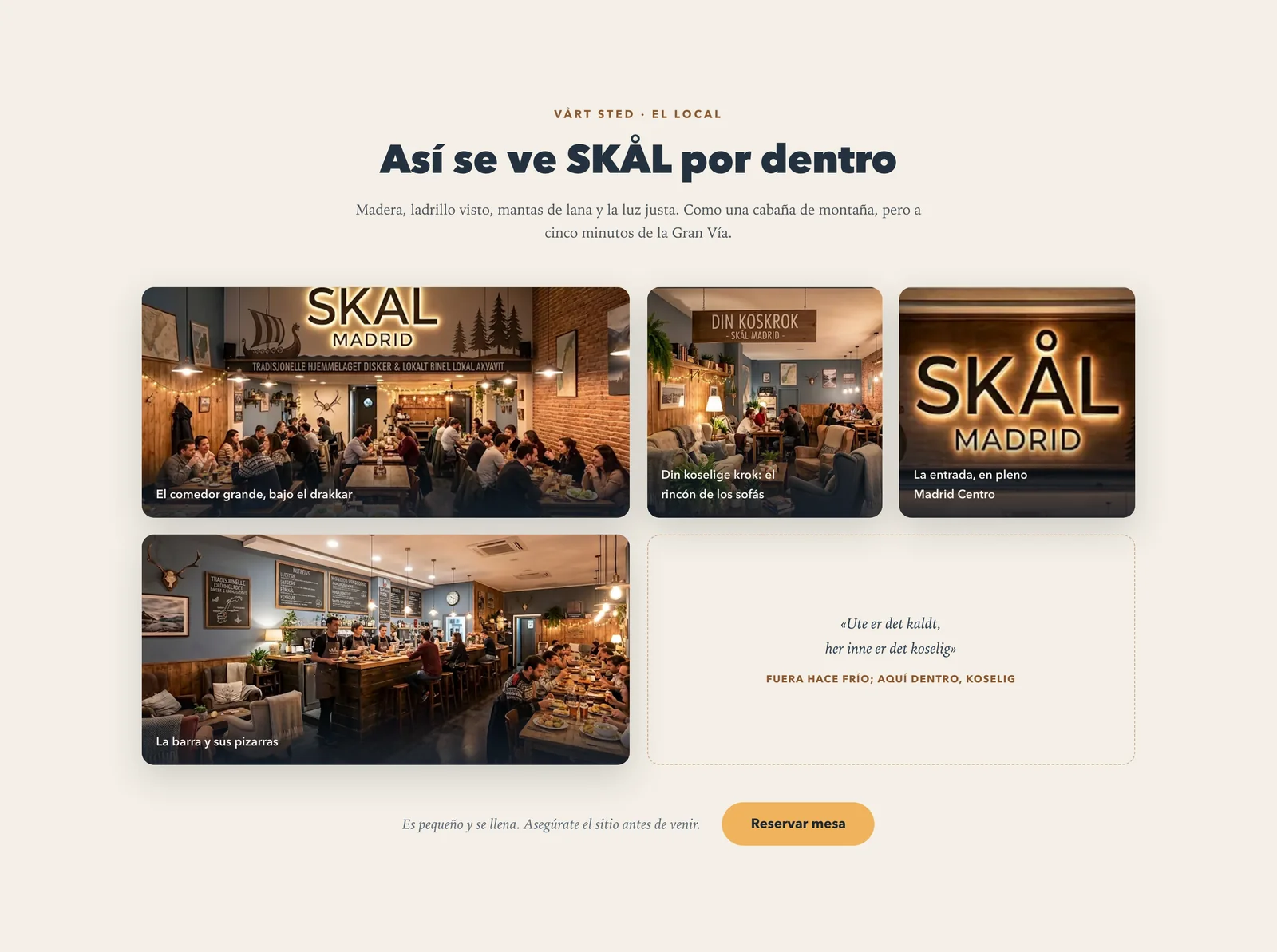
Four real photographs where there used to be empty boxes with internal working text: the dining room under the drakkar, the sofa corner, the bar with its blackboards and the front. They open with a native <dialog>, with focus trapped, Esc to close and arrow keys to move between photos.
And they weigh what they should. A Sharp script generates four widths in WebP, the srcset, the sizes and a blurred placeholder for the fade-in. The photo the audit singled out, at 1.9 MB, is served today in 83 kB.
scripts · optimizar-imagenes.mjs1,855 kB → 83 kB on the worst one
<dialog>, focus trapped, keyboard first04 · On a phone, booking is one tap
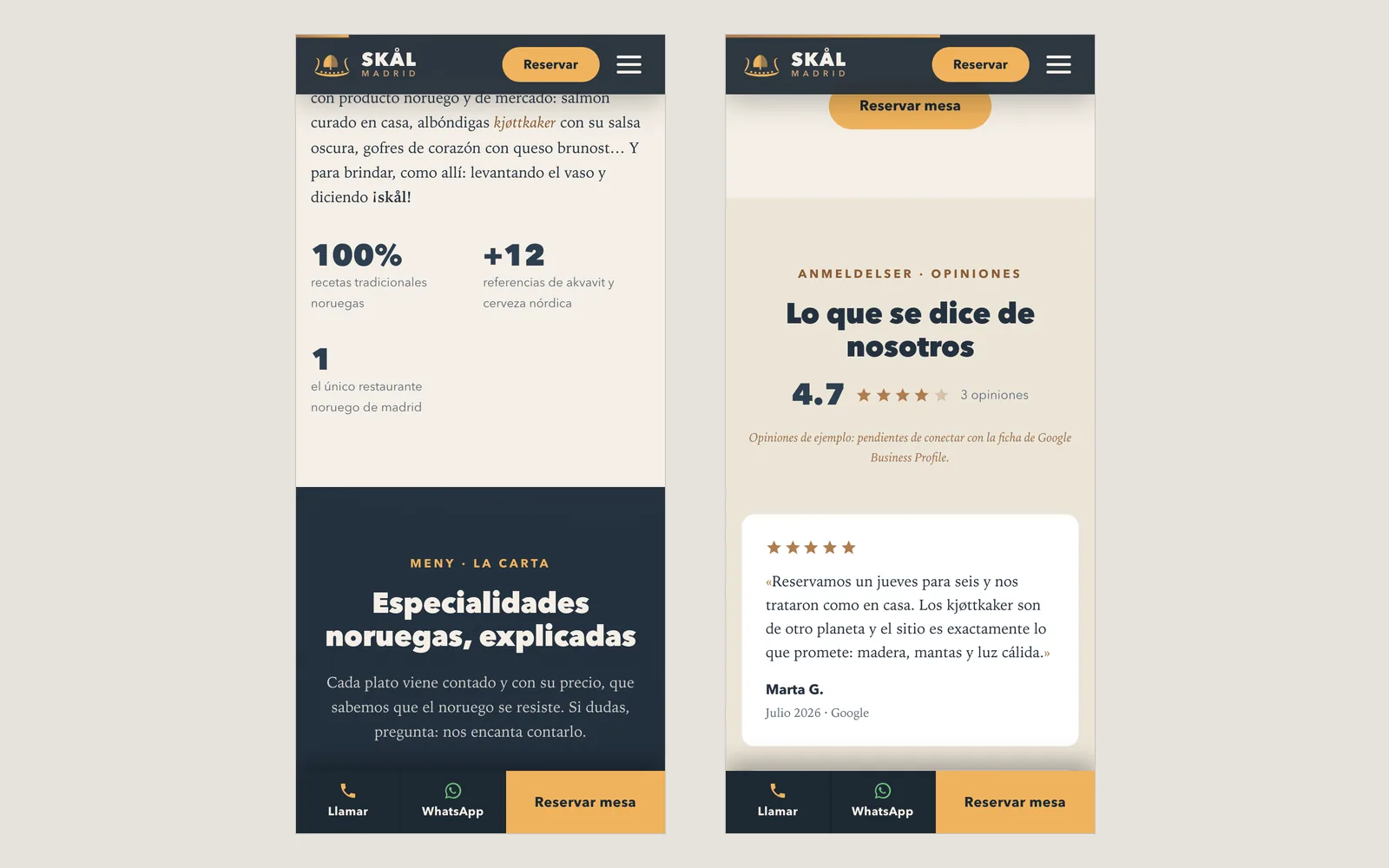
The report counted conversion in taps, and booking cost two because the button lived inside the hamburger menu. Now “Book” is always visible in the header, and there is a fixed bar at the bottom with Call · WhatsApp · Book a table that appears once you are past the hero.
With one detail visible in both screenshots: the bar gets out of the way on its own once the form is on screen. Insisting at that moment would mean covering up exactly what the visitor came to do.
disposicion · barra-accionFrom two taps to one · 44 px touch targets
Nothing loads without permission, measurement included
Out of the box there is not a single third-party request: the typefaces are system ones and the icons are inlined SVG. Google Analytics and Clarity only load if the cookie notice is accepted, and the twelve conversion events that happen before that decision are queued and sent on acceptance, or dropped if not. It was a strength of the previous version and there was no reason to lose it.
The site knows what it doesn’t have yet
This is not live yet. What is missing does not depend on the code: the final phone number, the company number for the legal notice, the real destination for the form, the measurement IDs and the Google reviews. All of it is declared in a single file, and while it stays there the site says so on screen instead of covering it up.
That is why the form warns that submission isn’t connected, and why the reviews block says they are samples. There is a consequence you cannot see, and I think it is the most important one: while the reviews are samples, the average rating is not declared in the structured data. Publishing an invented 4.7 in Schema.org would be lying to Google and to the customer who comes because of that star.
Less weight on the worst photo
The gravlaks’ 1,855 kB, served in 83 kBOf gzipped JavaScript
The whole site, without a single third-party libraryThird-party requests by default
System typefaces and inlined SVG iconsPrerendered routes
Home, legal notice, privacy, cookies and creditsA reminder only the developer sees
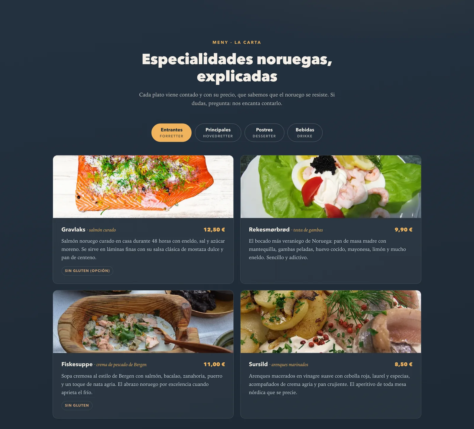
In development the site itself shows the outstanding list in the bottom-left corner; in production it never appears. It is how the list stops living in a document nobody opens again and starts living in front of the person who can cross it off. And the dish photographs, which come from Wikimedia Commons under free licences, carry their attribution inside the site itself, at /creditos.
The site, running
The whole site is below: move through the menu tabs, open a photograph of the room, watch the indicator at the top work out whether the restaurant is open right now, and try asking for a sitting that doesn’t exist.
And use the control at the top right: set the frame to phone size and you will see the fixed bar appear at the bottom and “Book” come out of the menu. Nothing is being scaled; it is simply being handed a different width.
This copy is the real build, with the provisional details the restaurant hasn’t settled yet: the phone number, the company number and the reviews are placeholders, and the site says so where it matters. Nothing has been dressed up for the demo; it is shown in the state it is in.
Angular 21 · zoneless · prerendered · 148 KB of JavaScript (44 KB gzipped)
Where it comes from
This page is half of a job. The other half is the digital audit and the UX/CRO report that set its order: the analysis of the previous version, the benchmark, the four accessibility failures measured one by one, and the plan of thirteen prioritised actions.
Writing the report and then implementing it changes how you write the report. Once you know you are the one who will have to solve “connect the form to a real destination with error handling”, you stop drafting recommendations and start drafting things that can be finished. It forces the opposite too: action thirteen —a paid booking engine— is still marked out of scope, because it is a business decision and not a code problem.
Next in Front-end development
EdG Design System