Work / Graphic / Ceramic reports
A report you read and also consult
Project 24 of 28 in the archive 07 of 11 in Graphic design See the whole discipline ↗
The brief
An excavation report has two readers inside the same document: the one who reads it straight through, and the one who goes directly to a given stratigraphic unit to verify a fragment.
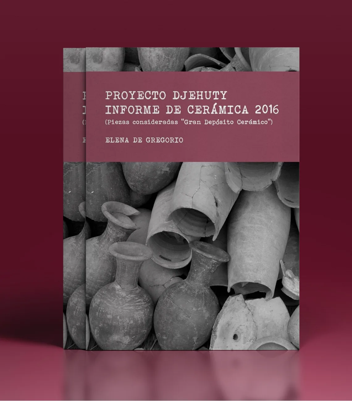
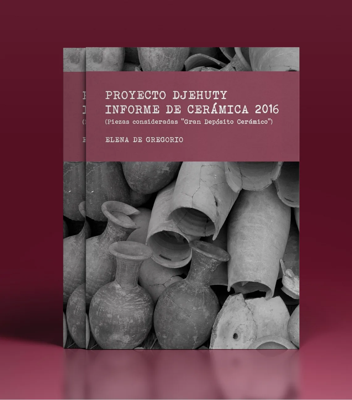
The 2016 edition covered the pieces classed as the «Great Ceramic Deposit»: hundreds of fragments photographed, numbered and described. If the layout does not separate those two readings, the document fails both.
How it was solved
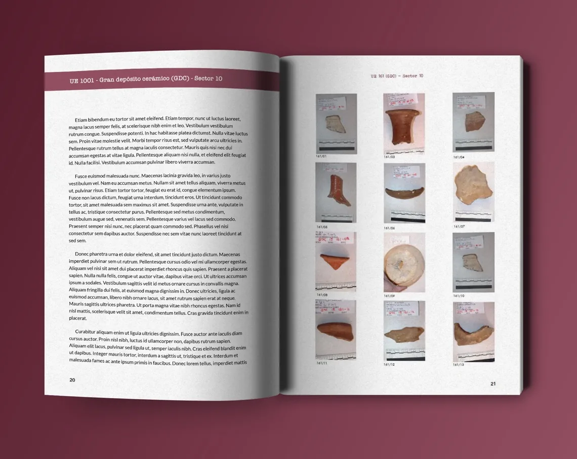
One grid that takes both. Text runs in a single wide column that is comfortable to read; the catalogue sits in a three-per-row grid with its inventory number underneath, always in the same place.
The running head states the stratigraphic unit and sector on every page — that is what people scan for. The burgundy from the cover is the document's only colour signal: running head, folio, little else.
Field photographs were corrected in Photoshop to match exposure and background across pieces shot on different days, so the grid reads as a series rather than an album.
Next in Graphic design
Djehuty dossiers