Work / Front-end / My little baby
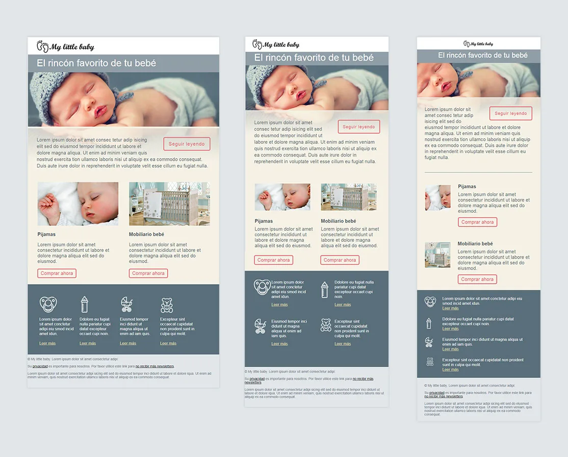
My little baby at three widths
Project 16 of 28 in the archive 07 of 08 in Front-end development See the whole discipline ↗
The brief
A commercial newsletter with a lot to place: brand header, a large image, two product cards with their buttons and four icon call-outs. It fits on desktop; on a phone it does not.
Shrinking was not an option: scale everything down evenly and the buttons stop being tappable while the icons turn into smudges.
How it was solved
Two breakpoints, at 660 and 510 pixels. At each one the grid reorders rather than shrinks: the two product cards stack, and the four call-outs become a list with the icon on the left.
The trick holding the piece together is an old one that still works: at small widths the header and promo images are hidden and their cell picks the same image back up as a background, in a crop made for that width. The email never drags a desktop image onto a phone.
The buttons are built from tables rather than styled links — the only thing that renders the same across every mail client.
Live
Opens in a new tab. Resize the window to see the three states.
Next in Front-end development
Responsive newsletters