Work / Front-end / Responsive newsletters
Newsletters that arrive whole on a phone
Project 17 of 28 in the archive 08 of 08 in Front-end development See the whole discipline ↗
The brief
A newsletter is not built like a web page. There is no reliable external stylesheet, no flexbox, and every mail client reads the HTML its own way — so what works in a browser can fall apart in Outlook.
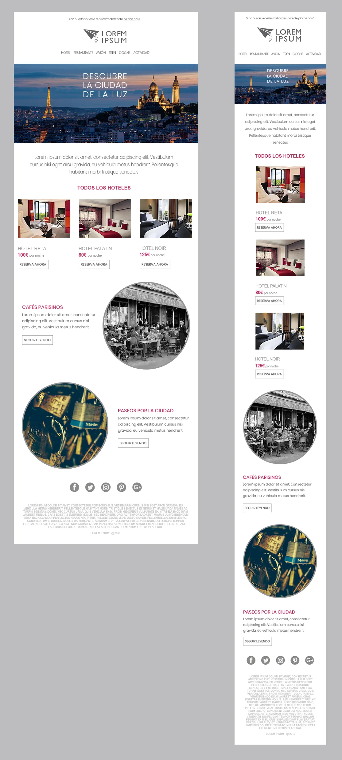
The brief was a content piece — destinations, hotels with prices and several editorial sections — that had to read the same on a laptop and on a phone on the underground.
How it was solved
Nested tables with pixel widths as the base, media queries on top for mobile: the three-hotel grid becomes a single column, images scale to 100% and the buttons keep their tap area.
Photographs were prepared in Photoshop at the exact size they are served at — no client-side scaling — and every block carries its own link, so the call to action does not depend on one button at the end.
Next in Front-end development
SKÅL Madrid · The site in Angular