Work / Front-end / EdG Libraries
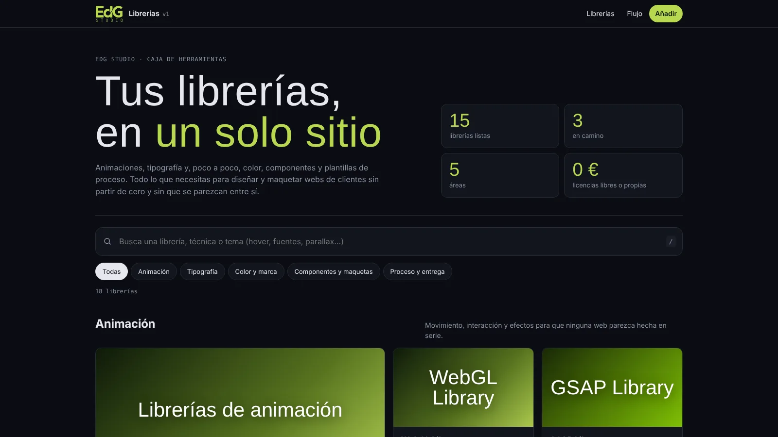
All my libraries, in one place
Project 30 of 30 in the archive 10 of 10 in Front-end development See the whole discipline ↗
Open them: search, customise and copy the code
It is a working tool, not a public website: it asks for a password. It opens in a new tab, on the hub with all the libraries.
Password access · remembered for 30 days in your browser
Why I built it
Every client site needs the same pieces, and mine were scattered across folders.
A scroll animation, a font pairing that works, a palette that reads well, an image hover. For years I copied everything from earlier projects and, every time, I lost time finding it again and adapting it, with another client's colours and details I no longer remembered the reason for.
So I gathered it all in one place. EdG Libraries is a hub: each library lives in its own folder, the hub builds itself from a list, and adding a new one means creating the folder and adding one line. What used to be digging through old projects is now typing what I need into the search box.
What is inside
Animation, typography, colour and, little by little, components and process templates.
Palettes for web, iOS and Android
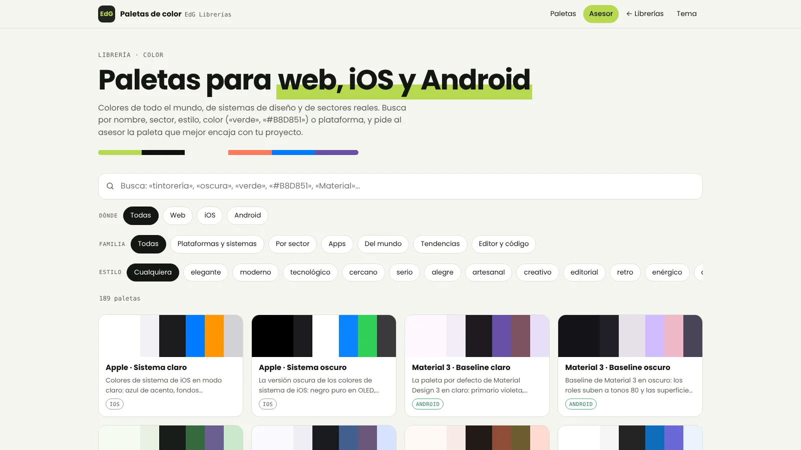
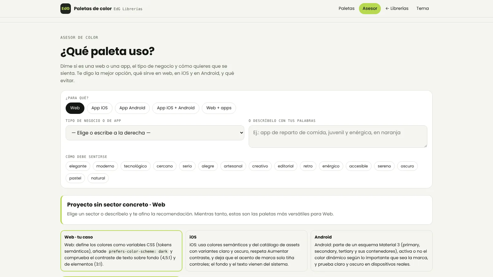
I search by sector, style, colour or platform, and the advisor tells me which one fits.
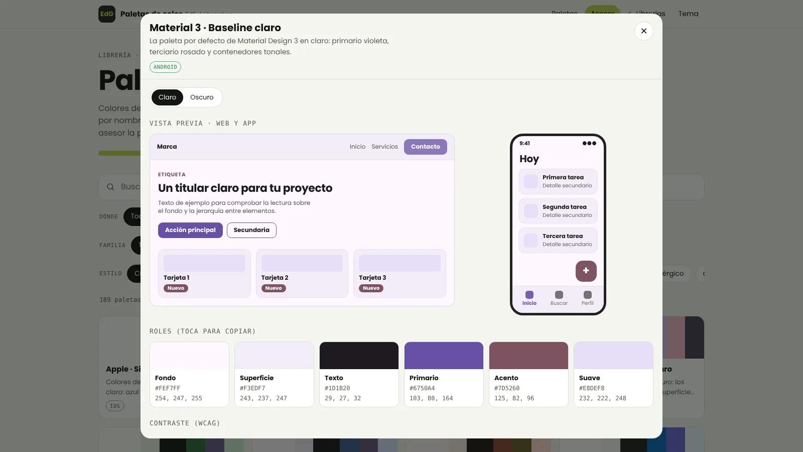
The 189 palettes come from real design systems (Apple, Material 3, Tailwind, IBM Carbon, Atlassian, Shopify…), from specific sectors (dry cleaner, law firm, clinic, banking, delivery…) and from trends around the world. Each one has six roles (background, surface, text, primary, accent and soft), a light and a dark version, the WCAG contrast table and a preview on a website and on an app.
They export to CSS, Tailwind, SwiftUI, Jetpack Compose, Android XML and JSON tokens. And the colour advisor asks whether it is a website, an iOS app, an Android app or several at once, the sector and how it should feel, and gives me the best ones with the reason and what suits each platform.
Animation for apps too
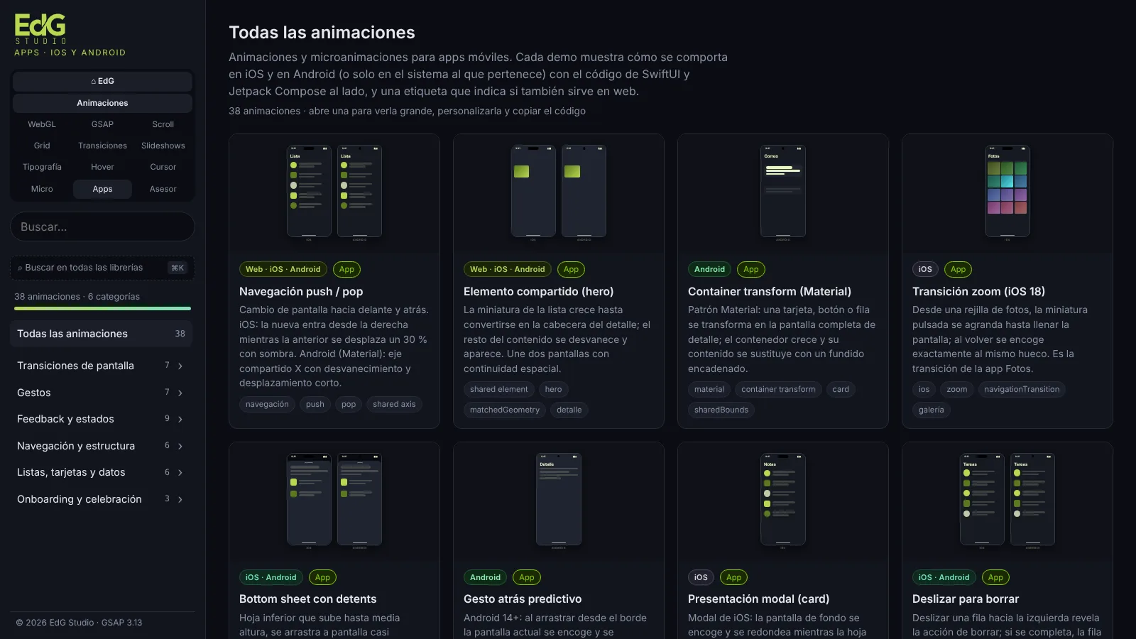
There are animations only for web, only for iOS, only for Android and for all of them at once.
Every animation in the library carries a tag: Web, Web · iOS · Android, iOS · Android, iOS only or Android only. The app ones show how the motion behaves on iOS and on Android (or only on the system it belongs to) with the SwiftUI and Jetpack Compose code beside it.
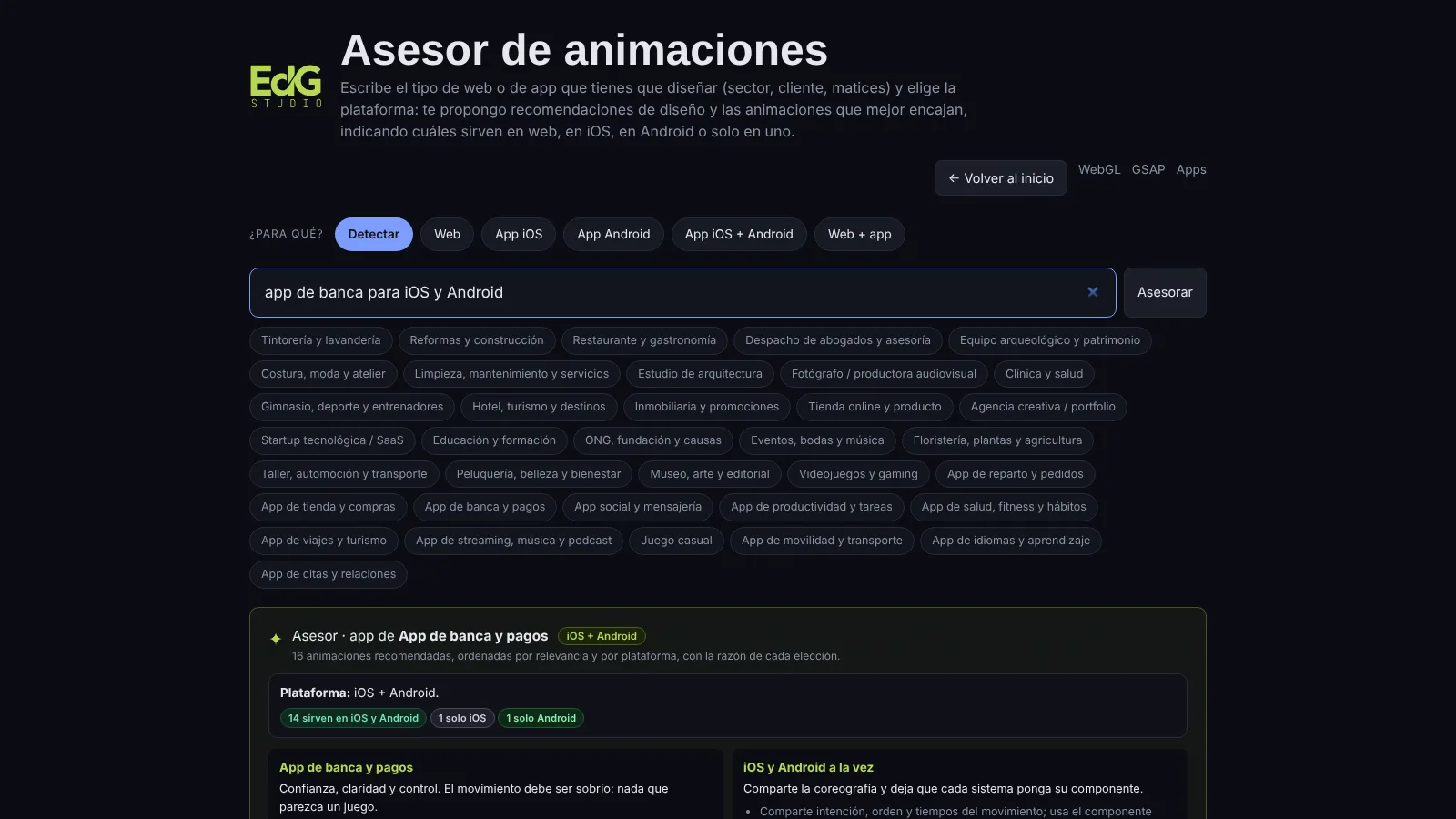
The animation advisor understands “web”, “app”, “iOS” and “Android”. If I tell it I am building a banking app for iOS and Android, it separates what I can share between both systems from what only works on one and gives me the equivalent on the other. If I talk about a website, it does not suggest anything that does not exist there.
How it is built
No bundler, no framework: folders, ES modules and a list that generates the hub.
Each library is a folder with its own page, and the hub reads a list (libraries.json) to draw the cards, the filters by area and their status: ready or on the way. Everything is written in HTML, CSS and JavaScript with ES modules, and the animations use GSAP and WebGL. It is designed for mobile from the start, because I review it on my phone as much as on my computer.
Since it is a working tool and not a product, it is password-protected: one door on the server and another in the browser, so it also works locally. Inside, the switcher jumps between libraries and the global search runs through all of them.
The libraries, running
It is private because it is a working tool: I open it, search, customise and copy. If you want to see it, ask me for the password and come in with the button.
See the resources site in the browser
It asks for a password. It opens in a new tab.
Next in Front-end development
GMF Reformas · The new website