One campaign and all of its sizes
Project 27 of 28 in the archive 10 of 11 in Graphic design See the whole discipline ↗
The brief
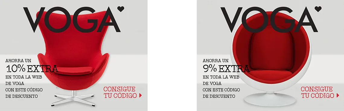
A design furniture shop runs on campaigns: sales, back to school, private sale, discount codes. Each one needs its hero piece and, behind it, the same idea repeated across the standard sizes affiliates ask for.
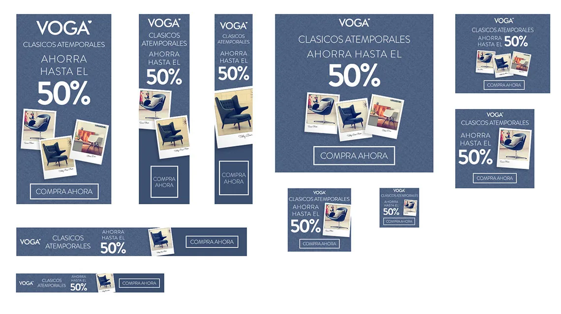
Drawing the big banner is not the problem. The problem is keeping the campaign recognisable when all that fits is the logo, the percentage and a button.
How it was solved
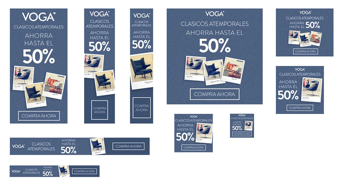
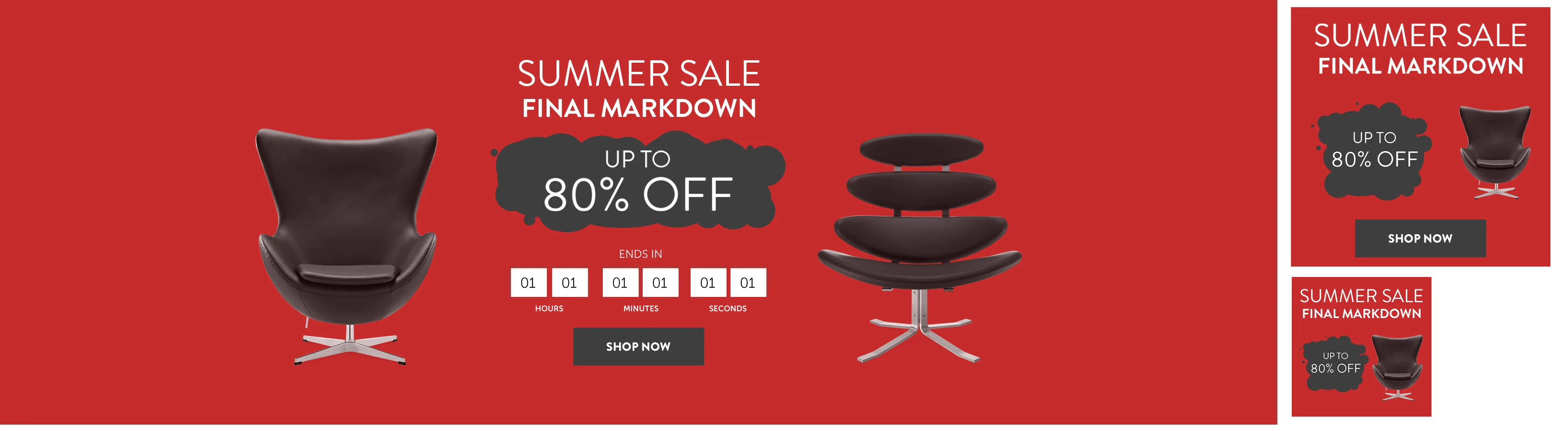
Every campaign runs on a fixed hierarchy of four elements — brand, headline, percentage and call to action — and one rule: going smaller means recomposing, not scaling. In the panoramic piece the product breathes either side of the headline; in the skyscraper it stacks, and the percentage takes the room the text gives up.
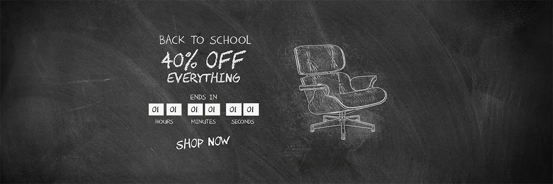
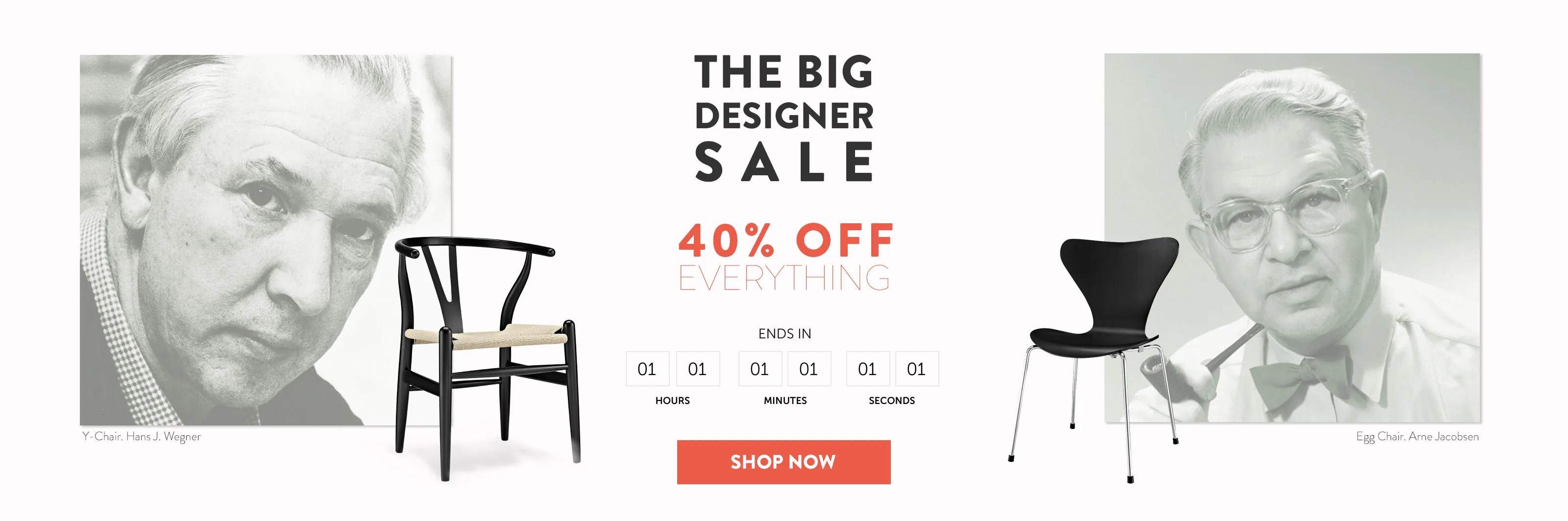
Products were cut out in Photoshop and the type set in Illustrator, so the same piece serves at whatever size is needed. Each campaign has its own register: black and red for the private sale, hand-drawn chalk for back to school, portraits of Wegner and Jacobsen for the designer sale.
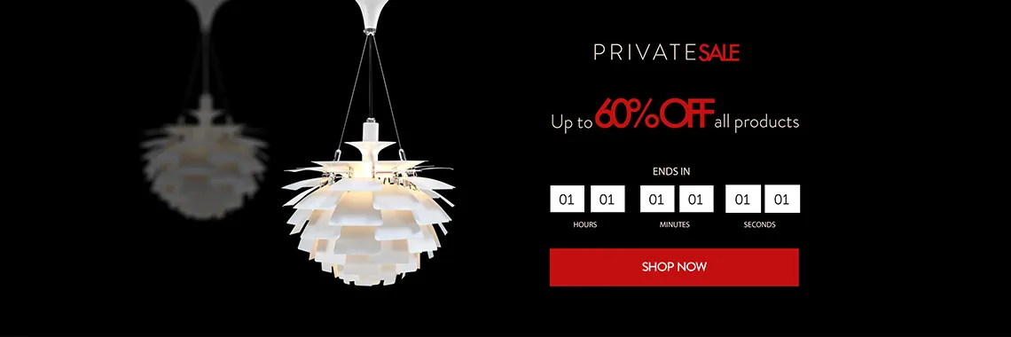
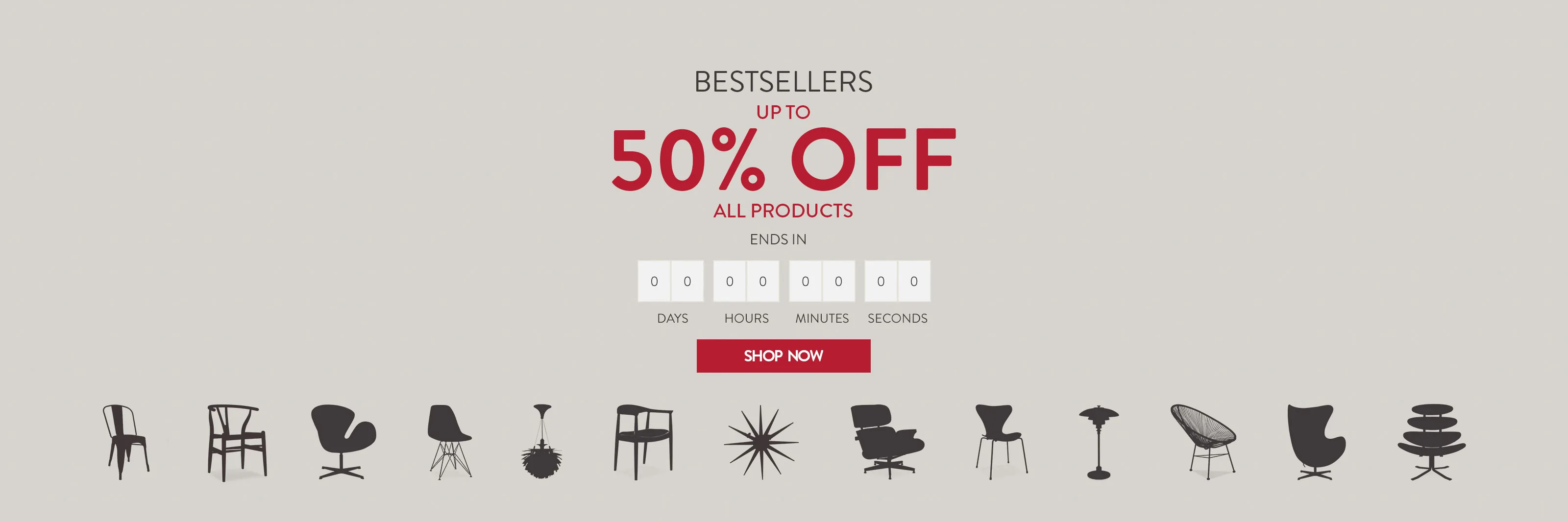
The hero piece is not a flat image: headline, countdown and button are HTML and CSS over the background, so the banner adapts to the browser width and the text stays text.
Next in Graphic design
Infographic